
Chapter 5. An Introduction to Human Visual Perception
5.1. Introduction
The human eye dominates the field of computer graphics, for without it, graphics would be almost useless. Everyone working in graphics should understand something about how the visual system works. Until some day when graphics is “perfect” and somehow indistinguishable from reality, we must try to best use our computational and display resources to convince the visual system that it’s perceiving reality, which entails omitting work that produces undetectable (or barely detectable) differences from the ideal.
This chapter introduces some important basic ideas, as well as outlining the limitations of our current understanding. The science of human vision and the related science of machine vision are lively areas of research precisely because of the richness of these limitations. Of course, a great deal is known, and we’ll summarize some of it here.
The visual system’s remarkable parallel processing powers allow enormous amounts of information to be transferred from the computer to the user. (The limitations on bandwidth in the other direction—human to computer—are a source of frustration and opportunity for clever design; see Chapter 21.) The visual system is both tolerant of bad data (which is why the visual system can make sense of a child’s stick-figure drawing, or an image rendered with a very crude lighting model), and at the same time remarkably sensitive. Indeed, the eye is so sensitive to certain kinds of error that debugging graphics programs entails special challenges: A single tiny error (one red pixel in a 1-million-pixel grayscale image of a lighted sphere) stands out, while a one-in-a-million error in many other computations might never be noticed. There’s a converse to this as well, which we mentioned earlier: We can use imagery to convey an enormous amount about what a program is doing, so good graphics programmers use visual displays to help them understand and debug their code.
![]() The Visual Debugging Principle
The Visual Debugging Principle
Use visual displays to help you debug and understand your graphics programs.
In graphics, output from the computer to the user is typically in the form of light emitted by a display toward the user’s eyes. The display might be a conventional flat-panel display, a projector, a head-mounted display, or a heads-up display for an aircraft pilot or automobile driver. In all cases, the light reaches us through the eye. The eye’s responses to that light are processed by the visual system.
There are other modes of interaction as well, of course: Haptics (touch) and sound are often used as part of the computer-to-human communication channel. But the great bulk of the communication is through the visual system, which is why we concentrate on it. The visual system is powerful in part because light, which carries information to the visual system, has some special properties that are not shared by sound, touch, smell, or taste. For instance, light isn’t directionally diffuse: A beam of light that starts in some direction travels in that direction only; it can travel without a supporting medium, and when traveling through air (the most common medium) it’s largely uninfluenced by the air (although variations in the air’s index of refraction as a function of density can distort light—think of seeing the desert “ripple” on a hot day). By contrast, the chemicals responsible for smell and taste not only diffuse, but also are advected by moving air, and sound’s direction of propagation can be substantially altered by wind shear. Light is remarkably good at carrying information from a source to our eyes. Touch, by contrast, only works when the sensor (e.g., your finger) is collocated with the thing being observed.
It’s tempting to try to reduce the visual system’s response to stimuli in various ways that will make it easier to formulate a model of it. For example, because the first step in our processing of light is detection by the sensory elements of the eye, it’s tempting to say, “The response of the visual system depends only on the incoming light; if you apply the same pattern of light, you get the same response.” That’s wrong, however, at both the physical and mental levels. At the physical level, seeing a sunny beach after walking out of a dark restaurant, for instance, causes you to squint your eyes reflexively, while seeing that same beach after having been outdoors for a few minutes causes no such physical, physiological, or psychological reaction. At the mental level, it’s been shown that if you’ve recently been shown an object, you’ll notice another object like it in a jumble of others more quickly. So, any model of visual processing must depend not only on the current stimuli, but on the recent past as well. More significantly, our pattern recognition ability is also influenced by training and learning. Once you’ve learned to identify a shape, you will recognize it much faster the next time you encounter it; a good example is the reading of the characters or glyphs that make up text. Almost every aspect of the visual system is similarly complicated; there seem to be no easy explanations. On the other hand, there is a wealth of experimental evidence that helps us understand some of what the visual system is doing [Roc95]. In this chapter, we focus on the visual system and how it perceives the world, but the discussion is necessarily abbreviated; we limit the discussion to the aspects of the system that are likely to have an impact within graphics systems. The chapter does however, conclude with a few brief remarks on the relationship between the visual system and other perceptual modes, like hearing and touch.
Each section concludes with a paragraph or two labeled “Applications,” in which ideas from the section are related to applications in graphics.
5.2. The Visual System
The human visual system (see Figure 5.1) consists of the eye (which focuses light and contains sensors that respond to incoming light), the optic nerve, and parts of the brain collectively called the visual cortex. The exact functioning of the parts of the visual cortex is not completely known, but it is known that some “early vision” parts (i.e., those that handle the first few steps in the processing of the visual signal) detect sharp contrasts in brightness, small changes in orientation and color, and spatial frequencies, that is, the number of alternations between light and dark per centimeter. We could summarize this by saying that we are adept at detecting and noting changes in what we might loosely call “patterns.” The detection of orientation or color or frequency changes is local, that is, we are sensitive to adjacent things having different colors, but small color differences between things that are far apart in our visual field are not detected by the early-vision system. Also in the early-vision system are parts that assemble the local information into slightly larger-scale information (“This little bit of edge here and this little bit next to it constitute a larger piece of boundary between two regions”).
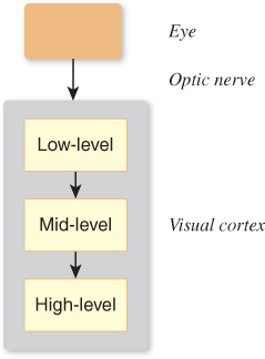
Later regions of the visual cortex seem to be responsible for detecting motion, objects (“This is the thing in the foreground; all that other stuff is in the background”), and shapes, handling “attention,” and providing control of the eye (i.e., muscle control to help the eye track an object of interest).
The simplicity suggested by Figure 5.1 is misleading: While there is certainly a “pipeline” structure to the visual system at a large scale, a wealth of parallel processing goes on as well, along with substantial feedback from later levels to earlier ones.
The visual system performs many tasks extremely well, such as determining size and orientation regardless of your viewpoint or distance, recognizing color invariantly under a variety of lighting conditions, and recognizing shapes, even in the presence of noise and distortions. It performs other tasks poorly, such as determining absolute brightness, recognizing parallel lines, and detecting identical but nonadjacent colors. And some of these strengths and weaknesses seem almost contradictory: We’re great at noticing a tiny thing that’s different from its surroundings (e.g., a black pebble on white sand), but we’re also great at ignoring many things that are different from their surroundings, which lets us watch old films with lots of film grain and scratches and other noise and not be distracted. It’s natural to explain the visual system’s particular “talents” on an evolutionary basis, often based on the ideas that the visual system helps us (a) find food, and (b) avoid predators.1 Thus, for example, humans are very sensitive to motion (which would help one detect predators that are trying to camouflage themselves), but we’re not particularly good at remembering colors from one day to the next. The visual system is also very good at detecting color similarity under different lighting conditions (you want to be able to recognize food both at noon and at dusk, and you want to recognize that something is all banana, even if part of it is in sunlight and part of it is in shade). It’s reasonably good at determining depth, especially for nearby objects—which is very useful for coordinating your hand movement as you reach out to pick a berry or fruit. Indeed, hand–eye coordination, especially in the movements of an athlete or craftsperson, is a marvel of multiple systems working together efficiently while completely bypassing the conscious aspects of the cognitive system.
1. Mating and obstacle avoidance may also be influences.
The details of color perception are discussed extensively in Chapter 28; we’ll touch on them only briefly in this chapter. Similarly, the perception of motion is discussed in Section 35.3.2.
It’s rather tempting to believe that we know how we see. We say things like, “Well, it’s obvious that I look for things with similar color, like the leaves of a tree, and try to group them together into a coherent whole so that I perceive the leaves and the trunk-and-branches as separate groups.” But what’s obvious is not necessarily true; a few moments spent examining various so-called “optical illusions” demonstrates this immediately [Bac].
The visual system’s functioning matters in immediate ways in computer graphics. In graphics, we often want to ask, “Is the image I have rendered perceptually different from the ideal image, or is it close enough to generate the same percept in the viewer’s mind, in which case I need not compute anything further?” In other words, the ultimate measure of rendering-and-display success is perceptual. There’s an easy way to measure the similarity between two images (take the pixel-by-pixel difference of the image, square all the resultant numbers, sum them, and take the square root; this is called the sum-squared difference, L2 difference, or L2 distance2), but this measure of difference does not always match actual differences in perception. Figure 5.2 shows a grayscale instance of this: The L2 distances from the top 41 × 41-pixel image (in which all pixel values are 118 in a range of 0 [black] to 255 [white]) to the middle (all pixels 128) is the same as the distance to the bottom (all pixels 118, except the middle, which has a value of 255), even though the bottom one looks much more different.
2. Closely related is the notion of “root mean square” or RMS difference, which is the L2 difference per pixel.

Figure 5.2: Three 41 × 41-pixel images. The top image has all pixel values 118; the middle has all pixel values 128; the bottom has all pixel values 128, except the center, which is 255. The L2 distances from the top image to each of the others are approximately equal, but this does not match our own understanding of “sameness.”
There’s been substantial work in trying to develop a “distance function” that tells how far apart two images are, perceptually speaking [LCW03], but much remains to be done. In the meantime, there are some useful rules to guide design choices. The logarithmic sensitivity of the visual system described later means that our visual system is more sensitive to radiance3 errors (of a fixed magnitude) in dark areas than in light ones. The local adaptability of the visual system means that changes in intensity tend to matter more than absolute intensity (as suggested by Figure 5.2); if you have a choice, you should aim to get the gradients (i.e., the local changes in the intensity) right rather than the values.
3. Radiance is a physical unit for measuring light, described in detail in Chapter 26.
We now know the following about the visual system: first, that our perception of things is fairly independent of lighting (e.g., when you see an object lit by bright sunlight or by the remaining light at dusk, you still identify it as “the doorknob to my home”), and second, that the early portions of the visual system tend to detect edges (i.e., boundaries between regions of different brightness) and assemble them into something that the brain perceives as a whole. From these, it seems reasonable to say that images are similar if the pixel-by-pixel ratio of brightness is locally fairly constant, and if the set of “edges” in each image are in the same locations. The notion of “locally” depends on how the image is viewed: If each pixel subtends 1° at the eye, “locally” may mean “over a region a few pixels wide,” while if each pixel subtends 0. 01°, “locally” may mean “several hundred pixels.” Indeed, it’s possible to make images that appear similar at one distance but distinct at another distance. A simple example is a black-and-white checkerboard pattern and a gray rectangle: Close up, they’re quite distinct; at a large distance (great enough that the visual system cannot distinguish the individual checkerboard squares) they appear identical. More complex examples (see Figure 5.3) are described by Oliva [OTS06].
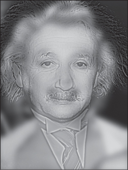
Figure 5.3: Close up, you see Einstein; from a distance, you see Marilyn Monroe. (Image courtesy of Aude Oliva, MIT.)
Applications. How much does all this matter for graphics? Since much of graphics is used to make people say that they are seeing some particular thing when they view their computer’s display, it’s quite important. On the other hand, our understanding of the visual system is still relatively sparse, so adapting our imagery to affect perception at the retinal level may be relatively easy, while trying to adjust it to affect the way in which whole objects are perceived may be more challenging and more prone to unexpected results. Furthermore, there’s an interaction between low-level vision (the parts of our visual system responsible for detecting things like rapid changes in brightness in a particular area, typically the early-vision parts) and high-level vision (the parts responsible for forming hypotheses like “I’m seeing a surface with a pattern on it”) that is still not well understood. Mumford, in an essay on pattern theory [Mum02], cites a remarkable analogous example from the auditory system: Psychologists recorded various sentences—“The heel is on the shoe,” “The wheel is on the car,” “The peel is on the orange”—and replaced the first phoneme of the second word in each sentence with noise, resulting in “The #eel is on the shoe,” for example, where the hash mark denotes noise. Subjects who listened to these sentences perceived not the noise-replaced sentences, but the originals, and indeed, did not notice a phoneme was missing. Thus, as Mumford notes, the actual auditory signal did not reach consciousness. On the other hand, the replacement phoneme could only be determined from the larger context of the sentence. Mumford conjectures that vision may, in many cases, work the same way: While low-level information is often extracted from what you see, in some cases the way in which it’s treated may be influenced by the results of higher-level understandings that you get from partially assembling the low-level information. For example, when you see someone leaning against a railing, you form the hypothesis that the railing continues behind the person, without ever consciously considering it. When you see something through the spinning blades of a fan, you assemble the parts you see at different times into a coherent whole, rather than assuming that the obscured parts at one instant are unrelated to the unobscured parts in the same portion of your visual field a moment later. Because of these interactions between high-level and low-level vision, we’ll concentrate primarily on the low-level aspects, which are better understood.
Do we really “see” things? It’s more accurate to say that our visual system contructs a model of the world from its input, forming this model with a combination of perceptual and cognitive processes that resolve apparent contradictions in the perceptual data (as in the experiment Mumford describes). This lets the brain eventually form an object hypthesis (“I see this thing!”), albeit with some backtracking if your cognitive abilities contradict what you think you saw (“That can’t be a flying elephant!”). Thus, the end result of vision is a construction created by the mind, and not objective reality.
5.3. The Eye
Despite our limited understanding of the visual system, there are physical characteristics of the eye that limit what it can possibly do, and these can help govern the design of graphics systems. For instance, there is a smallest detectable brightness difference, and a smallest angular resolution for the eye. A display whose pixels could show brightness differences smaller than those, or whose pixels subtended an angle only 1/10 as large as this smallest angular resolution, would be unnecessarily complex. We’ll regard the eye as stopping at the optic nerve, with the nerve and the visual cortex constituting the remainder of the visual system.
5.3.1. Gross Physiology of the Eye
At a large scale, the eye consists of a globe-shaped object, held in place by the skull, various muscles that are attached to it, and other soft tissue surrounding it (see Figure 5.4).
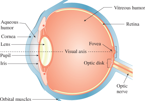
Figure 5.4: Light enters the eye through the pupil, then passes through the lens and vitreous humor, and arrives at the retina.
The control of the rotation of a pair of eyes is coordinated by our visual system so that the received pattern of light on the retinas of the eyes can be integrated to form a single coherent view of the world; the left-eye and right-eye views of a scene are generally different, and the disparity between these views helps us estimate the depth of objects in the world. (You can experiment with this easily: Mark a spot on the wall of a room, and place several objects more or less between you and this mark, at different distances. While staring at the mark, cover first one eye and then the other, and notice how the left–right positions of objects near you seem to move as you switch eyes.)
At a coarse level, the path from an object that’s either emitting light (a light bulb) or reflecting it (a book on your desk) to your retina—through the pupil and lens and vitreous humor (the gel-like liquid in the eyeball)—can be modeled by a simple lens, mounted between the light-producing object and an imaging plane (see Figure 5.5). Light from an object is emitted along many rays, which hit different points of a lens and are refracted (bent) as they pass into and out of the lens, with the result (if the lens is properly shaped) that the rays all converge again at some point on the other side. If this point happens to lie on the imaging plane, we say that the object is “in focus.” If the point of convergence is not on the imaging plane, then instead of producing a bright point of light, the rays generate a dim disk of light on the imaging plane. If the imaging plane is the sensor array for a digital camera, for instance, then the point B appears out of focus and blurry.
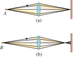
Figure 5.5: Light from point A is in focus when it arrives at the surface at right; point B is out of focus.
The convergence of all rays to a single point depends on the index of refraction (see Chapter 26)—a number that describes how much light bends as it passes from air to the lens and back to air—being independent of the wavelength of the light. For most materials, the index of refraction does vary slightly with wavelength; this can make objects of one color be in focus while those of another color are not, which accounts for the rainbow-colored fringe on the edges of objects when they’re viewed through a magnifying glass, for instance.
Because the eyes can slightly modify their lenses’ shape, the visual system can use focus/defocus to detect distance from the eye to an object, at least for nearby objects (defocus becomes less severe the farther away objects are). The amount of defocus-from-depth depends on the lens diameter. For very small diameters, there is a much larger depth range that’s almost in focus (this range is described in photography as depth of field); for large diameters, the depth of field tends to be small. For an idealized pinhole camera, in which light passes through an infinitesimal hole on its way to the image plane, depth of field is infinite; unfortunately, the light-gathering ability of such an idealized device is zero. The human eye also has an adjustable pupil. In low light, the pupil opens wide and gathers more light, but at the cost of reduced depth of field; in bright light, the pupil closes, enhancing depth of field. Contrary to common wisdom, this pupil adjustment is hardly significant in the matter of adapting to a wide range of brightness levels—the pupil’s area changes by a factor of, at most, ten, while the largest arriving radiance in ordinary experience is about ten orders of magnitude larger than the smallest, but the response is fast, making the pupil very effective at short-term adjustments. The longer-term adjustment is a chemical process in the receptors.
5.3.2. Receptors in the Eye
A large portion of the inner back surface of the eye, the retina, is covered with cells that respond to the light that arrives at them. These are primarily in two groups: rods and cones, which we discuss further in Chapter 28. Rods are responsible for detecting light in low-light situations (e.g., night vision), while cones detect light in higher-light situations. There are three kinds of cones, each responsive to light of different wavelengths; the combination of the three responses generates the sensation of color (discussed further in Chapter 28). There are far more rods than cones (a ratio of about 20:1), and the distribution of rods and cones is not uniform: At the fovea, a region opposite the pupil, the cone cell density is especially high. Deering [Dee05] gives detailed descriptions of these distributions, and a computational model for the eye’s response to light. There’s another special area of the retina, the optic disk, where the optic nerve attaches to the eye. In this region, there are no rods or cones at all. Despite this, you do not have the sense, as you look around, that there is a “blind spot” in your perception of the world; this is an instance of higher-level processing masking out (or filling in) the details of low-level information. The blind spot is very much present, but if you were to notice it all the time, it would distract you constantly.
The receptors in the eye detect light, provoking a response in the visual system; very roughly speaking, each doubling of the arriving light at a receptor generates the same increment of response. If light B appears half as bright to you as a geometrically identical light A, then the energy emitted by B is about 18% that of light A. A light C whose energy is 18% of that from B will appear half as bright as B, etc. This logarithmic response helps us handle the wide range of illumination we encounter in everyday life. We discuss the perception of brightness of light further in Chapter 28. The logarithmic response of the visual system also determines something about display technology: An effective display must be able to show a wide range of intensities, and this range of intensities should not be divided into even steps, but rather into even ratios of intensity. This notion drives the idea of gamma correction discussed in Chapter 28. Brightness is the name used to describe the perception of light; by contrast, what we’ve been informally calling “intensity” of light is more precisely measured in units of radiance, described in detail in Chapter 26. What we’ve been saying is that, all other things being equal, brightness is roughly proportional to the log of radiance.
In general, it’s useful to know that the eye adapts to its circumstances. When you’re in your bedroom at night, reading, your eyes are adapted to the level of light in the room, an adaptation that’s centered on the intensity4 of the page you’re looking at; when you turn off the light to go to sleep, everything in the room looks black, because the page’s intensity is now well below the range of intensities to which your eye has adapted. But a few minutes later you can begin to distinguish things in your room that are illuminated by just moonlight, as your eye begins to adapt to the new, lower, light level. If you turn the light on again to resume reading, the page will initially seem very bright to you, until your eye has readapted.
4. We’re using this term informally to describe the amount of light energy leaving the page and arriving at your eye.
The receptor cells in the eye do not act entirely independently. When the eye is generally adapted to ambient illumination, an extra bit of light arriving at one receptor will not only increase the sensation of brightness there, but also slightly reduce the sensitivity of the neighboring receptors, an effect known as lateral inhibition. The result of this (see Figure 5.6) is that the edge contrast between regions of light and dark is enhanced compared to the contrast between the centers of the regions: The dark side of the edge is perceived as being darker and the light side as being lighter. This is the origin of the Mach banding discussed in Section 1.7.
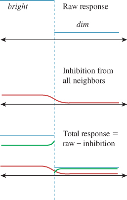
Figure 5.6: The raw response of receptors in the bright and dark regions (in blue, at top), the lateral inhibition amounts (in red, middle), and their difference—the actual response—shown in green at the bottom. Notice the enhanced contrast at the edge between light and dark, indicated by the dotted line.
This has an important consequence for computer graphics. In early graphics systems, polygons were often “flat shaded.” That is, relatively large areas of the screen were given constant colors. When a shape like a cylinder (approximated by an extruded polygon) was illuminated by light from one direction, adjacent facets were assigned differing constant shades depending on how directly they faced the light source. The eye, instead of blending together the slightly different adjacent shades, tended to enhance the differences at the edges, emphasizing the faceted structure.
Given this enhanced sensitivity to edges, it’s natural to ask how small an edge the eye can detect. We can make a drawing of alternating parallel black and white stripes and move it away from the eye until it appears gray. This turns out to happen at a distance where two adjacent stripes subtend about 1.6 minutes of arc (a minute is 1/60 of 1°).
The receptors in the eye adapt chemically to the overall brightness of what the eye is seeing. For many ordinary illumination levels, the eye can detect a ratio of intensities of about 100:1 within a small area. Figure 5.7 shows that this adaptation allows us to detect the brightness of arriving light only over a modest range for each level of adaptation. On the other hand, the eye can adapt very quickly to modest changes in illumination, so you can, for example, quickly search for a pencil in your dark backpack, even outdoors on a sunny day. Full adaptation to a major reduction in illumination, however, which involves chemical changes in the receptor cells, requires about a half-hour. After such adaptation, one can detect very low illumination levels; the ratio of the brightest distinguishable daytime levels to the dimmest distinguishable nighttime levels is more than 1,000,000:1. Many displays advertise contrast ratios of 10,000:1; since the eye can only discern ratios of about 100:1, why would such a range be important? Because the adaptation of the eye is partly local: As you stare from your unlit bedroom through a small window to the sunny outdoors, one part of your eye may be able to distinguish between things of different brightnesses in the room, while another distinguishes between things of different brightnesses outdoors. To generate this same percept, a display screen must be able to present comparable stimuli to the different regions of your eye. As an example of the extremes of perception, on a clear night you may be able to see a magnitude-3 star, while also seeing the moon clearly; the stellar magnitude for the moon is about – 12. 5. Since 5 stellar magnitudes represents a factor of 100 in intensity, this represents an intensity range of about 1 million. But if the moon is reasonably close (in your visual field) to that magnitude-3 star, you’ll almost certainly be unable to see the star.
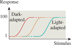
Figure 5.7: The dark-adapted eye’s response to light “saturates” at a fairly low stimulus level; the light-adapted eye cannot detect differences between various low-light-level stimuli.
Applications. The visual system’s ability to detect distance to an object through two different mechanisms—the eye can focus, or the two eyes together can use parallax, which we’ll discuss presently—means that it’s possible to have divergent distance detections when the eyes are fed different data. For instance, if a user wears a pair of glasses whose lenses are replaced by individual displays, we can fool the user into seeing “in 3D” by displaying different images on the two displays, making the user believe that the things seen are at various distances, creating a “stereo” effect. But to see these two distinct images at all, the user must focus on the displays, which are just a few inches from the user’s eyes (or can be made to seem more distant with the use of lenses). The two percepts of depth contradict each other, and this makes many “3D display” experiences unpleasant for some users.
The adaptation of the eye to surrounding light levels, and the limited dynamic range within an adapted eye, means that we need not contruct displays with enormous contrast ratios between pixels, although it may be useful to be able to adjust the mean intensity over a large range. On the other hand, it also means that when we’re displaying something very bright, like the sun shining through the leaves of a tree, we can eliminate most of the detail near the sun, since small variations in brightness of the leaves will be “masked” by the eye’s local adaptation to the brightness of the sun.
The concentration of receptors near the center of the visual field means that we can afford to make peripheral displays less precise. Our sensitivity to motion in our peripheral field, however, means that we cannot be too sloppy.
The limitations of edge detection tell us how many lightness levels we need to be able to display to generate imagery that’s apparently smooth.
5.4. Constancy and Its Influences
Somehow our visual systems go from received light to a perception of the world around us (“That’s my car over there next to the red truck!”). The process is remarkably robust, in the sense that substantial changes in the input result in almost no change in the resultant percept: You can identify your car as being next to the red truck in bright sunlight, at dusk, or in late evening; you can identify it whether you’re standing three feet away or 300 feet away (and when you’re 300 feet away, you don’t say, “Gosh, my car has shrunk!”); you can recognize it when you see it from the front or the right side or the left side or the back, without saying, “It’s changed shape!”
On the other hand, the stimuli that provoke these constant percepts are very different: The light entering the eye from the car at night is very different from the light entering the eye from the car at midday. It’s less intense, and probably has many more short-wavelength components (which humans tend to see as blue), at least if the streetlights use mercury-vapor lamps. Different cells are responding to the light (the rods are in the range of light at which they begin to discriminate illumination levels). So the visual cortex must do some interesting things to generate the same general percept. Of course, the percept is not entirely the same: You know you’re seeing the car at night rather than during the day, but you don’t believe, because of the different illumination, that the car’s color has changed. This is an instance of color constancy. Similarly, you don’t believe, when you look at it from a different location, that the car’s shape or size has changed; these are examples of shape constancy and size constancy.
Constancy is a wonderful thing (in terms of preventing perpetual confusion). On the other hand, it’s also responsible for making our visual systems rather bad at some things at which other visual systems (e.g., digital cameras) are good. As mentioned, we’re not very reliable at determining when two colors are the same, unless they’re adjacent. But a digital camera can do so quite reliably. One consequence of this is that, as we work in computer graphics, it’s important to know what “visual system” will be processing the images we produce: If it’s a human eye, then small color errors in patches that are far from one another may not matter; if, however, we’re using computer-graphics-produced images to test a computer-vision system whose input comes from digital cameras, then such errors may be significant.
It’s often helpful, in understanding a system, to know of instances where it fails (e.g., we use such instances in debugging). In the case of the visual system, “failure” may not be well defined, but we certainly have examples where our visual system does not do what we expect it to do. For instance, you can see how bad humans are at determining the absolute lightness of a region by noting your sensation of lightness when that region is surrounded by other regions of varying lightness, as in Figure 5.8.

Figure 5.8: All the center squares have the same lightness; the apparent lightness, however, is profoundly influenced by the surrounding squares.
This might seem like a failure of constancy—after all, the center squares in Figure 5.8 are “all the same.” But if we model the center square and its surrounding square as being painted on a surface and illuminated by lights of varying intensity, we get a very different set of images, as in Figure 5.9, in which the center square’s gray values are all different, but you have the perception that the center squares are all fairly comparably dark. This is an instance of lightness constancy under varying illumination. (An even more spectacular example of lightness constancy—and its nonrelation to incoming intensity—is shown in Figure 28.15.)

Figure 5.9: The ratio of the center square’s darkness to the surrounding square’s darkness is approximately the same in each example; you tend to see the center squares as exhibiting far less variation in lightness than those in the previous figure.
The materials available on this book’s website discuss further constancy effects.
Applications. The various constancy illusions show that surrounding brightness can affect our perception of the brightness of a surface or of a light. This leads to the use of different gamma values (discussed in Section 28.12) for studio monitors, theatre projection, and ordinary office or home displays, where the average brightness of the surroundings affects the appearance of displayed items. It also suggests that during rendering, if you want to visually compare two renderings, you should surround each with an identical neutral-gray “frame” to help avoid any context-based bias in your comparison.
The other consequence of constancy, at least for brightness, is that relative brightnesses matter more than absolute ones (which helps explain why edge detection is so important in early vision). This suggests that if we want to compare two images, it may be the ratio of corresponding pixels that matters more than the difference.
5.5. Continuation
When one object seems to disappear behind another, and then reappear on the other side (see Figure 5.10), your visual system tends to associate the two parts as belonging to a whole rather than as separate things; this is an instance of the idea from Gestalt psychology that the brain tends to perceive things as a whole, rather than just as individual parts.
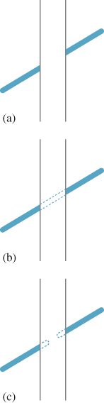
Figure 5.10: The diagonal line in (a) seems to pass behind the vertical strip. You strongly sense the two diagonal segments are part of a continuous whole, as shown in (b), rather than each terminating behind the vertical strip, as in (c).
![]() One proposed partial mechanism for this perception is the C1 random walk theory [?, Wil94] in which we suppose that at T-junctions (where an outline of one object appears to pass behind another object), the brain “continues” the line in the same general direction it was going when it disappeared, but with some random variation in direction. Some such continuations happen to terminate at the other T-junction, headed in the appropriate direction. If we consider all such connections between the two, some are more probable than others (depending on the probability model for variation in direction, and on the lengths of continuations). Each point in the obscured area occurs on some fraction of all such continuations (i.e., there’s a probability density p with the property that the probability that a random connection passes through the area A is the integral of p over A). The ridge lines of the distribution p turn out to constitute very plausible estimates of the “inferred” connection between the T-junctions, with the integral of p over the curve providing a measure of “likelihood” that the lines are connected at all. If the T-junctions are offset from each other (i.e., if the two segments are not part of a single line), the probability decreases; if the two segments are nonparallel, the probability decreases; only when the T-junctions are perfectly aligned is the probability of connection at its maximum. Is such a “diffusion of probability of connection” really taking place in the brain? That’s not known. But this notion that the ridge lines of p form the most likely connections cannot, as stated, tell the whole story, because there’s a peculiar effect in the matching of diagonal lines, which we now discuss.
One proposed partial mechanism for this perception is the C1 random walk theory [?, Wil94] in which we suppose that at T-junctions (where an outline of one object appears to pass behind another object), the brain “continues” the line in the same general direction it was going when it disappeared, but with some random variation in direction. Some such continuations happen to terminate at the other T-junction, headed in the appropriate direction. If we consider all such connections between the two, some are more probable than others (depending on the probability model for variation in direction, and on the lengths of continuations). Each point in the obscured area occurs on some fraction of all such continuations (i.e., there’s a probability density p with the property that the probability that a random connection passes through the area A is the integral of p over A). The ridge lines of the distribution p turn out to constitute very plausible estimates of the “inferred” connection between the T-junctions, with the integral of p over the curve providing a measure of “likelihood” that the lines are connected at all. If the T-junctions are offset from each other (i.e., if the two segments are not part of a single line), the probability decreases; if the two segments are nonparallel, the probability decreases; only when the T-junctions are perfectly aligned is the probability of connection at its maximum. Is such a “diffusion of probability of connection” really taking place in the brain? That’s not known. But this notion that the ridge lines of p form the most likely connections cannot, as stated, tell the whole story, because there’s a peculiar effect in the matching of diagonal lines, which we now discuss.
When you see a diagonal line pass behind a vertical strip, as in Figure 5.11, you tend to fail to correctly perceive when the diagonal parts are aligned (the explanation seems to involve misperception of acute angles). Nonetheless, the effect can be drastically reduced by placing ends on the vertical strip to make it a parallelogram (or to give other cues, like a texture that appears to have perspective foreshortening) so that the diagonal line appears to lie in a plane parallel to that of the strip (see Figure 5.12).
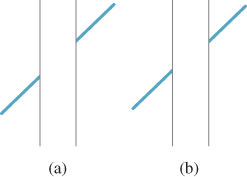
Figure 5.11: Which of (a) and (b) seems to be a single continuous straight line passing behind a strip, and which looks like the two segments are parallel but not part of the same line? Place a straightedge on the figure to determine the truth.
Applications. Such peculiarities of the visual system have an important impact when we examine nonphotorealistic or expressive rendering, in which we seek to create imagery whose goal is not faithfulness to reality, but rather the expression of the creator’s intent, which may be to draw the eye to a particular portion of the image through judicious choices of what to show. Consider, for example, an illustration in an automobile repair manual, where the area being discussed is drawn in detail, and surrounding regions are simplified to just a few lines to avoid confusion. When we simplify our imagery by eliminating detail, are we also losing important cues that the visual system uses to understand the presented scene? In some cases, it’s clear that we do lose important features; a failure to draw shadows can cause a viewer to misunderstand which objects are touching others, for instance. But even in an example like that of Figure 5.12, suppose that our abstraction removes the “texture” on the vertical strip in (b). The diagonal line then will appear mismatched, as in Figure 5.11(b).
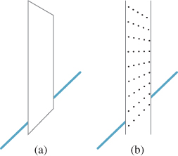
Figure 5.12: When we truncate the vertical lines so that the obscuring strip seems to be a plane parallel to one containing the line, the illusion from Figure 5.11 disappears; the same effect happens when the strip is given a texture that indicates this tilted orientation.
Continuation can also be used to infer meaning from a user’s sketch of a shape [KH06]: When one contour is obscured by another, we can use a model of continuation to infer where the user thinks it goes.
5.6. Shadows
Shadows provide remarkably powerful cues to our visual system, but these cues are not always exactly what we think they are. For instance, shadows help us estimate the depth (distance from the viewer) of objects that are not on the ground plane. Keren et al. [LKMK97] demonstrated this compellingly with an example like the one shown in Figure 5.13, in which the motion of a ball in a scene is very strongly disambiguated by means of shadow cues: With no shadow cues, it’s easy to convince yourself that the ball is either moving in a plane of constant distance from the eye, rising as it moves right, or moving at constant height from a point above the front-left corner of the tray to a point above the rear-right corner. When shadows are included, one choice or the other is forced on the perceptual system. It’s interesting to experiment with this example, because it turns out that the effect is almost equally strong when the shadow does not correspond to the shape of the object—a small square instead of a disklike shadow, for instance. Furthermore, the shadow cue can easily overwhelm other visual cues like the foreshortening due to perspective (in the front-to-back motion, the sphere will subtend a smaller visual angle when it’s far away than when it’s close, so a constant-size sphere should appear to be always moving in the constant-distance plane; nonetheless, with a shadow cue, you see it moving along the front-left/rear-right diagonal).
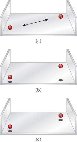
Figure 5.13: (a) A ball moves above a three-sided tray without shadows; its motion is not strongly determined. (b) and (c) Shadows force an interpretation of the motion as being in a vertical or horizontal plane.
From this, we might infer that shadows provide some kind of depth or position information, but are less informative about shape. But shadows where an object meets a surface actually do convey something about shape, as shown in Figure 5.14. Such shadows are also very strong cues in helping us determine object contact; a drawing without contact shadows can lead us to see objects as “floating above” a surface rather than resting on it.
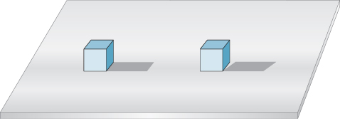
Figure 5.14: The appearance of a contact shadow tells us quite a lot about shapes and their relationship. You perceive the two identically drawn forms quite differently when shown their nonidentical shadows.
Applications. Although a shadow may be quite faint, and hence not terribly important in the L2 difference between two images, the perceptual difference between the images can be huge. Rendering shadows is essential; getting them exactly right is not.
5.7. Discussion and Further Reading
Perception is a huge subject, of which this brief overview only touches on a few items of particular interest in graphics. There are physiological, mental, and philosophical aspects to the subject; there are also large unexplored areas. Static perception has been given a great deal of attention and study, but the effects of motion (not only how humans perceive motion, but also what effects motion has on our perception) are far less understood. Hoffman [Hof00] and Rock [Roc95] both provide fine overviews, but brain science is advancing at such a rate that you’re probably best advised to look at recent journal articles rather than surveys in books to find out the best current thinking on the subject (which will surely change rapidly).
We’ve described constancy effects, but there are higher-level effects in vision as well. To some degree, what you see is highly dependent on what you’re looking for. Simons and Chabris [SC99] showed that many viewers told to count how often a basketball is passed by some players fail to notice a person in a gorilla suit walking through the midst of them. Thus, semantic expectations regulate perception.
We haven’t discussed stereo viewing in detail because it’s rather specialized. In stereo the two eyes are presented with different images which the visual system must resolve. Typically, differences between the images result in the powerful percept of depth variation across the field of view. Unfortunately, as we mentioned earlier, the images presented to the eyes by a stereo-graphics system are typically displayed on flat surfaces that are not very distant from the eye; the adaptation of the eyes’ lenses to focus on this display plane gives a depth signal that is at odds with the depths that the brain is inferring for the various things in the scene. This kind of contradictory evidence being presented to the visual system makes it quite difficult to know what a user will actually perceive. Furthermore, while stereo is a key cue in depth perception for most people, there are people who lack stereo vision but have sufficient depth perception to perform tasks as complex as flying airplanes, thanks to their ability to read other cues such as perspective foreshortening, intensity modulation with distance, and especially motion parallax.
We’ve already mentioned that rendering is really a process of integration, and that the integration is typically done with randomized sampling. In building a renderer, we get to choose samples for the integrator. In regions of the image where there are more samples, we tend to get better estimates of the integrals we’re computing. If that area is one which has little perceptual significance (e.g., if it’s part of a salt-and-pepper texture), then the extra sampling effort is wasted; if it’s perceptually salient (e.g., the edge of a dark shadow on a light surface), then the extra sampling is valuable. Greenberg et al. [Gre99] describe the inclusion of perceptual factors as a driving influence in rendering. One challenge is that to apply these ideas straightforwardly, one must model the perceptual process and then compare the ideal image (which may not be available) to the approximate one in the post-perception state. Ramasubramanian et al. [RPG99] developed an approach in which measurements made directly on images were closely related to perceptual measurements, allowing image formation to be more easily guided by estimated perceptual importance. Walter et al.[WPG02] applied a similar approach to reduce rendering effort substantially in textured regions where such a reduction would be imperceptible.
Perceptual difference measures are also used in image compression. JPEG image compression, for instance, attempts to approximate an input image in multiple ways, and then selects among these by choosing the one whose perceptual distance (in some measure) from the original is smallest. MPEG compression of moving image sequences operates similarly.
Differences that matter to the visual system when items are viewed in isolation may be ignored when they are viewed in a larger context, particularly one with lots of visual complexity. Recent work by Ramanarayanan et al. [RBF08] demonstrates that our perceptions of aggregates (a mixture of marbles and dice, or of two kinds of plants in a garden) have some surprising weaknesses. Related work [RFWB07] from the same group demonstrates that even though two pictures may be perceptually distinguishable, the distinction may not matter.
The field of perception is constantly advancing in new and surprising ways. As an example of the sort of stunning discovery that’s being made even now, consider motion-induced blindness, in which certain objects can be made to disappear, depending on the motion of others. If the arrangement of crosses shown in Figure 5.15 is slowly rotated, and you stare at the tiny dot in the center, the three fixed surrounding dots can disappear completely from view. The effect is weak when the grid is the same color as the dots, but quite strong when they are different; a blue grid and yellow dots work well. The effect is also present over a wide range of rotation speeds and dot sizes.
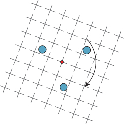
Figure 5.15: The grid of crosses is rotated about its center at a speed approaching ten seconds per complete rotation. The user is instructed to fixate on the center of rotation. After a moment, one or more of the other dots in the image seem to disappear.
As mentioned at the beginning of this chapter, visual perception is not the only mode of computer-to-human communication; sound and touch are also in frequent use. When both hearing and vision are used, and they contradict each other, which one dominates? Shams et al. [SKS02] report an interesting instance in which sound dominates; they “report a visual illusion which is induced by sound: when a single flash of light is accompanied by multiple auditory beeps, the single flash is perceived as multiple flashes.” What about touch and vision? Randy Pausch [personal communication] reported that when a display shows an apparently dented surface, and a haptic device is used to “touch it” and is guided by data that hides the dent, users report being able to feel the dent regardless. A careful study has been carried out by Burns et al. [BWR+05], supporting the idea of visual dominance. These are, however, isolated and controlled instances of multi-modal sensation. The degree to which these different modalities interact in more complex situations is still unmeasured.
5.8. Exercises
Exercise 5.1: Write a program that displays an image consisting of parallel stripes, sitting above another image that’s pure gray. Make the gray level adjustable (by slider, buttons, keystrokes, or any other means you like). Stand far enough away that the stripes are indistinguishable from one another, and adjust (or have a friend adjust) the gray level of the solid rectangle until you say it matches the apparent gray of the stripes. Now move toward the display screen until you can detect the stripes individually; measure your distance from the display, and compute the angle subtended at your eye by a pair of parallel stripes. You should make sure that you’re not fooling yourself by having the display (after the press/click of a button) show either vertical or horizontal stripes next to the gray rectangle (at random) and have the position of the stripes and the solid rectangle exchanged or not (at random).
Exercise 5.2: Implement the motion-induced-blindness experiment; include buttons to increase/decrease the speed of rotation and the size of the “disappearing” dots, and allow the user to choose the color of the grid and the dots. Experiment with which colors work best at making the dots disappear.
Exercise 5.3: Write a program that draws three black dots of radius 0.25 at x = 0, 1, 2 along the x-axis. Then display instead three black dots at positions t, t + 1, and t + 2 (using t = 0. 25 initially). Make the display toggle back and forth between the two sets of dots, once every quarter-second. Do you tend to see the dots as moving? What if you increase t to 0. 5? Include a slider that lets you adjust t from 0 to 3. Does the illusion of the dots moving ever weaken? When t = 1, you could interpret the motion as “the outer dot jumps back and forth from the far left (x = 0) to the far right (x = 3) while the middle two dots remain fixed.” Can you persuade yourself that this is what you’re seeing? The strong impression that the dots are moving as a group is remarkably hard to abandon, supporting the Gestalt theory.
Exercise 5.4: Write a program to imitate Figure 5.13, where a slider controls the position of the red ball along its trajectory. Include a set of radio buttons that lets you change the “shadow” of the ball from an ellipse to a disk to a square to a small airplane shape, and see how the change affects your perception of the red ball’s position. You can write the program using the 3D test bed or the 2D test bed—there’s no particular need to get the perspective projection exactly right, so merely mimicking the figure will suffice.