
In chapter 11, we covered binding. I believe binding to be one of the most important topics for Silverlight developers. One reason behind that is because the DataGrid and DataForm, as well as data annotations for display, all require binding in order to be useful.
Silverlight 2 included the DataGrid, and Silverlight 3 added the DataForm to the mix of data-centric controls. The DataGrid provides tabular Excel-like data view and editing. The DataForm is like a DataGrid rotated 90 degrees. Where the DataGrid is all about rows and columns for multiple visible entries, the DataForm is about fields and labels for a single visible entry.
Once we cover the DataGrid and DataForm, we'll see how to annotate properties with simple attributes to control display within the DataGrid and DataForm. We'll cover the related validation attributes in chapter 13.
When used together, the DataForm, DataGrid, and data annotations can form the heart of the user interface for any forms-over-data or business application and can save you a ton of implementation time. Of the three, the DataGrid is the most often used, so we'll start there.
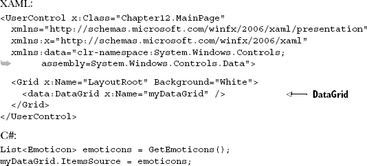
The DataGrid is a list-style control that belongs to the System.Windows.Controls namespace. This control provides capabilities for displaying a collection of entities in a tabular format. In addition, it enables users to add, edit, delete, select, and sort items from a binding data source. This data source is bound to a DataGrid through the ItemsSource property just like an ItemsControl, so the data binding features you've seen so far are applicable within the realm of the DataGrid. Before you can bind data to a DataGrid, you must first reference the correct assembly.
The DataGrid control is defined in its own assembly called System.Windows.Controls. Data.dll. This assembly can be found within the Silverlight SDK, which is available at www.silverlight.net. Note that the DataGrid control's assembly isn't part of the default Silverlight runtime installation; it's an extended control, so you must reference the System.Windows.Controls.Data assembly within your Silverlight application. The process of referencing an assembly like this was discussed in section 2.1.2. Part of this process involves choosing a prefix in order to use the control at design time.
Throughout this section, we'll use a prefix called data. Referencing the DataGrid control's assembly will package it up with your application, ensuring that your users can enjoy the power of the DataGrid.
Throughout this section, you'll experience the power of the DataGrid. You'll first see how easy it is to use the DataGrid to display data. From there, you'll learn how to leverage the built-in features to enable a user to edit the data within a DataGrid. Finally, you'll see how to empower your users to sort the data in a DataGrid.
The DataGrid was designed to make displaying data easy. The easiest way to display data from an ItemsSource is to use the AutoGenerateColumns property. This Boolean property defaults to true, causing the content within the ItemsSource to be rendered in tabular format. This ability is demonstrated in listing 12.1.
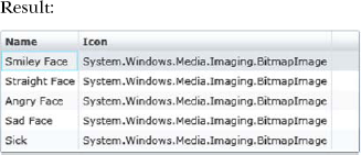
Voilà! This example relies on the System.Windows.Controls.Data assembly to deliver the DataGrid. This Control instance relies on its default behavior to automatically create columns based on the data that it's bound to. This approach is the fastest way to show the data bound to a DataGrid, and it also has some details that are worth examining.
Let's look at what makes a bound column tick. From there, you'll learn how to customize the columns, rows, and headers of a DataGrid.
When the AutoGenerateColumns property is set to true, the columns in a DataGrid are automatically ordered and rendered based on the type of the underlying data. Regardless of the type of data, the column type will always derive from the abstract base class DataGridBoundColumn, which serves as the base for the two types shown in table 12.1.
This table shows the kinds of columns that can be automatically generated within a DataGrid. If you want to manually create a column, you can also use these types. But, when you're manually defining your columns, you must set the Binding property, which represents the Binding associated with a column (the property name and the type name are, in fact, the same). Because of this, you can use the Binding syntax explained in chapter 11. This Binding declaration may be necessary because by default, when you use a DataGridBoundColumn, a TwoWay binding is used.
The DataGridBoundColumn is one of the main types of DataGrid columns. The other main type is a DataGridTemplateColumn, which uses a DataTemplate to determine how to render the binding source. Note that every type of column that can be added to a DataGrid derives from the DataGridColumn class, which is used to represent the column of a DataGrid. Objects of this type can be manually added to a DataGrid at design time and managed at runtime.
Table 12.1. The types of columns that can be automatically generated within a DataGrid
Type | Description |
|---|---|
| This type of column is used to display textual data. Most of the data from a binding source will be rendered in a |
| This column type generates a |
The DataGrid can use any column that derives from DataGridColumn. These columns can be added to a DataGrid at design time through the Columns property. This approach is demonstrated in listing 12.2.
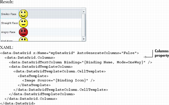
This example shows how to add columns manually to a DataGrid at design time. These columns are added to the Columns property. The items of this read-only collection will be displayed in the order they appear in XAML, but you can change this through the DisplayIndex property.
The DisplayIndex property represents the position of a DataGridColumn in a DataGrid. This zero-based integer can be set at design time to override the default ordering approach. Alternatively, the DisplayIndex property can be set at runtime. This property makes it possible to create a truly dynamic DataGrid, but the dynamic features don't stop there. They also continue at the row level.
A row within a DataGrid will most likely represent a summarized view of an item. In these situations, it's not unusual to redirect the user to another page to get the details associated with the item, but the DataGrid provides the ability to display these details within the row itself. This approach can reduce the strain of waiting for another page to load for the user. To make this happen, you define the RowDetailsTemplate.
The RowDetailsTemplate is a DataTemplate that can be used to show the finer points of a specific row. This information may be shown if the RowDetailsVisibilityMode property is set accordingly. You'll learn more about that in a moment. For now, just assume that a row will show its details when a user selects it. When this occurs, the DataGrid will reveal the details using a smooth sliding animation. The details can take up as much or as little space as needed. To demonstrate how this works, imagine adding a string property called Keys to the Emoticon class defined earlier in this chapter. This property represents the keyboard shortcut to use for an emoticon. The DataTemplate for revealing this information is shown in listing 12.3.
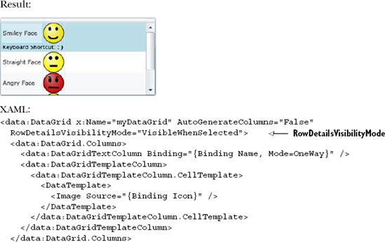
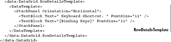
This shows how to use the RowDetailsTemplate property. This property uses a DataTemplate to display additional details about a row in a way dependent upon the value of the RowDetailsVisibilityMode property.
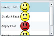
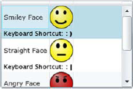
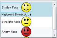
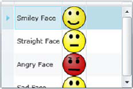
The RowDetailsVisibilityMode property determines when the details associated with a row are shown. By default, this property is set to Collapsed, but you can change this value to any option available within the DataGridRowDetailsVisibilityMode enumeration. This enumeration provides three options. All are shown in relation to the DataGrid with the emoticons (table 12.2).
This table shows the options available within the DataGridRowDetailsVisibilityMode enumeration. These options, coupled with the RowDetailsTemplate property, give you the ability to customize the experience with item-level details. The DataGrid extends the same type of power to the column headers.
Table 12.2. The options available within the DataGridRowDetailsVisibilityMode enumeration
Option | Example | Description |
|---|---|---|
|
| When this option is used, the content in the |
|
| This option forces the content in the |
|
| This option will show the content in the |
The DataGrid gives you the ability to customize every part of it, including the headers. The headers of a DataGrid are split across two separate categories: row and column. By default, your DataGrid will show both, but you can control this by changing the HeadersVisibility property. This property uses one of the options available in the DataGridHeadersVisibility enumeration, which are shown in table 12.3.
Table 12.3. The options available through the DataGridHeadersVisibility enumeration
Option | Example | Description |
|---|---|---|
|
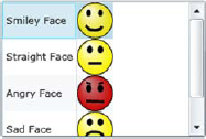
| This option displays both row and column headers. This is the default value. |
|
| This option displays only the column headers. |
|
| This option displays neither the row nor column headers. |
|
| This option displays only the row header. |

The DataGridHeadersVisibility enumeration is used to set whether a header type is visible. You can also customize what the header looks like and how it behaves through the DataGridColumn class's Header property. This property simply represents the column header content, so it uses the same content-related information you've already learned about.
As you've seen, the DataGrid empowers you to fully customize how your data is presented. These customizations can be applied at the header, row, and column levels. Note that you don't have to make any of these adjustments. If you're looking for a quick way to show your data in a tabular format, you can rely on the fact that the AutoGenerateColumns property defaults to true. Either way, once your data is loaded, you can enable your users to edit the data directly within the grid.
In addition to presenting data, the DataGrid has the ability to edit data. Users will be able to edit the contents of a DataGrid as long as the IsReadOnly property is set to false. By default it is, so your users have the flexibility to interact with their data in a familiar interface. As they do so, you can watch for the beginning of the editing process through two events. These events are triggered by the DataGrid and are called BeginningEdit and PreparingCellForEdit.
The BeginningEdit event gives you the opportunity to make last-minute adjustments just before users do their thing. In some situations, you may want to prevent a user from editing a cell due to previous inputs. For these occasions, the BeginningCellEdit event exposes a bool Cancel property within its DataGridBeginningEditEventArgs parameter. By setting this property to true, the event will stop running. If the event does complete in its entirety, the PreparingCellForEdit event will also be fired.
The PreparingCellForEdit is fired when the content of a DataGridTemplateColumn enters the editing mode. This event exists to give you the opportunity to override any changes that may have been made in the BeginningEdit event. Once this event and/or the BeginningEdit event have completed without cancellation, users will be given the reins. After they're done editing the data in the DataGrid, they may decide they want to re-sort the data.
The DataGrid has built-in support for sorting collections that implement the IList interface. This interface is a part of the System.Collections namespace and is heavily used throughout the Silverlight .NET framework so you can readily sort almost any collection of objects. If you don't like the way that the DataGrid sorts your collection, you're free to customize the sorting by binding to a collection that implements the ICollectionView interface. Either way, the DataGrid can be used to sort these collections via the SortMemberPath property.
The SortMemberPath property is a string available on the DataGridColumn class, so this property can be used by any of the options shown in table 12.3. Regardless of which option you use, the user will be empowered to sort the column in either ascending or descending order, as demonstrated in listing 12.4.
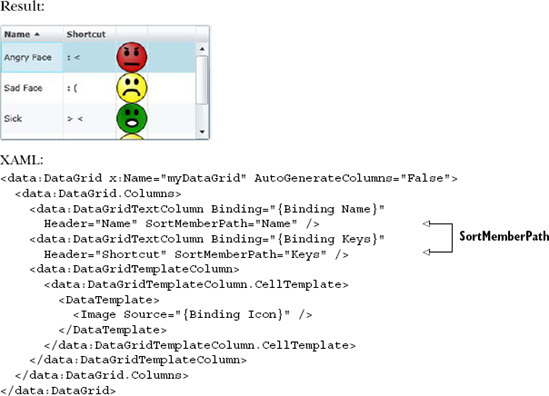
This snippet shows two DataGridColumn instances enabling the user to sort the underlying ItemsSource. The first DataGridColumn enables the user to sort the Emoticon objects by their Name property. The other DataGridColumn lets the user sort by the Keys property. If the user were to select a column header, it would first be sorted in ascending order. Then, if the column header were to be selected again, it would be sorted in descending order. The SortMemberPath property is what makes this feature of the DataGrid possible.
As you've just seen, the DataGrid has an incredibly rich development model. This model is important because it can help you assist your users in their data entry tasks, which may include editing data or simply viewing it. Either way, the DataGrid provides the ability to efficiently deliver items from a data source in a tabular format.
The DataGrid is great for tabular data, but what do you do when you want similar functionality in a form-based layout model? New in Silverlight 3 and originally considered part of WCF RIA Services (covered in chapter 17), the DataForm is the DataGrid's form-based counterpart.
Silverlight 3 introduced a control that does for forms what the DataGrid does for lists: the DataForm. The DataForm can be thought of as a single-row DataGrid turned on its side. It shares similar capabilities in that it can be read-only or editable and can infer column names and edit controls based on the types bound to it. Like the DataGrid, it also provides full customization of the representation of each of the bound fields.
Like the DataGrid, the DataForm can work with multiple rows of data. The presentation differs in that you'll see only one row at a time, as is typical in a details form. In fact, the DataGrid and DataForm are sometimes used together to show a master-detail relationship where the DataGrid contains all the records and the DataForm is used to show an editable form for the DataGrid row.
The DataForm was originally developed for Silverlight by the same team that brought us WCF RIA Services. In order to support continued iteration on the control, it was moved from the SDK, where the now-mature DataGrid resides, and placed in the Silverlight Toolkit in the System.Windows.Controls.Data.DataForm.Toolkit assembly. The Silverlight Toolkit can be thought of as an agile extension of the Silverlight SDK, with the bonus that you have access to the source code for the controls and tests it contains.
Though not all applications will use the DataForm, it's much richer and more customizable than it initially appears. Virtually any forms-over-data application can use this control to show a UI that can be as simple as a list of fields or as complex as a customized layout with specific field styles, sizes, and positioning. How it looks is up to you.
In this section, we'll take a tour through the capabilities of the DataForm, starting with a simple binding to a single object and then to a collection of objects. Next, we'll work with the command buttons for canceling updates and submitting data. Once we have the functional mechanics down, we'll customize the display of fields using properties and then using richer data templates for the edit, add, and display modes. The section will wrap up with a discussion of IEditableObject and how that interface can make working with the DataForm even easier.
The easiest thing to do with the DataForm is to bind it to an object and watch it generate all the fields you need. We'll step away from the Emoticon class for the remaining examples here to show the breadth of controls the DataForm understands. Let's create a new simple Person class, as shown in listing 12.5. (The Required attribute, used in this class, will be covered in chapter 13, which focuses on validation.)
Example 12.5. The Person class
public enum MaritalStatus
{
    Unknown,
    Married,
    Single,
    Divorced
}

public class Person
{
    [Required]
public string LastName { get; set; }
[Required]
public string FirstName { get; set; }
public bool IsRegistered { get; set; }
public MaritalStatus MaritalStatus { get; set; }
public DateTime DateOfBirth { get; set; }
[Required]
public string EmailAddress { get; set; }
[Required]
public int NumberOfChildren { get; set; }
}We'll then bind to it in XAML using a static resource, much as we have in other examples. Instead of individual controls, we'll use the entire object as our data source for the new DataForm control, as shown in listing 12.6.
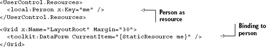
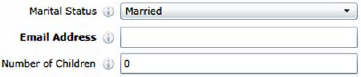
The property that's used to generate the form is the CurrentItem property, in this sample case bound to a single object sitting in the Resources section of this control. The resulting DataForm, as seen in figure 12.1, is impressive in the breadth of controls it has auto-generated for you. Not only did we not have to write any code specific to the DataForm, but we also didn't have to place any edit controls in the markup.
Note that the DataForm displayed a CheckBox for the bool property, a ComboBox for the enum (populated with all the possible values defined in the enumeration, of course), and a DatePicker for the DateTime property. Not bad for a default form, and certainly workable for a simple utility application.
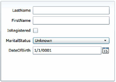
Figure 12.1. DataForm showing generated edit controls bound to a single object without a backing collection. Note that there's no toolbar or set of navigation buttons. Not all fields are shown, so your form will look slightly different.
So far we've been binding one discrete object to the DataForm. To harness the true power of the DataForm, you'll want to bind it to a list of objects much as you would a DataGrid.
If you want to support the ability to add new records, you'll need to provide a place to put them. For this example, we'll create a simple class that holds some dummy data. Of course, you could wire this up to a service to load a collection of Person objects, should you desire.
Listing 12.7 shows a class named PeopleRepository that will hold our Person objects. Note that this doesn't follow the formal Repository pattern; it's closer to a View-Model (covered in chapter 16).
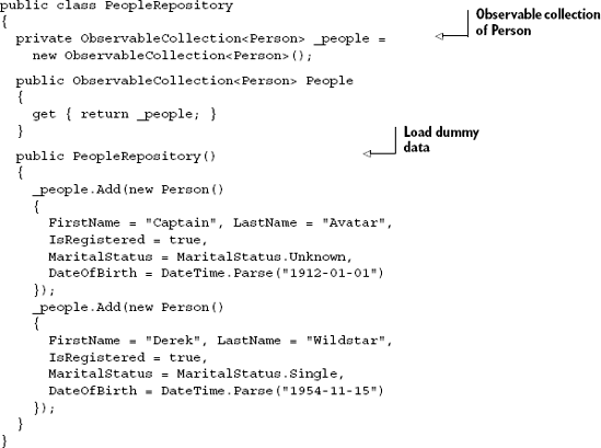
Once you have a suitable repository for the data (whether it's a view-model or something else), one of the easiest things to do is to supply an ObservableCollection<T> to the ItemsSource property, as shown in listing 12.8.
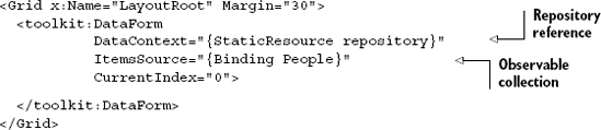
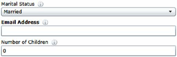
In the example, I use the PeopleRepository class from listing 12.7 with a collection of Person objects exposed through a property named People. In XAML, I create a resource to hold a reference to that repository and set the DataContext of the DataForm to that StaticResource. (You could, of course, also create the repository and set the DataContext from code.) I then bound the ItemsSource to the collection of Person objects. The resulting DataForm looks like figure 12.2.
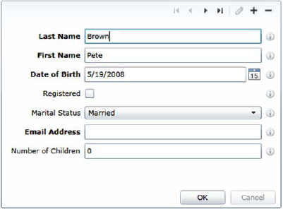
Figure 12.2. A DataForm bound to a collection of objects. Note the presence of the toolbar including the add/remove and navigation buttons, sometimes called the VCR control. (Display annotations, covered in 12.3.1, were used in this example.)
Note the new toolbar at the top of the DataForm. This provides navigation as well as Add (the plus sign) and Delete (the minus sign) capabilities. For each of the operations (Add, Delete, Validate, and so on) appropriate events are raised with the capability to cancel operations based on criteria you set in your code.
The toolbar can be customized both by templating and via the CommandButtonsVisibility property, whose possible values are shown in table 12.4.
Table 12.4. DataForm CommandButtonsVisibility values
Template property | Description |
|---|---|
| Show all buttons. |
| Show the add new item button. |
| Show the cancel edit button. If the underlying item implements |
| Show the commit edit button. If the underlying item implements |
| Show the delete button |
| Show the edit button. This button is typically not necessary if |
| Show the VCR control navigation buttons. |
| Don't show any command buttons. |
Figure 12.3 shows what the toolbar looks like with all of the command buttons visible. The OK and Cancel buttons at the bottom are the commit and cancel buttons. The pencil in the upper right (currently disabled) is the edit button. The other buttons are as described earlier.

Figure 12.3. The DataForm with all command buttons displayed. The OK and Cancel buttons are the commit and cancel buttons, respectively.
To alter the appearance of the OK and Cancel buttons without retemplating the DataForm, you can use CommitButtonContent and CancelButtonContent to set the contents of the buttons and CommitButtonStyle and CancelButtonStyle to restyle the buttons.
As with just about everything else in Silverlight, you can completely style the way the DataForm looks. You may want to change not only the style but also the field label display and the data type controls.
The DataForm provides multiple levels of UI customization, ranging from how to display field labels and descriptions all the way to providing your own complete DataTemplate for each of the various modes of the control.
In addition to the ability to change the text of the field labels, the DataForm provides the ability to change the position of the labels relative to the edit control. This capability is exposed through the LabelPosition property, the values of which are shown in table 12.5.
Table 12.5. Possible values for LabelPosition and the resulting display
Value | Result |
|---|---|
|
|
|
|
| When there is a parent |
The field label provides the primary way you should indicate the expected contents of a field. Should the user require additional information, it may be provided via the field description.
Field description elements are the small icons and related tooltips that typically appear to the right of any control bound to a property that has an associated display description. Later in this chapter, we'll discuss how to set the description text for individual fields on the form using the DisplayAttribute.
The DataForm provides the property DescriptionViewerPosition, which enables you to set the relative location of the description viewer icon. The possible values are described in table 12.6.
Table 12.6. Possible values for DescriptionViewerPosition and the resulting display
Value | Result |
|---|---|
|
|
|
|
|
|
| When there is a parent |
With the label and description covered, we can turn our attention to the field controls and edit them using the three available template properties.
The no-code/no-markup out-of-the-box experience is good, but those types of solutions only get us so far before they break down. The DataForm gets us further than most controls but, if you couldn't completely customize the DataForm, we all know it would be a nonstarter for production-ready real-world applications. Luckily, the DataForm supports customization of the associated data templates for the three values of the Mode property: AddNew, Edit, and ReadOnly.
In chapter 11, we covered how to use data templates. The DataForm control provides three places where we can insert our own data templates: the EditTemplate, NewItemTemplate, and ReadOnlyTemplate, all described in table 12.7.
Table 12.7. DataForm templates corresponding to the DataForm mode
Template property | Description |
|---|---|
| Corresponds to the |
| Corresponds to the |
| Corresponds to the |
The mechanics of defining the data templates for the three different modes are the same, so we'll concentrate on just the EditTemplate in the following examples.
Most of us will create our data forms ourselves, with our own aesthetics accounted for. Supplying your own data templates enable you to do a few primary things:
You have complete control over the layout of the form and can, therefore, make it look as the designer intended.
You can customize the individual field edit control types.
You can change the binding characteristics to include your own value converters.
What you give up, of course, is the magic. Unlike the case when you started manually adding fields to the DataGrid, the DataForm provides a nice assortment of capabilities when adding fields. You'll still need to add a field in markup for each field you want on the form but, in reality, this is no more work than we would've had to do if we created the forms without the help of the DataGrid, with some significant savings in application plumbing code.
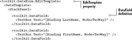
In a departure from its DataGrid cousin, the DataForm takes a more flexible approach to specifying the individual fields. Rather than have some built-in field types you must choose from or use a template for the remaining, you simply need to wrap edit controls within a DataField content control, as shown in listing 12.9.
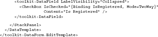
The resulting DataForm edit controls look like figure 12.4. Note that I hard-coded the CheckBox content property to IsRegistered and hid the associated DataField label so that I could demonstrate how to use the built-in CheckBox content property.
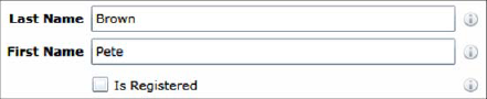
The DataField content control has a number of properties that mirror those on the DataForm itself. These are used for controlling where or if the description displays, where to put the field label, and so on. Those may all be set on a field-by-field basis in order to override the DataForm-level settings.
Finally, if you don't want the additional support provided by the DataField control, you can simply omit it and add the TextBlocks and TextBoxes (and other controls) directly to the template and bind them to the appropriate fields, without wrapping in DataField controls.
That's how you control the editing experience at a field and form level. Now let's look at how to control the overall editing and commit experience from a workflow standpoint.
The DataForm and similar controls provide several other settings and hooks that may be used to customize the overall editing workflow. These range from altering the object state based on whether it's about to go into the edit mode or not, how to commit changes, and finally how to manually check if the form includes only valid data.
System.ComponentModel.IEditableObject is an interface that allows controls such as the DataForm to make method calls into an object when it's about to be edited. Specifically, the interface defines the three methods listed in table 12.8.
Those three functions allow you to control exactly what happens to the object's data when it's put in the edit mode, the edit mode is cancelled, and the edits are committed. Though the sky's the limit with what you might do in these functions, common approaches include versioning, single or multiple-level undo, storing a history of changes, and lazy-loading data required for the edit process.
Table 12.8. IEditableObject interface
Template property | Description |
|---|---|
| Called when the object is put into the edit mode This is where you may want to cache undo information. If the |
| Called when the object was previously in the edit mode but now is to be put back into the read-only mode, reverting any changes On the |
| Called when the edit is complete and the changes should be committed If the |
The Silverlight DataForm control respects these methods and calls them at the appropriate times if your class implements the IEditableObject interface. Another place where the DataForm allows customization in the object workflow is in checking the item state.
The DataForm also provides a way to check the object's changed state, often called its dirty state, from within the DataForm itself. This doesn't require any dirty tracking infrastructure in place within the entity being edited; the DataForm takes care of all of that. To check whether the current item has been changed, simply refer to the IsItemChanged property as follows:
if (dataForm.IsItemChanged) {...}If the item has changed, you'll probably be interested in knowing if it's valid. Luckily, the DataForm provides a property for that as well: the IsItemValid property. This property returns true if the currently edited item, the item visible on the DataForm, has met all associated validation rules (covered in chapter 13). The syntax for the read-only IsItemValid property is as shown here:
if (dataForm.IsItemValid) {...}The DataForm by itself is a nice way to handle data entry in your applications. Without sacrificing the capabilities it offers, you have a great deal of control over how the content is rendered and how navigation is handled. The DataForm will help do for forms what the DataGrid did for tabular data.
The DataGrid and DataForm are two powerful controls for displaying and editing data. If you're writing a line-of-business application or something that's otherwise very data heavy, I strongly recommend you consider using these controls. Both provide commonly understood UI metaphors in an easy-to-use package. You can do pretty much anything you'd need to do with them more efficiently than writing analogous controls from scratch, especially when you consider the annotations we'll cover in the next section.
Now that we've seen how to edit data in the DataGrid and DataForm, we'll want to impose some parameters around how the data is displayed. We can do this in code, but it's typically more efficient to use data annotations.
The DataForm and DataGrid both offer the ability to set the properties of columns and labels, including things such as the display caption and tooltips. But, if you share the data between many instances of the controls, instances which may vary in their display properties in other ways, it can be both tedious and a maintenance burden to have to repeat this configuration in multiple places.
Autogeneration of columns and labels often leaves us with even uglier results. Sadly, many internal applications go into production with programmer-friendly but user-unfriendly display properties because it was too much effort to keep the UI updated and in sync with the data model.
The System.ComponentModel.DataAnnotations assembly and namespace found in the Silverlight SDK provide a number of attributes designed to make data validation and display hinting easier for controls such as the DataForm, DataGrid, and some third-party controls. The approach taken by these attributes is to mark up the properties in your entities using attributes in code rather than require code within the properties or external to your entities.
The two main attributes that we'll cover here are Display and Editable. In chapter 13, we'll take a look at the validation attributes and how they can further enhance the DataGrid and DataForm.
Both the DataGrid and the DataForm provide the capability to automatically generate display and edit controls, and associated labels or column headers, at runtime. Though the controls themselves provide a number of ways to customize the field information, there are times when you'd be better served by a centralized definition of that metadata.
One way to centralize that metadata is to annotate the properties on the entities themselves. The assembly System.ComponentModel.DataAnnotations provides a number of attributes designed specifically for this purpose (see listing 12.10).
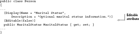
Example 12.10. The Person class with Display attributes attached
public class Person
{
...
  [Display(Name = "Registered",
    Description = "Check if this person has registered with us.")]
  public bool IsRegistered { get; set; }
[Display(Name = "Marital Status",
Description = "Optional marital status information.")]
public MaritalStatus MaritalStatus { get; set; }
...
}The result of including the Display attribute with the name and description can be seen in figure 12.5. Note that the MaritalStatus field has its correctly formatted display name shown in the label, and the Registered field shows the information icon with the associated tooltip containing the description property.

Figure 12.5. Portion of a DataForm showing the tooltips with the Description property of the Display attribute and the field captions pulled from the Name property of the same attribute.
The DisplayAttribute enables us to control a number of different aspects of the onscreen representation of the control, above and beyond just the field label and the tooltip. It can control whether the field is automatically generated as a column in the DataGrid or field in the DataForm. It can also control the order the fields are displayed in or information on the string to use when localizing. Table 12.9 has the complete list of the different properties available.
Table 12.9. DisplayAttribute properties and their uses
Property | Description |
|---|---|
| Set this value to false if you don't want controls like the |
| Set to true if you want the filtering UI automatically displayed for this field. It is currently unused by the |
| A resource name or regular text that will be displayed by the rendering control. In the case of the |
| A resource name or regular text to display as the heading for a group of related fields. Currently unused by the |
| A resource name or regular text to display as the name of this field. This is typically used in field labels. |
| Relative order for this field in display. By default, fields are displayed in the order they're defined in the class. This property allows you to override that behavior. |
| Specifies a prompt, such as a watermark, to use when displaying this field. Currently unused by the |
If you intend to use localized resources, specify the type container for those resources here. | |
| A resource name or regular text to display as the name of this field. This is typically used in column headers. |
In several instances in table 12.9, I wrote that a property is "typically used as" something or other. The DisplayAttribute simply contains data; it doesn't provide behavior or any enforcement of proper use. It's up to the consuming control—typically a DataGrid, DataForm or a third-party control—to decide how that data will be used.
In addition to the DisplayAttribute and its properties, one final important attribute-based setting you have as a developer is the ability to mark individual properties as editable or read only.
On occasion, you may want to designate certain properties as read only from a UI point of view but still allow them to be manipulated via code. One way to handle that is to provide an accessor (property get) with no corresponding property set and then provide an explicit mutator method. Unfortunately, that makes the programming interface more cumbersome.
Another approach is to provide a normal property getter and setter but mark the property as read only at the UI level. Like the Display attribute discussed in the previous section, you could certainly do this on a form-by-form basis. But you may want to instead centralize this information on the entity itself, as shown in listing 12.11.
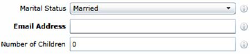
In this example, we've marked the Marital Status field as read only by applying an EditableAttribute with the editable flag set to false. The result will be an onscreen field that's disabled, as shown in figure 12.6.
Figure 12.6 shows the Marital Status field disabled. Note also that its information icon isn't displayed, even though we've included a display description. The display of the field control itself will depend upon the disabled state for the control in use. This is something that may be easily changed by editing the control template as shown in chapter 23.
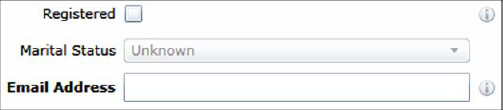
Figure 12.6. The Marital Status field has been disabled because its underlying property is marked as read only.
There is a number of other attributes in the DataAnnotations namespace, including some specifically geared toward object-relational mapping (ORM). Take a look around in there and you may find other attributes that can help with specific challenges you're facing in your applications.
Annotations are a powerful way to provide metadata for your entities. When combined with annotation-aware controls like the DataForm and DataGrid, you can provide UI information such as field labels and help text, and control whether fields are editable on forms and in grids. WCF RIA Services, covered in chapter 17, provides other options for surfacing this metadata.
For business and forms-over-data applications, the DataGrid and DataForm often form the heart of the UI. Even nontraditional applications sometimes use heavily styled DataGrids due to their rich programming model. Though the controls are complex, they're equally powerful and worth the time it takes to master them.
The DataGrid is great for tabular data, whether it's flat grid-style or contains images or richer content. There are lots of options for the types of content it contains as well as how you style both the content and the columns and rows that contain it. When you need to display and edit data in a tabular form, look first to the DataGrid.
The DataForm is the 90-degrees-off equivalent of the DataGrid, with columns shown as fields rather than columns. Like the DataGrid, it can work on multiple rows of data but, unlike the DataGrid, it shows only one at a time. Though certainly useful on its own, the DataForm is often combined with the DataGrid for master-detail layouts.
The DataGrid and DataForm both understand the display annotations such as the Display and Editable attributes. These allow you to mark up your classes or buddy partial classes to control the rendering of the controls in the grid and the form.
Now that we've covered binding (chapter 11) and the DataGrid and DataForm, we'll move on to validation. When you combine the grid, form, binding, and validation, you'll be well on your way to having a set of tools that cover the majority of the data manipulation needs of a business application UI.