
So now we've built out all of our views in our storyboard, connected them with segues, and set constraints using Auto Layout, and everything is perfect! Or… is it? If you've tried to rotate your phone into landscape, you may have noticed that everything is decidedly not perfect. Our constraints don't hold up particularly well when the screen becomes so wide and short.
But what should we do? It would be nearly impossible to come up with a set of constraints that are so robust that they work in all sizes and orientations that a device can come in. Luckily, there is one last feature that solves this very problem: size classes.
Size classes are a way to group constraints into categories that are general enough that you don't have to design for each individual device, but specific enough to change rules depending on the heights and widths of a device. The biggest use case for size classes are for when you switch between landscape and portrait modes, or when you use multitasking views on the iPad in iOS 10.
New in Xcode 8 is the ability to work directly with device sizes. In earlier versions of Xcode you would have to work with general size class shapes like squares and rectangles, which forced you to always think about the general shape of a size class, and not a specific layout for a given device. Now we have a much better visualization in interface builder, and a great tool for working with size classes–the best of both worlds. Let's see how it works:

Figure 4.21: The device selection bar at the bottom of the interface builder editor window
First, click on the View as: {Device Name} button on the bottom of the window. This should open up a tray full of devices, as shown in Figure 4.21. Clicking on all of the devices on the left half of the tray will change the physical size of the interface builder view controllers to match the size of those devices. Likewise, you can use the orientation buttons to switch between the different orientations for all devices.
While this is a fantastic visualization tool, the most important piece of information for us right now is the text in parenthesis next to the device name (in Figure 4.21 it reads (wC hR) where C stands for Compact and R stands for Regular). This is letting us know that the current device at the specified orientation has a certain width and height size class. Both the horizontal and vertical size classes can have a value of Compact and Regular. So using the example from Figure 4.21 the iPhone SE has a width size class of Compact and a height size class of Regular.
Once you know the size class of the device and orientation you are targeting, we're ready to put them to work.
When you click on the Size Class Selection button, you'll be greeted with a grid that lets you visually select the size class that you want to work with (see Figure 4.22), along with a description of the types of devices it covers. Since we want to fix our constraints for landscape mode, we want to find the right size class that covers iPhones in landscape mode. After some quick searching, it looks like we want to choose the Any Width, Compact Height size class.
Now that we know how to find our size classes, it's time to edit our constraints. Let's work on the biggest issue: the Custom Time View Controller. Figure 4.22 shows what it looks like right now on the iPhone 6s in landscape mode:
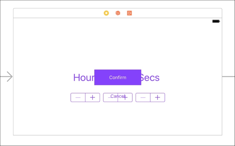
Figure 4.22: The Custom Time View Controller in landscape before using size classes
Everything is overlapping! The issue here is that in portrait mode we have more vertical space to work with than we do in landscape. If you look at the size classes for the two different orientations, you'll see that we go from a Regular height to a Compact height. To fix this issue, we're going to want to implement some special constraints for the hC size class.
To begin, make sure you have selected the landscape iPhone 6s device (technically, any configuration with a hC size class will work). Next, click on the button on the far right of the device bar that says "Vary for Traits" as shown in the figure 4.21. It will ask you which traits you would like to make variations for, and in this case we want to check off variations for the height class. Once we check off the height checkbox, the device bar will turn blue, letting you know that you are now editing constraints for specific size classes:
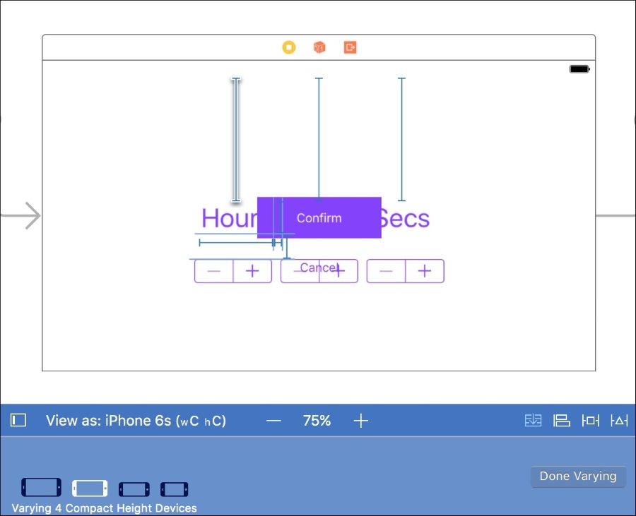
Figure 4.23: Beginning to edit our Custom Time View Controller for the hC size class
In the device bar in Figure 4.23 we can see that four devices are visible, namely all four iPhone sizes in landscape. This is letting us know which devices are being affected by the varying traits.
To modify a constraint for the current size class, hover over the little blue strut for a second until it pops out, and then double click on it. Let's start with the constraint that pins the Hour label to the top of the screen. First click on the Hour label, then hover and double click on the top pin constraint and you should see something similar to Figure 4.24.
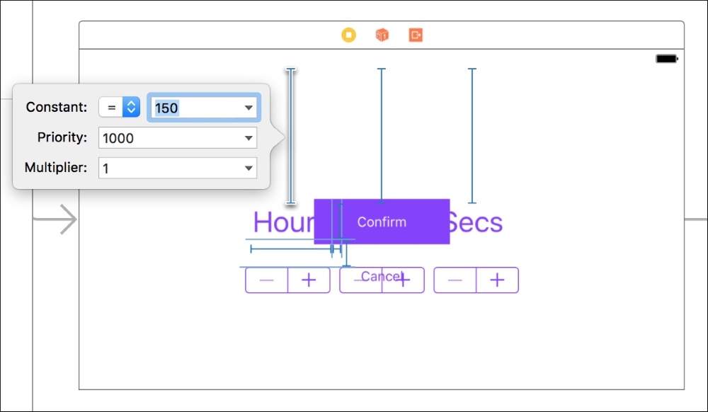
Figure 4.24: Editing a constraint
We'll change the constraint constant from 150 to 30; this will make it hug the top of the screen much tighter. Next we'll do the same for the top pin constraints for the other two labels. After those are finished, we'll do the same for the bottom pin label on the Cancel button, also setting the Constant to 30.
With those changes, we have fixed our landscape layout, and we can click the Done Varying button in the device bar to lock in our modifications.
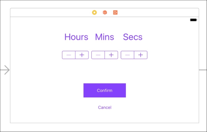
Figure 4.25: Our finished landscape view for the Custom Time View Controller
Now, when switch between portrait and landscape mode in the device bar, you should see how the layouts are correct in both modes (see Figure 4.25 for the final landscape layout). Everything looks much better now! To get another perspective on what we just did, select the top pin constraint on the Hours label again, and then look at the inspector sidebar.
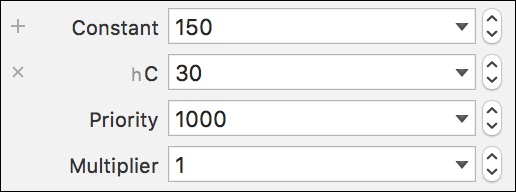
Figure 4.26: The added constant value for the Compact height size class
Looking at Figure 4.26, we can see that underneath the default constant value there is another constant defined with an hC next to it. This means that when the size class is hC, the new value will override the default. If you wanted to, you could manually add new constants for different size classes using the plus button next to the constant field. In fact, you can set override values for any attributes in the inspector that has a plus sign next to it. This means you can change things like font size and background color based on size classes too.
For a final challenge to test your new skills, go ahead and try to fix the Timer View Controller without looking at the instructions for the Custom Time View Controller we set up. For an even bigger challenge, see what you can do for some of the iPad layouts!
Once you've done that, you should finally have a completely working app in both portrait and landscape across all iPhone models!