
Unlike iOS, where an app is mostly considered a single cohesive entity, watchOS applications have many different forms. There is the base app, which lives on the home screen, but there are also additional ways to interact with an app through notifications and a special watchOS interface known as complications, and finally by glancing at it in the dock. Each component of a watchOS app has its own strengths, and it's important to have a thorough understanding of how they all work together.
The app on watchOS is the closest analog to what is traditionally seen as an app on iOS. It has a circular icon on the watch's home screen, and when you tap it you enter the full watchOS application. In a watchOS app, you can let the user tap buttons, scroll through content, and navigate through view controller hierarchies like in an iOS app. Later on, we'll talk about the features you have access to on the watch, but know that in the app you have access to everything:

Figure 10.1: The watchOS home screen, and the open Weather app
In watchOS 2.0 and onward, the watch applications will run directly on the device. In earlier versions, the iPhone would actually run the application and connect to the watch wirelessly. Running directly on the device gave the app better performance, but unfortunately apps were still quite slow. However, in watchOS 3.0 performance has been given top priority, and a user's favorite apps now always stay in memory making app launches instantaneous. Any app that has an active complication, or is kept in the dock is determined to be a favorite.
The main watch application is an important piece of your development efforts, but as you'll see shortly, it is not the most important part of the package. This is a pretty big departure from what we expect of iOS, but I think you'll see why this is true.
Different from the dock found on iOS, the watchOS dock is a live application view of your favorite apps just below the watch face. From the dock view, the app snapshot must be a single screen of information, because they cannot be scrolled from the dock. Buttons and interactions won't work either, because tapping on the app snapshot from the dock launches the full app. To make your application's dock snapshot as useful as possible, it should display only the most relevant information.:
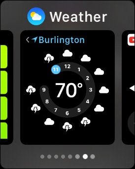
Figure 10.2: The Weather application's dock snapshot, found below the watch face
When on the watch face screen, the user can press the long side button on the watch to bring up the dock. All of the user's docked applications are presented in a card-like format, swiping left and right to see their different apps.
Now, if you follow good watchOS design principles, a dock snapshot may be the primary use case for your application. Applications in the dock are very easy to get to, and the user can swipe through several apps very quickly. If you are displaying simple information (such as a gate number and boarding time for a flight), a dock snapshot will be more than enough for a user to quickly get the information they need.
Creating a good dock snapshot for your app presents an interesting challenge: you are required to cut down your whole watchOS application even further, presenting only the most essential information on a single screen. In practice, I find that I very rarely open an application from the home screen, and because of this I believe that earning a spot on a user's dock (only 10 apps can be docked) can make or break the usefulness of your watchOS application.
While the dock is great for quickly finding passive information, notifications on Apple Watch are the primary method for dealing with active information. The common examples are e-mails and text messages. I rarely (or never) go into the messages or mail app on my Apple Watch to compose new messages. However, I interact with dozens of messages and e-mail notifications every day. Right from the notification, I can respond to a text with some pre-set answers, or use Siri dictation to respond with a simple answer. Usually, though, I just screen the texts and pull out my phone if they are urgent.
Notifications are a great way to present actionable information to your users. It's important to remember the intimacy of the watch here; if you're overloading your user's wrist with notifications that they don't care about, they will disable them altogether.
Finally, we have complications. The word is a term carried over from traditional watches, which would have sub-dials for stopwatches or little date markers that were referred to as complications. The term is used well, since complications on the Apple Watch are little icons or labels that you can optionally place on your watch face:

Figure 10.3: The Weather complication (in the upper left corner) displaying the current temperature
A complication can be seen as the ultimate summary of your application: you only get a very tiny rectangle to display information directly on the user's watch face. A great example is the complication for the built-in weather app, which displays the current temperature and nothing more. Tapping on the temperature launches the full weather application, making it very useful to not only get a quick gist of the weather, but to also bypass the home screen or dock to get more useful information.
One of the greatest new features in watchOS 2.0 is Time Travel, which allows you to turn the digital crown to look at the future. In addition to spinning the clock hands on the watch face, Time Travel will also update all of a user's complications to display the pre-computed future value, provided the developer supports the functionality. Using our weather example, spinning the watch a few hours into the future will change the temperature to read as the predicted temperature for that time:
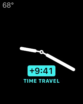
Figure 10.4: The Weather complication showing the future temperature during Time Travel
As you can imagine, this is tremendously useful for people, and in my personal opinion is one of the greatest selling points of the watch. If you have an app that has any time sensitive information, supporting a Time Travel complication is the best way to make your app a must-have for Apple Watch owners.
Just as every iOS app doesn't need a watchOS app, not every watchOS app needs a complication. Sometimes the information in your app is not the right fit for such a time-oriented and compact summary, and a dock snapshot would serve you better. However, I believe that if you cannot come up with a useful dock snapshot, notification, or complication, there may be very little need for an app at all.