
All this time, we've been building out our data model and adding ways to input new information. However, we still can't see any of the snippets we've been making! Now it's time to actually let the user see what they've been saving.
The next story is "I want to scroll through my snippets". The tasks that we need to complete are:
- Adding a
UITableViewto our first scene, with two prototype cells for theTextSnippetand thePhotoSnippet - Programming the view controller to display the information from our data array in our
UITableView
To satisfy our user story, we're going to use a UITableView, which allows us to scroll through cells of data. We're also going to create our own custom cells (called prototype cells) to define a distinct look for both the Text and Photo type cells. Then, we are going to populate the table view with data from our data array.
Current task: Add a
UITableView to our first scene, with two prototype cells for the TextSnippet and the PhotoSnippet.
The first part of this story has us building out custom views to display the snippet data we've been creating. As we just discussed, we'll be using a UITableView with prototype cells. The table view is a special type of view that will manage and display a list of data cells that the user can scroll through. However, in order to use a table view, we are going to once again use a protocol.
Head over to ViewController.swift, and let's add yet another extension to implement a protocol:
extension ViewController: UITableViewDataSource {

}
The new protocol that we added is UITableViewDataSource, which lets the table view know which object is responsible for telling it what its data is. In the next task we will actually implement some of that protocol's functions, but for now we just need to let the class know that it implements that protocol.
Let's go back to Main.storyboard. On our initial view controller (the one with the New snippet button), we're going to add a Table View (not a Table View Controller) from the object library. Just drag it out to the center and resize it so the sides touch the edges of the screen, the top touches the bottom of the status bar, and the bottom touches the top of the toolbar.
Now we're going to use Auto Layout to configure our table view. Select the table view, and then go to the pin menu. On the top area, we're going to set constraints for all four sides. Again, first uncheck the box that says Constrain to margins, then set all four sides to 0. Remember to click on the little red lines next to the numbers to create that constraint. Then set Update frames to All, and click Add Constraints.
Now that our table view is in our view and set up with Auto Layout, we want to set up its data source. Earlier, we set our ViewController class to implement the UITableViewControllerDataSource protocol, so we want to let our new table view know that ViewController will manage its data source. To do this, control-drag from the table view up to the view controller icon on the top of our view controller:

Figure 6.10: Control-dragging from the table view to the view controller to set the data source
When you let go, it should show two outlets: delegate, and data source. Select the dataSource outlet to connect the two objects together.
To finish up with the table view itself, select the table view and check out the Attributes Inspector (option + command + 4). In the second section, you should set the Separator attribute to None. This will get rid of the little lines that show up between each cell. Finally, scroll down toward the bottom to the View category. Change the background color to Clear color. This will let us see through to the orange background color of the app.
Next, it's time to create our custom cells. Before we create the visual parts, we're going to need some very simple custom classes to back them up. Create two new files (command + N), and name the first one TextSnippetCell, and the second PhotoSnippetCell. In each file, we're going to create a very simple subclass of the UITableViewCell, which is the default cell type in Table View:
TextSnippetCell.swift:
import UIKit

class TextSnippetCell: UITableViewCell {

    @IBOutlet var label: UILabel!
}
PhotoSnippetCell.swift:
import UIKit

class PhotoSnippetCell: UITableViewCell {

    @IBOutlet var photo: UIImageView!
}
In each subclass, we're only adding one interface builder outlet, which will point to the UI element where we'll be displaying our data.
Back in the storyboard, we are going to create the two cells that represent the classes we just made. In the object inspector, search for the UITableViewCell, and drag two into our table view:

Figure 6.11: Two blank table view cells in our table view
Right now, each of these cells represents the standard UITableViewCell, but we have to assign them a custom class type using our new TextSnippetCell and PhotoSnippetCell classes. Let's set up the text cell first.
Select the first cell, then go to its Identity Inspector (option + command + 3). In the Custom Class section, set its class to TextSnippetCell. Now the prototype cell knows that it is actually of the class TextSnippetCell. Next, go to the Attributes Inspector, and change the Identifier attribute to textSnippetCell. This is unrelated to the class, but we'll be using it later as an ID to reference the type of cells we want to use.
Next, we'll follow the same instructions as above, but for the second prototype cell. Instead, we'll set the class to PhotoSnippetCell, and the identifier to photoSnippetCell.
Now it's time to add custom UI elements to our cells, so that they can display our user data. Drag a UILabel out onto our top (text) cell, and a UIImageView onto our bottom (photo) cell.
For the UILabel, in the Attributes Inspector, set the Lines attribute to 0. Setting Lines to 0 allows the label to have as many lines as it needs without a cutoff. We need this, since our users are allowed to write as much text as they want. Our UILabel needs to grow to accommodate the user's text.
To finish setting up the UILabel, we need to configure its Auto Layout constraints. These are going to be pretty simple. Select the label, and go to the Pin menu. At the top, enable all four directional constraints, and set them all to 0. This time, you can leave the Constrain to margins checkbox enabled, since we actually want to use the margins this time. Set Update Frames to All and press Add Constraints to finish setup. Our UILabel is now complete.
Basically, what we did was anchor the height of the table view cell to our label. As more lines are added to the label, the cell will expand, since its edges are constrained to the label's edges.
Next we'll set up the UIImageView in our photo cell. The photo doesn't need any attributes changed, so we can get right to setting the auto layout constraints. From the Pin menu, we are once again going to set all four directional pins to 0, and we're going to uncheck the Constrain to margins box, since we want the image to stretch to the edge of the screen. This time, we are also going to use the Aspect Ratio constraint further down, so check that off as well. Now set Update Frames to All and press Add Constraints to set the constraints.
There are still more constraints to add, however! Select the image view again, and go to the Align menu (directly to the left of the Pin menu). Here, we're going to add Horizontally in Container with a value of 0, and Vertically in Container with a value of 0. Set Update Frames to All and press Add Constraints to set the constraints.
So far what we've done is tell the image view to expand all the way to the edges of its containing cell, and to stay centered vertically and horizontally. However, what we want is for the image to be perfectly square, and stretch the cell to be as tall as it is wide.
That's where the aspect ratio constraint comes in. If the pin constraints are pulling our image view to the edges of the cell, but the image is then forcing itself to be the same height as its width, it will stretch the cell out vertically, too. For this to work, we need to set the aspect ratio constraint to be 1:1. Find the aspect ratio constraint in the document outline (underneath our image view), and then in the Inspector set its multiplier to 1:1:

Figure 6.12: Finding the aspect ratio constraint in the document outline (left); setting its multiplier (right)
If everything went well, your constraints should be all set up now! However, it's worth noting that the cell height won't automatically update live in your storyboard, so the image will go off the bottom of the cell. When you run the app later, though, everything will be fine!
Now that all of our Auto Layout is set up, we have one last thing to do: we need to connect the outlets in our TextSnippetCell and PhotoSnippetCell to our storyboard. Click on the textSnippetCell object in the document outline, and then navigate to the Connections Inspector (option + command + 6). Find the label outlet in the Outlets section, then click and drag from the circle onto the label in the cell to connect them:

Figure 6.13: Connecting the label outlet to the UILabel in the storyboard
Do the same with the photo cell and its photo outlet with the image view:
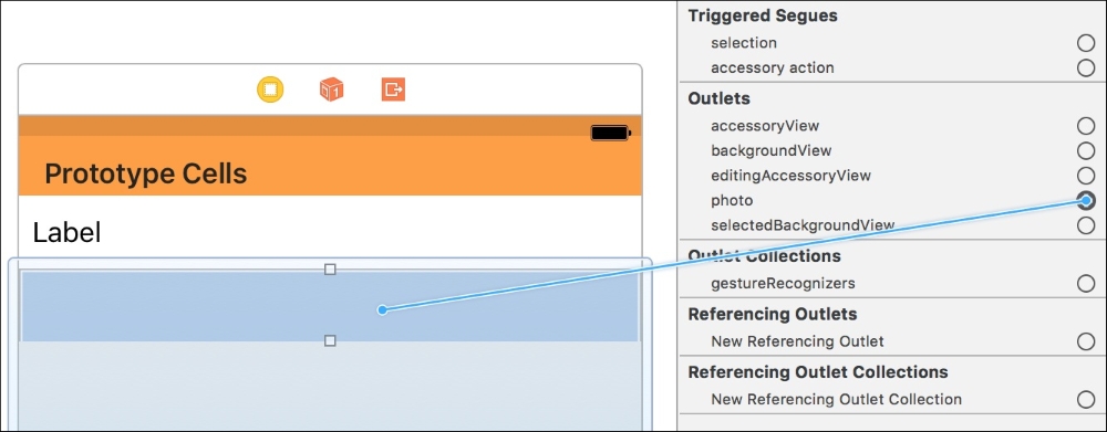
Figure 6.14: Connecting the photo outlet to the UIImage in the storyboard
And now our views are fully configured!
Current task: Program the view controller to display the information from our data array in our UITableView.
With our custom table view cells configured, we now have to set up the table view's data source. The prototype cells we built in our storyboard were just visual blueprints for cells. When our application is running, the table view will ask its data source to tell it what information it should present to the user. The data source is responsible for choosing what type of cell to use, and what data to fill those cells with.
Let's open up the ViewController.swift file, since that is the class that is our table view's data source. First, we're going to need a reference to our table view, so at the top of the class, add an @IBOutlet for the table view, like so:
@IBOutlet weak var tableView: UITableView!
Then, in Main.storyboard, use the assistant editor to connect the outlet to our table view:

Figure 6.15: Dragging from the IBOutlet in the view controller into the storyboard to make a connection
Now, in our viewDidLoad() function, we can set some properties on our table view. Right now, if you were to run the app, the cells on the table view wouldn't expand vertically to match the content. That's because by default, UITableViewCells have a standard height of 44 points. You can set a custom height in the storyboard, but we don't want a single custom height, we want a dynamic height based on the content. We have to tell the table view that we want that behavior:
override func viewDidLoad() {
    super.viewDidLoad()
    imagePicker.delegate = self

    tableView.estimatedRowHeight = 100
    tableView.rowHeight = UITableViewAutomaticDimension
}
In our viewDidLoad() function, we added two lines; the first one gives the table view an estimated height (this mostly just has to not be 0), and the second line tells the table view that the row height will be automatic. Now our table view will let Auto Layout dynamically resize each cell based on the content and our Auto Layout constraints.
Next, we are going to implement some functions from the UITableViewDataSource protocol class extension that we added a little while ago. The functions that we are going to add are as follows:
func numberOfSections(in tableView: UITableView) -> Int {

}

func tableView(_ tableView: UITableView, numberOfRowsInSection section: Int) -> Int

}

func tableView(_ tableView: UITableView, cellForRowAt indexPath: IndexPath) -> UITableViewCell {

}
The first function needs to return an Int that tells the table view how many sections it will have. A section in a table view is used to group different parts of the table (think about the Settings.app), and each section can have a header. In our app, we are just going to have one big section with no header, so we're just going to return 1:
func numberOfSections(in tableView: UITableView) -> Int {
    return 1
}
The second function tells the table how many rows are in a given section. Since we only have one section, we don't have to take into account which section it is asking about; we only have to return a single value. Since our table is going to store all of our snippets, the number of rows will be equal to the number of snippet data objects we have. That means it's as simple as returning the length of our data array:
func tableView(_ tableView: UITableView, numberOfRowsInSection section: Int) -> Int {
    return data.count
}
At this point, our table knows how many sections and rows it has. Now it just needs to know what goes in each cell. For that, we're going to use the last function, tableView( cellForRowAtIndexPath: ). This function gives us an index, and asks for us to give it a cell.
Before we look at the code, let's talk about how this will work. We're going to use the index to ask our data array what data is at that index. Then we're going to check what type of data it is, and then configure a new cell based on that information:
func tableView(_ tableView: UITableView, cellForRowAt indexPath: IndexPath) -> UITableViewCell {

    let cell: UITableViewCell

    let sortedData = data.reversed() as [SnippetData]
    let snippetData = sortedData[indexPath.row]

    switch snippetData.type
    {
    case .text:
        cell = tableView.dequeueReusableCell(withIdentifier: "textSnippetCell", for: indexPath)
        (cell as! TextSnippetCell).label.text = (snippetData as! TextData).textData

    case .photo:
        cell = tableView.dequeueReusableCell(withIdentifier: "photoSnippetCell", for: indexPath)
        (cell as! PhotoSnippetCell).photo.image = (snippetData as! PhotoData).photoData
    }

    return cell
}
Let's start from the top. First, we declare a cell that will be a UITableViewCell. We don't assign it a value just yet. Then, underneath that, we sort our data. Since we want our table view to list our snippets in reverse chronological order, we need get the reversed version of our data array. Now that we have a sorted data array, we ask for the specific data at the specified row. (Note how this functions passes in an indexPath value as a parameter.)
Once we have the specific data that we are making a cell for, we need to know what kind of data it is, so we can create the right kind of cell. To do that, we use a switch statement with the snippetData's type, which is an enum. Then we make two cases, depending on if the type enum was .text, or .photo.
In the case that the type was .text, we want to create a cell using the textSnippetCell prototype cell from our storyboard. To do that, we call the function dequeueReusableCell(), and pass in the String identifier for the prototype cell we want to use.
Note
UITableView is smart, and doesn't create and delete new table view cells all the time. Instead, it only has a handful of cells that it reuses as cells go off the screen, and new ones come on screen. Imagine if we had tens of thousands of pieces of data… we'd run out of memory trying to create that many cells! So when you use dequeueReusableCell(), you are actually just asking the table view for an already existing and available cell of the right type.
After we dequeue the cell, we want to take the text from our data, and put it into the label in our cell. However, since cell thinks it is a UITableViewCell class, and snippetData thinks it is a SnippetData class, we need to cast the data to the appropriate subclass:
(cell as! TextSnippetCell).label.text = (snippetData as! TextData).textData
We tell the cell that it should be read as a TextSnippetCell, and the snippetData that it should be read as a TextData object. Then we can access their properties, because the compiler knows what type they are. The exclamation point (!) forces the cast, otherwise we'd end up with an optional value.
Underneath all that, we just do the same thing, except for the photo cell. Here we use the cell identifier photoSnippetCell, and then cast cell as PhotoSnippetCell and snippetData as PhotoData. Also, instead of setting the label's text property in the cell, we are setting the image property of the photo (which is a UIImageView).
At the end, we just return the cell.
If you were to build and run on your device and create a new snippet… nothing happens. Where is our snippet? Well, our table view has a data source, but it doesn't know when to load the data from the data source. Naturally, it tries to load the data when the app starts, but in our case there's no data yet.
Luckily, this is a quick fix. We want to refresh the data whenever one of our popover view controllers is dismissed. To do this, add this function to the class, near the top (under viewDidLoad() is a good place for it):
override func viewWillAppear(_ animated: Bool) {
    tableView.reloadData()
}
The viewWillAppear() function is called just before the view controller becomes visible to the user, making it the perfect time to tell our tableView to reload its data.
Build and run the project now, create a new snippet… and it works! We can now create as many snippets as we want, and scroll through them. Our app is almost complete! Remember to commit your work (option + command + C), and now let's move on to our final user story.