454
LESSON 40 Making WPF aPPlications
<Grid>
<Image Height=”100” HorizontalAlignment=”Left” Margin=”12,12,0,0”
Name=”butterflyImage” Source=”/Critters;component/Butterfly.jpg”
Stretch=”Uniform” VerticalAlignment=”Top” Width=”100”
MouseDown=”butterflyImage_MouseDown” />
... Other Image controls omitted ...
</Grid>
</Window>
If you study this code, you’ll see that the Window contains a Grid and the Grid contains the Image
controls. You’ll also notice that the XAML code gives the name of the code-behind event handlers
that should execute when the user presses the mouse down on an
Image. In the code shown here, the
MouseDown event handler is called butterflyImage_MouseDown.
A Window can contain only a single child control. Normally that is a container
such as a
Grid that holds all of the other controls.
Although this simple application works, it could use some improvements. For example, the images
are not centered vertically. They also do not resize to take advantage of the form’s current size.
One of the philosophical goals of WPF is to make controls arrange themselves to make the best use
of whatever spaces is available. In a Windows Forms application you might use
Anchor properties to
do this. In a WPF application, you generally use container controls that help arrange their children.
The following section shows how you can improve the way this program arranges its controls.
ARRANGING WPF CONTROLS
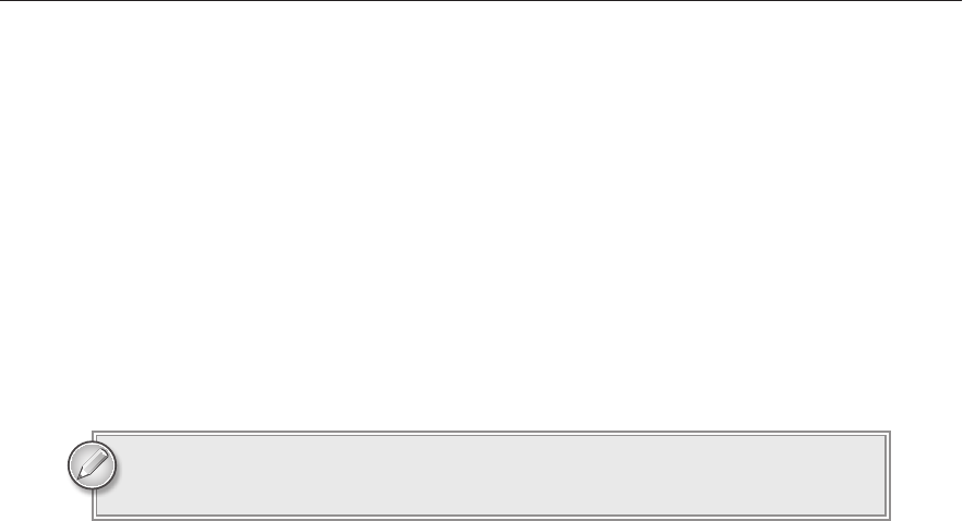
The first version of the Critters program placed Image controls directly inside the Window’s Grid. The
Grid control arranges its children in rows and columns, although the designer creates only one row and
column by default. A better arrangement for this program would use five columns: one for each
Image.
To make the columns, select the
Grid control. In the Properties window, click the ellipsis button to
the right of the
ColumnDefinitions property and use the dialog that appears to create five columns.
By default the columns have
Width set to *, which means they divide the Grid’s area evenly.
Because the
Image controls were originally placed in the Grid’s first column, they are still contained
in that column. To move the controls into their proper columns, set their
Grid.Column properties.
Note that the columns are numbered starting with 0 so the column indexes should be 0, 1, 2, 3, and 4.
Originally the
Image controls used their Margin properties to position themselves within the Grid’s
first row and column. Now those values move them to strange locations within their new columns.
For example, the frog
Image’s Margin value of 118,12,0,0 moves the image 118 pixels to the right so
it isn’t visible in its column.
596906c40.indd 454 4/7/10 12:35:19 PM
Arranging WPF Controls
455
The Margin property supports three different formats that hold one, two, or
four values. One value represents all of the control’s margins. Two values rep-
resent the left/right and top/bottom margins. Four values represent the left, top,
right, and bottom margins.
To make the Images appear centered in their Grid cells, set their Margin properties to 4.
Right now the controls’
Width and Height properties are 100 so the controls always have the same
size. If you change these property values to
Auto, the controls will resize themselves to fit their Grid
cells (minus their margins).
Finally, to ensure that the
Image controls are centered in their cells, set their HorizontalAlignment
and
VerticalAlignment properties to Center.
The following XAML code shows how the program defines the new interface. This code shows only
the frog image’s definition. The others are similar.
<Window x:Class=”Critters.MainWindow”
xmlns=”http://schemas.microsoft.com/winfx/2006/xaml/presentation”
xmlns:x=”http://schemas.microsoft.com/winfx/2006/xaml”
Title=”Critters” Height=”164” Width=”569”>
<Grid>
<Grid.ColumnDefinitions>
<ColumnDefinition />
<ColumnDefinition />
<ColumnDefinition />
<ColumnDefinition />
<ColumnDefinition />
</Grid.ColumnDefinitions>
... Other Image controls omitted ...
<Image HorizontalAlignment=”Center” Margin=”4”
Name=”frogImage” Source=”/Critters;component/Frog.jpg”
Stretch=”Uniform” VerticalAlignment=”Center”
MouseDown=”frogImage_MouseDown”
Grid.Column=”1” />
... Other Image controls omitted ...
</Grid>
</Window>
Now when you resize the Window, the Grid resizes. Its columns
divide the
Grid’s space evenly so they resize. The Image controls
then resize to fill their cells (minus their margins).
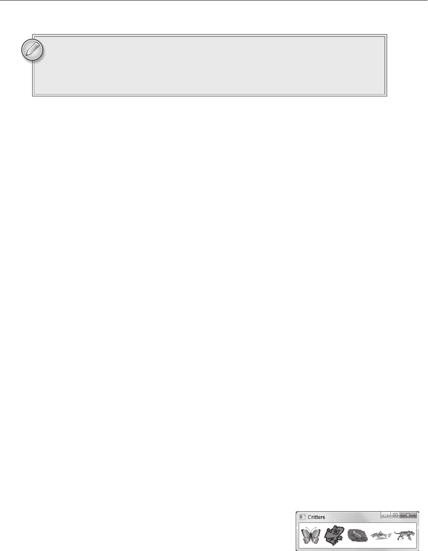
Figure 40-3 shows the new program when the form has been
shrunk. Notice that the
Image controls are also shrunk so they fit
in their
Grid cells. If you shrink the first version of this program,
the
Image controls do not resize so they are clipped off. FIGURE 403
596906c40.indd 455 4/7/10 12:35:20 PM
456
LESSON 40 Making WPF aPPlications
EDITING XAML CODE
The next change I’d like to make to the program is to give the images drop shadows, as shown in
Figure 40-4.
FIGURE 404
Unfortunately the Properties window won’t let you add this kind of effect so you must type in the
appropriate code in the XAML editor.
To display a drop shadow, you must set the
Image control’s BitmapEffect property to a
DropShadowBitmapEffect object. Because this value is an object and not a simple value like a
string or number, you need to use a special syntax for setting it.
Inside the
Image element, you need to add an Image.BitmapEffect element to indicate the property
you are setting. Inside that you need to add a
DropShadowBitmapEffect object.
The following XAML code shows the new definition of the frog
Image control with the control’s
BitmapEffect property highlighted in bold. Here I’ve also changed the Margin property to 8, so there’s
more room for the drop shadows between the controls. The code for the other controls is similar.
<Image HorizontalAlignment=”Center” Margin=”8” Name=”frogImage”
Source=”/Critters;component/Frog.jpg” Stretch=”Uniform”
VerticalAlignment=”Center” MouseDown=”frogImage_MouseDown”
Grid.Column=”1”>
<Image.BitmapEffect>
<DropShadowBitmapEffect/>
</Image.BitmapEffect>
</Image>
USING WPF STYLES
The last change I want to make to this program is to simplify the code. The preceding XAML
snippet shows the definition for the first
Image control. The code that defines the others is omitted
because it is very similar.
In fact, the code for those other controls is so similar that the XAML file contains a lot of
duplicate code. All of the controls have the same
HorizontalAlignment, Margin, Stretch,
VerticalAlignment, and BitmapEffect values. Repeating those values for every control makes
the code cluttered and makes it hard to change the values for every control. For example, if you
decide that you’d rather give the images a beveled edge instead of a drop shadow, you have to make
the change in five places.
596906c40.indd 456 4/7/10 12:35:20 PM
Using WPF Styles
457
You can simplify the code and its maintenance by creating a style. A style is a set of specific property
values that you can then assign in a group to other controls.
You can create a style inside an object’s Resources section. For this example, I’ve placed the style in
the
Window’s Resources section.
The style itself is represented by a
Style element. That element’s TargetType property tells the kind
of object to which the style will apply (
Image controls for this example). Its x:Key property gives the
style a name.
Within the
Style element, Setter elements define property values. The Setter element’s Property
and
Value attributes determine which property is set to what value.
After you define a style, you can set a control’s
Style property to it. If the style is named imageStyle,
then the syntax for assigning the
Style property is:
Style=”{StaticResource imageStyle}“
The following code shows the revised XAML file. The new Window.Resources section defines the
style. The
Image controls’ definitions now use the style instead of setting all of their common properties
individually. In this snippet the style’s definition and the places where it is used are highlighted in bold.
<Window x:Class=”Critters.MainWindow”
xmlns=”http://schemas.microsoft.com/winfx/2006/xaml/presentation”
xmlns:x=”http://schemas.microsoft.com/winfx/2006/xaml”
Title=”Critters” Height=”164” Width=”569”>
<Window.Resources>
<Style TargetType=”Image” x:Key=”imageStyle”>
<Setter Property=”HorizontalAlignment” Value=”Center”/>
<Setter Property=”VerticalAlignment” Value=”Center”/>
<Setter Property=”Margin” Value=”8”/>
<Setter Property=”Stretch” Value=”Uniform”/>
<Setter Property=”BitmapEffect”>
<Setter.Value>
<DropShadowBitmapEffect/>
</Setter.Value>
</Setter>
</Style>
</Window.Resources>
<Grid>
<Grid.ColumnDefinitions>
<ColumnDefinition />
<ColumnDefinition />
<ColumnDefinition />
<ColumnDefinition />
<ColumnDefinition />
</Grid.ColumnDefinitions>
<Image Style=”{StaticResource imageStyle}“ Name=”butterflyImage”
Source=”/Critters;component/Butterfly.jpg”
MouseDown=”butterflyImage_MouseDown” />
<Image Style=”{StaticResource imageStyle}“ Name=”frogImage”
Source=”/Critters;component/Frog.jpg”
MouseDown=”frogImage_MouseDown” Grid.Column=”1” />
<Image Style=”{StaticResource imageStyle}“ Name=”platypusImage”
596906c40.indd 457 4/7/10 12:35:20 PM

458
LESSON 40 Making WPF aPPlications
Source=”/Critters;component/Platypus.jpg”
MouseDown=”platypusImage_MouseDown” Grid.Column=”2” />
<Image Style=”{StaticResource imageStyle}“ Name=”sharkImage”
Source=”/Critters;component/Shark.jpg”
MouseDown=”sharkImage_MouseDown” Grid.Column=”3” />
<Image Style=”{StaticResource imageStyle}“ Name=”tigerImage”
Source=”/Critters;component/Tiger.jpg”
MouseDown=”tigerImage_MouseDown” Grid.Column=”4” />
</Grid>
</Window>
Now that you’ve built the style, you can easily make changes that apply to all of the images. For
example, if you want to change the
BitmapEffect property to a BevelBitmapEffect object, you
can do so in one place.
TRY IT
By now you probably understand what I meant when I said that WPF’s biggest weakness is its
complexity. The syntax is sometimes odd and inconsistent. The way you need to use different
syntax to set property values with different types, the unusual way you define styles, the odd
syntax you use to refer to a style, and a host of other differences between WPF programming
and Windows Forms programming make mastering WPF difficult.
However, building simple applications isn’t too hard.
In this Try It, you get to practice some of the techniques described in this lesson while you build a pro-
gram similar to the Critters program described earlier in this lesson. In this program, however, you’ll
remove the initially created
Grid control and replace it with a horizontally oriented StackPanel.
The
StackPanel control allows the controls it contains to take their preferred sizes. It allows an
Image control to take whatever size it needs to hold its picture at full scale. In contrast, the Grid
control requests that its children resize themselves to use the available space. That means the
Images
in this Try It must be given fixed sizes so they have a reasonable size.
You can download the code and resources for this Try It from the book’s web
page at
www.wrox.com or www.CSharpHelper.com/24hour.html. You can find
them in the Lesson40 folder of the download.
Lesson Requirements
Create a new WPF application. Copy the critter images from the Critters4 directory in this
lesson’s download into the project directory (or use images of your own).
Remove the initially created
Grid control and add a StackPanel.
Use the Properties window to give the
StackPanel the properties shown in Table 40-2:
596906c40.indd 458 4/7/10 12:35:21 PM
..................Content has been hidden....................
You can't read the all page of ebook, please click here login for view all page.