
As you saw earlier, a studs-up mosaic offers some subtleties that studs-out mosaics do not. Because you are using plates as seen from their side, rather than full-height bricks, you are obviously dealing with smaller changes in color and shape. Take another look at a studs-out versus a studs-up mosaic in Figure 8-18.
Although there’s nothing wrong with the letters in the studs-out mosaic, it’s also clear that the word LEGO is a little more natural looking in the studs-up version. Being able to incorporate simple shading or highlighting techniques (such as seen above the letters on the studs-up version in Figure 8-18) gives you more control as a builder.
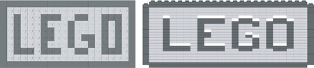
Figure 8-18. A side-by-side comparison of the two basic mosaic techniques. The studs-up version (on the right) offers some advantages when it comes to lettering.
Designing mosaics from a studs-up perspective isn’t really that much different than what you’ve already seen, but it does add more depth to the skills you are developing.