
We devote our first recipe in this chapter to demonstrating several ways to avoid a common problem with gnuplot. As mentioned in previous chapters, gnuplot does not really try to account for the horizontal space occupied by tic labels, simply placing them at the tic positions and printing them in the selected tic font, whether that is the default or the one specified by the user.
This works acceptably well most of the time, but can fail spectacularly if our labels are long or we've chosen a big font. In these cases, the tic labels on the x-axis are in danger of overlapping. This is a particularly common problem when gnuplot is used to generate graphs automatically, where the user has no opportunity to tune each graph by hand.
In this recipe, we'll explore two ways to deal with long x-axis labels that don't require the use of tiny fonts to squeeze them in. The following figure shows the use of some very long numerical labels that are rotated to get them to fit, in a fashion reminiscent of some parking space arrangements:
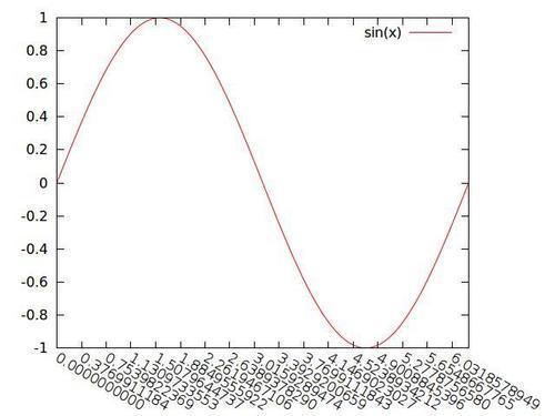
Feed the following script to gnuplot to produce the previous figure:
set xrange [0:2*pi]
set xtics 0, 0.12*pi, 2*pi
set xtics format "%.10f"
set xtics rotate by -30
set rmargin 10
plot sin(x)
The first two lines should not contain any surprises. The third line tells gnuplot to print the tic labels on the x-axis with 10 places following the decimal point, which should take up a bit of room. The third line rotates the labels by 30 degrees clockwise from the axis. We then need to increase the margin on the right of the graph to avoid cutting off the labels near the right, which is what the set rmargin command accomplishes.
The problem of long labels often arises when we are plotting dates and times (see Chapter 4, Controlling your Tics). gnuplot tries to avoid collisions by truncating date/time tic labels at 24 characters. This is unfortunate, because it not only fails to solve the problem but severely constrains the format of our labels.
If we try the following settings followed by any plot command, then we get the figure that follows, where the labels overlap:
set xdata time
set format x "%A, %b %d, %Y"
set xrange ["1/1/72" : "1/10/72"]
These commands tell gnuplot that we're working with time/date data, that our label format should follow the pattern "Thursday, Jan 26, 2012", and that the range along the x-axis should cover 10 days starting at Jan 1, 1972.
We can fix this with one change to the format:
set format x "%A
%b %d, %Y"
The previous command inserts a linebreak ( ) after the code for the weekday, leading to the arrangement of labels on the axis shown in the following figure: