
In Chapter 2, Annotating with Labels and Legends, we learned how to place a text label anywhere on the graph with the set label command. It is also possible to plot a set of labels whose text, positions, and possibly other attributes are derived from the information in a datafile. In this way, we can create visualizations such as the following:
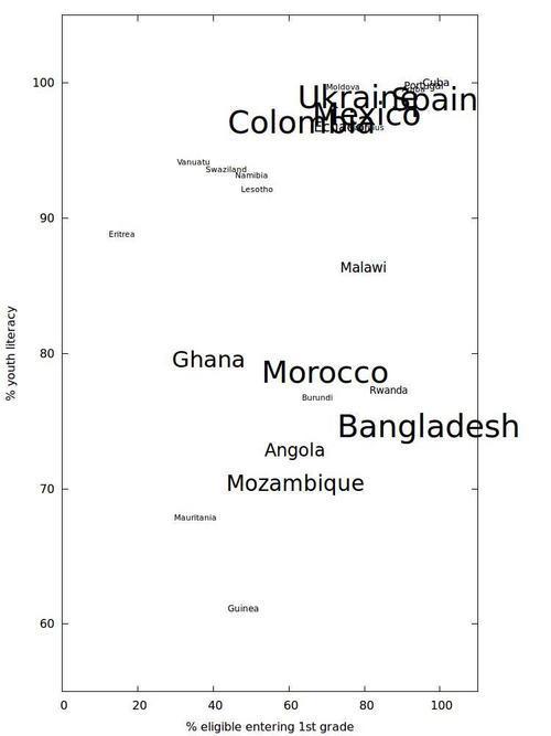
The previous figure shows a collection of names of countries printed with a text size that is proportional to each country's population (aside from the practical requirement to impose a maximum and minimum font size). The labels are positioned to indicate each country's school intake rate in the first grade as a percentage of official school-age population versus the literacy rate for people in the age group 15-24. The data comes from the World Bank and can be found at http://data.worldbank.org/data-catalog/world-development-indicators. The numbers reported for 2009 are used, and all countries with data for that year are plotted.
Execute the following gnuplot script to produce the previous figure:
set term pngcairo enhanced size 750, 1000
set out 'p3.png'
unset key
set rmargin 10
set xrange [0:110]
set yrange [55:105]
set xlabel '% eligible entering 1st grade'
set ylabel '% youth literacy'
min(a,b) = (a<b?a:b)
max(a,b) = (a>b?b:a)
scale(x) = min(max(x/1000000,8), 32)
CountryName(String,Size) = sprintf("{/=%d %s}", scale(Size), String)
plot 'p3.dat' using 2:3:(CountryName(stringcolumn(1),$4)) with labels
Since we are going to be using codes to set the font size for each label, we need to select a terminal that supports enhanced text, which is the purpose of the first line of the script. We've also set a size that will help keep our labels from becoming too crowded together; this was chosen through trial-and-error.
A text legend on this type of plot would just be confusing, so we've turned it off with unset key. We've increased the size of the right margin to make room for one of the labels that sticks out.
The next two lines that require some explanation are the definitions of the min and max functions. gnuplot does not come with these, so we had to make our own. We've used the ternary operator explained in Chapter 7, Programming gnuplot and Dealing with Data to very simply create functions that return the minimum or maximum of two arguments, which is all that we'll need them to do.
After that we've defined a scale function that uses our min and max functions. This function transforms the large population numbers to much smaller font sizes, and imposes minimum and maximum font size cutoffs. The particular numbers used were arrived at largely through trial and error.
The CountryName function takes two arguments. The first will be the name of the country read from the file. The second will be a size, which we will read in from the column giving the total population. The CountryName function inserts the enhanced text code for setting the font size, which it calculates using our scale function.
Finally, the plot command in the last line uses the labels style. This style accepts three entries for the x and y coordinates and the text to be positioned at those coordinates (it is also possible to plot labels in 3D). We use the stringcolumn function here, which returns, as a string, the text of the column given in its argument.
The general approach in this recipe is inspired by the example provided in the online help under help labels.