
The default font size for labels and titles in gnuplot looks a little small with most terminals. For example, the labels can be hard to read from the back rows of an auditorium during a presentation. We now show how to adjust the font size, and how to select the font for labels and titles.
Most terminals accept a font and size specification in the set terminal command. To find out about the terminal you are using, just type help set term terminal, substituting the name of the terminal. For example, if you are using the PostScript terminal, typing help set term postscript provides a wealth of information on all the options accepted by the PostScript terminal, including the syntax for the font and size specifications. The following commands show how to produce the plot with all labels set in Courier at 18 pt:
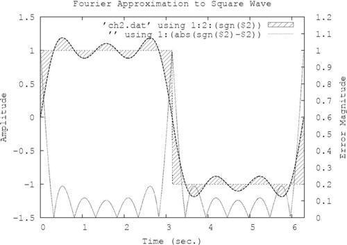
set term postscript landscape "Courier, 18"
set output 'squarewave.ps'
set yrange [-1.5:1.5]
set xrange [0:6.3]
set ytics nomirror
set y2tics 0,.1
set y2range [0:1.2]
set style fill pattern 5
set xlabel "Time (sec.)
set ylabel "Amplitude"
set y2label "Error Magnitude"
set title "Fourier Approximation to Square Wave"
plot 'ch2.dat' using 1:2:(sgn($2)) with filledcurves, '' using 1:2 with lines lw 2 notitle, '' using 1:(sgn($2)) with lines notitle, '' using 1:(abs(sgn($2)-$2)) with lines axis x1y2
We've highlighted the new commands, which select the PostScript terminal and define a filename for the output. The first line chooses landscape orientation, which is usually desirable for single graphs standing on their own, and selects the Courier font at the somewhat larger-than-default 18 pt size. Note that this selects the font and size for the title, all labels, legend, and numbers labeling the tick marks. The second line says to put the output in the file squarewave.ps. You can choose any filename you like, as long as you place it within quotation marks. If you neglect to define an output, gnuplot will merrily spit out the PostScript code onto the terminal, which is probably not what you want.
A few typographical changes to the graph make it easier on the eyes:
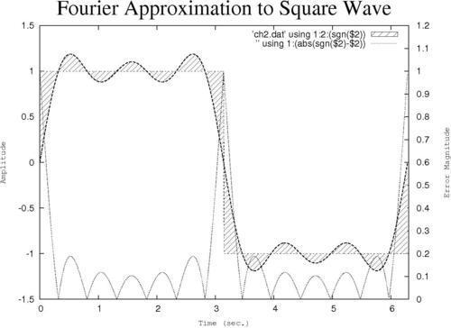
Having everything in the same style and size is neither very attractive nor optimally readable. Fortunately, we can select different fonts and sizes for every label and annotation on the graph:
set term postscript landscape
set yrange [-1.5:1.5]
set xrange [0:6.3]
set ytics nomirror
set y2tics 0,.1
set y2range [0:1.2]
set style fill pattern 5
set key font "Helvetica, 14"
set xlabel "Time (sec.)" font "Courier, 12"
set ylabel "Amplitude" font "Courier, 12"
set y2label "Error Magnitude" font "Courier, 12"
set title "Fourier Approximation to Square Wave" font "Times-Roman, 32"
plot 'ch2.dat' using 1:2:(sgn($2)) with filledcurves, '' using 1:2 with lines lw 2 notitle, '' using 1:(sgn($2)) with lines notitle, '' using 1:(abs(sgn($2)-$2)) with lines axis x1y2
In the previous script, the font commands are highlighted. The fonts you request must be available on your computer; usually it is safe to use the familiar PostScript fonts, from which collection we have selected three typefaces in the example. The new set key command sets the style of the legend, which is the subject of the next recipe.