
Sometimes our curves can or should not share the same y-axis. Gnuplot handles this with its tics commands, which we cover in greater detail in Chapter 4, Controlling your Tics. The following figure is a plot of two functions covering very different ranges; if the two curves were plotted against the same y-axis, one would be too small to see:
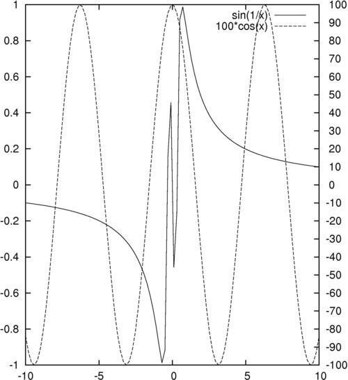
The following simple three-line script will create the previous figure:
set y2tics -100, 10
set ytics nomirror
plot sin(1/x) axis x1y1,100*cos(x) axis x1y2
Tip
You can download the example code files for all Packt books you have purchased from your account at http://www.packtpub.com. If you purchased this book elsewhere, you can visit http://www.packtpub.com/support and register to have the files e-mailed directly to you.
Gnuplot can have two different y-axes and two different x-axes. In order to define a second y-axis, use the y2tics command; the first parameter is the starting value at the bottom of the graph, and the second is the interval between tics on the axis. The command set ytics nomirror tells gnuplot to use a different axis on the right-hand side, rather than simply mirroring the left-hand y-axis. The final plot command is similar to the ones we've seen before, with the addition of the "axis" commands; these tell gnuplot which set of axes to use for which curve.
One of our functions, sin(1/x), oscillates infinitely quickly near x = 0. Experiment with issuing the command set samples N before the plot command to see how more information is plotted near the singularity at the origin if you use larger values of N.
You can have two x-axes as well (but be careful, this can often lead to plots that are difficult to understand). The following script is used to set the ranges of the two x axes to be different:
set x2tics -20 2
set xtics nomirror
set xrange [-10:10]
set x2range [-20:0]
plot sin(1/x) axis x1y1, 100*cos(x-1) axis x2y2
The previous script creates a plot that sets different scales on the top and bottom axes as well as on left and right axes; it uses the axis command in the last line to specify against which axes the curves are plotted.
One problem with the graphs in this recipe is that, although there is a legend generated automatically to show which curve is a plot of which function, there is nothing to show us which curve is plotted against which axis. In Chapter 2, Annotating with Labels and Legends, you will see how to put informative labels and arrows on your plots to address this.