
Sometimes we would like to plot two related but different sets of data on the same graph. In the case of 2D plots, it's simple: we just plot any number of curves and identify them with labels or a legend. But with 3D plots, trying to interpret a graph containing two different surfaces or sets of contours would be difficult, and plotting two heat maps simultaneously would not make any sense.
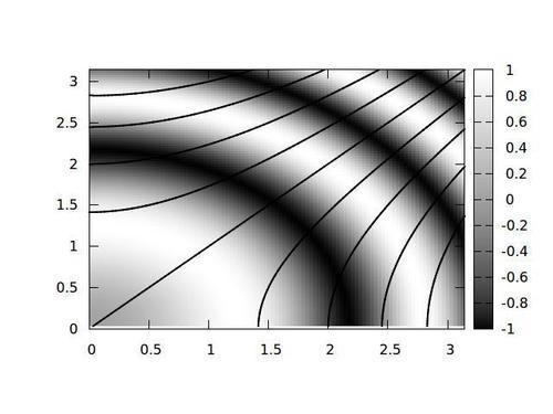
The previous figure shows one way to do this: plot contours and an image map together.
Feed this code to gnuplot to get the previous figure:
set xrange [0:pi]
set yrange [0:pi]
set iso 100
set samp 100
set cntrparam levels 10
unset key
unset surface
set view map
set contour base
set pm3d at b
splot '++' using 1:2:($1**2-$2**2):(sin($1**2+$2**2))
with lines lw 2
We set everything up as in the previous contour plot example, but we also put in a set pm3d at base, so we are asking for both a contour plot and a colored surface plot. How do we make the surface, which will appear as an image plot here, and the contours to represent distinct sets of data? The splot command, when plotting data from a file or the "++" pseudofile, can take an optional fourth column. When this is present, it will be used to color the surface, which itself, as before, will be defined by the third column. This can be used to draw a surface in 3D perspective view, which is colored to represent some related quantity, rather than to redundantly indicate its height. Or, as here, it can be used to draw contours over a "surface" that is rendered as an image map. The function for the contours is given in the third column, which, using coordinate variables rather than the columns' index's, is x**2 - y**2, and the fourth column defines the image map: sin(x**2 + y**2).