
Color Myths, Theory, and Management
Ask an Expert About Color
When it comes to explaining color theory and management, I look to the experts. I grasp color theory but not well enough to articulate it in a way that is convincing to me or anyone reading this. I defer to my friend and esteemed and knowledgeable colleague Steve Laskevitch (https://rockynook.com/author-info/stephen-laskevitch-375/). He is more adept and experienced than I am on this topic. He has written several books on Photoshop, Lightroom, and InDesign, and he clearly knows what he is talking about and articulates his knowledge very well.
The next section on Color Myths, Theory, and Management is all in Steve’s words. Thank you Steve for this.
Grasping at Light
Color is what happens in the brain when light of various wavelengths passes through the lenses of our eyes and hits our retinas. There, cells called cones pass signals via the optic nerve to our brain’s imaging center, where we perceive color. Those cone cells in your retina come in three varieties: sensitive to red, green, or blue (RGB). We are essentially RGB devices.
Despite colors being about perception, we’ve tried for centuries to come up with ways to precisely define colors numerically. The most successful process, or model, used in today’s color-savvy software is called CIELAB.
CIELAB (or just “Lab”) is the color model at work in the best software. Although built from studies of real humans, most humans don’t find Lab intuitive to work with—it is, after all, a mathematical model. But I think many of us can overlook that unintuitiveness in light of the most useful aspect of Lab: it is device independent, meaning it doesn’t refer to a specific computer monitor, printer, or any other device. Its numbers refer to perceived color. In a very real way, since it represents our perception, its numbers really mean something. Since computers are good at crunching numbers and wielding mathematical models, Lab space is a way for our software to refer to a specific real color. It also makes it possible to translate colors between the other models we use to describe color.
But what is meant by the word “space” in the phrase “color space”? There’s an easy way to visualize this idea. You’re probably in a “space” right now—a room, a train car, a bus. Pick a spot on the floor. If you’re seated, your head is bobbing maybe a meter and a half above that floor. Let’s call that height z. Your head is also some meters (or inches if you like) left or right of the spot you chose (x), and yet another distance forward or backward from that spot (y). You can locate any point in your space with those three coordinates, which represents the distances from your starting point.

Coordinates in color spaces are measured from a point in the middle of the floor: the blackest black we can see. We measure Luminance (L) straight up from there to a value of 100 for the whitest white we can see. That axis is easy; it’s just light and dark. One of the other two directions runs from reddish to green (the a axis), and the other from yellow to blue (the b axis). The a and b axes are divided into 256 increments. To find the orange color of an item, like a leaf, we start in the center of the floor and move along the b axis for 39 units. We then turn right (in the a direction) for 43 units. Finally, we go up to a Luminance of 60. Just going up and down the L axis, we’d see only grayscale. If we went further out along the a or b axes, we’d find increasingly intense, saturated colors. By specifying a point in this space, we can refer to any perceived color.
Most of us don’t have to deal directly with Lab space often, but we should know that our best software partners, like Photoshop and InDesign, use it to get us what we want. To help them help us, we need to know the challenges of using the supposedly user-friendlier (but often misunderstood) color models: RGB and CMYK.
Devices and Their Disappointing Limitations
When we view an image on our monitor, it often looks different than what we photographed. The sky is never quite as blue and, luckily, the sun in a photo doesn’t blind us. When we print that photo, we face more disappointments; blues may get even more muted and the whitest white is the color of the paper. The colors in nature are often beyond the gamut of a printer. It’s often thought that RGB devices (like monitors) always show more colors than prints, but that’s not necessarily true. A good printer can produce some colors (perhaps yellows and teals) that an average monitor cannot. We say those colors are outside of the monitor’s gamut.
Color geeks often use special software to compare devices by the size (and shape) of the devices’ color spaces. So when we say that the Epson 4900 printer has a larger gamut or color space than, say, its cousin the 3880, we mean that it can produce more vibrant colors. That is, it produces colors farther out along the a and b axes in Lab space. Two monitors may both be using 255R 255G 255B to represent white, but one will be brighter than another. This is just like when I turn up the volume of my stereo to 11 and two different loudspeakers produce different volumes from that same signal.
To get identical results from my devices, I may have to dim my brighter monitor, or send different color numbers to the more vibrant printer to match a less vibrant one. As you can imagine, this could make it difficult to produce images or documents for different media.
So What Should I Do?
The old advice when preparing documents was to always and only use RGB for onscreen viewing (for websites, presentations, etc.), and to always and only use CMYK for print. But the puzzle is deciding which numbers to use to achieve a specific color. We crossed our fingers or hoped that someone else would make it work.
Consider the case of making a swatch to best represent the orange of a leaf. To accurately see that color on a computer’s display, the numbers might be 223R 110G 78B. In fact, that would get me pretty close on most average displays. But on a high-end display with a larger color space (one that produces a wider range of colors), the numbers might be 209R 87G 60B. Since each device requires its own values, there’s never one, perfect answer.
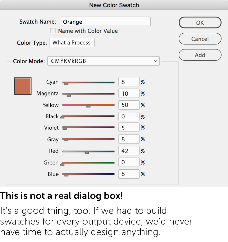
The print case is worse. For a press job on good paper, the numbers for that orange could be 9C 67M 70Y 0K. On newsprint (typically a cool-gray paper), we might need 8C 61M 77Y 0K. A different manufacturer’s inks may require both of those to change. Different paper stock? Start again. And what happens to the “use CMYK for print” rule if I use a modern inkjet printer with perhaps ten or more different inks that could include red, green, blue, violet, or even orange itself? Can you even imagine the dialog box you’d have to navigate for this situation?
Fortunately, you’ll never see a fictitious dialog box like that. But honestly, for a color like this, do you really care what the numbers need to be? You should care only that the output looks right—that is, it maps to the right point in the Lab color space. We don’t have to worry about colors’ numbers at final output because Adobe software uses a cool technology to make sure they’re the right numbers: color profiles.
Profiles
Long ago, in the dark years of the 1980s and 1990s, we had to manually tune the numbers for each output device, or we paid someone to do it for us. But now, software uses data files called color profiles to help compensate for the quirks of our monitors and output devices.

A profile describes a device’s color space. In fact, some people use the phrases “color profile” and “color space” interchangeably. The profile captures information about the darkest black, the whitest white, the most saturated versions of each hue, and more. Most importantly, a profile lets us map a perceived color to the RGB or CMYK numbers needed for that specific device. While we work in our documents, the software itself uses a profile for its working color space. That is, our software is treated as yet another device in our workflow. Since it’s software, and therefore a virtual device, we can choose the color space it uses—and that color space has a profile to describe it. Photo-editing programs like Photoshop take note of a camera’s profile and convert that to Photoshop’s color space, and then when we print, the numbers get converted to the printer’s profile. The colors are assigned numbers that best represent them at each stage of the process, for each device. Software does the math with the numbers provided by profiles.
The Flexibility of RGB
As always, my main concern is that all colors’ appearances are maintained correctly through output (if physics allows it). I may want to borrow a color from an image for other graphic elements so they all match each other. Since all my Adobe software typically uses the same working space, that orange in the example of the leaf, can be represented by 223R 110G 78B in Photoshop, InDesign, and Illustrator.

Imagine we’ve created an InDesign document with an RGB color swatch with those values. In that publication, we’ve placed photos from Photoshop and graphics from Illustrator, which also use the same values (you can see this in the example above).
When the job is done and we make a PDF for the public, what form will it take? If it’s to be consumed onscreen only, then I’d choose a specific RGB for the PDF’s Destination (details to follow). If I’m sending the PDF to a print shop, I’d ask them what they’d like. If they request CMYK, I’d then ask them which press profile they prefer, and I’ll use that as the PDF’s destination. In either case, the color numbers used by the photo and graphic elements in my layout will change, but they will continue to match each other. For a press PDF (using GRACoL, for example), that orange would become 9C 67M 70Y 0K. Since the orange we started with is within the gamut of the destination color space, it will be maintained with high fidelity.

But what do I mean by destination, and where do we specify it?
When saving a document as a PDF from Illustrator, we are given many options (see the Output chapter of this compendium for more). In the Output options, we choose whether and how colors are converted from their current color space. We also choose the destination profile and whether or not that profile will be included in the PDF. The destination will usually be sRGB for those PDFs viewed onscreen, or the CMYK profile that your print vendor desires.
Notice that for Color Conversion, I chose Convert to Destination (Preserve Numbers). There’s a lot implied by that short phrase. It means that if I choose an RGB profile for my destination, all my RGB numbers and any CMYK numbers will change to yield the correct perceived colors for the new RGB profile. If I choose a CMYK destination, all my RGB numbers will be converted to that destination, but any native Illustrator content that uses CMYK builds will keep those numbers, even though they’ll look different on the destination device. That’s helpful for those few CMYK builds that must not change (like pure black for text).

The Useful Rigidity of CMYK
A clear example of where the CMYK build matters more than the visual appearance is the text you’re reading right now. I want it to print as pure black and nothing but black, no matter which press or paper I use. On newsprint, it’ll look more gray than black. On a good paper, it’ll look darker. On either, it’ll be sharp, because with just one ink there’s no chance of misalignment. Illustrator’s default (black) swatch is perfect for this: a CMYK build of 0 0 0 100K. With the Preserve Numbers option, it’ll always be black ink only.
That very special build is more important to me than its final visual appearance. I know that if pure black got converted from one CMYK color space to another, it might become 74C 70M 64Y 77K—a 4-color black! If there’s any misregistration in printing, delicate text could become fringed with color, making this conversion a disaster for legibility.
Our example orange is different. As long as I don’t apply it to small, delicate text, I don’t care what numbers are used to render it. That’s why, for this color and most all others, I define InDesign color swatches as RGB. If it’s a color I sampled from an RGB photo, using an RGB swatch is easier, too.
If you find that you harbor an inner color geek, you can even use a Lab swatch in Illustrator! If you use Pantone spot colors, you’ll notice they’re defined with Lab as well, since they’re aspiring to a specific perceived color.
Illustrator is color-mulitlingual: it speaks RGB, CMYK, and Lab, and converts between and among them. It can use elements in any of those modes at the same time and output to the one you choose. Since elements of any color mode may end up in an Illustrator file, this is a necessary luxury.
Final Advice
In a nutshell, use RGB for onscreen and print documents, and use CMYK swatches for those few kinds of things whose ink-use is more important than color appearance.