
Putting Blazor Server in Context
Question | Answer |
|---|---|
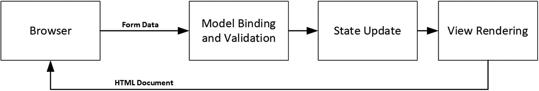
What is it? | Blazor Server uses JavaScript to receive browser events, which are forwarded to ASP.NET Core and evaluated using C# code. The effect of the event on the state of the application is sent back to the browser and displayed to the user. |
Why is it useful? | Blazor Server can produce a richer and more responsive user experience compared to standard web applications. |
How is it used? | The building block for Blazor Server is the Razor Component, which uses a syntax similar to Razor Pages. The view section of the Razor Component contains special attributes that specify how the application will respond to user interaction. |
Are there any pitfalls or limitations? | Blazor Server relies on a persistent HTTP connection to the server and cannot function when that connection is interrupted. Blazor Server is not supported by older browsers. |
Are there any alternatives? | The features described in Part 3 of this book can be used to create web applications that work broadly but that offer a less responsive experience. You could also consider a client-side JavaScript framework, such as Angular, React, or Vue.js. |
Chapter Summary
Problem | Solution | Listing |
|---|---|---|
Configuring Blazor | Use the AddServerSideBlazor and MapBlazorHub methods to set up the required services and middleware and configure the JavaScript file | 3–6 |
Creating a Blazor Component | Create a .blazor file and use it to define code and markup | 7 |
Applying a component | Use a component element | 8, 9 |
Handling events | Use an attribute to specify the method or expression that will handle an event | 10–15 |
Creating a two-way relationship with an element | Create a data binding | 16–20 |
Defining the code separately from the markup | Use a code-behind class | 21–23 |
Defining a component without declarative markup | Use a Razor Component class | 24, 25 |
Preparing for This Chapter
This chapter uses the Advanced project from Chapter 32. No changes are required to prepare for this chapter.
You can download the example project for this chapter—and for all the other chapters in this book—from https://github.com/apress/pro-asp.net-core-3. See Chapter 1 for how to get help if you have problems running the examples.
Dropping the Database
Running the Example Application

Running the example application
Understanding Blazor Server
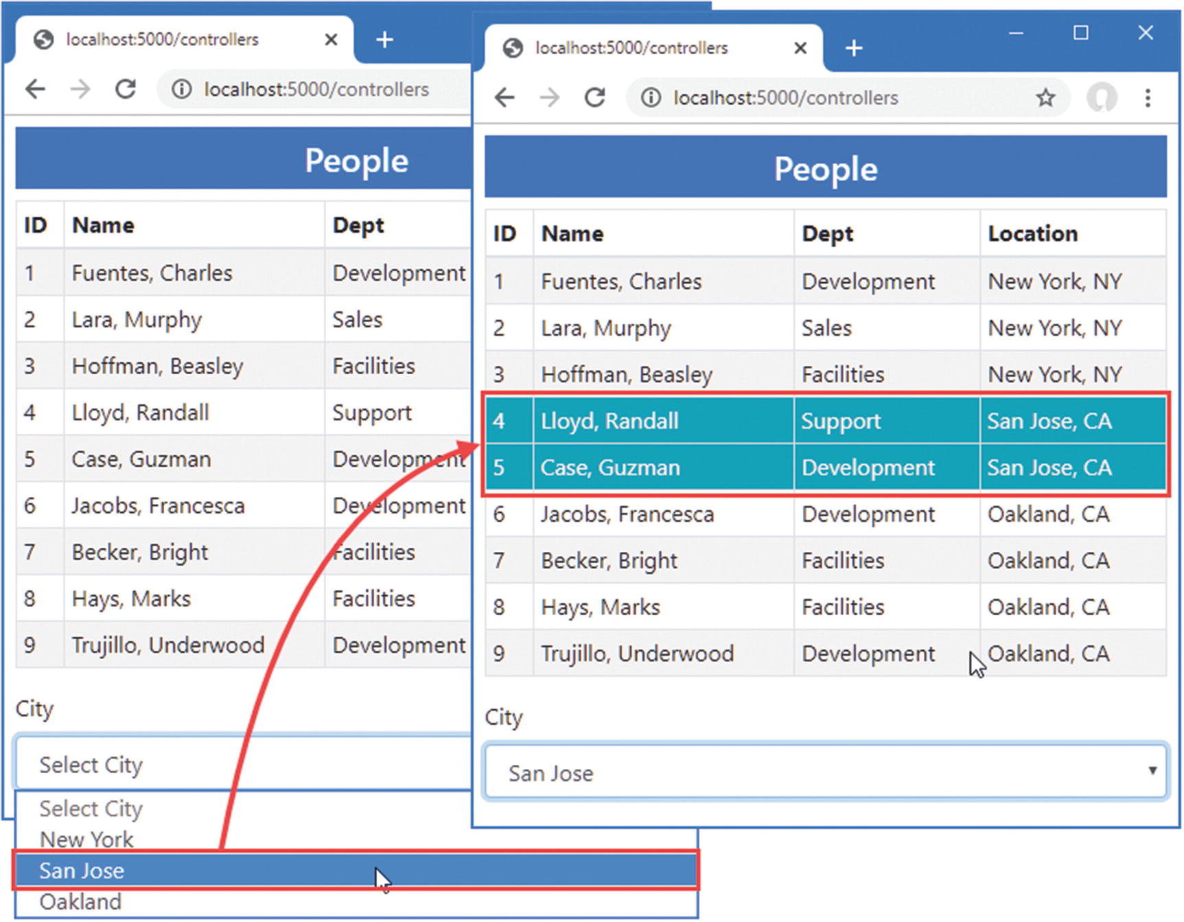
Interacting with the example application
This cycle is effective but can be inefficient. Each time the Submit button is clicked, the browser sends a new HTTP request to ASP.NET Core. Each request contains a complete set of HTTP headers that describe the request and the types of responses the browser is willing to receive. In its response, the server includes HTTP headers that describe the response and includes a complete HTML document for the browser to display.
The amount of data sent by the example application is about 3KB on my system, and almost all of it is duplicated between requests. The browser only wants to tell the server which city has been selected, and the server only wants to indicate which table rows should be highlighted; however, each HTTP request is self-contained, so the browser must parse a complete HTML document each time. The root issue that every interaction is the same: send a request and get a complete HTML document in return.

Interacting with Blazor
The persistent HTTP connection minimizes the delay, and replying with just the differences reduces the amount of data sent between the browser and the server.
Understanding the Blazor Server Advantages
The biggest attraction of Blazor is that it is based on Razor Pages written in C#. This means you can increase efficiency and responsiveness without having to learn a new framework, such as Angular or React, and a new language, such as TypeScript or JavaScript. Blazor is nicely integrated into the rest of ASP.NET Core and is built on features described in earlier chapters, which makes it easy to use (especially when compared to a framework like Angular, which has a dizzyingly steep learning curve).
Understanding the Blazor Server Disadvantages
Blazor requires a modern browser to establish and maintain its persistent HTTP connection. And, because of this connection, applications that use Blazor stop working if the connection is lost, which makes them unsuitable for offline use, where connectivity cannot be relied on or where connections are slow. These issues are addressed by Blazor WebAssembly, described in Chapter 36, but, as I explain, this has its own set of limitations.
Choosing Between Blazor Server and Angular/React/Vue.js
Decisions between Blazor and one of the JavaScript frameworks should be driven by the development team’s experience and the users’ expected connectivity. If you have no JavaScript expertise and have not used one of the JavaScript frameworks, then you should use Blazor, but only if you can rely on good connectivity and modern browsers. This makes Blazor a good choice for line-of-business applications, for example, where the browser demographic and network quality can be determined in advance.
If you have JavaScript experience and you are writing a public-facing application, then you should use one of the JavaScript frameworks because you won’t be able to make assumptions about browsers or network quality. (It doesn’t matter which framework you choose—I have written books about Angular, React, and View, and they are all excellent. My advice for choosing a framework is to create a simple app in each of them and pick the one whose development model appeals to you the most.)
If you are writing a public-facing application and you don’t have JavaScript experience, then you have two choices. The safest option is to stick to the ASP.NET Core features described in earlier chapters and accept the inefficiencies this can bring. This isn’t a terrible choice to make, and you can still produce top-quality applications. A more demanding choice is to learn TypeScript or JavaScript and one Angular, React, or Vue.js—but don’t underestimate the amount of time it takes to master JavaScript or the complexity of these frameworks.
Getting Started with Blazor
The best way to get started with Blazor is to jump right in. In the sections that follow, I configure the application to enable Blazor and re-create the functionality offered by the controller and Razor Page. After that, I’ll go right back to basics and explain how Razor Components work and the different features they offer.
Configuring ASP.NET Core for Blazor Server
Adding Services and Middleware in the Startup.cs File in the Advanced Folder
The “hub” in the MapBlazorHub method relates to SignalR, which is the part of ASP.NET Core that handles the persistent HTTP request. I don’t describe SignalR in this book because it is rarely used directly, but it can be useful if you need ongoing communication between clients and the server. See https://docs.microsoft.com/en-gb/aspnet/core/signalr for details. For this book—and most ASP.NET Core applications—it is enough to know that SignalR is used to manage the connections that Blazor relies on.
Adding the Blazor JavaScript File to the Layout
Adding Elements in the _Layout.cshtml File in the Views/Shared Folder
Adding Elements in the _Layout.cshtml File in the Pages Folder
Creating the Blazor Imports File
The Contents of the _Imports.razor File in the Advanced Folder
The first five @using expressions are for the namespaces required for Blazor. The last two expressions are for convenience in the examples that follow because they will allow me to use Entity Framework Core and the classes in the Models namespace.
Creating a Razor Component
The Contents of the PeopleList.razor File in the Blazor Folder
This @foreach expression generates option elements for each value in the Cities sequence and is identical to the equivalent expression in the controller view and Razor Page created in Chapter 32.
This Blazor attribute creates a data binding between the value of the select element and the SelectedCity property defined in the @code section.
I describe data bindings in more detail in the “Working with Data Bindings” section, but for now, it is enough to know that the value of the SelectedCity will be updated when the user changes the value of the select element.
Using a Razor Component
Using a Razor Component in the Index.cshtml File in the Views/Home Folder
The RenderMode Values
Name | Description |
|---|---|
Static | The Razor Component renders its view section as static HTML with no client-side support. |
Server | The HTML document is sent to the browser with a placeholder for the component. The HTML displayed by the component is sent to the browser over the persistent HTTP connection and displayed to the user. |
ServerPrerendered | The view section of the component is included in the HTML and displayed to the user immediately. The HTML content is sent again over the persistent HTTP connection. |
For most applications, the Server option is a good choice. The ServerPrerendered includes a static rendition of the Razor Component’s view section in the HTML document sent to the browser. This acts as placeholder content so that the user isn’t presented with an empty browser window while the JavaScript code is loaded and executed. Once the persistent HTTP connection has been established, the placeholder content is deleted and replaced with a dynamic version sent by Blazor. The idea of showing static content to the user is a good one, but it can be confusing because the HTML elements are not wired up to the server-side part of the application, and any interaction from the user either doesn’t work or will be discarded once the live content arrives.
Using a Razor Component
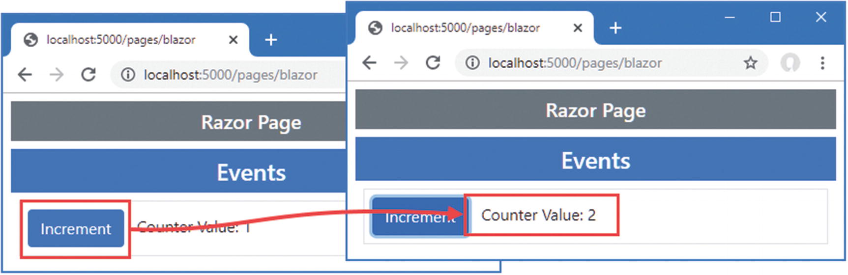
When you use the select element, the value you choose is sent over the persistent HTTP connection to the ASP.NET Core server, which updates the Razor Component’s SelectedCity property and rerenders the HTML content. A set of updates is sent to the JavaScript code, which updates the table.
The Contents of the Blazor.cshtml File in the Pages Folder

Demonstrating that only changes are used
When you stop ASP.NET Core, you will see an error message in the browser window, which indicates the connection to the server has been lost and prevents the user from interacting with the displayed component. Blazor will attempt to reconnect and pick up where it left off when the disconnection is caused by temporary network issues, but it won’t be able to do so when the server has been stopped or restarted because the context data for the connection has been lost; you will have to explicitly request a new URL.
There is a default reload link in the connection message, but that goes to the default URL for the website, which isn’t useful for this book where I direct you to specific URLs to see the effect of examples. See Chapter 34 for details of how to configure the connection messages.
Understanding the Basic Razor Component Features
Now that I have demonstrated how Blazor can be used and how it works, it is time to go back to the basics and introduce the features that Razor Components offer. Although the example in the previous section showed how standard ASP.NET Core features can be reproduced using Blazor, there is a much wider set of features available.
Understanding Blazor Events and Data Bindings
The Contents of the Events.razor File in the Blazor Folder
The value assigned to the attribute is the name of the method that will be invoked when the event is triggered. The method can define an optional parameter that is either an instance of the EventArgs class or a class derived from EventArgs that provides additional information about the event.
The EventArgs Classes and the Events They Represent
Class | Events |
|---|---|
ChangeEventArgs | onchange, oninput |
ClipboardEventArgs | oncopy, oncut, onpaste |
DragEventArgs | ondrag, ondragend, ondragenter, ondragleave, ondragover, ondragstart, ondrop |
ErrorEventArgs | onerror |
FocusEventArgs | onblur, onfocus, onfocusin, onfocusout |
KeyboardEventArgs | onkeydown, onkeypress, onkeyup |
MouseEventArgs | onclick, oncontextmenu, ondblclick, onmousedown, onmousemove, onmouseout, onmouseover, onmouseup, onmousewheel, onwheel |
PointerEventArgs | ongotpointercapture, onlostpointercapture, onpointercancel, onpointerdown, onpointerenter, onpointerleave, onpointermove, onpointerout, onpointerover, onpointerup |
ProgressEventArgs | onabort, onload, onloadend, onloadstart, onprogress, ontimeout |
TouchEventArgs | ontouchcancel, ontouchend, ontouchenter, ontouchleave, ontouchmove, ontouchstart |
EventArgs | onactivate, onbeforeactivate, onbeforecopy, onbeforecut, onbeforedeactivate, onbeforepaste, oncanplay, oncanplaythrough, oncuechange, ondeactivate, ondurationchange, onemptied, onended, onfullscreenchange, onfullscreenerror, oninvalid, onloadeddata, onloadedmetadata, onpause, onplay, onplaying, onpointerlockchange, onpointerlockerror, onratechange, onreadystatechange, onreset, onscroll, onseeked, onseeking, onselect, onselectionchange, onselectstart, onstalled, onstop, onsubmit, onsuspend, ontimeupdate, onvolumechange, onwaiting |
The Blazor JavaScript code receives the event when it is triggered and forwards it to the server over the persistent HTTP connection. The handler method is invoked, and the state of the component is updated. Any changes to the content produced by the component’s view section will be sent back to the JavaScript code, which will update the content displayed by the browser.
Using a New Component in the Blazor.cshtml File in the Pages Folder
Handling an event
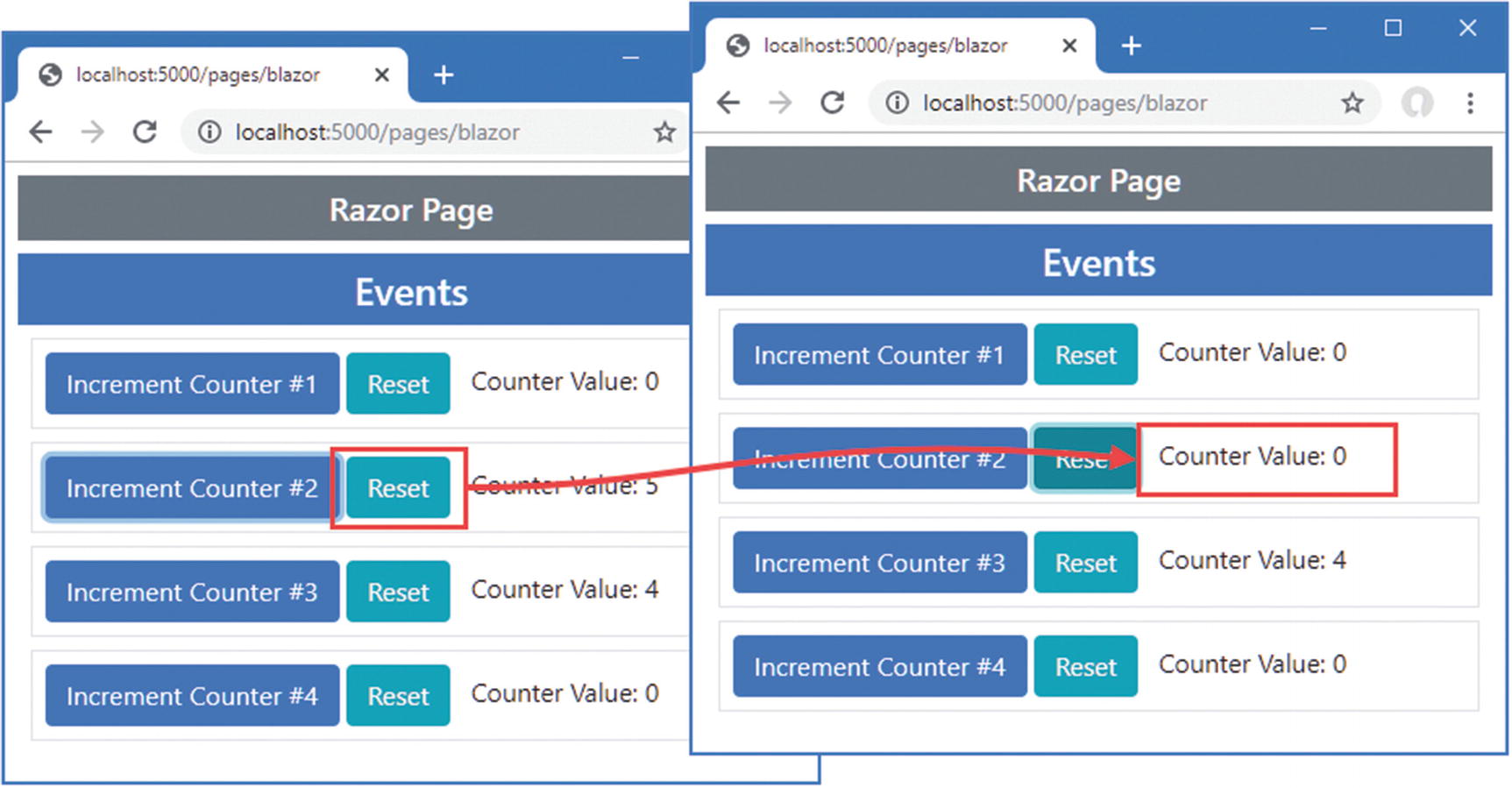
Handling Events from Multiple Elements
Handling Events in the Events.razor File in the Blazor Folder
This technique can also be used when elements are generated programmatically, as shown in Listing 33-13. In this example, I use an @for expression to generate elements and use the loop variable as the argument to the handler method. I have also removed the EventArgs parameter from the handler method, which isn’t being used.
You will quickly become used to these rules as you start to work with Blazor, even if they seem inconsistent at first.
Generating Elements in the Events.razor File in the Blazor Folder

Handling events from multiple elements
Processing Events Without a Handler Method
Handling Events in the Events.razor File in the Blazor Folder
Handling events in a lambda expression
Preventing Default Events and Event Propagation
The Event Configuration Parameters
Name | Description |
|---|---|
@on{event}:preventDefault | This parameter determines whether the default event for an element is triggered. |
@on{event}:stopPropagation | This parameter determines whether an event is propagated to its ancestor elements. |
Overriding Event Defaults in the Events.razor File in the Blazor Folder
This example creates two situations in which the default behavior of events in the browser can cause problems. The first is caused by adding a form element. By default, button elements contained in a form will submit that form when they are clicked, even when the @onclick attribute is present. This means that whenever one of the Increment Counter buttons is clicked, the browser will send the form data to the ASP.NET Core server, which will respond with the contents of the Blazor.cshtml Razor Page.
Events go through a well-defined lifecycle in the browser, which includes being passed up the chain of ancestor elements. In the example, this means clicking the button will cause two counters to be updated, once by the @onclick handler for the button element and once by the @onclick handler for the enclosing div element.
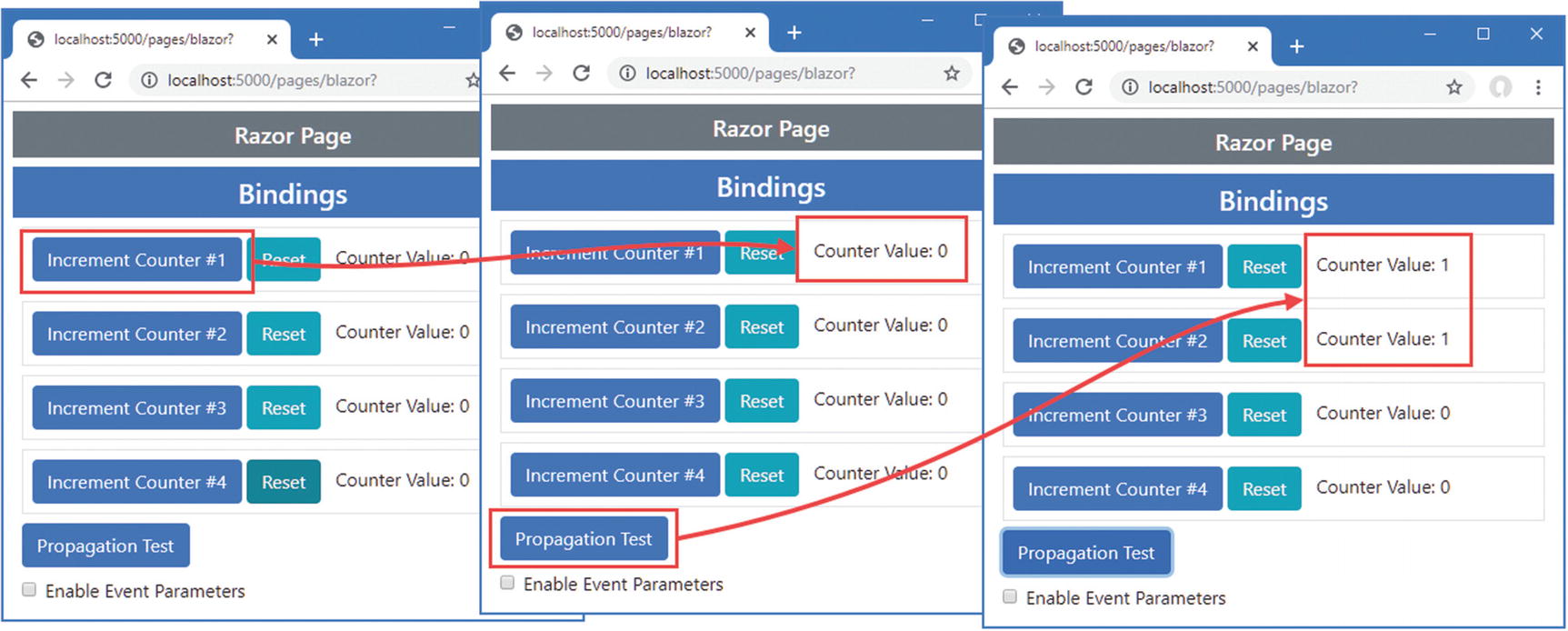
Problems caused by the default behavior of events in the browser

Overriding the default behavior of events in the browser
Working with Data Bindings
The Contents of the Bindings.razor File in the Blazor Folder
The @onchange attribute registers the UpdateCity method as a handler for the change event from the input element. The events are described using the ChangeEventArgs class, which provides a Value property. Each time a change event is received, the City property is updated with the contents of the input element.
Using a Razor Component in the Blazor.cshtml File in the Pages Folder

Creating a two-way relationship between an element and a property
Using a Data Binding in the Bindings.razor File in the Blazor Folder
The @bind attribute is used to specify the property that will be updated when the change event is triggered and that will update the value attribute when it changes. The effect in Listing 33-18 is the same as Listing 33-16 but expressed more concisely and without the need for a handler method or a lambda function to update the property.
Changing the Binding Event
The Binding Attributes for Specifying an Event
Attribute | Description |
|---|---|
@bind-value | This attribute is used to select the property for the data binding. |
@bind-value:event | This attribute is used to select the event for the data binding. |
Specifying an Event for a Binding in the Bindings.razor File in the Blazor Folder

Changing the event in a data binding
Creating DateTime Bindings
The DateTime Parameters
Name | Description |
|---|---|
@bind:culture | This attribute is used to select a CultureInfo object that will be used to format the DateTime value. |
@bind:format | This attribute is used to specify a data formatting string that will be used to format the DateTime value. |
If you have used the @bind-value and @bind-value:event attributes to select an event, then you must use the @bind-value:culture and @bind-value:format parameters instead.
Listing 33-20 shows the use of these attributes with a DateTime property.
The formatting strings used in these examples are described at https://docs.microsoft.com/en-us/dotnet/api/system.datetime?view=netcore-3.1.
Using a DateTime Property in the Bindings.razor File in the Blazor Folder
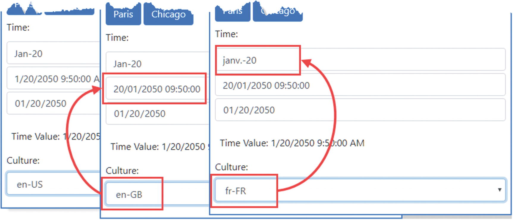
Formatting DateTime values
The initial locale in this example is en-US. When you switch to en-GB, the order in which the month and date appear changes. When you switch to en-FR, the abbreviated month name changes.
You should not specify a culture or a format string when setting the type attribute to date, datetime-local, month, or time, because Blazor will automatically format date values into a culture-neutral format that the browser translates into the user’s locale. Figure 33-11 shows how the date is formatted in the en-US locale but the user will see the date expressed in their local convention.
Using Class Files to Define Components
If you don’t like the mix of code and markup that Razor Components support, you can use C# class files to define part, or all, of the component.
Using a Code-Behind Class
The @code section of a Razor Component can be defined in a separate class file, known as a code-behind class or code-behind file. Code-behind classes for Razor Components are defined as partial classes with the same name as the component they provide code for.
The Contents of the Split.razor File in the Blazor Folder
The Contents of the Split.razor.cs File in the Blazor Folder
Applying a New Component in the Blazor.cshtml File in the Pages Folder
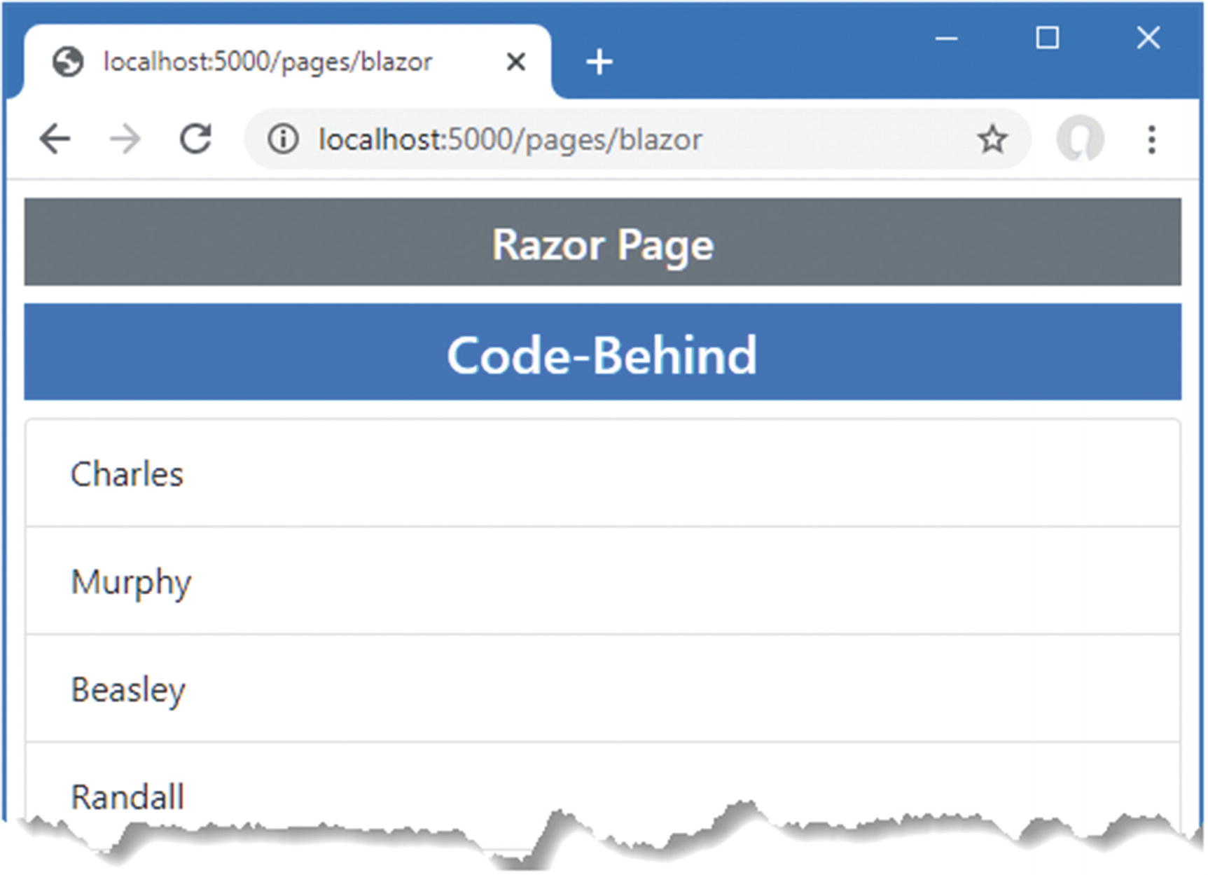
Using a code-behind class to define a Razor Component
Defining a Razor Component Class
The Contents of the CodeOnly.cs File in the Blazor Folder
Applying a New Component in the Blazor.cshtml File in the Pages Folder
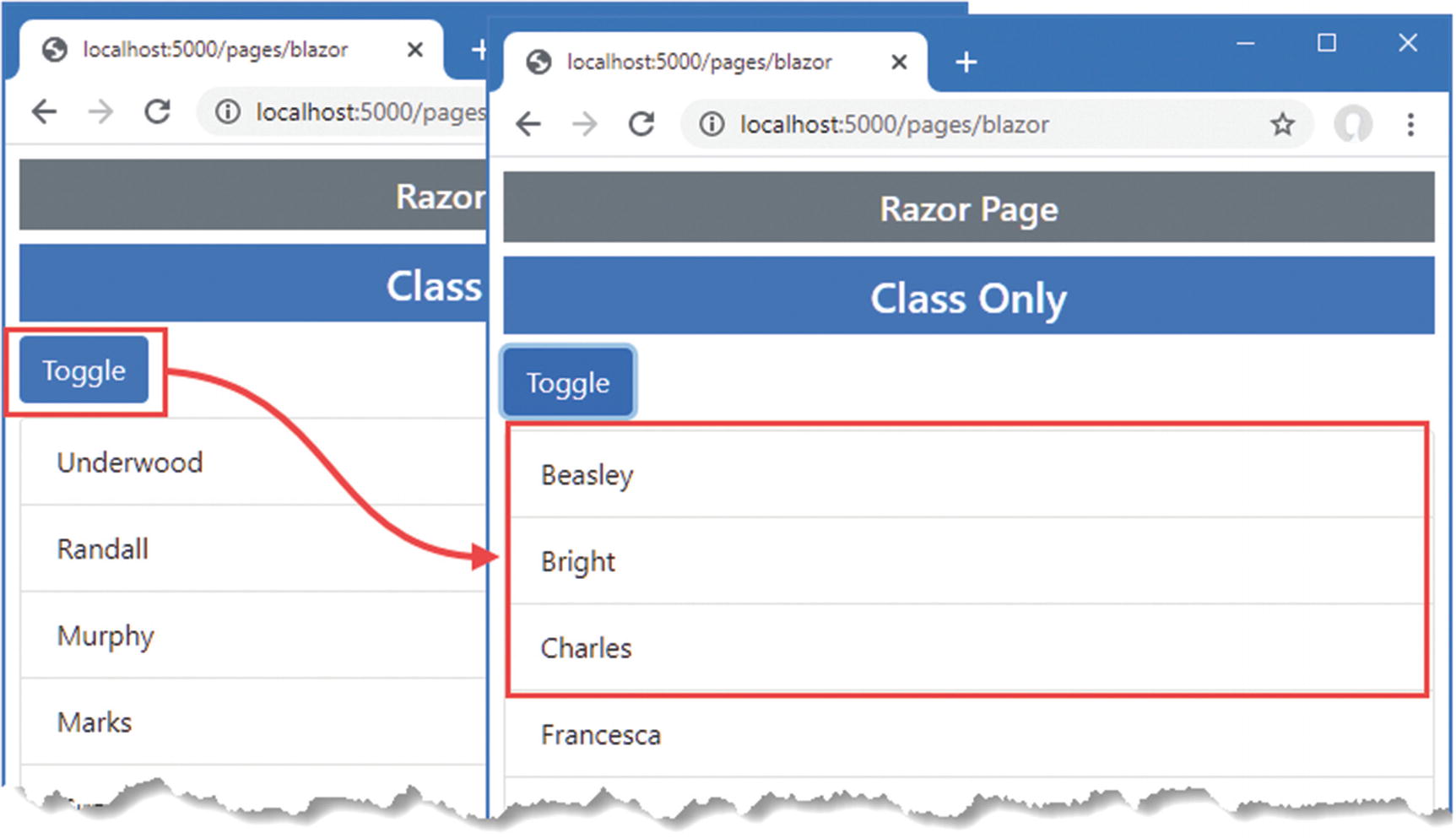
Defining a component entirely in code
Summary
In this chapter, I introduced Blazor Server, explained the problem it solves, and described the advantages and disadvantages it presents. I showed you how to configure an ASP.NET Core application to enable Blazor Server and showed you the basic features that are available when using Razor Components, which are the Blazor building blocks. In the next chapter, I continue to describe the features provided by Blazor.