In this chapter, I continue to describe Blazor Server, focusing on the way that Razor Components can be used together to create more complex features. Table 34-1 summarizes the chapter.
Table 34-1.
Chapter Summary
Problem
Solution
Listing
Creating complex features using Blazor
Combine components to reduce duplication
3, 4
Configuring a component
Use the Parameter attribute to receive a value from an attribute
5–10
Defining custom events and bindings
Use EventCallbacks to receive the handler for the event and follow the convention to create bindings
11–14
Displaying child content in a component
Use a RenderFragment named ChildContent
15, 16
Creating templates
Use named RenderFragment properties
17, 25
Distributing configuration settings widely
Use a cascading parameter
26, 27
Responding to connection errors
Use the connection element and classes
28, 29
Responding to unhandled errors
Use the error element and classes
30, 31
Preparing for This Chapter
This chapter uses the Advanced project from Chapter 33. No changes are required to prepare for this chapter.
Tip
You can download the example project for this chapter—and for all the other chapters in this book—from https://github.com/apress/pro-asp.net-core-3. See Chapter 1 for how to get help if you have problems running the examples.
Open a new PowerShell command prompt, navigate to the folder that contains the Advanced.csproj file, and run the command shown in Listing 34-1 to drop the database.
dotnet ef database drop --force
Listing 34-1.
Dropping the Database
Select Start Without Debugging or Run Without Debugging from the Debug menu or use the PowerShell command prompt to run the command shown in Listing 34-2.
dotnet run
Listing 34-2.
Running the Example Application
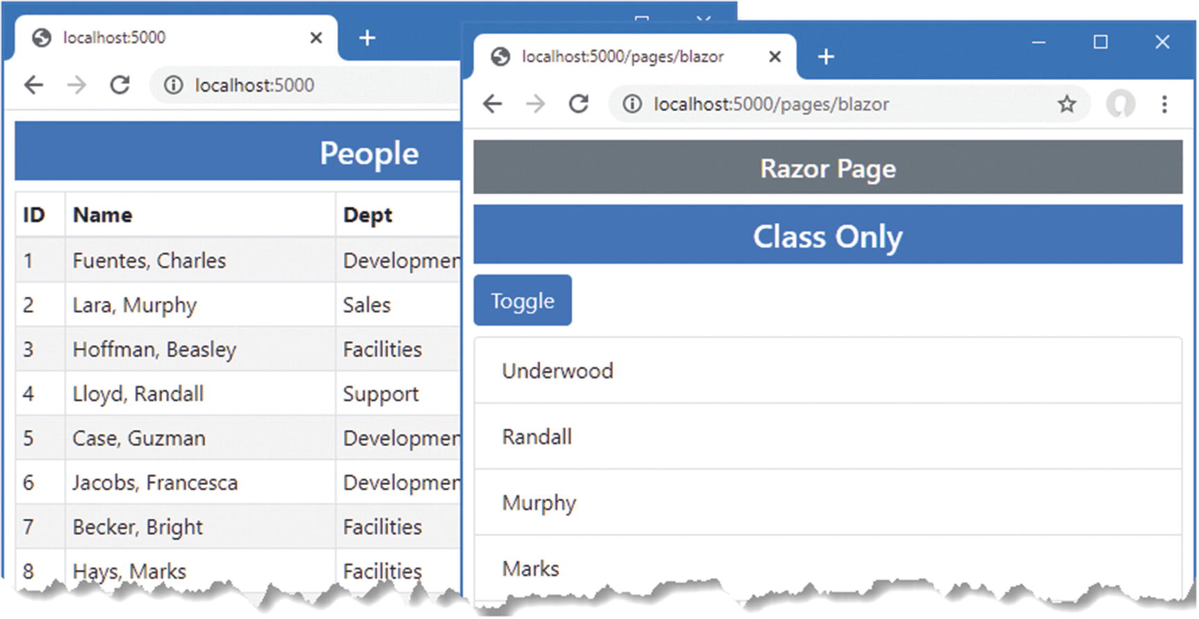
Use a browser to request http://localhost:5000/controllers, which will display a list of data items. Request http://localhost:5000/pages/blazor, and you will see the component from Chapter 33 I used to demonstrate data bindings. Figure 34-1 shows both responses.
Figure 34-1.
Running the example application
Combining Components
Blazor components can be combined to create more complex features. In the sections that follow, I show you how multiple components can be used together and how components can communicate. To get started, add a Razor Component named SelectFilter.razor to the Blazor folder with the content shown in Listing 34-3.
public IEnumerable<string> Values { get; set; } = Enumerable.Empty<string>();
public string SelectedValue { get; set; }
public string Title { get; set; } = "Placeholder";
}
Listing 34-3.
The Contents of the SelectFilter.razor File in the Blazor Folder
The component renders a select element that will allow the user to choose a city. In Listing 34-4, I have applied the SelectFilter component, replacing the existing select element.
public IEnumerable<string> Cities => Context.Locations.Select(l => l.City);
public string SelectedCity { get; set; }
public string GetClass(string city) =>
SelectedCity == city ? "bg-info text-white" : "";
}
Listing 34-4.
Applying a Component in the PeopleList.razor File in the Blazor Folder
When a component is added to the content rendered by a controller view or Razor Page, the component element is used, as shown in Chapter 33. When a component is added to the content rendered by another component, then the name of the component is used as an element instead. In this case, I am adding the SelectFilter component to the content rendered by the PeopleList component, which I do with a SelectFilter element. It is important to pay close attention to the capitalization, which must match exactly.
When combining components, the effect is that one component delegates responsibility for part of its layout to another. In this case, I have removed the select element that the PeopleList component used to present the user with a choice of cities and replaced it with the SelectFilter component, which will provide the same feature. The components form a parent/child relationship; the PeopleList component is the parent, and the SelectFilter component is the child.
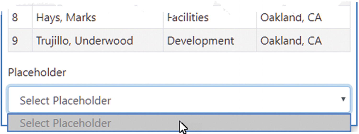
Additional work is required before everything is properly integrated, but you can see that adding the SelectFilter element displays the SelectFilter component by restarting ASP.NET Core and requesting http://localhost:5000/controllers, which produces the response shown in Figure 34-2.
Figure 34-2.
Adding one component to the content rendered by another
Configuring Components with Attributes
My goal with the SelectList component is to create a general-purpose feature that I can use throughout the application, configuring the values it displays each time it is used. Razor Components are configured using attributes added to the HTML element that applies them. The values assigned to the HTML element attributes are assigned to the component’s C# properties. The Parameter attribute is applied to the C# properties that a component allows to be configured, as shown in Listing 34-5.
public IEnumerable<string> Values { get; set; } = Enumerable.Empty<string>();
public string SelectedValue { get; set; }
[Parameter]
public string Title { get; set; } = "Placeholder";
}
Listing 34-5.
Declaring Configurable Properties in the SelectFilter.razor File in the Blazor Folder
Components can be selective about the properties they allow to be configured. In this case, the Parameter attribute has been applied to two of the properties defined by the SelectFilter component. In Listing 34-6, I have modified the element the PeopleList component uses to apply the SelectFilter component to add configuration attributes.
public IEnumerable<string> Cities => Context.Locations.Select(l => l.City);
public string SelectedCity { get; set; }
public string GetClass(string city) =>
SelectedCity == city ? "bg-info text-white" : "";
}
Listing 34-6.
Configuring a Component in the PeopleList.razor File in the Blazor Folder
For each property that should be configured, an attribute of the same name is added to the parent’s HTML element. The attribute values can be fixed values, such as the City string assigned to the title attribute, or Razor expressions, such as @Cities, which assigns the sequence of objects from the Cities property to the values attribute.
Setting and Receiving Bulk Configuration Settings
Defining individual properties to receive values can be error-prone if there are many configuration settings, especially if those values are being received by a component so they can be passed on, either to a child component or to a regular HTML element. In these situations, a single property can be designated to receive any attribute values that have not been matched by other properties, which can then be applied as a set, as shown in Listing 34-7.
public IEnumerable<string> Values { get; set; } = Enumerable.Empty<string>();
public string SelectedValue { get; set; }
[Parameter]
public string Title { get; set; } = "Placeholder";
[Parameter(CaptureUnmatchedValues = true)]
public Dictionary<string, object> Attrs { get; set; }
}
Listing 34-7.
Receiving Bulk Attributes in the SelectFilter.razor File in the Blazor Folder
Setting the Parameter attribute’s CaptureUnmatchedValues argument to true identifies a property as the catchall for attributes that are not otherwise matched. The type of the property must be Dictionary<string, object>, which allows the attribute names and values to be represented.
Properties whose type is Dictionary<string, object> can be applied to elements using the @attribute expression, like this:
This is known as attribute splatting, and it allows a set of attributes to be applied in one go. The effect of the changes in Listing 34-7 means that the SelectFilter component will receive the Values and Title attribute values and that any other attributes will be assigned to the Attrs property and passed on to the select element. Listing 34-8 adds some attributes to demonstrate the effect.
Adding Element Attributes in the PeopleList.razor File in the Blazor Folder
Restart ASP.NET Core and navigate to http://localhost:5000/controllers. The attributes passed on to the select element do not affect appearance, but if you right-click the select element and select Inspect from the popup menu, you will see the attributes added to the SelectFilter element in the PeopleList component have been added to the element rendered by the SelectFilter component, like this:
Configuring a Component in a Controller View or Razor Page
Attributes are also used to configure components when they are applied using the component element. In Listing 34-9, I have added properties to the PeopleList component that specify how many items from the database should be displayed and a string value that will be passed on to the SelectFilter component.
public IEnumerable<Person> People => Context.People.Include(p => p.Department)
.Include(p => p.Location).Take(ItemCount);
public IEnumerable<string> Cities => Context.Locations.Select(l => l.City);
public string SelectedCity { get; set; }
public string GetClass(string city) =>
SelectedCity == city ? "bg-info text-white" : "";
[Parameter]
public int ItemCount { get; set; } = 4;
[Parameter]
public string SelectTitle { get; set; }
}
Listing 34-9.
Adding Configuration Properties in the PeopleList.razor File in the Blazor Folder
Values for the C# properties are provided by adding attributes whose name begins with param-, followed by the property name, to the component element, as shown in Listing 34-10.
Adding Configuration Attributes in the Index.cshtml File in the Views/Home Folder
The param-itemcount attribute provides a value for the ItemCount property, and the param-selecttitle attribute provides a value for the SelectTitle property.
When using the component element, attributes values that can be parsed into numeric or bool values are handled as literal values and not Razor expressions, which is why I am able to specify the value for the ItemCount property as 4. Other values are assumed to be Razor expressions and not literal values, even though they are not prefixed with @. This oddity means that since I want to specify the value for the SelectTitle property as a literal string, I need a Razor expression, like this:
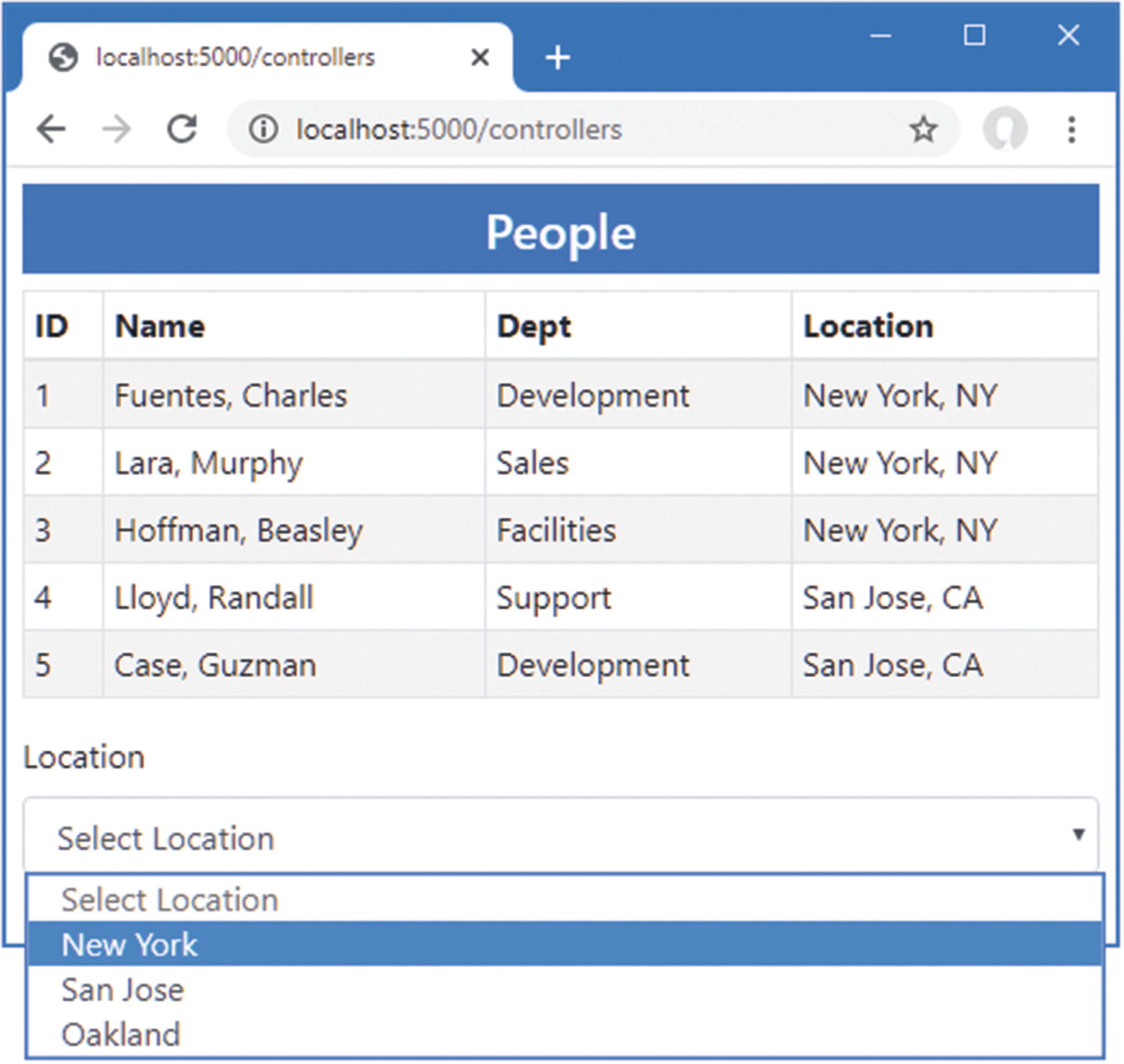
To see the effect of the configuration attributes, restart ASP.NET Core and request http://localhost:5000/controllers, which will produce the response shown in Figure 34-3.
Figure 34-3.
Configuring components with attributes
Creating Custom Events and Bindings
The SelectFilter component receives its data values from its parent component, but it has no way to indicate when the user makes a selection. For this, I need to create a custom event for which the parent component can register a handler method, just as it would for events from regular HTML elements. Listing 34-11 adds a custom event to the SelectFiltercomponent.
public IEnumerable<string> Values { get; set; } = Enumerable.Empty<string>();
public string SelectedValue { get; set; }
[Parameter]
public string Title { get; set; } = "Placeholder";
[Parameter(CaptureUnmatchedValues = true)]
public Dictionary<string, object> Attrs { get; set; }
[Parameter]
public EventCallback<string> CustomEvent { get; set; }
public async Task HandleSelect(ChangeEventArgs e) {
SelectedValue = e.Value as string;
await CustomEvent.InvokeAsync(SelectedValue);
}
}
Listing 34-11.
Creating an Event in the SelectFilter.razor File in the Blazor Folder
The custom event is defined by adding a property whose type is EventCallback<T>. The generic type argument is the type that will be received by the parent’s event handler and is string in this case. I have changed the select element so the @onchange attribute registers the HandleSelect method when the select element triggers its onchange event.
The HandleSelect method updates the SelectedValue property and triggers the custom event by invoking the EventCallback<T>.InvokeAsync method, like this:
...
await CustomEvent.InvokeAsync(SelectedValue);
...
The argument to the InvokeAsync method is used to trigger the event using the value received from the ChangeEventArgs object that was received from the select element. Listing 34-12 changes the PeopleList component so that it receives the custom event emitted by the SelectList component.
public IEnumerable<Person> People => Context.People.Include(p => p.Department)
.Include(p => p.Location).Take(ItemCount);
public IEnumerable<string> Cities => Context.Locations.Select(l => l.City);
public string SelectedCity { get; set; }
public string GetClass(string city) =>
SelectedCity as string == city ? "bg-info text-white" : "";
[Parameter]
public int ItemCount { get; set; } = 4;
[Parameter]
public string SelectTitle { get; set; }
public void HandleCustom(string newValue) {
SelectedCity = newValue;
}
}
Listing 34-12.
Handling an Event in the PeopleList.razor File in the Blazor Folder
To set up the event handler, an attribute is added to the element that applies the child component using the name of its EventCallback<T> property. The value of the attribute is a Razor expression that selects a method that receives a parameter of type T.
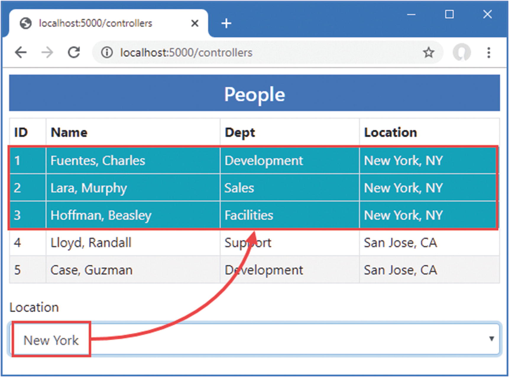
Restart ASP.NET Core, request http://localhost:5000/controllers, and select a value from the list of cities. The custom event completes the relationship between the parent and child components. The parent configures the child through its attributes to specify the title and the list of data values that will be presented to the user. The child component uses a custom event to tell the parent when the user selects a value, allowing the parent to highlight the corresponding rows in its HTML table, as shown in Figure 34-4.
Figure 34-4.
Using a custom event
Creating a Custom Binding
A parent component can create a binding on a child component if it defines a pair of properties, one of which is assigned a data value and the other of which is a custom event. The names of the property are important: the name of the event property must be the same as the data property plus the word Changed. Listing 34-13 updates the SelectFilter component so it presents the properties required for the binding.
Preparing for Custom Binding in the SelectFilter.razor File in the Blazor Folder
Notice that the Parameter attribute must be applied to both the SelectedValue and SelectedValueChanged properties. If either attribute is omitted, the data binding won’t work as expected.
The parent component binds to the child with the @bind-<name> attribute, where <name> corresponds to the property defined by the child component. In this example, the name of the child component’s property is SelectedValue, and the parent can create a binding using @bind-SelectedValue, as shown in Listing 34-14.
public IEnumerable<Person> People => Context.People.Include(p => p.Department)
.Include(p => p.Location).Take(ItemCount);
public IEnumerable<string> Cities => Context.Locations.Select(l => l.City);
public string SelectedCity { get; set; }
public string GetClass(string city) =>
SelectedCity as string == city ? "bg-info text-white" : "";
[Parameter]
public int ItemCount { get; set; } = 4;
[Parameter]
public string SelectTitle { get; set; }
//public void HandleCustom(string newValue) {
// SelectedCity = newValue;
//}
}
Listing 34-14.
Using a Custom Binding in the PeopleList.razor File in the Blazor Folder
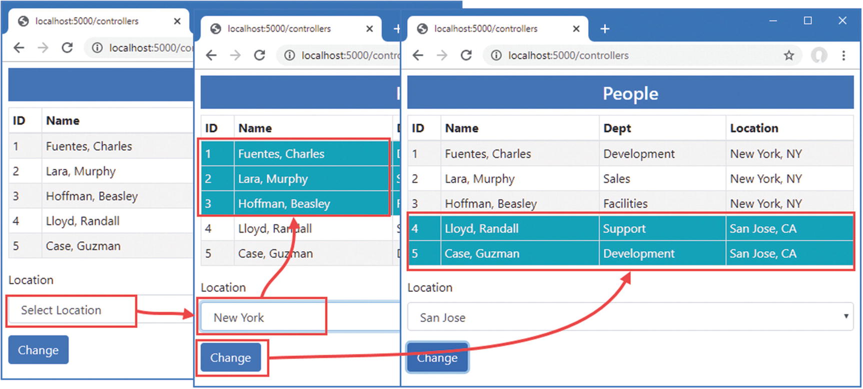
Restart ASP.NET Core, request http://localhost:5000/controllers, and select New York from the list of cities. The custom binding will cause the value chosen in the select element to be reflected by the highlighting in the table. Click the Change button to test the binding in the other direction, and you will see the highlighted city change, as shown in Figure 34-5.
Figure 34-5.
Using a custom binding
Displaying Child Content in a Component
Components that display child content act as wrappers around elements provided by their parents. To see how child content is managed, add a Razor Component named ThemeWrapper.razor to the Blazor folder with the content shown in Listing 34-15.
<div class="p-2 bg-@Theme border text-white">
<h5 class="text-center">@Title</h5>
@ChildContent
</div>
@code {
[Parameter]
public string Theme { get; set; }
[Parameter]
public string Title { get; set; }
[Parameter]
public RenderFragment ChildContent { get; set; }
}
Listing 34-15.
The Contents of the ThemeWrapper.razor File in the Blazor Folder
To receive child content, a component defines a property named ChildContent whose type is RenderFragment and that has been decorated with the Parameter attribute. The @ChildContent expression includes the child content in the component’s HTML output. The component in the listing wraps its child content in a div element that is styled using a Bootstrap theme color and that displays a title. The name of the theme color and the text of the title are also received as parameters.
Restricting Element Reuse
When updating the content presented to the user, Blazor will reuse elements if it can because creating new elements is a relatively expensive operation. This is particularly true when displaying elements for a sequence of values, such as with @for or @foreach expressions. If the sequence changes, Blazor will reuse the elements it created for the old data values to display the new data.
This can cause problems if changes have been made to the elements outside of the control of Blazor, such as with custom JavaScript code. Blazor isn’t aware of the changes, which will persist when the elements are reused. Although this is a rare situation, you can restrict the reuse of elements by using an @key attribute and providing an expression that associates the element with one of the data values in the sequence, like this:
Defining Child Content in the PeopleList.razor File in the Blazor Folder
No additional attributes are required to configure the child content, which is processed and assigned to the ChildContent property automatically. To see how the ThemeWrapper component presents its child content, restart ASP.NET Core and request http://localhost:5000/controllers. You will see the configuration attributes that selected the theme and the title text used to produce the response shown in Figure 34-6.
Figure 34-6.
Using child content
Creating Template Components
Template components bring more structure to the presentation of child content, allowing multiple sections of content to be displayed. Template components are a good way of consolidating features that are used throughout an application to prevent the duplication of code and content.
To see how this works, add a Razor Component named TableTemplate.razor to the Blazor folder with the content shown in Listing 34-17.
The Contents of the TableTemplate.razor File in the Blazor Folder
The component defines a RenderFragment property for each region of child content it supports. The TableTemplate component defines two RenderFragment properties, named Header and Body, which represent the content sections of a table. Each region of child content is rendered using a Razor expression, @Header and @Body, and you can check to see whether content has been provided for a specific section by checking to see whether the property value is null, which this component does for the Header section.
When using a template component, the content for each region is enclosed in an HTML element whose tag matches the name of the corresponding RenderFragment property, as shown in Listing 34-18.
Applying a Template Component in the PeopleList.razor File in the Blazor Folder
The child content is structured into sections that correspond to the template component’s properties, Header and Body, which leaves the TableTemplate component responsible for the table structure and the PeopleList component responsible for providing the detail. Restart ASP.NET Core and request http://localhost:5000/controllers, and you will see the output produced by the template component, as shown in Figure 34-7.
Figure 34-7.
Using a template component
Using Generic Type Parameters in Template Components
The template component I created in the previous section is useful, in the sense that it provides a consistent representation of a table that I can use throughout the example application. But it is also limited because it relies on the parent component to take responsibility for generating the rows for the table body. The template component doesn’t have any insight into the content it presents, which means it cannot do anything with that content other than display it.
Template components can be made data-aware with the use of a generic type parameter, which allows the parent component to provide a sequence of data objects and a template for presenting them. The template component becomes responsible for generating the content for each data object and, consequently, can provide more useful functionality. As a demonstration, I am going to add support to the template component for selecting how many table rows are displayed and for selecting table rows. The first step is to add a generic type parameter to the component and use it to render the content for the table body, as shown in Listing 34-19.
public RenderFragment<RowType> RowTemplate{ get; set; }
[Parameter]
public IEnumerable<RowType> RowData { get; set; }
}
Listing 34-19.
Adding a Generic Type Parameter in the TableTemplate.razor File in the Blazor Folder
The generic type parameter is specified using the @typeparam attribute, and, in this case, I have given the parameter the name RowType because it will refer to the data type for which the component will generate table rows.
The data the component will process is received by adding a property whose type is a sequence of objects of the generic type. I have named the property RowData, and its type is IEnumerable<RowType>. The content the component will display for each object is received using a RenderFragment<T> property. I have named this property RowTemplate, and its type is RenderFragment<RowType>, reflecting the name I selected for the generic type parameter.
When a component receives a content section through a RenderFragment<T> property, it can render it for a single object by invoking the section as a method and using the object as the argument, like this:
...
@foreach (RowType item in RowData) {
<tr>@RowTemplate(item)</tr>
}
...
This fragment of code enumerates the RowType objects in the RowData sequence and renders the content section received through the RowTemplate property for each of them.
Using a Generic Template Component
I have simplified the PeopleList component so it only uses the template component to produce a table of Person objects, and I have removed earlier features, as shown in Listing 34-20.
public IEnumerable<Person> People => Context.People
.Include(p => p.Department)
.Include(p => p.Location);
}
Listing 34-20.
Using a Generic Template Component in the PeopleList.razor File in the Blazor Folder
The RowType attribute is used to specify the value for the generic type argument. The RowData attribute specifies the data the template component will process.
The RowTemplate element denotes the elements that will be produced for each data object. When defining a content section for a RenderFragment<T> property, the Context attribute is used to assign a name to the current object being processed. In this case, the Context attribute is used to assign the name p to the current object, which is then referred to in the Razor expressions used to populate the content section’s elements.
The overall effect is that the template component is configured to display Person objects. The component will generate a table row for each Person, which will contain td elements whose content is set using the current Person object’s properties.
Since I removed properties that were decorated with the Parameter attribute in Listing 34-20, I need to remove the corresponding attributes from the element that applies the PepleList component, as shown in Listing 34-21.
Removing Attributes in the Index.cshtml File in the Views/Home Folder
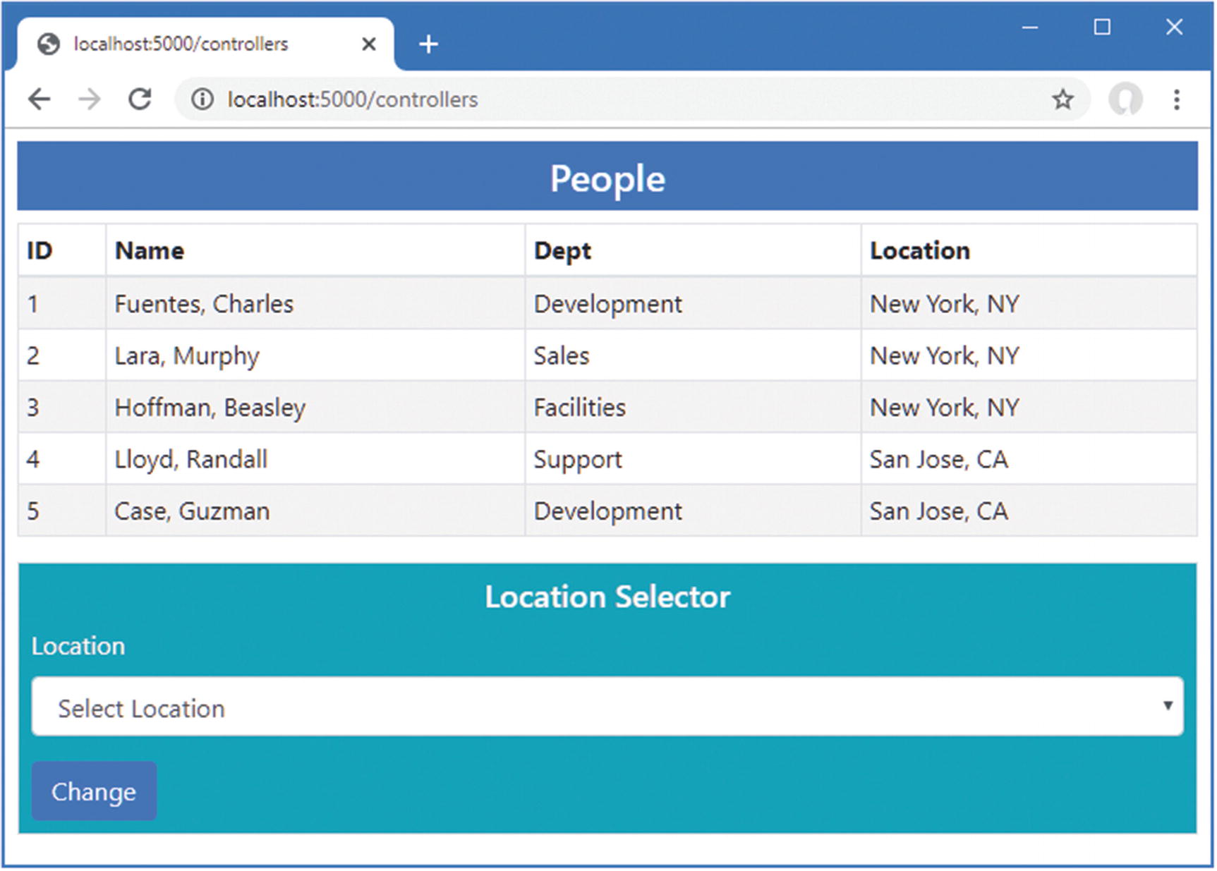
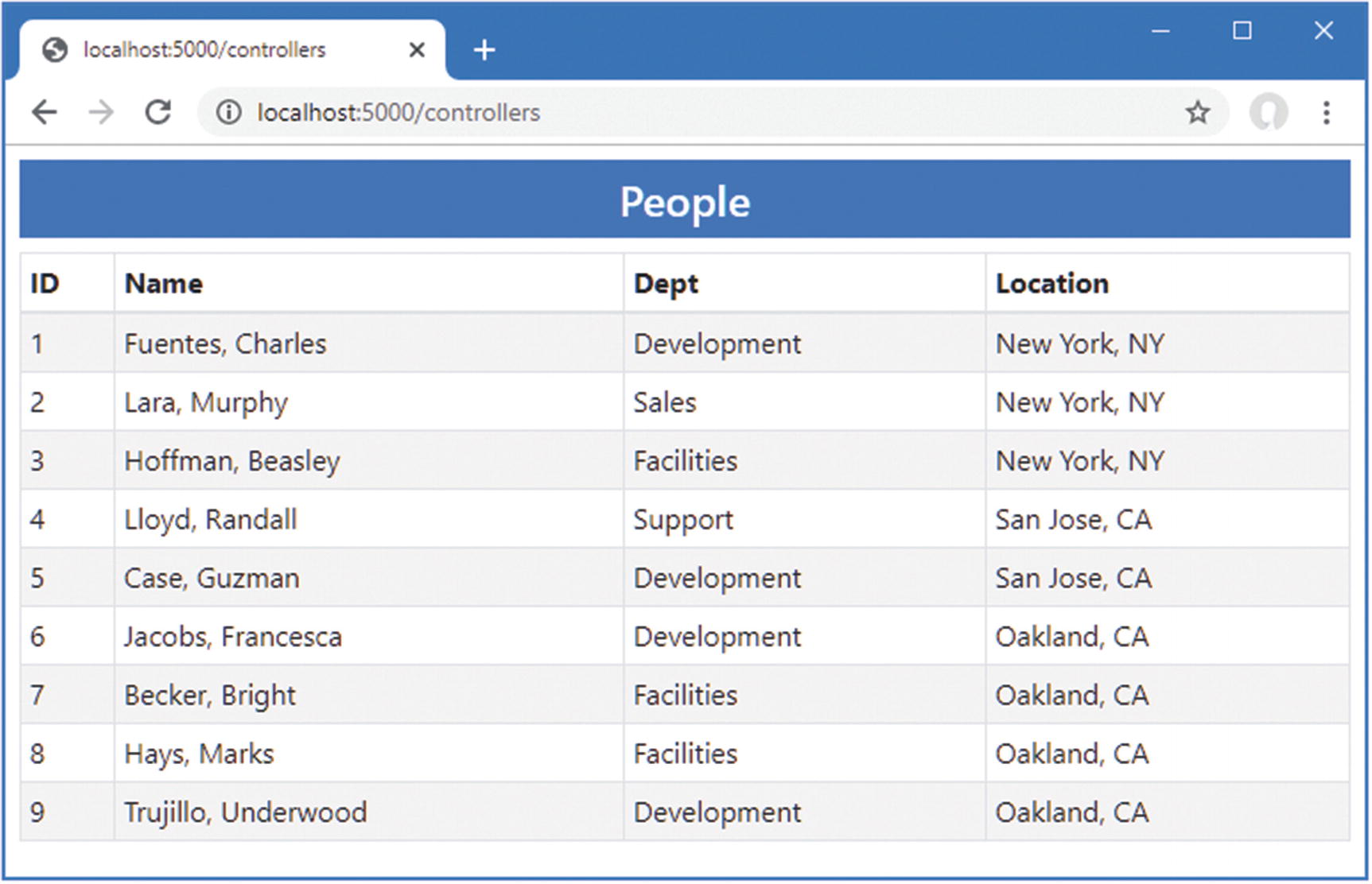
To see the generic template component, restart ASP.NET Core and request http://localhost:5000/controllers. The data and content sections provided by the PeopleList component have been used by the TableTemplate component to produce the table shown in Figure 34-8.
Figure 34-8.
Using a generic template component
Adding Features to the Generic Template Component
This may feel like a step backward, but, as you will see, giving the template component insight into the data it handles sets the foundation for adding features, as shown in Listing 34-22.
public Func<RowType, string> SortDirection { get; set; }
public string[] SortDirectionChoices =
new string[] { "Ascending", "Descending" };
public string SortDirectionSelection{ get; set; } = "Ascending";
public IEnumerable<RowType> SortedData() =>
SortDirectionSelection == "Ascending"
? RowData.OrderBy(SortDirection)
: RowData.OrderByDescending(SortDirection);
}
Listing 34-22.
Adding a Feature in the TableTemplate.razor File in the Blazor Folder
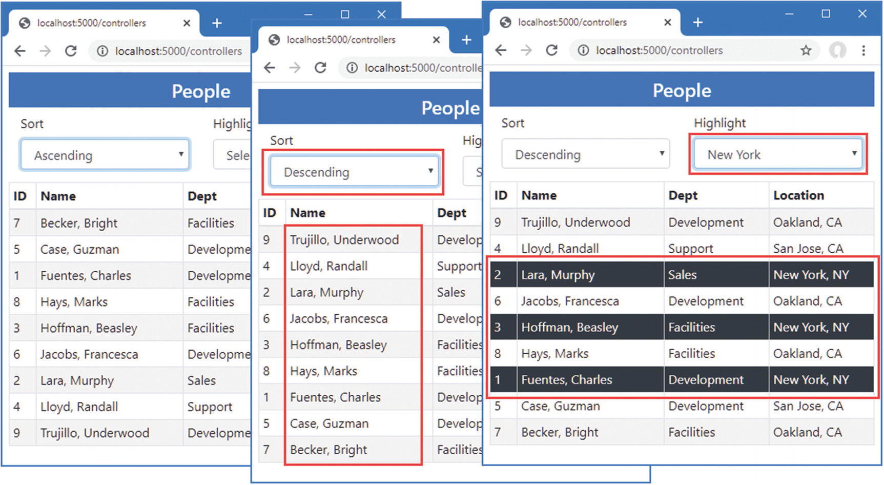
The changes present the user with two select elements that are presented using the SelectFilter component created earlier in the chapter. These new elements allow the user to sort the data in ascending and descending order and to select a value used to highlight rows in the table. The parent component provides additional parameters that give the template component functions that select the properties used for sorting and highlighting, as shown in Listing 34-23.
public IEnumerable<Person> People => Context.People
.Include(p => p.Department)
.Include(p => p.Location);
}
Listing 34-23.
Configuring Template Component Features in the PeopleList.razor File in the Blazor Folder
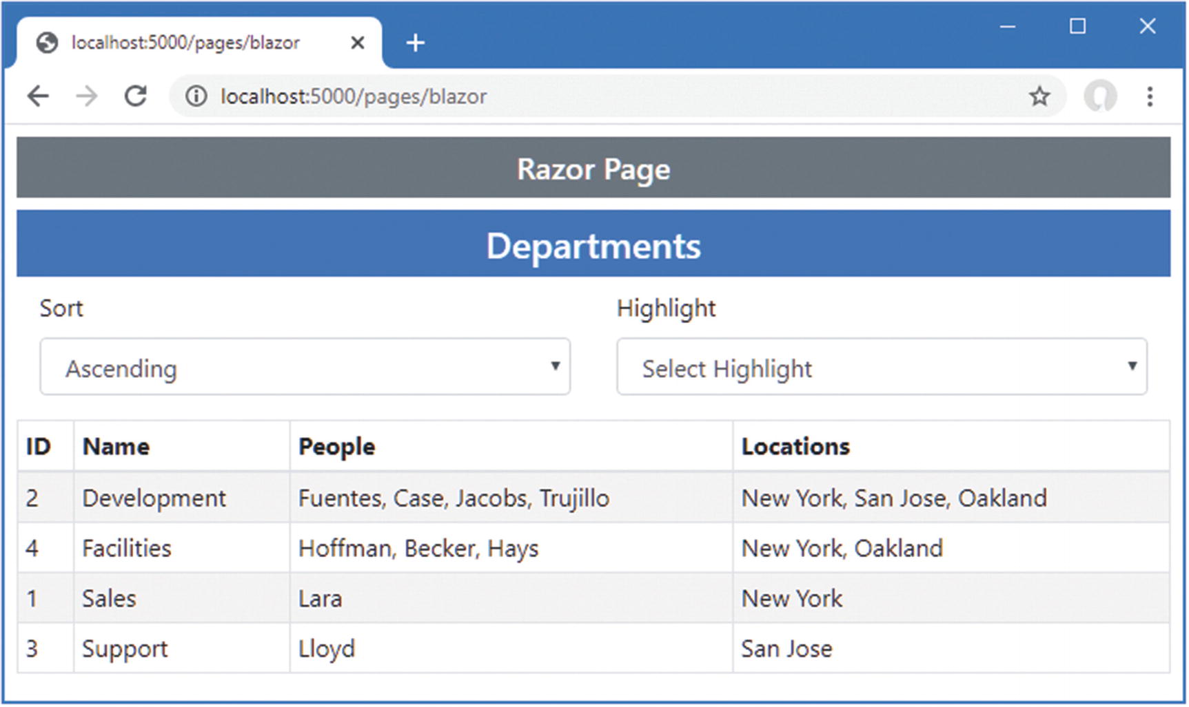
The Highlight attribute provides the template component with a function that selects the property used for highlighting table rows, and the SortDirection attribute provides a function that selects a property used for sorting. To see the effect, restart ASP.NET Core and request http://localhost:5000/controllers. The response will contain the new select elements, which can be used to change the sort order or select a city for filtering, as shown in Figure 34-9.
Figure 34-9
Adding features to a template component
Reusing a Generic Template Component
The features added to the template component all relied on the generic type parameter, which allows the component to modify the content it presents without being tied to a specific class. The result is a component that can be used to display, sort, and highlight any data type wherever a table is required. Add a Razor Component named DepartmentList.razor to the Blazor folder with the content shown in Listing 34-24.
The Contents of the DepartmentList.razor File in the Blazor Folder
The TableTemplate component is used to present the user with a list of the Department objects in the database, along with details of the related Person and Location objects, which are queried with the Entity Framework Core Include and ThenInclude methods. Listing 34-25 changes the Razor Component displayed by the Razor Page named Blazor.
Changing the Component in the Blazor.cshtml File in the Pages Folder
Restart ASP.NET Core and request http://localhost:5000/pages/blazor. The response will be presented using the templated component, as shown in Figure 34-10.
Figure 34-10.
Reusing a generic template component
Cascading Parameters
As the number of components increases, it can be useful for a component to provide configuration data to descendants deep in the hierarchy of components. This can be done by having each component in the chain receive the data and pass it on to all of its children, but that is error-prone and requires every component to participate in the process, even if none of its descendants uses the data it passes on.
Blazor provides a solution to this problem by supporting cascading parameters, in which a component provides data values that are available directly to any of its descendants, without being relayed by intermediate components. Cascading parameters are defined using the CascadingValue component, which is used to wrap a section of content, as shown in Listing 34-26.
public string[] Themes = new string[] { "primary", "info", "success" };
}
Listing 34-26.
Creating a Cascading Parameter in the DepartmentList.razor File in the Blazor Folder
The CascadingValue element makes a value available to the components it encompasses and their descendants. The Name attribute specifies the name of the parameter, the Value attribute specifies the value, and the isFixed attribute is used to specify whether the value will change. The CascadingValue element has been used in Listing 34-26 to create a cascading parameter named BgTheme, whose value is set by an instance of the SelectFilter component that presents the user with a selection of Bootstrap CSS theme names.
Tip
Each CascadingValue element creates one cascading parameter. If you need to pass on multiple values, then you can nest the CascadingValue or create a simple parameter that provides multiple settings through a dictionary.
Cascading parameters are received directly by the components that require them with the CascadingParameter attribute, as shown in Listing 34-27.
Receiving a Cascading Parameter in the SelectFilter.razor File in the Blazor Folder
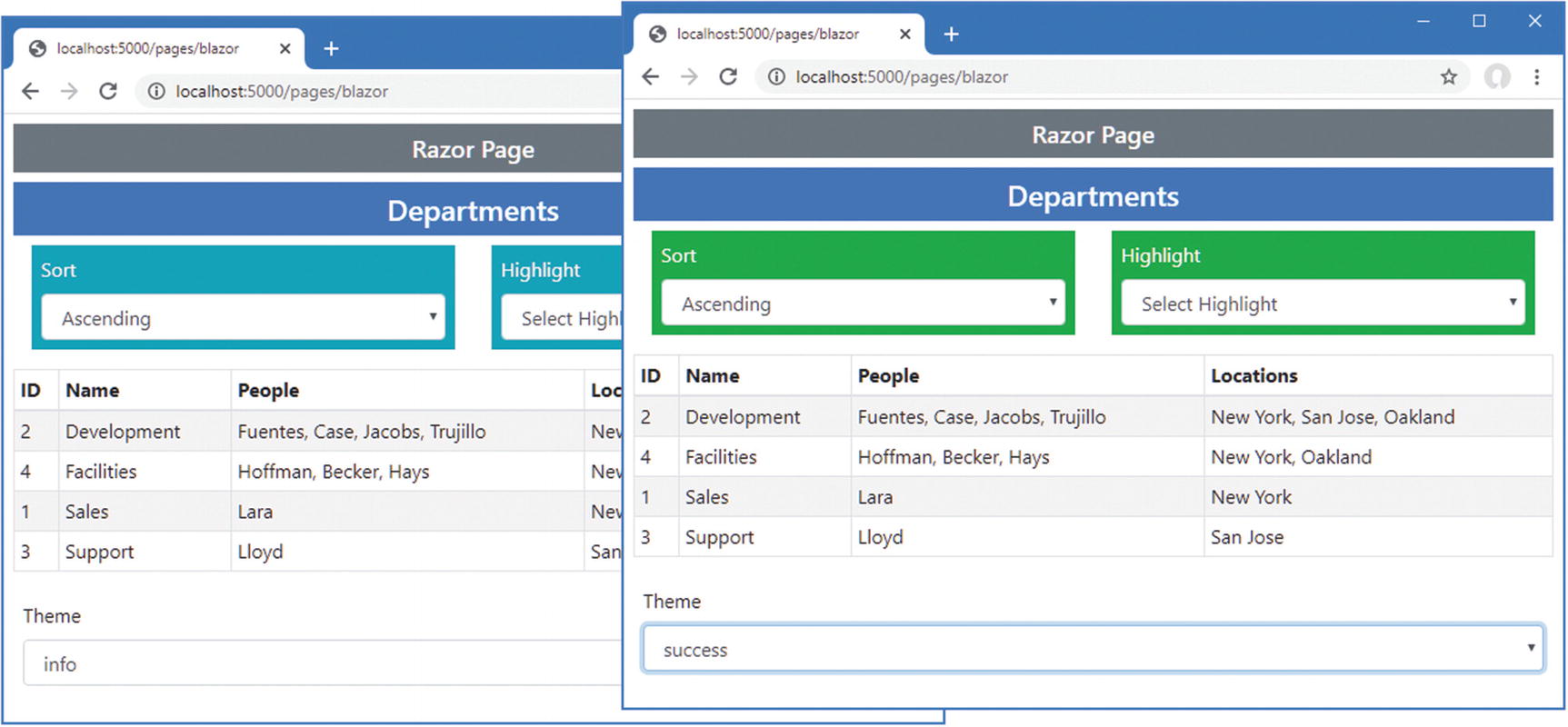
The CascadingParameter attribute’s Name argument is used to specify the name of the cascading parameter. The BgTheme parameter defined in Listing 34-26 is received by the Theme property in Listing 34-27 and used to set the background for the component. Restart ASP.NET Core and request http://localhost:5000/pages/blazor, which produces the response shown in Figure 34-11.
Figure 34-11.
Using a cascading parameter
There are three instances of the SelectFilter component used in this example, but only two of them are within the hierarchy contained by the CascadingValue element. The other instance is defined outside of the CascadingValue element and does not receive the cascading value.
Handling Errors
In the following sections, I describe the features Blazor provides for dealing with connection errors and unhandled application errors.
Handling Connection Errors
Blazor relies on its persistent HTTP connection between the browser and the ASP.NET Core server. The application cannot function when the connection is disrupted, and a modal error message is displayed that prevents the user from interacting with components.
Blazor allows the connection errors to be customized by defining an element with a specific id, as shown in Listing 34-28.
Defining a Connection Error Element in the Blazor.cshtml File in the Pages Folder
The id attribute of the custom error element must be components-reconnect-modal. When there is a connection error, Blazor locates this element and adds it to one of four classes, described in Table 34-2.
Table 34-2.
The Connection Error Classes
Name
Description
components-reconnect-show
The element is added to this class when the connection has been lost and Blazor is attempting a reconnection. The error message should be displayed to the user, and interaction with the Blazor content should be prevented.
components-reconnect-hide
The element is added to this class if the connection is reestablished. The error message should be hidden, and interaction should be permitted.
components-reconnect-failed
The element is added to this class if Blazor reconnection fails. The user can be presented with a button that invokes window.Blazor.reconnect() to attempt reconnection again.
components-reconnect-rejected
The element is added to this class if Blazor is able to reach the server, but the user’s connection state has been lost. This typically happens when the server has been restarted. The user can be presented with a button that invokes location.reload() to reload the application and try again.
The element isn’t added to any of these classes initially, so I have explicitly added it to the components-reconnect-hide class so that it isn’t visible until a problem occurs.
I want to present specific messages to the user for each of the conditions that can arise during reconnection. To this end, I added elements that display a message for each condition. To manage their visibility, add a CSS Stylesheet named connectionErrors.css to the wwwroot folder and use it to define the styles shown in Listing 34-29.
The Contents of the connectionErrors.css File in the wwwroot Folder
These styles show the components-reconnect-modal element as a modal item, with its visibility determined by the components-reconnect-hide and components-reconnect-show classes. The visibility of the specific messages is toggled based on the application of the classes in Table 34-2.
To see the effect, restart ASP.NET Core and request http://localhost:5000/pages/blazor. Wait until the component is displayed and then stop the ASP.NET Core server. You will see an initial error message as Blazor attempts to reconnect. After a few seconds, you will see the message that indicates that reconnection has failed.
Restart ASP.NET Core and request http://localhost:5000/pages/blazor. Wait until the component is displayed and then restart ASP.NET Core. This time Blazor will be able to connect to the server, but the connection will be rejected because the server restart has caused the connection state to be lost. Figure 34-12 shows both sequences of error messages.
Figure 34-12.
Handling connection errors
Tip
It is not possible to test successful connection recovery with just the browser because there is no way to interrupt the persistent HTTP connection. I use the excellent Fiddler proxy, https://www.telerik.com/fiddler, which allows me to terminate the connection without stopping the ASP.NET Core server.
Handling Uncaught Application Errors
Blazor does not respond well to uncaught application errors, which are almost always treated as terminal. To see the default error behavior, add the elements shown in Listing 34-30 to the DepartmentList component.
<button class="btn btn-danger" @onclick="@(() => throw new Exception())">
Error
</button>
@code {
// ...statements omitted for brevity...
}
Listing 34-30.
Adding Elements in the DepartmentList.razor File in the Blazor Folder
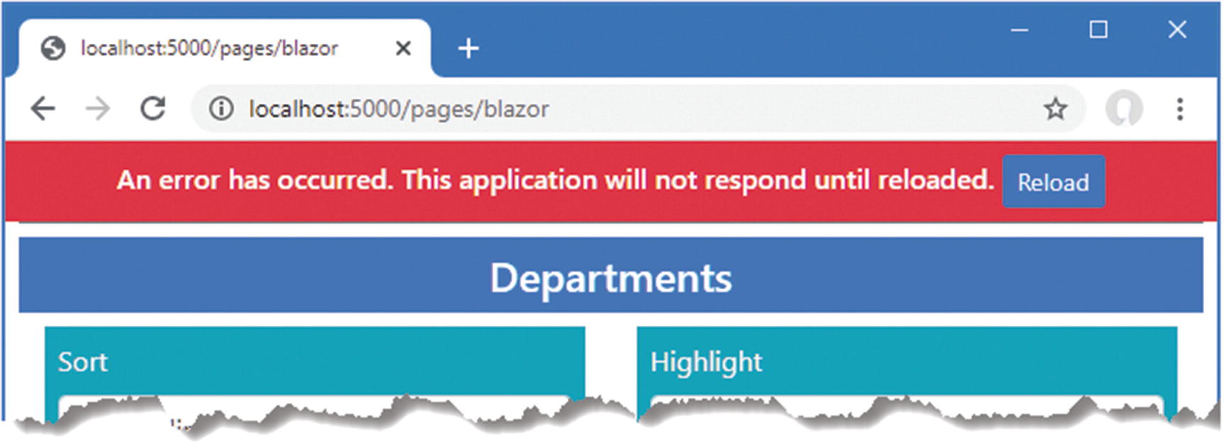
Restart ASP.NET Core, request http://localhost:5000/pages/blazor, and click the Error button. There is no visible change in the browser, but the exception thrown at the server when the button was clicked has proved fatal: the user can still choose values using the select elements because these are presented by the browser, but the event handlers that respond to selections no longer work, and the application is essentially dead.
When there is an unhandled application error, Blazor looks for an element whose id is blazor-error-ui and sets its CSS display property to block. Listing 34-31 adds an element with this id to the Blazor.cshtml file styled to present a useful message.
Adding an Error Element in the Blazor.cshtml File in the Pages Folder
When the element is shown, the user will be presented with a warning and a button that reloads the browser. To see the effect, restart ASP.NET Core, request http://localhost:5000/pages/blazor, and click the Error button, which will display the message shown in Figure 34-13.
Figure 34-13.
Displaying an error message
Summary
In this chapter, I showed you how to combine Razor Components to create more complex features. I showed you how to create parent/child relationships between components, how to configure components with attributes, and how to create custom events to signal when important changes occur. I also showed you how a component can receive content from its parent and how to generate content consistently using template components, which can be defined with one or more generic type parameters. I finished the chapter by demonstrating how Blazor applications can react to connection and application errors. In the next chapter, I describe the advanced features that Blazor provides.