
All field controls appear in the same format in Page Designer. The SubType column is empty and the SourceExpr column contains the data expression that will be displayed.
All the field control properties are listed for each field, but individual properties only apply to the data type for which they make sense. For example, the DecimalPlaces property only applies to fields where the data type is decimal. The following is a split screenshot of the properties for field controls:
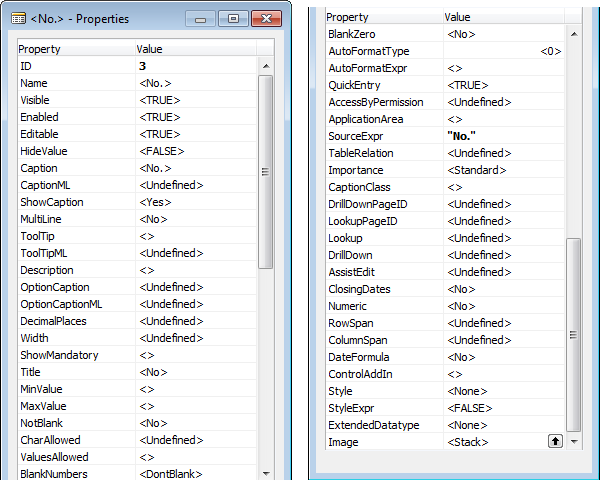
We'll review the field control properties that are more frequently used or that are more significant in terms of effect as follows:
- Visible, Enabled, and Editable: These have the same functionality as the identically named group controls, but they only apply to individual fields. If the group control is set to FALSE, either statically (in the control definition within the page) or dynamically by an expression evaluated during processing, the Group control's FALSE condition will take precedence over the equivalent Field control setting. Precedence applies in the same way at the next, higher levels of identically named properties at the Page level, and then at the Table level. For example, if a data field is set to Non-Editable in the table, that setting will take precedence over (override) other settings in a page, control group, or control.
- HideValue: This allows the value of a field to be optionally displayed or hidden, based on an expression that evaluates to TRUE or FALSE.
- CaptionandCaptionML: These define the caption that will be displayed for this field (in English or the current system language if not English).
- ShowCaption: This is set to Yes or No; it determines whether or not the caption is displayed.
- MultiLine: This must be set to TRUE if the field is to display multiple lines of text.
- OptionCaption and OptionCaptionML: These set the text string options that are displayed to the user. The captions that are set as page field properties will override those defined in the equivalent table field property. The default captions are those defined in the table.
- DecimalPlaces: This applies to decimal fields only. If the number of decimal places defined in the page is smaller than that defined in the table, the display is rounded accordingly. If the field definition is the smaller number, it controls the display.
- Width: This allows setting a specific field display width - number of characters. Especially useful for Control SubType of GridLayout.
- ShowMandatory: This shows a red asterisk in the field display to indicate a required (mandatory) data field. ShowMandatory can be based on an expression that evaluates to TRUE or FALSE. This property does not enforce any validation of the field. Validation is left to the developer.
- ApplicationArea: This allows us to hide controls based on the Application Area feature, which was introduced in NAV2017.
This blog entry explains how the Application Area property is implemented by Microsoft. You can check it out by clicking on the following link:
https://markbrummel.wordpress.com/2016/11/19/nav2017-applicationarea-the-mistery-of-disapearing-controls/
https://markbrummel.wordpress.com/2016/11/19/nav2017-applicationarea-the-mistery-of-disapearing-controls/
- QuickEntry: This allows the field to optionally receive focus or be skipped, based on an expression that evaluates to TRUE or FALSE.
- AccessByPermission: This determines the permission mask required for a user to view or access this field.
- Importance: This controls the display of a field. This property only applies to individual (non-repeating) fields located within a FastTabs. Importance can be set to Standard (the default), Promoted, or Additional, which are briefly described here:
- Standard: This is the normal display. Implementations of the rendering routines for different targets may utilize this differently.
- Promoted: If the property is set to Promoted and the page is on a collapsed FastTab, then the field contents will be displayed on the FastTab line. If FastTab is expanded, the field will display normally.
- Additional: If the property is set to Additional and FastTab is collapsed, there is no effect on the display. If FastTab is expanded, then the user can determine whether or not the field is displayed by clicking on the Show More Fields or Show Fewer Fields display control in the lower-right corner of the FastTab.
- RowSpan and ColumnSpan: These are used in conjunction with the GridLayout controls as layout parameters.
- ControlAddIn: When the field represents a control add-in, this contains the name and public token key of the control add-in.
- ExtendedDatatype: This allows a text field to be categorized as a special data type. The default value is None. If ExtendedDatatype is selected, it can be any one of the following data types:
- Phone No.: This displays a regionally appropriate phone number format
URL: This displays a formatted URL - E-MailFilter: This is used on reports
- Ratio: This displays a progress bar
- Masked: This fills the field with bold dots in order to mask the actual entry. The number of masking characters displayed is independent of the actual field contents. The contents of a masked field cannot be copied. If ExtendedDatatype is set with Phone No., URL, or E-Mail data, an active icon is displayed on the page following the text field providing access to call the phone number, access the URL in a browser, or invoke the e-mail client. Setting ExtendedDatatype will also define the validation that will automatically be applied to the field.
- Person: This allows rendering an image as a person in the Web Client.
- Resource: (Not used, according to Microsoft).
- Phone No.: This displays a regionally appropriate phone number format
- Image: This allows the display of an image on a Cue for a Field control in a CueGroup control. It only applies to a CueControl field of an integer data type. If no image is wanted, choose a value of None.