
EXAMPLE 4 Using an Image As Part of the Graph
Purpose: Demonstrate how to use an image as part of the graph itself.
Although a simple graph is usually best for analyzing data, sometimes a visually captivating graph is needed for certain situations or audiences. Sometimes you need a graph that will catch people’s attention and lure them into reading an article, or stopping on a webpage, to learn more about the data shown in the captivating graph.
When you need to create such a graph, I encourage you to try to add fanciness that is at least related to the data, rather than simply using random graphical tricks like bright colors, glittery images, three-dimensionality, or what is sometimes called “dancing bologna.”
The graph described here is a good example. I first saw a graph similar to this one on the (now-defunct) uppervalleybullion.com Web site. This trick graph not only caught my attention, but it also immediately let me know it had something to do with the shrinking value of the dollar.
As with the other examples in this book, there is no simple procedure option that can be used to generate this type of graph. But by using annotate, and a tiny bit of custom programming, this visually captivating graph is possible.
First, I located some consumer price index data on the Bureau of Labor Statistics (BLS) Web site that could be used to represent the value of a dollar over time. With about 100 years of data, and 12 monthly values for each year, that is over 1000 lines of data, so I show only a subset of the data below (but you can get the whole series from this author’s Web site or the BLS Web site)1:
data mydata;
input year month cpi;
datalines;
1913 1 9.8
1920 1 19.3
1930 1 17.1
1940 1 13.9
1950 1 23.5
1960 1 29.3
1970 1 37.8
1980 1 77.8
1990 1 127.4
2000 1 168.8
2010 1 216.687
;
run;
Next I calculate some macro variables. I determine the minimum year (MINYR), and then the minimum consumer price index (COMPCPI) from that year. This will be the CPI that I compare to all the other yearly values. There are several alternative ways to do this, and I chose to do it step-by-step using PROC SQL.
proc sql;
select min(year) into :minyr from mydata;
select min(cpi) into :compcpi from mydata where year=&minyr;
quit; run;
I trim the blanks off the MINYR, so that it will fit nicely into the title string later. Alternatively, I could have used separated by ' ' in the sql query to get rid of the blanks when the macro variable was created. Both techniques are useful.
%let minyr=%trim(&minyr);
I need to combine the year and month into a single value in order to plot the data the way I want. I could have built a string containing the year and month and read it in as a SAS date, but in this case I decided to use a more direct approach and calculate the YEAR + FRACTION_OF_YEAR (which I call YEARPLUS). While running the data through this DATA step, I also go ahead and calculate the dollar’s value each year. After I am done, I stuff the minimum and maximum YEARPLUS values into macro variables (called MINYEAR and MAXYEAR) so I can easily use them later.
data mydata; set mydata;
yearplus=year+((month-1)/12);
dollarvalue=&compcpi/cpi;
run;
proc sql;
select min(yearplus) into :minyear from mydata;
select max(yearplus) into :maxyear from mydata;
quit; run;
At this point the data is ready to plot.
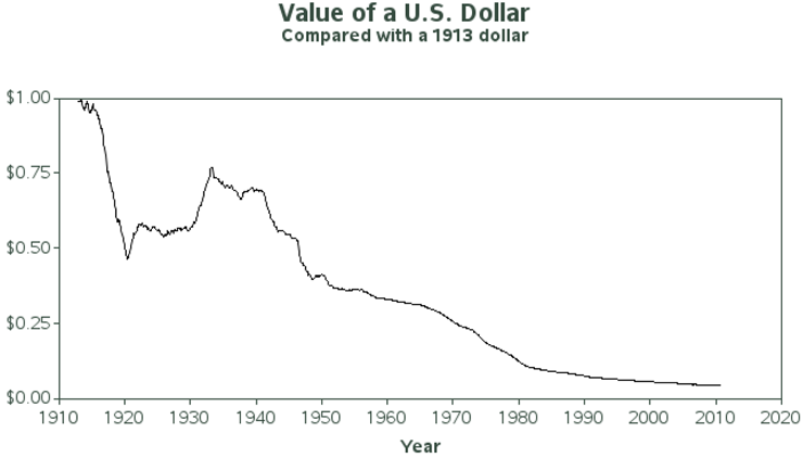
symbol1 v=none i=join c=black;
title1 ls=2.5 "Value of a U.S. Dollar";
title2 font="albany amt/bold" "Compared with a &minyr dollar";
proc gplot data=mydata;
plot dollarvalue*yearplus;
run;
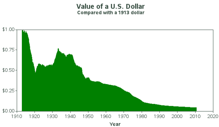
But the basic line plot can be improved. PROC GPLOT lets you color the area below the line using the AREAS= option, but it does not let you specify an image for the fill pattern of the area under the curve. And using a color, as shown below, just does not have the same impact as using the image of a dollar, as was used in the original graph I am imitating.
symbol1 v=none i=join c=black;
pattern1 v=solid c=green;
proc gplot data=mydata;
plot dollarvalue*yearplus / areas=1;
run;
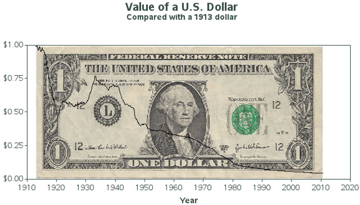
To get the desired graph, we will need to do some custom programming. You can annotate an image anywhere on the graph, so why not annotate an image of a dollar in the exact same area where the data is plotted. Note that it would be easier to use the built-in IFRAME= GPLOT option, but then the dollar would fill the entire axis area, and not necessarily limit itself to the area occupied by the dollar data. Therefore, you must use annotate to guarantee the desired effect.
To annotate an image, you first move to the bottom-left x and coordinates, and then specify the IMAGE function and the top-right coordinates. The image then fills this rectangular area. In the x direction I specify xsys='2' so that I can use the minimum and maximum YEARPLUS values, and so that the dollar image does not extend beyond the data range. In the y direction I specify ysys='1' so I can easily specify values to make the image extend from the bottom to the top of the axes (y=0 to y=100). And I specify when='b' so the annotated dollar is drawn first and appears behind the rest of the graph.
data annodollar;
length function $8;
xsys='2'; ysys='1'; when='b';
function='move'; x=&minyear; y=0; output;
function='image'; x=&maxyear; imgpath='dollar_image.jpg'; style='fit'; y=100; output;
run;
symbol1 v=none i=join c=black;
proc gplot data=mydata anno=annodollar;
plot dollarvalue*yearplus;
run;
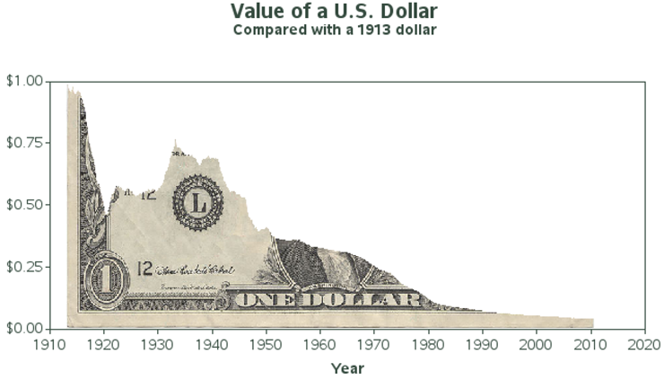
Now, the only thing left to do is to cover (obscure) the part of the dollar that is above the plot line. To do this, we return to the built-in GPLOT AREAS= option. This time we tell it areas=2 so that both the area below and above the one graph line are filled with a pattern or color. But we get a little tricky with the patterns: we specify that the area below the line is filled with an empty pattern (in other words, you can see through it), and the area above the line is filled with solid white color, same as the background.
goptions cback=white;
symbol1 v=none i=join c=black;
pattern1 v=empty c=pink;
pattern2 v=solid c=white;
axis1 label=none order=(0 to 1 by .25) minor=none offset=(0,0) length=2.5in;
axis2 label=(font="albany amt/bold" 'Year') minor=none offset=(0,0) length=6.0in;
proc gplot data=mydata anno=annodollar;
format dollarvalue dollar5.2;
plot dollarvalue*yearplus / areas=2
vaxis=axis1 haxis=axis2;
run;
Notes
1 Bureau of Labor Statistics (BLS) Website: ftp://ftp.bls.gov/pub/special.requests/cpi/cpiai.txt.