EXAMPLE 3 Paneling Multiple Graphs on a Page
Purpose: Although a simple grid of graphs is not a dashboard, it is still a useful way to visualize data in certain situations. This example demonstrates how to tile multiple graphs onto the same page using the ODS HTMLPANEL tagset.
After gasoline prices in the U.S. hit $3 and $4 a gallon in 2008, everyone became interested in finding cars with good mileage. A good Web site I found for looking up the miles per gallon (MPG) is www.fueleconomy.gov. They have a really nice site that provides the MPG data for vehicles sold in the U.S., enabling you to look up the MPG values for an individual vehicle, download a PDF document with the data for all the cars in a given year, or download the data in spreadsheet format.
This example demonstrates how to import their spreadsheet data into SAS and create plots of the MPG data by type of car. As a bonus, I think you will also find the MPG plots very interesting and informative.
Data Preparation
First, get the data, from the http://www.fueleconomy.gov/feg/download.shtml Web page, selecting the “2011 Datafile” link and saving the 11data.zip file to your computer, and then extracting the “2011FEguide-public.xlsx” Excel spreadsheet from the ZIP file. You can then import the data from the Excel spreadsheet into a SAS data set using the SAS/ACCESS to PC Files product to run the following code:
proc import datafile="2011FEguide-public.xlsx" dbms=EXCEL out=mpgdata replace;
getnames=YES; mixed=YES; scantext=NO;
run;
Note: If you do not have SAS/ACCESS to PC Files (and therefore cannot run PROC IMPORT on Excel spreadsheets), an alternative would be to export the data from Excel as a CSV file, and then read that into SAS.
PROC IMPORT uses the column header text as the variable names. You can assign custom text labels to the variables by using label statements in a DATA step, and the labels will be used in the graph axes. You could also do “data cleaning” in the DATA step, if needed, such as the IF statement that eliminates data observations that do not contain the variable CARLINE_CLASS_DESC.
data mpgdata; set mpgdata;
label Hwy_FE__Guide____Conventional_Fu='Highway';
label City_FE__Guide____Conventional_F='City mpg';
if Carline_Class_Desc^='' then output;
run;
And here is a final bit of data preparation: since we are going to be creating a separate plot for each car classification (that is, plotting by CARLINE_CLASS_DESC), the data set needs to be sorted by that variable.
proc sort data=mpgdata out=mpgdata;
by Carline_Class_Desc;
run;
Graph the Data
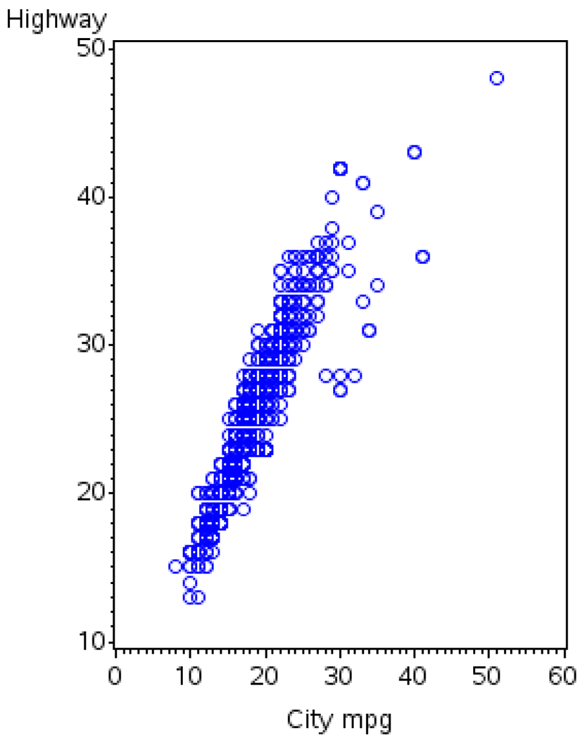
Now that the data is in a SAS data set, we can easily plot it using PROC GPLOT:
goptions xpixels=284 ypixels=360;
symbol1 color=blue value=circle h=1.4 interpol=none;
proc gplot data=mpgdata;
plot Hwy_FE__Guide____Conventional_Fu*City_FE__Guide____Conventional_F=1;
run;
But the results are not much to look at.
This is a book about custom SAS graphs, therefore let’s make a few customizations.
First, let’s add a few standard customizations. Rather than letting the axes auto-scale (and pick a slightly different range for the X and Y axes), it is preferable in this case to hardcode the range for the axes so they both show 0–60 MPG. Also, since both axes are showing MPG, and you want to be able to compare them apples to apples, it is good to hardcode a physical length for the axes (LENGTH=2.3in). That way the axes will be drawn proportionally, no matter what the proportions of the PNG file are. The minor tick marks clutter the graph, therefore let’s eliminate them by specifying minor=none as an axis option. I find it useful to have light gray reference lines at the major tick marks, so I can easily see whether the plot markers are above or below those values; the AUTOHREF and AUTOVREF options add these reference lines.
axis1 length=2.3in offset=(0,0) order=(0 to 60 by 10) minor=none;
axis2 length=2.3in offset=(0,0) order=(0 to 60 by 10) minor=none;
proc gplot data=mpgdata;
plot Hwy_FE__Guide____Conventional_Fu*City_FE__Guide____Conventional_F=1 /
autohref autovref chref=graycc cvref=graycc
vaxis=axis1 haxis=axis2;
run;
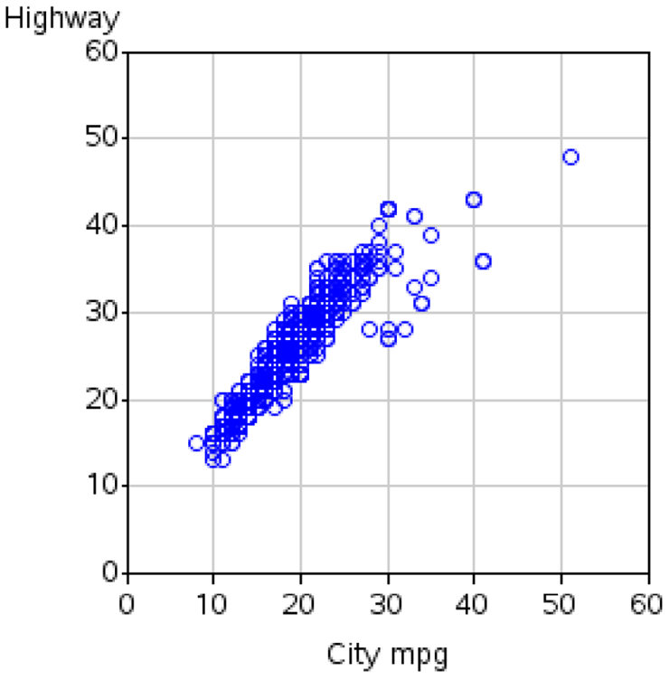
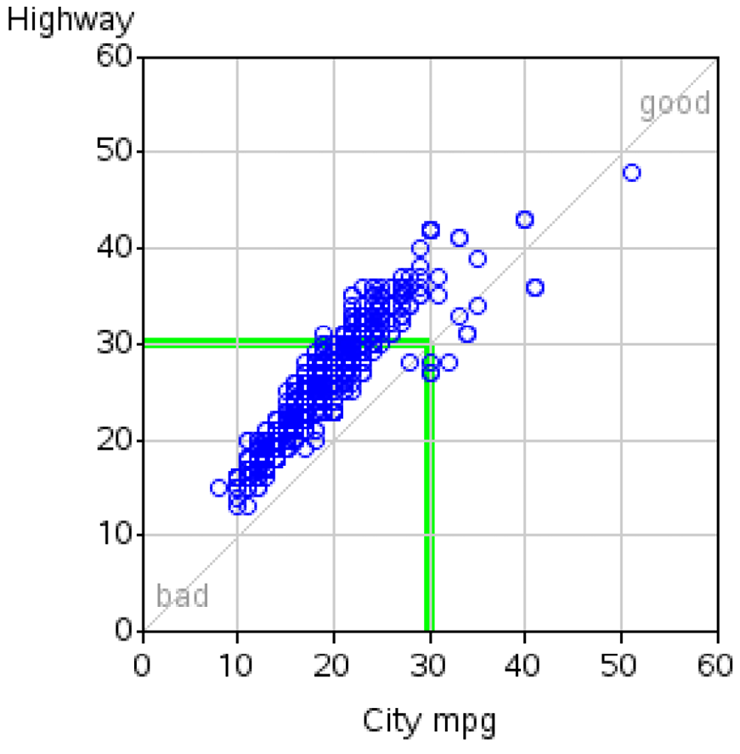
The above plot looks much more refined now, but the plot markers still have no points-of-reference to tell us whether the values are good or bad. This is where custom annotation can be useful.
Annotations
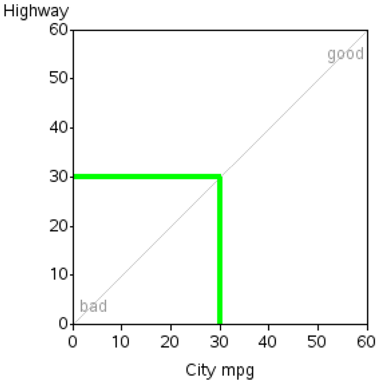
First, let’s annotate the text labels “good” in the top-right, and “bad” in the bottom-left. By using the XSYS and YSYS=’1’ coordinate system, the x and Y coordinates specified are percent values, from 0–100 within the axis area.
data my_anno;
length function color $8;
xsys='1'; ysys='1';
color='gray99';
position='5'; hsys='3'; when='a'; style=''; size=.;
function='label'; x=93; y=93; text='good'; output;
function='label'; x=7; y=7; text='bad'; output;
Next, draw a thin (size=.1) gray line from the bottom-left to top-right. If a marker is exactly on this line, the vehicle gets exactly the same MPG in highway driving as they do in city driving. Traditional engines will typically be above this diagonal line, and hybrids will typically be near (or below) the line.
color='graycc';
when='b';
function='move'; x=0; y=0; output;
function='draw'; x=100; y=100; size=.1; output;
And finally, draw two wider (size=1) green line segments at 30 MPG—vehicles outside/above this line have “good” MPG, and cars below it are “bad” (note that this is just a totally arbitrary number I picked, based on what I think is good and bad MPG). I use xsys/ysys=’2’ so that I can specify the x/y values using the same coordinate system as the data (a 30 here is 30 MPG). Note that it is especially important for this line to use when=’b’ so that it is drawn before/behind everything else. Otherwise, this thick line would obscure plot markers.
xsys='2'; ysys='2';
color='cx00ff00';
function='move'; x=30; y=0; output;
function='draw'; x=30; y=30; size=1; output;
function='draw'; x=0; y=30; size=1; output;
run;
Here is what the annotated text and graphics look like, plotted on a blank set of axes:
Simply specify the ANNO= option when you run PROC GPLOT to have the annotation show up on the graph with the plot markers:
proc gplot data=mpgdata anno=my_anno;
{same code as before}
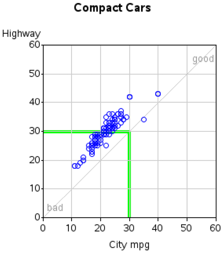
One remaining weakness with the graph is that it is trying to plot “too much” in one plot. There are almost 1000 vehicles in the data, and many of the markers are overprinting other markers in exactly the same locations. Also, most people shopping for a car would be interested in seeing a plot of all the cars in a certain classification (small, medium, large, and so on).
Since the data is sorted by CARLINE_CLASS_DESC, we can easily plot it by that variable. One enhancement I like to make is that instead of using the default by-titles (such as Carline_Class_Desc='Compact Cars'), I suppress the automatic titles by specifying options nobyline, and I use the by-value in my own title statement.
options nobyline;
title1 ls=1.5 "#byval(Carline_Class_Desc)";
proc gplot data=mpgdata anno=my_anno;
by Carline_Class_Desc;
plot Hwy_FE__Guide____Conventional_Fu*City_FE__Guide____Conventional_F=1 /
autohref autovref chref=graycc cvref=graycc
vaxis=axis1 haxis=axis2;
run;
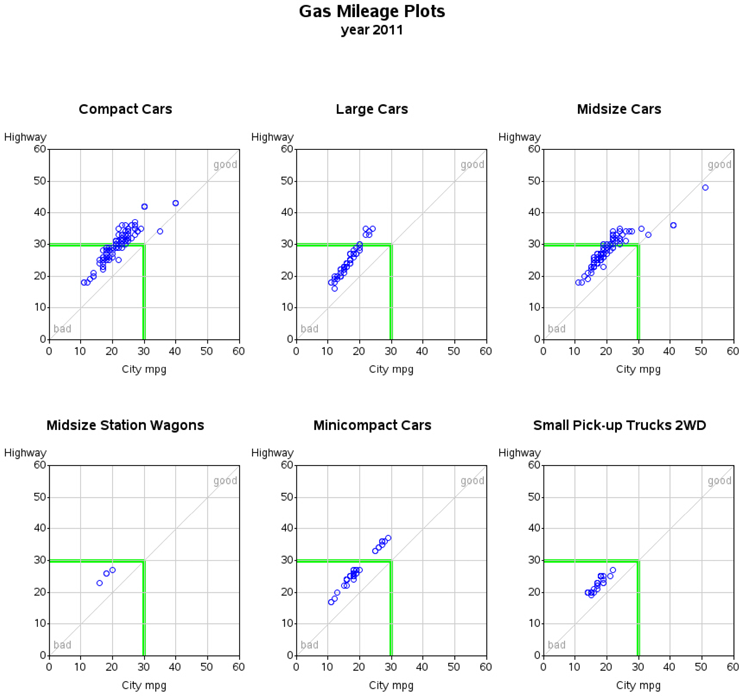
You now get a plot for each car classification, arranged sequentially (one after the other) down the Web page. The plot markers are much less crowded and easier to read, but you would have to do a lot of scrolling up and down in your Web browser to see all 19 plots. Here are two of those plots:
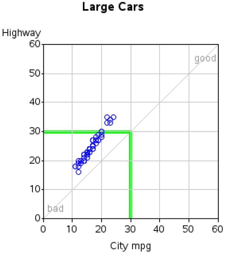
And so on, for all the other 17 car classifications.
Paneling the Graphs
Wouldn’t it be nice to put the plots in a panel three-across? That way you could see and compare more plots at the same time, rather than scrolling up/down to see them. This can be done with just a little more work, using the ODS HTMLPANEL tagset. Here is the basic code to display the graphs paneled three-across:
ODS LISTING CLOSE;
%let panelcolumns=3;
ods tagsets.htmlpanel path="." (url=none) file="somename.htm" style=minimal;
{do your graphs}
ods tagsets.htmlpanel event = panel(finish);
quit;
ods html close;
Now I am going to make it just a little fancier, by creating a title using PROC GSLIDE to go above all the graphs. First I will show you just the skeleton (without any GSLIDE or GPLOT details, so you can easily see how it fits into the ODS HTMLPANEL code). And then I will show you the full-blown code:
ODS LISTING CLOSE;
%let panelcolumns=3;
ods tagsets.htmlpanel path="." (url=none) file="somename.htm" style=minimal;
goptions xpixels=830 ypixels=80;
{do your title gslide}
ods tagsets.htmlpanel event = panel(start);
goptions xpixels=284 ypixels=360;
{do your graphs}
ods tagsets.htmlpanel event = panel(finish);
quit;
ods html close;
And here is the full-blown code, with all the details:
%let year=2011;
%let name=gas&year;
ODS LISTING CLOSE;
%let panelcolumns=3;
ods tagsets.htmlpanel path="." (url=none) file="&name..htm" (title="&year Gas Mileage Plots") style=minimal;
goptions device=png;
goptions ftitle="albany amt/bold" ftext="albany amt" htitle=11pt htext=10pt;
goptions xpixels=830 ypixels=80;
title1 h=15pt "Gas Mileage Plots";
title2 h=12pt ls=1.5 font="albany amt/bold" "year &year";
proc gslide name="&name";
run;
ods tagsets.htmlpanel event = panel(start);
goptions xpixels=284 ypixels=360;
options nobyline;
axis1 length=2.3in offset=(0,0) order=(0 to 60 by 10) minor=none;
axis2 length=2.3in offset=(0,0) order=(0 to 60 by 10) minor=none;
symbol1 color=blue value=circle h=1.4 interpol=none;
title1 ls=1.5 "#byval(Carline_Class_Desc)";
footnote h=3pct " ";
proc gplot data=mpgdata anno=my_anno;
by Carline_Class_Desc;
plot Hwy_FE__Guide____Conventional_Fu*City_FE__Guide____Conventional_F=1 /
autohref autovref chref=graycc cvref=graycc
vaxis=axis1 haxis=axis2
des="" name="gas_mpg_&year._#byval(Carline_Class_Desc)";
run;
ods tagsets.htmlpanel event = panel(finish);
quit;
ods html close;
This code produces the following output (note that this is just a screen-capture of the first two rows, for brevity—there are seven total rows of plots in the final output):