
EXAMPLE 13 Population Tree Charts
Purpose: Demonstrate how to create a population tree chart with the axis in the middle.
Population tree charts (also known as, paired bar charts or sometimes tornado charts) are very useful when comparing two populations by age group.
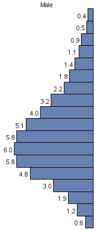
Most savvy SAS/GRAPH programmers have found ways to create a basic population tree chart with a minimum of custom programming. For example, you might make the values for one population negative, to have them plot on the left side of the response axis. For a nice touch, you could create a user-defined format to make the negative response axis values look positive. A paper I co-authored with Dr. Moon W. Suh for the 1994 SouthEast SAS Users’ Group entitled “Creating Population Tree Charts (Using SAS Graph Software”) describes this technique in detail.1 Here is an example:
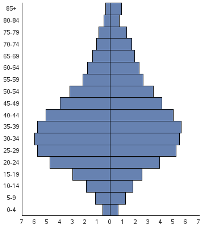
The graph is not bad, but I think it would look a lot better to have the midpoint axis values between the left and right halves rather than on the side. That way it is easier to see which label goes with which bar, and it makes the graph move visually symmetrical.
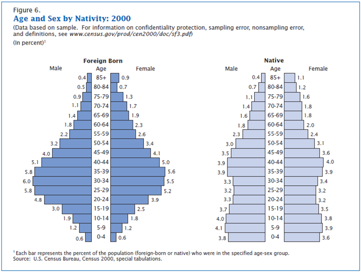
A good example of the type of layout can be found in the following Census publication: http://www.census.gov/prod/2003pubs/c2kbr-34.pdf.
But this type of layout is a bit tougher to do in SAS/GRAPH, and requires some custom SAS programming.
Basically, the approach involves creating each half of the chart separately, and then using PROC GREPLAY to place the two halves side by side.
Let’s start with the chart for the foreign-born population. First we will need some data. For each pair of bars (left and right pieces), we will need a label for the age group and the male and female populations. While I am creating the data set, I make the male value negative (because that bar will be going to the left), and I assign a DATA_ORDER variable so I can later plot the bars in that same order. This will be important later, because we do not want to plot the bars alphabetically or ascending or descending.
data foreign;
input age_range $ 1-5 male female;
male=-1*male;
data_order=_n_;
datalines;
85+ 0.4 0.9
80-84 0.5 0.7
75-79 0.9 1.3
70-74 1.1 1.7
65-69 1.4 1.9
60-64 1.8 2.3
55-59 2.2 2.6
50-54 3.2 3.4
45-49 4.0 4.1
40-44 5.1 5.0
35-39 5.8 5.6
30-34 6.0 5.5
25-29 5.8 5.2
20-24 4.8 3.9
15-19 3.0 2.5
10-14 1.9 1.8
5-9 1.2 1.2
0-4 0.6 0.6
;
run;
The DATA_ORDER variable is going to control the ordering of the bars (that is, we will use the discrete DATA_ORDER values as our bar midpoints), but we do not want those numeric values to show up as the bar labels. Instead, we want the AGE_RANGE text to show up. Therefore, we create a user-defined format, so the numeric DATA_ORDER values show up as the AGE_RANGE text.
data control; set foreign (rename = ( data_order=start age_range=label));
fmtname = 'my_fmt';
type = 'N';
end = START;
run;
proc format lib=work cntlin=control;
run;
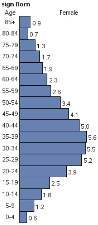
Let’s start with the right side of the chart (the female population). You can easily produce the basic bars using the following code. There is nothing tricky about that besides the user-defined format for the midpoint labels:
pattern v=s c=cx6782b1;
axis3 label=none value=(justify=center);
axis4 label=none minor=none major=none value=(color=white) style=0 order=(0 to 7 by 1);
goptions xpixels=186 ypixels=435;
proc gchart data=foreign;
format data_order my_fmt.;
hbar data_order / discrete
type=sum sumvar=female
nostats noframe
coutline=black space=0
maxis=axis3 raxis=axis4
name="f_female";
run;
Now, to get the text labels and such around the bar chart, I will use some annotation. First, let’s create the labels above the graph (“Foreign Born”, “Age”, and “Female”). These are just standard annotated labels with the positions hardcoded using xsys and ysys='3' (that is, the X and Y positions are specified as a percentage of the graphics output area).
data foreign_right1;
length text $20;
function='label';
xsys='3'; ysys='3'; position='5'; when='a';
x=8; y=95.5; text='Foreign Born'; style='"albany amt/bold"'; output;
x=8; y=92; text='Age'; style=''; output;
x=65; y=92; text='Female'; output;
run;
Next, we will annotate the data values at the end of each bar. Note that I am using the data values and therefore using the coordinate system (xsys and ysys='2'). Since it is a horizontal bar chart I use the midpoint variable instead of the Y variable. I use position='6' so the text appears to the right of the annotate location, and I even add a little bit of offset in the X direction (x=female+.2). Every variable in this Annotate data set is important in order to get the desired text in the desired position.
data foreign_right2; set foreign;
function='label';
xsys='2'; ysys='2'; position='6'; when='a';
x=female+.2; midpoint=data_order;
text=trim(left(put(female,comma5.1)));
run;
I then run the same PROC GCHART code as before, but this time I specify the two Annotate data sets to get the extra text. I could have combined them into one data set, but since PROC GCHART enables me to specify two Annotate data sets, I find it convenient to leave them separate. Note that I have also added a blank title to create some white space at the top of the chart, and make room for the annotated labels.
title1 h=7pct " ";
proc gchart data=foreign anno=foreign_right1;
format data_order my_fmt.;
hbar data_order / discrete type=sum sumvar=female
nostats noframe coutline=black space=0
maxis=axis3 raxis=axis4 anno=foreign_right2
name="f_female";
run;
Do not worry that part of the “Foreign Born” label is chopped off. There will be more room for it in the final chart after we use PROC GREPLAY.
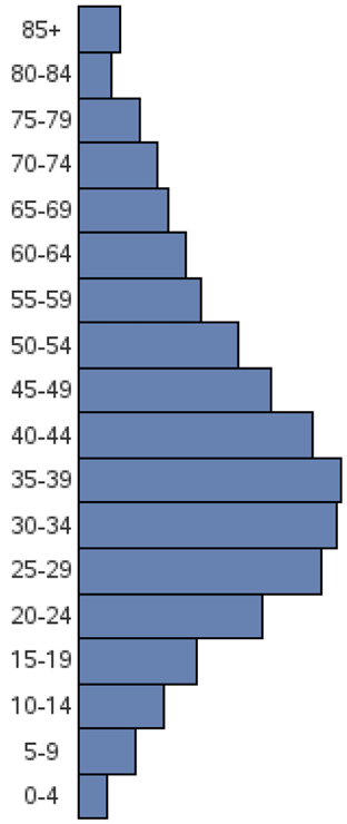
The left half (the male population) is basically the same as the right half except that the data values are negative (so they will point to the left), and the annotated text uses position='4' so it goes to the left of the annotation location. I suppress the midpoint values on the axis (value=none) because I do not need two copies of them. And I make the XPIXELs a little smaller than I used on the right half, because I do not need the extra real estate for the midpoint value labels.
data foreign_left1;
length text $20;
function='label';
xsys='3'; ysys='3'; position='5'; when='a';
x=50; y=92; text='Male'; output;
run;
data foreign_left2; set foreign;
function='label';
xsys='2'; ysys='2'; position='4'; when='a';
x=male-.1; midpoint=data_order;
text=trim(left(put(abs(male),comma5.1)));
run;
axis1 label=none value=none style=0;
axis2 label=none minor=none major=none value=(color=white) style=0 order=(-7 to 0 by 1);
goptions xpixels=165 ypixels=435;
title1 h=7pct " ";
proc gchart data=foreign anno=foreign_left1;
hbar data_order / discrete type=sum sumvar=male
nostats noframe coutline=black space=0
maxis=axis1 raxis=axis2 anno=foreign_left2
name="f_male";
run;
Now that we have created the left and right halves and saved them in GRSEG entries (named using the NAME= option), we can put the two halves together using PROC GREPLAY.
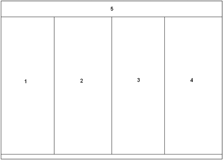
We will need a custom GREPLAY template for this, which can be created by specifying the X and Y coordinates of the four corners of each area that will contain a piece of the graph. I create panels numbered 1–4 for the left and right halves of the two graphs (four pieces total), and then a fifth panel as the whole area (on which I will use PROC GSLIDE to create the overall title and footnote text for). I name this custom template CENSUS.
goptions xpixels=700 ypixels=500;
proc greplay tc=tempcat nofs igout=work.gseg;
tdef census des='Panels'
1/llx = 0 lly = 3
ulx = 0 uly = 90
urx =24 ury = 90
lrx =24 lry = 3
2/llx =24 lly = 3
ulx =24 uly = 90
urx =50 ury = 90
lrx =50 lry = 3
3/llx =50 lly = 3
ulx =50 uly = 90
urx =74 ury = 90
lrx =74 lry = 3
4/llx =74 lly = 3
ulx =74 uly = 90
urx =100 ury = 90
lrx =100 lry = 3
5/llx = 0 lly = 0
ulx = 0 uly = 100
urx =100 ury = 100
lrx =100 lry = 0
;
Here is what the custom template layout looks like (with the sections numbered).
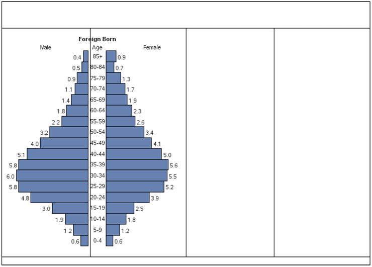
With the following PROC GREPLAY code, you can display the GRSEGs for the left and right halves of the Foreign Born chart (F_MALE and F_FEMALE) into the template. The image below shows the results with the template borders turned on so you can see exactly where the pieces are going:
template = census;
treplay
1:f_male 2:f_female
;
run;
For the overall title and footnote text, we will use a simple PROC GSLIDE to create that.
goptions xpixels=700 ypixels=500;
title1 j=l c=cx005096 ls=.8 " Age and Sex by Nativity: 2000";
title2 j=l h=2.4 ls=.4 " (Data based on sample. For information on confidentiality protection, sampling error, nonsampling error.";
title3 j=l h=2.4 ls=.4 " and definitions, see " f="albany amt/italic" "www.census.gov/prod/cen2000/doc/sf3.pdf" f="albany amt" " )";
footnote1 j=l h=2.2 " Each bar represents the percent of the population (foreign-born or native) who were in the specified age-sex group.";
footnote2 j=l h=2.2 " Source: U.S. Census Bureau, Census 2000, special tabulations.";
footnote3 h=1pct " ";
proc gslide name="titles";
run;
Creating the left and right sides of the “Native Born” chart are basically the same as for the “Foreign Born” chart, so I will not waste the space by including the code here. (It’s in the full program you can download from the author’s Web page.) But basically, you create both halves of the graph and name the GRSEGs N_MALE and N_FEMALE. And then you combine the four pieces of the graphs, along with the titles, using the following TREPLAY code in your PROC GREPLAY.
treplay
1:f_male 2:f_female 3:n_male 4:n_female
5:titles
;
run;
And that produces the following, which is almost identical to the Census chart.
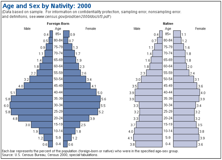
This is a very useful and flexible type of chart. With a little tweaking and customizing, you should be able to re-use this code to plot many different types of data.
Notes
1 Available at http://support.sas.com/publishing/authors/allison_robert.html.