
EXAMPLE 1 Bar with Annotated Marker
Purpose: Demonstrate how to annotate custom graphic markers onto a chart in a data-driven manner.
Let us start with a simple little bar chart. This bar chart technique was developed as part of the winning entry from SAS/GRAPH in DM Review Magazine’s Dashboard Contest.1 (See Example 2, “Using PROC GREPLAY for Custom Dashboard Layout,” for a description of the dashboard in its entirety.)
The data set consists of quarter (Q1-Q4), the actual value attained, and the target value. We will use the following simple values:
data metrics;
input Quarter $ 1-2 Actual Target;
datalines;
Q1 3.1833 3.25
Q2 2.9500 3.50
Q3 2.8167 3.75
Q4 1.8126 4.00
;
run;
The performance criteria are as follows:
<60% = poor
60%-90% = satisfactory
>=90% = good
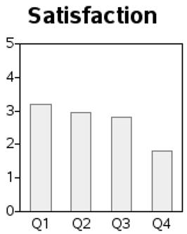
In my quest for the “perfect graph,” I started with a simple bar chart, showing just the actual values.
axis1 label=none order=(0 to 5 by 1) minor=none major=(h=2) offset=(0,0);
axis2 label=none;
pattern1 v=s c=grayee;
proc gchart data=metrics;
vbar quarter / type=sum sumvar=actual
raxis=axis1 maxis=axis2 coutline=gray width=14 space=14;
run;
But this graph told only a small part of the story, and was definitely not going to win a dashboard contest. In addition to the actual values, I wanted to show the target value, and also indicate whether performance was poor, satisfactory, or good.
There was no built-in graphing option for what I had in mind, but custom SAS/GRAPH programming enabled me to implement what I had in mind.
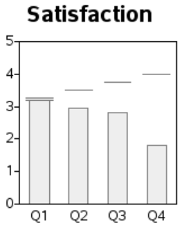
Target Line
First I annotated a target line above each bar. I used the MOVE and DRAW Annotate functions to create a line over each bar.
In the annotate data set, first specify xsys='2' and ysys='2' to use the data coordinate system, and set the X value (called a midpoint for vbar charts) to the quarter, and the Y value to the target, and move to that location. Then switch to xsys='7' (relative % coordinate system) and move 8.5% to the left, and from that location draw a line 17% to the right (17% = 2*8.5%). This produces a target line, centered above each bar.
data targets; set metrics;
length style color $20 function $8;
hsys='3'; position='5'; when='a';
function='move';
xsys='2'; ysys='2'; midpoint=quarter; y=target; output;
function='move'; xsys='7'; x=-8.5; output;
function='draw'; xsys='7'; x=17; color=”gray”; size=.1; output;
run;
proc gchart data=metrics anno=targets;
vbar quarter / type=sum sumvar=actual
raxis=axis1 maxis=axis2 coutline=gray width=14 space=14;
run;
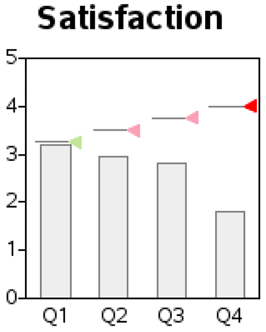
Target Marker
The annotated lines add a reference to visually compare the bars to the target values, but the chart still does not show which performance criteria range the bars are in.
To do the latter I annotated a triangular shaped marker at the end of the target line, and colored it to indicate whether performance was poor or satisfactory or good. I used the A character of the SAS/GRAPH MARKER font for the triangle, but you could use other characters (and other fonts), if desired.
First, you need to measure the actual value against the target:
data metrics; set metrics;
format Percent_of_Target percent6.0;
length Evaluation $12;
percent_of_target=actual/target;
if (percent_of_target < .60) then evaluation='Poor';
else if (percent_of_target < .90) then evaluation='Satisfactory';
else if (percent_of_target >=.90) then evaluation='Good';
run;
Defining the colors in macro variables makes it convenient to maintain them in one location and use them in several locations throughout the program.
%let green=cxc2e699;
%let pink=cxfa9fb5;
%let red=cxff0000;
Create the annotated markers, of the appropriate color, by adding the following lines to the annotated TARGETS data set.
data targets; set metrics (where=(target^=.));
length style color $20 function $8;
hsys='3'; position='5'; when='a';
function='move';
xsys='2'; ysys='2'; midpoint=quarter; y=target; output;
function='move'; xsys='7'; x=-8.5; output;
function='draw'; xsys='7'; x=17; color=”gray”; size=.1; output;
function='move';
xsys='2'; ysys='2'; midpoint=quarter; y=target; output;
function='move'; xsys='7'; x=8.5; output;
function='cntl2txt'; output;
function='label'; text='A'; size=4; xsys='7'; x=0;
style='marker';
if (evaluation eq ‘Good') then color=”&green”;
else if (evaluation eq ‘Poor') then color=”&red”;
else if (evaluation eq ‘Satisfactory') then color=”&pink”;
output;
If you find a command in these examples that is not familiar to you, you can either accept that it just works, or you can look it up in the SAS Help. For example, if you are curious about the CNTL2TXT annotate function, the Help will tell you that it “copies the values of the internal coordinates stored in the variable pairs (XLAST, YLAST) to (XLSTT, YLSTT).” Which then might lead you to find that (XLAST, YLAST) “tracks the last values specified for the X and Y variables when X and Y are used with non-text functions,” and (XLSTT, YLSTT) “tracks the last position for the X and Y variables when X and Y are used with text-handling functions.” In other words, you use the CNTL2TXT function when you change from drawing to writing text in the same location where you were drawing.
Note: If you are looking at this publication in black and white, the images here do not show the color. To see the colors look at the color image on the author’s Web page.2
For a nice touch I added a border around the triangle (specifying the same color as the horizontal line), using the character A from the SAS/GRAPH MARKERE (marker empty) font. This way, if a light color is used against a light background (such as the light green with a white background), the triangle is still easily visible:
function='move';
xsys='2'; ysys='2'; midpoint=quarter; y=target; output;
function='move'; xsys='7'; x=8.5; output;
function='cntl2txt'; output;
function='label'; text='A'; size=4; xsys='7'; x=0;
style='markere';
color=”gray”;
output;
run;
proc gchart data=metrics anno=targets;
vbar quarter / type=sum sumvar=actual
raxis=axis1 maxis=axis2 coutline=gray width=14 space=14;
run;
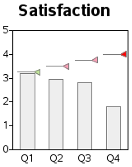
Colored Bars
I wanted to color the bars the same as the triangles. Colors can be easily assigned to bars using PROC GCHART’S SUBGROUP= option in combination with pattern statements. In this case, where the chart has three SUBGROUP= values, they are assigned as Good=pattern1, Poor=pattern2, Satisfactory=pattern3 (the values are assigned to the patterns in alphabetical order).
But what happens if the data changes the next time we generate a graph, and it does not have any bar subgroup values to map to a certain pattern color? That could change the order in which the colors are assigned!
In this graph, the colors hold special meaning—you always want green to mean Good, pink to mean Satisfactory, and red to mean Poor. Therefore, to guarantee that the colors are always assigned in that order, you need to insert some data with SAS missing values for each possible value of subgroup.
data foometrics;
length evaluation $12;
quarter='Q1'; actual=.;
evaluation='Poor'; output;
evaluation='Satisfactory'; output;
evaluation='Good'; output;
run;
data metrics;
set metrics foometrics;
run;
Note that these extra observations with missing numeric values could adversely affect a frequency count bar chart, but they have no adverse impact on a bar chart where the height of the bar is the sum of the values.
pattern1 v=s c=&green;
pattern2 v=s c=&red;
pattern3 v=s c=&pink;
proc gchart data=metrics anno=targets;
vbar quarter / type=sum sumvar=actual
subgroup=evaluation nolegend
raxis=axis1 maxis=axis2 autoref cref=graycc clipref
coutline=gray width=14 space=14;
run;
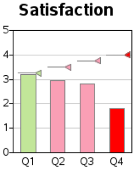
As you can see, this “simple little bar chart” is not so simple!
Notes
1 http://www.information-management.com/issues/20050901/1035522-1.html.
2 http://support.sas.com/publishing/authors/allison_robert.html.