
EXAMPLE 18 Fancy Line Graph With Broken Axis
Purpose: Demonstrate how to overlay multiple line symbols to create a “fancy” line.
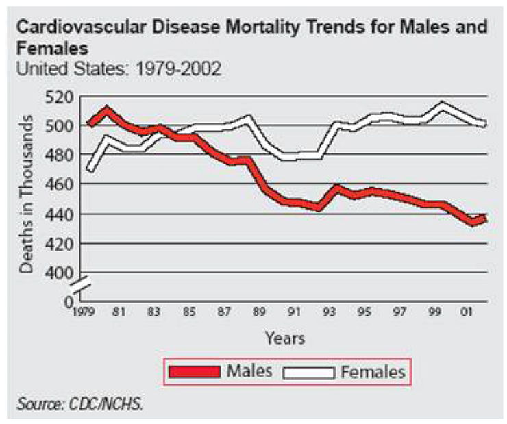
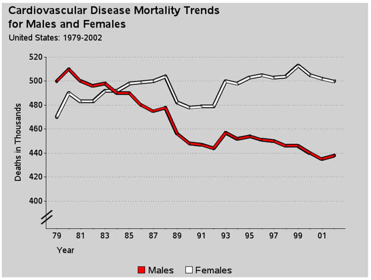
I saw the original version of this graph on the biomed.brown.edu Web site, and I liked it so much that I wanted to create the same graph in SAS.
Here is the original.1
The main challenge with re-creating this graph in SAS/GRAPH is that the graph lines have a border color and SAS does not have a built-in option for such a feature. That is where a bit of custom programming, and some ingenuity, come into play.
I did not have the actual raw data, so I estimated the data values:
data my_data;
format date year2.;
input date date9. male_deaths female_deaths;
datalines;
01jan1979 500 470
01jan1980 510 490
01jan1981 500 483
01jan1982 496 483
01jan1983 498 492
01jan1984 490 492
01jan1985 490 498
01jan1986 480 499
01jan1987 475 500
01jan1988 478 504
01jan1989 456 482
01jan1990 448 478
01jan1991 447 479
01jan1992 444 479
01jan1993 457 500
01jan1994 452 498
01jan1995 454 503
01jan1996 451 505
01jan1997 450 503
01jan1998 446 504
01jan1999 446 513
01jan2000 440 505
01jan2001 435 502
01jan2002 438 500
;
run;
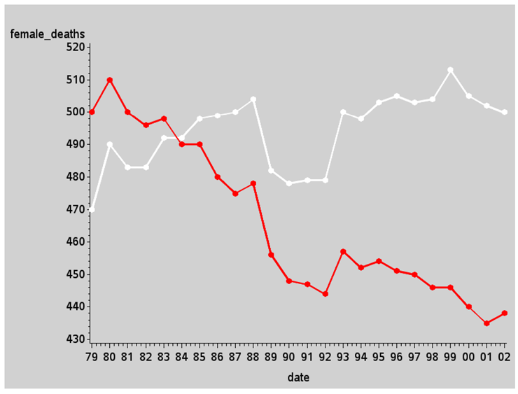
With the data in a SAS data set, you can easily plot it using PROC GPLOT:
symbol1 value=dot h=3 interpol=join w=2 color=white;
symbol2 value=dot h=3 interpol=join w=2 color=red;
proc gplot data=my_data;
plot female_deaths*date=1 male_deaths*date=2 / overlay noframe;
run;
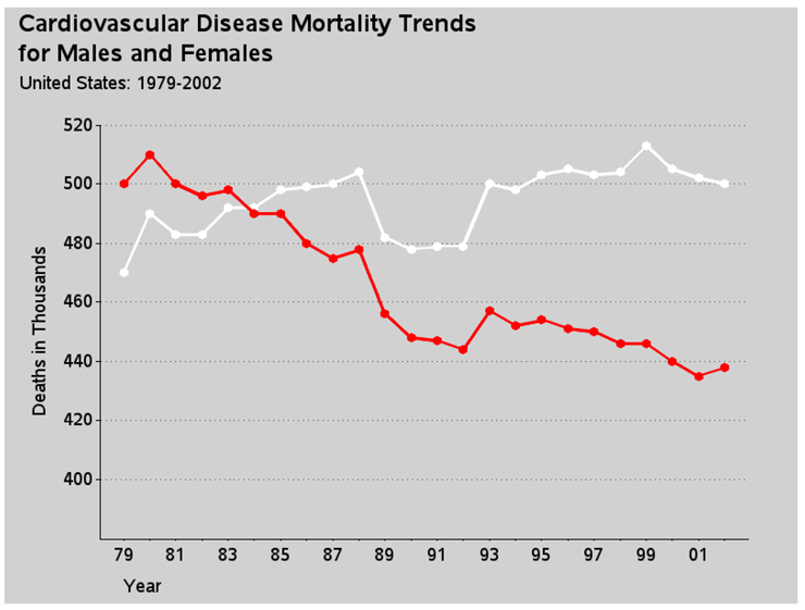
There are several standard built-in features you can use to make the graph look a lot more like the graph we are trying to imitate that don’t require any custom programming.
In the code below, I add some left-justified titles at the top of the page. I could also easily include a footnote here that says “Source: CDC/NCHS” like the original graph, but since I am not using the actual data values from the CDC/NCHS, I leave that off, so as not to have anyone think my estimated values are the real values. I also add some extra white space on the left and right sides of the graph, using blank title statements angled 90 and –90 degrees (see Example 7, “Adding Border Space,” for more info on that trick).
title1 ls=0.5 justify=left
" Cardiovascular Disease Mortality Trends";
title2 ls=0.5 justify=left font="albany amt/bold"
height=4 " for Males and Females";
title3 ls=1.0 justify=left " United States: 1979-2002";
title4 a=90 h=2 " ";
title5 a=-90 h=6 " ";
You can also control the axis characteristics using simple options on axis statements, again requiring no custom programming.
On the vertical axis (axis1), I control the range and tick mark values using the ORDER= option, and omit minor tick marks using minor=none. I hardcode the axis label rather than letting it default to the name or label of the plot variable, and I use a=90 to angle the label 90 degrees (up and down). The offset of 10 at the minimum end of the axis provides the visual space for the split axis marks I will add later.
axis1 order=(400 to 520 by 20) minor=none
label=(a=90 'Deaths in Thousands') offset=(10,0);
On the horizontal axis (axis2), I control the range of tick mark values using ORDER= again. I control the height of the major tick marks and suppress the minor ones. I add a small amount of offset (white space) before the first tick mark and after the last one. I left-justify the axis label text so it will be at the left side of the axis (where people generally start reading a graph).
Here is one “tricky” thing: I “blank” out the tick mark text values for every other tick mark on the horizontal date axis by hardcoding a blank value for every other one in the axis VALUE= list. Note that you refer to the tick marks as a number, 1 through n. I blank out the even-numbered ones (t=2, t=4, and so on).
axis2 order=('01jan1979'd to '01jan2002'd by year)
major=(height=.1) minor=none offset=(3,3)
label=(justify=left 'Year')
value=(t=2 '' t=4 '' t=6 '' t=8 '' t=10 '' t=12 ''
t=14 '' t=16 '' t=18 '' t=20 '' t=22 '' t=24 ''),
And here is one more easy customization via a simple PROC GPLOT option - I turn on reference lines using the AUTOREF option and specify the color (CREF) and line style (LREF). Although the original plot had solid black reference lines, I use gray dotted lines. This helps visually de-emphasize the reference lines, and keep the emphasis and attention on the data lines.
proc gplot data=my_data;
plot female_deaths*date=1 male_deaths*date=2 / overlay noframe
vaxis=axis1 haxis=axis2
autovref cvref=gray55 lvref=33;
run;
Here is the graph so far, with those simple changes:
Now for the custom programming.
I often find that a single PROC GPLOT SYMBOL statement does not let me specify the exact type of line or markers I want, and I use the trick of plotting the same data multiple times, using a different symbol statement each time, to iteratively build up the complex line that I want.
In this case, I plot the data three times: first as a thick black line, then as a slightly less thick white (or red) colored line so that the thick, black line appears to outline the white line, and finally so it appears as tiny circle markers with no line. I do that last by using the W character of the MARKERE (empty marker) SAS/GRAPH software font. This produces the illusion of a thick colored line with a black outline, and the circular markers let you easily see exactly how many data points make up the line. Also if you had mouse-over text or drill-down links, these circular markers show the user where to place their mouse. Note that the order of the lines is important.
symbol1 i=join c=black v=none w=7;
symbol2 i=join c=white v=none w=3;
symbol3 i=none c=black f=markere v='W' h=.6;
symbol4 i=join c=black v=none w=7;
symbol5 i=join c=red v=none w=3;
symbol6 i=none c=black f=markere v='W' h=.6;
proc gplot data=my_data;
plot
female_deaths*date=1 female_deaths*date=2 female_deaths*date=3
male_deaths*date=4 male_deaths*date=5 male_deaths*date=6
/ overlay noframe
vaxis=axis1 haxis=axis2
autovref cvref=gray55 lvref=33;
run;
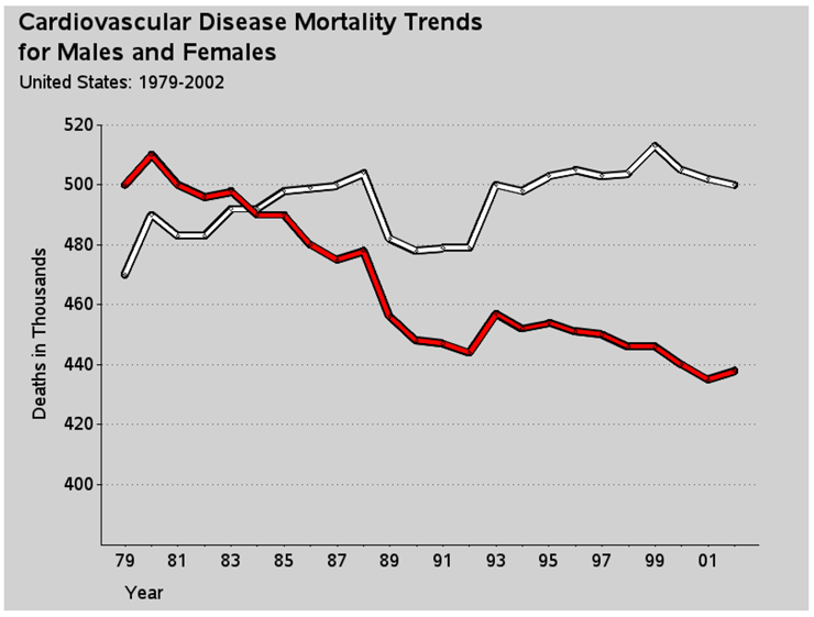
Unfortunately, when you do something tricky or custom in a graph, the automatic legends are not available, nor do they produce the desired legend. In this case, the automatic legend would show each of the six separate symbols that make up my two compound lines. But I really just want a legend showing that the red line represents males, and the white line represents females. Therefore I fake a simple legend using a footnote statement. I use the U character of the SAS/GRAPH MARKER font to draw a filled-in square, and then I move back and draw a black empty square around the filled one (using the SAS/GRAPH MARKERE empty marker font). How do you know exactly how much to move backwards, you might ask? Trial and error!
footnote f=marker h=3pct c=red 'U'
f=markere move=(-2.25,-0) c=black 'U'
f="albany amt" h=3.5pct c=black " Males "
f=marker h=3pct c=white 'U'
f=markere move=(-2.25,-0) c=black 'U'
f="albany amt" h=3.5pct c=black " Females";
Now here is the final custom touch—the “break” along the vertical axis. With time series data (such as this, or stock market prices, for example), is it better to show the data plotted against a vertical axis that includes zero so the variation in the lines is visually proportional to the total quantity? Or is it better to chop the axis so that it visually magnifies the variation? Either technique is okay, but you should make it evident to the user which of the two techniques is used. In this case the “chop” technique is used; therefore, it is desirable to show a visual break in the vertical axis line, so the user does not mistakenly assume the axis starts at zero.
There is not a built-in way to do this in PROC GPLOT, but there are several ways to do it with custom programming. I chose to annotate two large / (slash) characters, angled at 33-degrees. Notice that I am using xsys/ysys='1' to facilitate easy placement in relation to the axis line.
data anno_gap;
xsys='1'; ysys='1'; hsys='3'; position='5';
function='label'; size=7; angle=-33;
x=1; y=10; text='/'; output;
x=1; y= 7; text='/'; output;
run;
proc gplot data=my_data anno=anno_gap;
{same plot code as before}
Here is the final graph:
Notes
1 From http://biomed.brown.edu/Courses/BI108/BI108_2005_Groups/02/mortality.htm. Reprinted courtesy of Albert Lin.