
EXAMPLE 25 Plotting Multiple Graphs on the Same Page
Purpose: Use PROC GREPLAY to display several graphs on a page.
It is often useful to place multiple graphs on the same page, in varying sizes and positions, in order to look at the same data in different ways. There are several techniques you can use to accomplish this in SAS/GRAPH. I strongly recommend PROC GREPLAY because it provides the maximum flexibility.
To use PROC GREPLAY, you first run your code to create all the individual graphs, using the NAME= option to save them into named GRSEGs (so you can refer to them by those names later). Next create a custom PROC GREPLAY template, specifying the X and Y coordinates of the four corners of the desired areas to display each graph. And last, run PROC GREPLAY to display the saved graphs in the areas you have defined in the template.
Data
I got the original idea for this graph from an example on the DADiSP Web site: http://www.dadisp.com/grafx/XYZ-lg.gif.1 The data can be easily calculated programmatically, using a loop in a DATA step, and calculating the values using built-in SAS trig functions.
data foo;
do time = 0 to 1 by .0015;
Angle=4*360*time;
radians=Angle*(atan(1)/45);
X = sin(radians);
Y = cos(radians);
Z = time;
output;
end;
run;
Individual Plots
Before running the code to create the plots, I set GOPTIONS NODISPLAY so the graphs are not displayed yet. For now, the GRSEGs are saved, under the NAME= names. I also set my XPIXELS andYPIXELS size so the graphs are drawn in the desired proportions (the PROC GREPLAY template and final XPIXELS andYPIXELS determine the actual size of the final output, but I always set my XPIXELS andYPIXELS to the proper sizes so that the proportions are correct).
goptions nodisplay;
goptions xpixels=275 ypixels=200;
goptions htitle=11pt htext=7pt ftitle="albany amt/bo" ftext="albany amt";
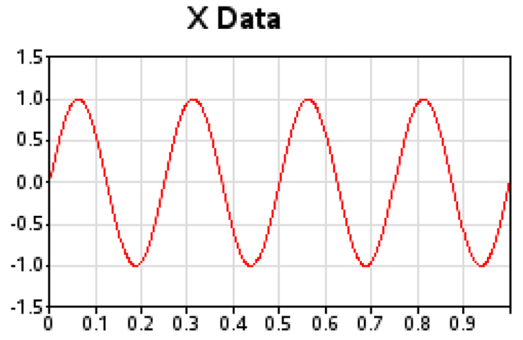
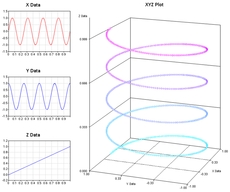
Here is the code for the “X Data” graph (PLOT1). There is not a lot of custom programming, but there are a few tricks worth noting. One such trick is the blank TITLE2 statement, angled 90 degrees to produce extra white space to the left of the graph (and similarly a blank footnote to produce extra white space at the bottom of the graph). This white space might look strange in the individual graphs, but it produces a visually pleasing spacing in the final, combined graph. Another trick is hardcoding values for specific tick marks on the horizontal axis using value=(t=1 '0' t=11 ' '). This puts a value of 0 at the first tick mark (rather than the default 0.0), and it blanks out the last tick mark value.
title1 ls=2.5 "X Data";
title2 a=90 h=10pct " ";
footnote1 h=10pct " ";
axis1 label=none order=(-1.5 to 1.5 by .5) minor=none offset=(0,0);
axis2 label=none order=(0 to 1 by .1) minor=none value=(t=1 '0' t=11 ' ') offset=(0,0);
symbol1 i=join width=1 v=none c=red;
proc gplot data=foo;
plot x*time=1 /
autohref chref=graydd autovref cvref=graydd
vaxis=axis1 haxis=axis2 name="plot1";
run;
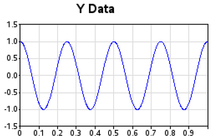
The “Y Data” graph (PLOT2) is created using almost identical code:
title1 ls=2.5 "Y Data";
title2 a=90 h=10pct " ";
footnote1 h=10pct " ";
symbol2 i=join width=1 v=none c=blue;
proc gplot data=foo;
plot y*time=2 /
autohref chref=graydd autovref cvref=graydd
vaxis=axis1 haxis=axis2 name="plot2";
run;
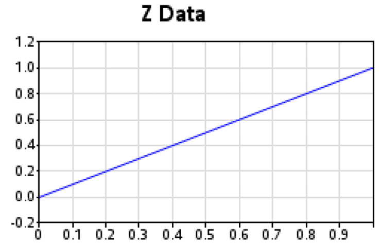
And the “Z Data” graph (PLOT3) uses a slightly different range in its vertical axis:
title1 ls=2.5 "Z Data";
title2 a=90 h=10pct " ";
footnote1 h=10pct " ";
axis3 label=none order=(-.2 to 1.2 by .2) minor=none offset=(0,0);
symbol3 i=join width=1 v=none c=blue;
proc gplot data=foo;
plot z*time=3 /
autohref chref=graydd autovref cvref=graydd
vaxis=axis3 haxis=axis2 name="plot3";
run;
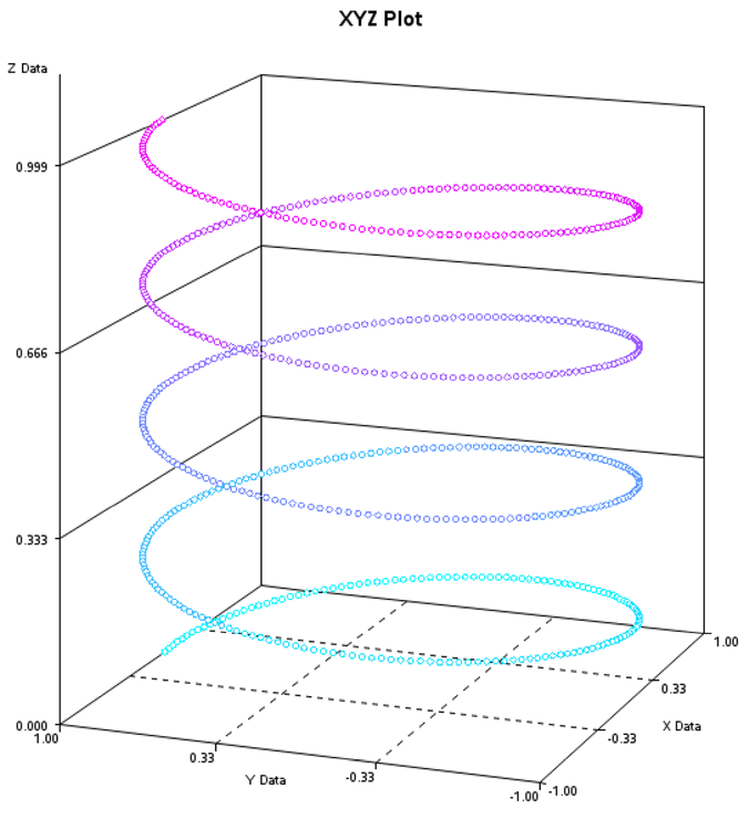
We want the three-dimensional “XYZ Data” plot (PLOT4) to be somewhat larger. Therefore, we adjust the XPIXELS andYPIXELS accordingly. I also assign a COLORVAR variable in the data to give a nice effect to the markers in the three-dimensional spiral (it helps you to visually discern which markers are at which Z depth when the spiral loops cross over one another). Note that the PROC G3D scatter plot is one of the few charts in SAS/GRAPH where you can directly assign a color via a variable in the data set (rather than having to indirectly control the color using symbol or pattern statements).
goptions xpixels=600 ypixels=600;
data foo; set foo;
length colorvar $8;
if Z<=0.1 then colorvar='cx0bf5ff';
else if Z<=0.2 then colorvar='cx1de0ff';
else if Z<=0.3 then colorvar='cx3ec0ff';
else if Z<=0.4 then colorvar='cx5f9eff';
else if Z<=0.5 then colorvar='cx738aff';
else if Z<=0.6 then colorvar='cx8974ff';
else if Z<=0.7 then colorvar='cx9f5eff';
else if Z<=0.8 then colorvar='cxc33dff';
else if Z<=0.9 then colorvar='cxe21bff';
else if Z<=1.0 then colorvar='cxf607ff';
run;
title1 ls=.75 "XYZ Plot";
title2;
footnote;
proc g3d data=foo;
label X="X Data";
label Y="Y Data";
label Z="Z Data";
scatter y*x=z / grid tilt=80 noneedle size=.4
shape="balloon" color=colorvar name="plot4";
run;
Combining the Plots
Now that we have all the individual plots, we get them all arranged on the same page using PROC GREPLAY.
I usually sketch a rough layout by hand, and then add up the total XPIXELs and YPIXELs (based on the XPIXELs and YPIXELs of the individual graphs), and calculate what percentage of the page (0–100% in the X and Y direction) each image occupies. I find it very useful to write both the pixel and percent values on the hand-drawn sketch, so I can use those numbers when I create my custom PROC GREPLAY template.
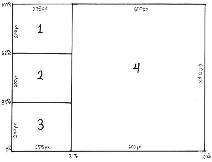
Here is the custom PROC GREPLAY template for this graph. Note that the areas are numbered 1–4 and correspond to the GRSEG names I plan to place into those areas (plot1-plot4) using PROC GREPLAY. The X and Y coordinates for the four corners of each GRSEG image are hardcoded into the template (LOWER_LEFT_X, LOWER_LEFT_Y, and so on).
goptions xpixels=875 ypixels=700;
proc greplay tc=tempcat nofs igout=work.gseg;
tdef layout des='layout'
1/llx = 0 lly = 66
ulx = 0 uly = 100
urx =31 ury = 100
lrx =31 lry = 66
2/llx = 0 lly = 33
ulx = 0 uly = 66
urx =31 ury = 66
lrx =31 lry = 33
3/llx = 0 lly = 0
ulx = 0 uly = 33
urx =31 ury = 33
lrx =31 lry = 0
4/llx =31 lly = 0
ulx =31 uly = 100
urx =100 ury = 100
lrx =100 lry = 0
;
And finally, use the TREPLAY (template replay) statement to display the four graphs (plot1–plot4) into the four numbered areas (1–4) of the custom GREPLAY template. The list of template area numbers and GRSEG names are space-delimited, and the spacing does not matter to TREPLAY, but I find it useful to arrange them so they visually correspond to the page layout. In this case, 1, 2, and 3 are on the left, and 4 is on the right.
template = layout;
treplay
1:plot1
2:plot2 4:plot4
3:plot3
;
run;
Here is the final result, with all four graphs on one page, in a visually captivating layout:
Notes
1 From www.dadisp.com. Used by permission of DADiSP.