EXAMPLE 8 Determine Customers Within Map Borders
Purpose: Demonstrate how to use the new SAS/GRAPH PROC GINSIDE to determine whether customers are in a sales area composed of a group of counties.
To make this example easy for you to run, and so you do not have to worry about having a customer database with hundreds of customer locations, I create some fake customer data from the sashelp.zipcode data set that is shipped with SAS:
proc sql;
create table customers as
select unique city, statecode as state, zip
from sashelp.zipcode
where statecode='NC';
quit; run;
I then use PROC GEOCODE (new in SAS 9.2) and look up the latitude and longitude of the ZIP code centroid for each customer. If you have the street address of your customer, you could also geocode down to the street level, but you will need to have SAS 9.2 third maintenance release or higher, and you will need to download the lookup table.
Note: The GEOCODE procedure’s ZIP option will be changing to METHOD=ZIP in future releases.
proc geocode ZIP NOCITY data=customers out=customers;
run;
PROC GEOCODE returns the longitude and latitude (X and Y) in degrees, and you need to convert them to radians so they can be conveniently combined with the maps supplied by SAS and projected with PROC GPROJECT. Note that I also multiply the longitude by –1. This converts it to the same eastlong and westlong direction as the maps supplied by SAS. (Alternatively, you could convert the map’s longitude and latitude values from radians to degrees, and multiply the map’s longitude by –1, and specify the DEGREES option in PROC GPROJECT. However, that seems like a lot more work.)
data customers; set customers;
x=(atan(1)/45 * x)*-1;
y=(atan(1)/45 * y);
run;
The data set will have several extra variables (from PROC GPROJECT), but the important part is that you now have an X and Y location (in radians) for each customer:
ZIP X Y
27513 1.37528 0.62492
27013 1.40808 0.62387
The following code converts the data set into Annotate instructions that will create a dark gray X on the map to represent each customer. We do not use the annotation just yet, but this is a convenient time to create it.
data customers;
set customers;
length text function $8 style color $20;
retain xsys ysys '2' hsys '3' when 'a';
anno_flag=1;
function='label';
style='"albany amt"';
position='5';
size=2.0;
color='gray55';
text='X';
output;
run;
Now to create the map. We start with the US county map (maps.counties). It contains the county outlines for each of the 50 states, and we will work with just the state of North Carolina (the location of the SAS headquarters), and identify a sales region that comprises several counties. Below is the state map with the counties of the sales region colored in red. (Note that for this example you must use maps.counties rather than maps.uscounty because only maps.counties has the unprojected latitude and longitude.)
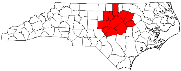
First, select just the counties in the sales region. In the US county map, the counties are identified by their numeric state and county FIPS codes. (If you are uncertain what the numeric FIPS codes are for your counties, you can look them up using their plain-text county names in the maps.cntyname data set.) Then assign as a common variable (REGION_ID) the same value for all the counties in your sales region. In this example I used region_id=999999.
data sales_region; set maps.counties (rename=(state=num_state)
where=(num_state=stfips('NC') and county in (183 101 85 105 37 63 135 77 69 127 195)));
state=fipstate(num_state);
region_id=999999;
run;
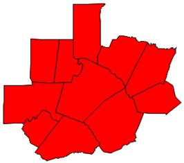
Now convert this group of counties into one contiguous map area by removing all the internal boundaries, using PROC GREMOVE. The ID statement tells GREMOVE what variables are needed to uniquely identify the areas in the original map (ID STATE COUNTY) and the BY statement tells GREMOVE which map areas to group together (all areas with the same REGION_ID).
proc gremove data=sales_region out=sales_region;
by region_id;
id state county;
run;

We now have a map area with the external borders of the sales region, and we could hypothetically combine this map area with the NC county map. But overlapping map areas can produce problems. What we really want is the NC county map, with just the outline of the sales region overlaid on top. As with most “overlay” challenges, this can be accomplished using the Annotate facility.
The following code converts the map area into an Annotate data set using the technique described in detail in Example 12, “Annotated Map Borders.”
data sales_region;
length COLOR FUNCTION $ 8;
retain XSYS YSYS '2' COLOR 'red' SIZE 1.75 WHEN 'A' FX FY FUNCTION;
set sales_region; by region_id Segment;
anno_flag=2;
if first.Segment then do;
FUNCTION = 'Move'; FX = X; FY = Y; end;
else if FUNCTION ^= ' ' then do;
if X = . then do;
X = FX; Y = FY; output; FUNCTION = ' '; end;
else FUNCTION = 'Draw';
end;
if FUNCTION ^= ' ' then do;
output;
if last.Segment then do;
X = FX; Y = FY; output; end;
end;
run;
The resulting Annotate data set (SALES_REGION) produces the following polygon:
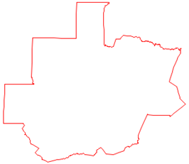
The SALES_REGION data set is not only a valid Annotate data set for drawing the sales region polygon; technically, it is also a valid SAS/GRAPH map data set. Although we are not going to use it to draw a map in PROC GMAP, we will specify it using MAP= for PROC GINSIDE.
PROC GINSIDE takes a map and some point data and tells you which map area the points are in. In this case, we use SALES_REGION as the map, and the CUSTOMERS data as the points. Since we have only one sales region, PROC GINSIDE basically tells us whether each customer is inside or outside of that sales region.
Note: PROC GINSIDE was new in SAS 9.2.
proc ginside data=customers map=sales_region out=customers;
id region_id;
run;
Here is what a tiny bit of the data would look like before running PROC GINSIDE (showing only two observations from the data set):
ZIP X Y
27513 1.37528 0.62492
27013 1.40808 0.62387
After running PROC GINSIDE, the CUSTOMERS data set has a REGION_ID variable. Observations with X and Ys that are inside a region have that region’s value. In our case, the sales region ID is 999999. If the point was not in any of the map areas, the value is missing (a dot in SAS).
ZIP X Y region_id
27513 1.37528 0.62492 999999
27013 1.40808 0.62387 .
Now that you know which customers are inside the sales region, you can do something special in their Annotate code to make them stand out in the map. In this case, I am making them red, and I am also using a different text character for their marker ('25cb'x is a circle character of the albany amt/unicode font). In the past, you might have used the W character of the SAS MARKERE font, but the Albany AMT characters render with nice smooth edges and look much better.
Note: The Albany AMT font is shipped with SAS 9.2 and higher, and is automatically available on all platforms.
data customers; set customers;
if (region_id ne .) then do;
style='"albany amt/unicode"';
size=2.9;
text='25cb'x;
color="red";
end;
run;
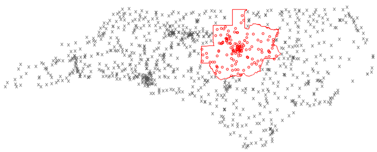
So, here is what all the Annotate pieces (customer markers and the sales region outline) look like at this point:
Now that you have all the Annotate pieces ready, you can combine them with the map, project the latitude and longitude coordinates, and then separate the map and Annotate data sets (as explained in more detail in Example 25, “Plotting Multiple Graphs on the Same Page”).
data mymap; set maps.counties (rename=(state=num_state) where=(num_state=stfips('NC')));
state=fipstate(num_state);
run;
data combined; set mymap customers sales_region;
run;
proc gproject data=combined out=combined dupok;
id state county;
run;
data mymap customers sales_region; set combined;
if anno_flag=1 then output customers;
else if anno_flag=2 then output sales_region;
else output mymap;
run;
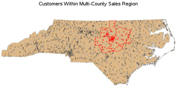
And finally, you are ready to use PROC GMAP to draw the NC county map, and annotate the customer markers and sales region outline. I specify the two Annotate data sets in two different ANNO= options for convenience (since PROC GMAP enables that). Alternatively, you could combine the two Annotate data sets, and specify the combined data set in just one location.
pattern1 v=msolid c=&landcolor;
title1 "Customers Within Multi-County Sales Region";
proc gmap map=mymap data=mymap anno=customers;
id state county;
choro state / levels=1 nolegend coutline=grayaa anno=sales_region;
run;