EXAMPLE 12 Annotated Map Borders
Purpose: This example demonstrates how to draw darker state outlines on a U.S. county map. The technique can be easily adapted to any map that has geographical boundaries at a lower level in which you want to also show groupings at a higher level. (This technique was adapted from SAS Technical Support’s example number 24904.)
There is no built-in way to represent two different levels of map borders in SAS/GRAPH. Therefore, you have to create a custom map using the Annotate facility. In a nutshell, you create a normal county map, and then annotate the state outline on top of it using a line that is darker or thicker or both.
You might be tempted to try combining maps.uscounty and maps.us, but those two do not necessarily line up perfectly. In order to guarantee that the state outline lines up exactly with the counties, you will need to create the state outline from the exact same points as the county outlines. You do this by removing the internal county boundaries within the states (using PROC GREMOVE), leaving just the state outlines.
The only requirement is that you start with a map that has a “compound ID” (that is, two variables to uniquely identify each area in the map, such as ID STATE COUNTY). First you will want to make a copy of that map, and you can use a simple DATA step for that. When you make a copy of the map, this gives you an easy opportunity to reduce the density of the map, or subset it to exclude unwanted areas, and so on.
data uscounty;
set maps.uscounty;
run;
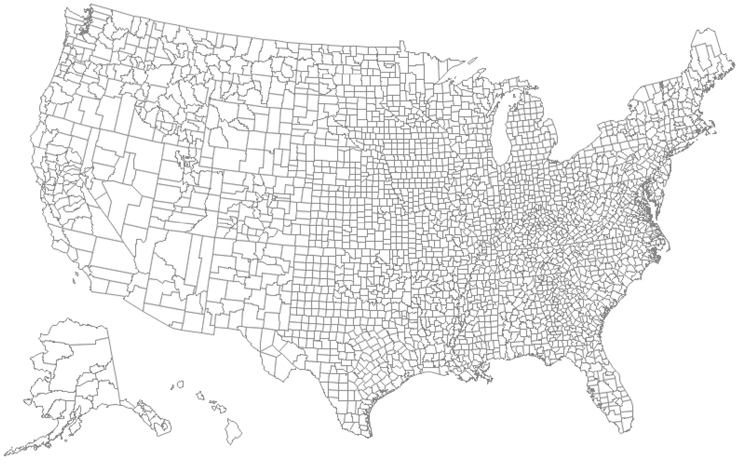
This is what the USCOUNTY data set looks like, when plotted with PROC GMAP. Note that there are no state outlines; therefore, it is difficult to know where one state ends and another begins.
The next step is to create a data set containing just the X and Y points of the outermost boundaries of the states (that is, remove all the internal boundaries). SAS has a procedure specifically for that purpose. Just make sure that you put the outermost border’s variables in the BY statement, and the innermost border’s variable in the ID statement.
proc gremove data=uscounty out=outline;
by STATE;
id COUNTY;
run;
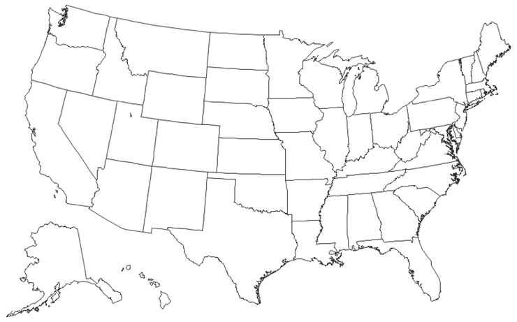
This is what the OUTLINE data set looks like:
At this point, you now have a county map and a state outline map. You could save the GRSEG entries, run PROC GREPLAY on them so that they are on top of each other, and you would probably achieve the desired result (that is, a county map, with darker state outlines). But there are several factors that might affect the positioning of the maps within the GRSEG (such as height, length, and auto-sizing of titles, legends, and so on). They could easily cause the state map borders to not line up exactly with the county map. At the very least this could cause the map to look bad, and at the very worst it could cause the map to be misinterpreted, thus compromising the data integrity.
By comparison, using Annotate to draw the state outlines guarantees the state borders will line up correctly with the county borders.
This next DATA step is the only part of this example that is complex. It converts the outline map data set into an Annotate data set. Basically, for each state you move to the first X and Y coordinate, then draw from coordinate to coordinate until you are done with that state, and then move (that is, “lift the pen and stop drawing”) to the next state. If the state is broken into multiple segments, then each segment of the state is handled separately. That is why the segment variable is also included in the BY statement.
Fortunately, you do not necessarily have to understand how this code works in order to use it. The only things you might want to edit here are the BY STATE SEGMENT (if your map uses a different variable other than STATE), and the COLOR and SIZE variables (in case you want to use a color other than gray33, or if you want to make the line thicker).
data outline;
length COLOR FUNCTION $ 8;
retain XSYS YSYS '2' COLOR 'gray33' SIZE 1.75 WHEN 'A' FX FY FUNCTION;
set outline; by STATE Segment;
if first.Segment then do;
FUNCTION = 'Move'; FX = X; FY = Y; end;
else if FUNCTION ^= ' ' then do;
if X = . then do;
X = FX; Y = FY; output; FUNCTION = ' '; end;
else FUNCTION = 'Draw';
end;
if FUNCTION ^= ' ' then do;
output;
if last.Segment then do;
X = FX; Y = FY; output; end;
end;
run;
Here is a little extra explanation about the Annotate commands. I use xsys='2' and ysys='2' so the annotation uses the same coordinate system as the map. This guarantees that the annotated X and Y coordinates line up exactly with the map’s X and Y coordinates. When='A' causes the annotation to be drawn after the map; therefore, it will be visible on top of the map (as opposed to when='B', which would draw the annotation before, or behind, the map). The values of FX and FY (first-X and first-Y) are retained, so you can connect the last point of each segment back to the first point.
All the hard work is basically done now. All you have to do is put it to use. For the purpose of keeping the example code small and easy to follow, I first demonstrate how to create the map using just a few observations of response data.
data combined;
input state county bucket;
datalines;
37 37 1
37 1 2
51 117 3
37 125 4
37 51 5
;
run;
I usually hardcode a few options to control the colors and fonts in order to override any ODS style that might be in effect. Note that I am using the new TrueType fonts that ship with SAS 9.2 (these will work on Windows, UNIX, or mainframe). I specify five pattern statements because I have divided my data into five “buckets.”
goptions cback=white;
goptions gunit=pct htitle=4 ftitle="albany amt/bold" htext=3 ftext="albany amt";
pattern1 v=s c=cxD7191C;
pattern2 v=s c=cxFDAE61;
pattern3 v=s c=cxFFFFBF;
pattern4 v=s c=cxA6D96A;
pattern5 v=s c=cx1A9641;
And finally, I use PROC GMAP to draw the county map and annotate the state outlines. Note that the coutline=graydd controls the outline color of the counties, and the outline color of the states is controlled by the COLOR= variable in the Annotate data set.
title1 "U.S. County map, with Annotated State Borders";
proc gmap data=combined map=uscounty all anno=outline;
id state county;
choro bucket /
midpoints = 1 2 3 4 5
coutline=graydd
nolegend;
run;
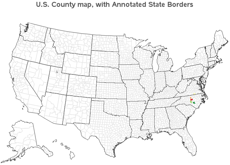
One thing worth mentioning is that I use the MIDPOINTS= option to guarantee that the legend will have all five possible bucket values, even if the particular data I am plotting does not have all five values in it. This guarantees that the desired data values will always have the desired legend color, and you can easily compare maps.
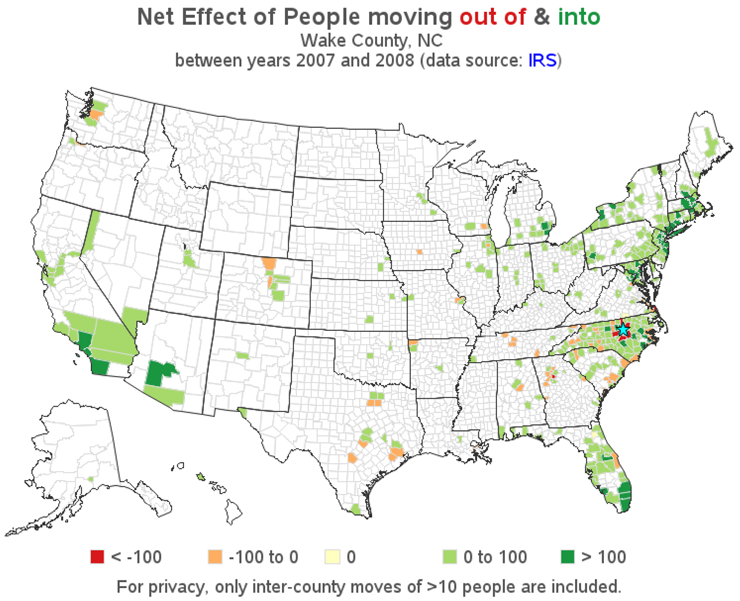
In order to generate the final map as shown in the example on the author’s Web page, you will need the full set of response data (which you can download from the Web page), and you will also need a little more code for the titles and the way the legend is displayed.
In the titles, I make the words “out of” red and “into” green in order to reinforce the color scheme used in the map legend. This is accomplished by breaking the title text into several pieces, and specifying the color before each piece of the title, using C=. I also use the LINK= option before the “IRS” text, so I can add a link to the IRS Web site where I got the data, and I make that text blue so people will know it has a link. Note that links in the title, as with most other links, will generally work only with ODS HTML output.
title1 "Net Effect of People moving " c=cxD7191C "out of" c=gray55 " & " c=cx1A9641 "into";
title2 " &countynm County, &statecode";
title3 "between years 20&year1 and 20&year2 "
"(data source: " c=blue link="http://www.irs.gov/taxstats/article/0,,id=212695,00.html" "IRS" c=gray ")";
Where did I get the text values for the macro variables used in TITLE2? I queried them out of some data sets supplied by SAS. At the top of the SAS job, I specify the numeric FIPS code for the state and county of interest, and then I use PROC SQL to look up the text county name in the maps.cntyname data set, and stuff that value into the COUNTYNM macro variable. Similarly, I look up the state abbreviation in maps.us. Note that I use separated by ' ' to guarantee that the values of the macro variables do not get padded with blanks (which would throw off the spacing in the titles).
%let state=37;
%let county=183;
proc sql;
select propcase(countynm) into :countynm separated by ' '
from maps.cntyname where state=&state and county=&county;
select unique statecode into :statecode separated by ' '
from maps.us where state=&state;
quit; run;
If you were to plot the map with what we have got so far, it would look something like this:
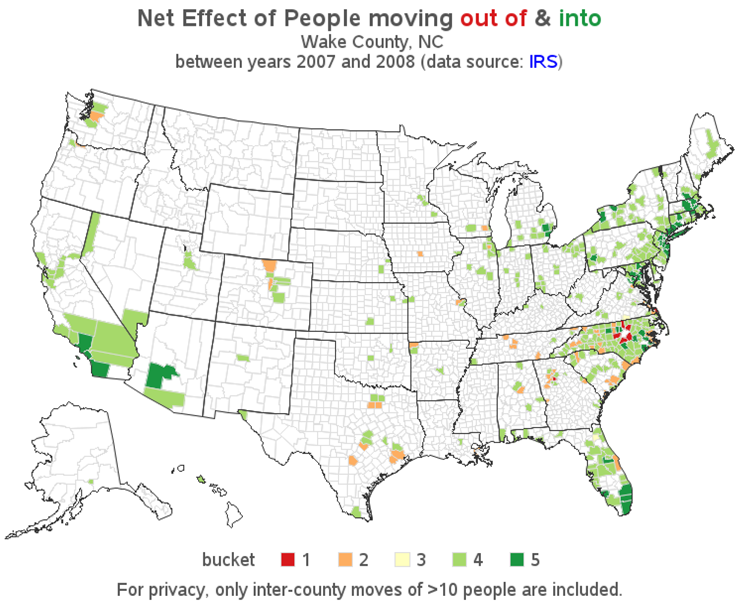
Although I have assigned each county a “bucket” value of 1 through -5, I actually want them to show up as something a little more descriptive in the legend. Therefore, I create a user-defined format so the numeric values 1 through -5 will show up as descriptive text. Note that I use macro variables to hold the numeric cut-off values for the buckets. That way, I can use the macro variable in both the IF statement (when assigning the bucket values) and the user-defined format, guaranteeing that they will match. Otherwise, someone editing the program might change the value in one place, and not the other, which would compromise the data integrity.
proc format;
value buckets
1 = "< &bucketn"
2 = "&bucketn to 0"
3 = "0"
4 = "0 to &bucketp"
5 = "> &bucketp"
;
run;
Note that there are several ways to control the binning and the appearance of the legend. Just consider this as one example (and not necessarily the best technique for every situation).
Although the title indicates which county is the subject of the map, I thought it would also be good to indicate that graphically, so I annotate a “star” in the center of that county. I just approximate the geographical center of the county by taking the average X and Y from maps.uscounty. I use the SAS/GRAPH MARKER font “V” character to draw a star, and then the MARKERE (e=empty) font to draw an outline around the star and make it more visible.
proc sql;
create table anno_star as
select avg(x) as x, avg(y) as y
from maps.uscounty
where state=&state and county=&county;
quit; run;
data anno_star; set anno_star;
length function style color $8;
xsys='2'; ysys='2'; hsys='3'; when='a';
function='label';
text='V';
size=3.0;
style='marker'; color='cyan'; output;
style='markere'; color='black'; output;
run;
The bucket’s user-defined format is applied via the FORMAT statement, and the annotated star (ANNO_STAR) is specified in the second ANNO= option.
proc gmap data=combined map=uscounty all anno=outline;
id state county;
format bucket buckets.;
choro bucket / discrete
midpoints = 1 2 3 4 5
coutline=graydd
legend=legend1
anno=anno_star;
run;
And here is what the final map looks like: