EXAMPLE 26 Grand Finale: An Advanced Dashboard
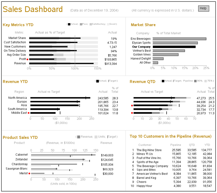
The final example is somewhat of a grand finale. It is a SAS/GRAPH implementation of the “Sales Dashboard” from page 177 of Stephen Few’s Information Dashboard Design.1 Below is the SAS output created in this example:

Few’s book is an excellent source of information about the design of information dashboards. When he created the dashboards for his book, he used a drawing application: the advantage was that it enabled him to design the more or less “perfect” dashboard, without being hindered by the limitations of any particular software. But the disadvantage is that users have no easy way to implement dashboards exactly like the ones in the book.
I must admit that implementing Few’s dashboard with SAS/GRAPH was a bit of a challenge. Even though I omitted the trend sparklines to simplify it a bit, the dashboard implementation still required almost 1000 lines of code. But the challenging nature of this dashboard also makes it a good example of what can be done with custom SAS/GRAPH programming.
Unlike the previous examples, where I provide extremely detailed descriptions of the code and show special plots that demonstrate how each of the sections of code affects the plot, I explain this example in a more general fashion. It would probably require an entire book to describe all the code in detail.
The Layout
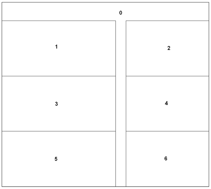
As should be done with most complex dashboards, I first created a rough layout to determine the size and proportions. I determined that I would need one overall area (area 0) that is 900x800 pixels, and six individual graph areas. The three on the left (areas 1, 3, and 5) are 495x240 pixels, and the three on the right (areas 2, 4, and 6) are 360x240 pixels.
Macro Variables
I initialize several values in macro variables, so I can easily maintain them in one place and use them throughout the SAS job:
%let browntext=cxB8860B;
%let graytext=gray99;
%let div_gray=graydd;
%let backcolor=white;
goptions cback=&backcolor;
%let poorcolor=grayaa;
%let satiscolor=graycc;
%let goodcolor=grayee;
%let pipe90=gray88;
%let pipe75=graydd;
%let revcolor=gray88;
%let unitcolor=graydd;
%let font='albany amt';
%let fontb='albany amt/bold';
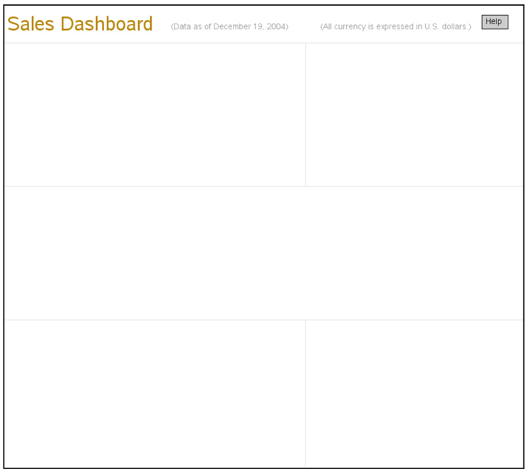
Plot 0 (Title Slide)
I use PROC GSLIDE and custom annotations to create the main title, dividing lines, and help button. This gives me total control. For example, by annotating the dividing lines (rather than using the automatic outlines provided by the GREPLAY template) I can make subtle adjustments to the line positioning, and do things such as eliminate the dividing line between the middle two graphs.
By using the Annotate LABEL function to write the text (rather than TITLE statements), I can control the exact placement and vertical alignment of the titles. I use the BAR function to draw the help button, and then annotate “Help” as text label on the button. The annotated help button uses an HTML variable with the HREF= tag to provide a drill-down link to a help page. I save the output of the PROC GSLIDE in a GRSEG named “titles” so that I can use it in PROC GREPLAY later.
data titlanno;
length function color $8 style $12 text $50 html $100;
xsys='3'; ysys='3'; hsys='3'; when='a';
/* annotate title text at top of page */
function='label'; style="&font";
y=97; x=.5; position='6'; color="&browntext"; size=4.3;
text='Sales Dashboard'; output;
y=95.8; x=32; position='6'; color="&graytext"; size=1.7;
text='(Data as of December 19, 2004)'; output;
y=95.8; x=90; position='4'; color="&graytext"; size=1.7;
text='(All currency is expressed in U.S. dollars.)'; output;
/* draw lines to group and separate graphs */
color="&div_gray"; size=.1;
function='move'; y=92.0; x=0; output;
function='draw'; x=100; output;
function='move'; y=61.0; x=0; output;
function='draw'; x=100; output;
function='move'; y=32.0; x=0; output;
function='draw'; x=100; output;
function='move'; y=61.0; x=58; output;
function='draw'; y=92; output;
function='move'; y=32.0; x=58; output;
function='draw'; y=0; output;
/* annotate help button */
html='title='||quote('Help')||' '|| 'href="sfew_info.htm"';
function='move'; y=95; x=92; output;
function='bar'; y=y+3; x=x+5; style="solid"; color="graycc"; line=0; output;
function='move'; y=95; x=92; output;
function='bar'; y=y+3; x=x+5; style="empty"; color="black"; line=0; output;
line=.;
function='label'; y=95; x=92.8; position='3'; style="&font";
color="black"; size=1.7; text='Help'; output;
run;
goptions xpixels=900 ypixels=800;
title;
footnote;
proc gslide name="titles" anno=titlanno;
run;
Title Slide results:
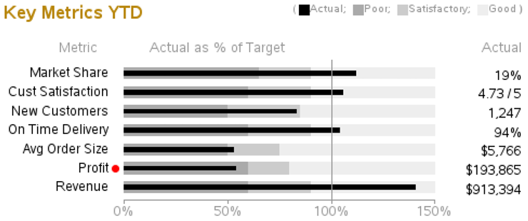
Plot 1 (Key Metrics YTD)
Data for Plot 1:
For each bar, you will need several values. The ACTUAL and TARGET values will be used to draw the bars, and the POORPCT and GOODPCT values will be used to draw the shaded areas behind the bar.
data data1;
input metric $ 1-20 actual target poorpct goodpct;
datalines;
Revenue 913394 650000 .60 .90
Profit 193865 360000 .60 .80
Avg Order Size 5766 11000 .50 .75
On Time Delivery .935 .900 .60 .90
New Customers 1247 1500 .50 .85
Cust Satisfaction 4.73 4.5 .60 .90
Market Share .190 .170 .65 .90
;
run;
/* the % of target will be the value of the black bar */
data data1; set data1;
format pct percent7.0;
pct=actual/target;
run;
Annotation for Plot 1:
As you might have guessed, SAS/GRAPH does not have a ready-made procedure to create this exact chart. In this case, I basically just use PROC GCHART to draw the axes and establish the coordinate system, and I annotate all the other aspects of the chart.
Of particular importance is that I annotate even the bar midpoint labels and the bars themselves, rather than using the ones that PROC GCHART draws. I annotate the midpoint labels so that I can offset them to the left, making room for the annotated red dots. And I annotate the black bars so that I can guarantee that they will be centered on top of the color ranges and will be of an appropriate size.
PROC GCHART HBAR does have an option to print a table of values to the right of the bars, but we do not actually want the bar values (which are percentages), but rather the actual values that were used behind the percent calculations. Therefore, we have to custom annotate the table. Note that I output only the labels at the top of the columns when _n_=1 (that is, the first observation of the data set). Otherwise, if you output it for every observation, you will generate multiple text labels stacked up at the same location, and the anti-aliasing will make this text appear to have a fuzzy halo.
Read the comments to see specifically what each section of Annotate code controls.
data anno1; set data1;
length function $8 color style $20 text $50;
/* Labels to the right of graph */
xsys='3'; ysys='2'; hsys='3'; when='a';
function='label';
x=98;
midpoint=metric;
position='4';
style="&font";
if metric in ('Revenue' 'Profit' 'Avg Order Size')
then text=trim(left(put(actual,dollar10.0)));
else if metric in ('On Time Delivery' 'Market Share')
then text=trim(left(put(actual,percent7.0)));
else if metric in ('New Customers')
then text=trim(left(put(actual,comma7.0)));
else if metric in ('Cust Satisfaction')
then text=trim(left(actual))||' / 5';
else text=trim(left(actual));
color='black';
output;
/* Red dots to left of graph */
if pct < poorpct then do;
xsys='2'; ysys='2'; when='a';
function='label'; color='red';
x=0;
midpoint=metric;
function='move'; output;
function='cntl2txt'; output;
function='label'; style='"wingdings"'; position='4';
xsys='9'; x=-.6; ysys='9'; y=+1;
text='6c'x;
output;
end;
/* Labels to left of graph */
xsys='2'; ysys='2'; when='a';
function='label';
x=0;
midpoint=metric;
function='move'; output;
function='cntl2txt'; output;
function='label'; style="&font"; position='4';
xsys='9'; x=-3.0; ysys='9'; y=+1; text=metric;
color='black';
output;
/* Annotated color ranges for poor, satisfactory, and good */
when='a'; size=.;
function='move'; xsys='2'; x=0; ysys='2'; midpoint=metric; output;
ysys='7'; y=-4; output;
function='bar'; style='solid'; line=0; color="&poorcolor"; y=+8; x=poorpct; output;
function='move'; xsys='2'; x=poorpct; ysys='2'; midpoint=metric; output;
ysys='7'; y=-4; output;
function='bar'; style='solid'; line=0; color="&satiscolor"; y=+8; x=goodpct; output;
function='move'; xsys='2'; x=goodpct; ysys='2'; midpoint=metric;
output; ysys='7'; y=-4; output;
function='bar'; style='solid'; line=0; color="&goodcolor"; y=+8; x=1.5; output;
line=.;
/* Now, annotate a skinnier bar to represent the data */
function='move'; xsys='2'; x=0; ysys='2'; midpoint=metric; output;
ysys='7'; y=-1.5; output;
function='bar'; style='solid'; line=0; color="black"; y=+3; x=pct; output;
/* Have to annotate the refline, to get it on top of the annotated bars */
when='a';
function='move'; xsys='2'; x=1.0; ysys='1'; y=0; output;
function='draw'; line=1; color="&graytext"; y=100; size=.1; output;
/* Labels at top of the columns */
if _n_=1 then do;
function='label'; style="&font"; color="&graytext"; size=5.5;
ysys='1'; y=100;
xsys='3'; x=15; position='2'; text='Metric'; output;
xsys='1'; x=30; position='2'; text='Actual as % of Target'; output;
xsys='3'; x=98; position='1'; text='Actual'; output;
end;
run;
Create Plot 1
This is basically a horizontal bar chart (PROC GCHART HBAR), with annotations enhancing, or replacing, all aspects of the chart except for the response axis. One non-Annotate enhancement is that I use the TITLE2 to simulate a legend because there are not automatic legends for the color ranges we are annotating behind the bars. I save the results in a GRSEG named PLOT1 that I can use later in PROC GREPLAY.
/* Use title to simulate a color legend */
title1 height=3.5 " ";
title2 height=7
justify=left font=&fontb color=&browntext " Key Metrics YTD"
justify=right height=4
font=&font color=&graytext "( "
font="webdings" color="black" '67'x
font=&font color=&graytext "Actual; "
font="webdings" color="&poorcolor" '67'x
font=&font color=&graytext "Poor; "
font="webdings" color="&satiscolor" '67'x
font=&font color=&graytext "Satisfactory; "
font="webdings" color="&goodcolor" '67'x
font=&font color=&graytext "Good ) "
;
/* Add white space to right, and left, of graph */
title3 angle=-90 height=25pct " ";
title4 angle=90 height=5pct " ";
axis1 label=none value=(color=&backcolor justify=right font=&font)
order=('Revenue' 'Profit' 'Avg Order Size' 'On Time Delivery'
'New Customers' 'Cust Satisfaction' 'Market Share')
style=0 offset=(5,5);
axis2 label=none minor=none order=(0 to 1.5 by .5) value=(color=&graytext)
color=&graytext offset=(0,0);
pattern1 v=solid color=black;
goptions xpixels=495 ypixels=240;
proc gchart data=data1 anno=anno1;
hbar metric / type=sum sumvar=pct
width=.7 space=3
maxis=axis1 raxis=axis2
nostats noframe
name="plot1";
run;
Plot 1 Results:
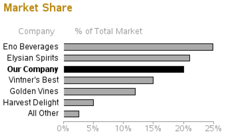
Plot 2 (Market Share)
Data for Plot 2:
The data for the second plot is a bit simpler and more straightforward. The only thing I do special in the data is setting colorvar=2 for “Our Company.”
data data2;
format market_share percent7.0;
input company $ 1-20 market_share;
if company eq "Our Company" then colorvar=2; else colorvar=1;
datalines;
Eno Beverages .249
Elysian Spirits .210
Our Company .200
Vintner's Best .150
Golden Vines .120
Harvest Delight .050
All Other .025
;
run;
Annotation for Plot 2:
Similar to the first plot, we will again be annotating the bar midpoint values. This time, instead of doing this to allow space for a red dot, we annotate the labels so that we can make the “Our Company” label bold.
data anno2; set data2;
length function $8 color style $20 text $20;
/* Labels to left of graph */
xsys='2'; ysys='2'; hsys='3'; when='a';
function='label';
x=0;
midpoint=company;
function='move'; output;
function='cntl2txt'; output;
function='label'; style="&font"; position='4';
xsys='9'; x=-2.0; ysys='9'; y=+1; text=company;
color="black";
if company eq "Our Company" then style="&fontb";
else style="&font";
output;
/* Labels at top of the columns */
if _n_=1 then do;
function='label'; style="&font"; color="&graytext"; size=5.5;
ysys='1'; y=100;
xsys='3'; x=15; position='2'; text='Company'; output;
xsys='1'; x=30; position='2'; text='% of Total Market'; output;
end;
run;
Create Plot 2:
Nothing really tricky going on here; we are just running PROC GCHART HBAR and specifying the Annotate data set.
axis1 label=none value=(color=&backcolor justify=right font=&fontb)
style=0 offset=(5,5);
axis2 label=none minor=none order=(0 to .25 by .05)
value=(color=&graytext) color=&graytext offset=(0,0);
pattern1 v=solid color="&poorcolor";
pattern2 v=solid color="black";
title1 height=3.5 " ";
title2 height=7 justify=left font=&fontb color=&browntext " Market Share";
title3 angle=-90 height=8pct " ";
goptions xpixels=360 ypixels=240;
proc gchart data=data2 anno=anno2;
hbar company / type=sum sumvar=market_share descending subgroup=colorvar
maxis=axis1 raxis=axis2
width=2.0 space=1.5
nostats noframe nolegend
name="plot2";
run;
Plot 2 Results:
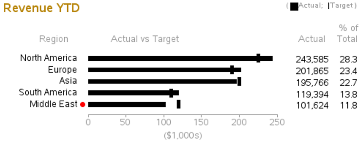
Plot 3 (Revenue YTD)
Data for Plot 3:
Plot 3’s layout is similar to plot 1, but the values being plotted are very different. In this case, rather than plotting the bars against good, satisfactory, or poor color ranges, we plot the bar against a target. The values in the table to the right show the bar values as a percentage of the total (which I calculate using PROC SQL).
data data3;
input region $ 1-20 actual target;
actual2=actual/1000;
datalines;
North America 243585 225000
Europe 201865 190000
Asia 195766 200000
South America 119394 110000
Middle East 101624 120000
;
run;
proc sql;
create table data3 as
select *,
100*(actual/sum(actual)) as pct_total,
(actual/target) as pct_target
from data3;
quit; run;
Annotation for Plot 3:
This Annotate code is very similar to the code used in plot 1 (except the values being annotated are different). One major difference is that instead of colored areas behind the bars, I annotate a TARGET (thick line segment), using MOVE and DRAW.
data anno3; set data3;
length function $8 color style $20 text $20;
when='a'; size=.;
/* Annotate a bar to represent the data rather than using the gchart bar */
function='move'; xsys='2'; x=0; ysys='2'; midpoint=region; output;
ysys='7'; y=-3; output;
function='bar'; style='solid'; line=0; color="black"; y=+6; x=actual2; output;
/* Annotate a thick mark for the 'target' value */
function='move'; xsys='2'; x=target/1000; ysys='2'; midpoint=region; output;
function='move'; ysys='7'; y=+6; output;
function='draw'; ysys='7'; y=-12; size=4; color="black"; output;
size=.;
/* Labels to the right of graph */
xsys='3'; ysys='2'; hsys='3'; when='a';
function='label';
midpoint=region;
position='4';
style="&font";
color='black';
x=91; text=trim(left(put(actual,comma12.0))); output;
color='black';
x=99; text=trim(left(put(pct_total,comma7.1))); output;
/* Labels to left of graph */
xsys='2'; ysys='2'; when='a';
function='label';
x=0;
midpoint=region;
function='move'; output;
function='cntl2txt'; output;
function='label'; style="&font"; position='4';
xsys='9'; x=-3.0; ysys='9'; y=+1; text=region; color='black';
color='black';
output;
/* Red dot beside 'poor' performance that needs attention */
if pct_target < .90 then do;
xsys='2'; ysys='2'; when='a';
function='label';
x=0;
midpoint=region;
function='move'; output;
function='cntl2txt'; output;
function='label'; style='"wingdings"'; position='4';
xsys='9'; x=-.6; ysys='9'; y=+1; text='6c'x; color='red'; output;
end;
/* Annotated color ranges for poor, satisfactory, and good */
when='a'; s
/* Labels at top of the columns */
if _n_=1 then do;
function='label'; style="&font"; color="&graytext"; size=5.5;
ysys='1'; y=100;
xsys='3'; x=15; position='2'; text='Region'; output;
xsys='1'; x=30; position='2'; text='Actual vs Target'; output;
xsys='3'; x=90; position='1'; text='Actual'; output;
xsys='3'; x=99; position='1'; text='Total'; output;
function='txt2cntl2'; output;
function='move'; ysys='9'; y=1.7; output;
function='cntl2txt'; output;
function='label';
xsys='3'; x=99; position='1'; text='% of'; output;
end;
run;
Create Plot 3:
The PROC GCHART HBAR code is almost identical to the code used for Plot 1. Note that the pink PROC GCHART BAR pattern is never seen by the end user because the annotated black bars cover the pink ones (but it is useful to be able to see the “real” bars in a different color if you omit the annotate data for debugging).
title1 height=3.5 " ";
title2 height=7 justify=left font=&fontb color=&browntext " Revenue YTD"
justify=right
font=&font height=4 color=&graytext "( "
font="webdings" height=4.5 color="black" '67'x
font=&font height=4 color=&graytext "Actual; "
font=&font height=4 color="black" '|'
font=&font height=4 color=&graytext "Target ) "
;
title3 angle=90 height=10pct " ";
title4 angle=-90 height=35pct " ";
axis1 label=none value=(color=&backcolor justify=right font=&font)
style=0 offset=(6,6);
axis2 label=('($1,000s)') minor=none order=(0 to 250 by 50) value=(color=&graytext)
color=&graytext offset=(0,0);
pattern1 v=solid color=pink;
goptions xpixels=495 ypixels=240;
proc gchart data=data3 anno=anno3;
hbar region / type=sum sumvar=actual2 descending
width=0.8 space=2.5
maxis=axis1 raxis=axis2
nostats noframe
name="plot3";
run;
Plot 3 Results:
Plot 4 (Revenue QTD)
Data for Plot 4:
The data for plot 4 is very similar to the data used in plot 3, with good reason. Plots 3 and 4 share the same bar midpoint labels and therefore need to line up exactly with one another.
data data4;
input region $ 1-20 actual target pipe90 pipe75;
actual2=(actual/1000);
pipe90_2=(pipe90/1000);
pipe75_2=(pipe75/1000);
datalines;
North America 47273 43000 13000 5000
Europe 44936 42000 8000 6000
Asia 39254 52000 5000 5000
South America 32734 30000 7000 4000
Middle East 20973 37500 9000 4000
;
run;
proc sql;
create table data4 as
select *,
100*(actual/sum(actual)) as pct_total,
(actual/target) as pct_target
from data4;
quit; run;
Annotation for Plot 4:
Plot 4’s Annotate code is similar to the code used in previous charts. Drawing the bar segments uses code very similar to what was used to draw the color ranges behind the bars in plot 1.
data anno4; set data4;
length function $8 color style $20 text $20;
when='a'; size=.;
/* Annotate a bar to represent the data rather than using the gchart bar */
function='move'; xsys='2'; x=0; ysys='2'; midpoint=region; output;
ysys='7'; y=-3; output;
function='bar'; style='solid'; line=0; color="black"; y=+6; x=actual2; output;
/* Annotate gray bar segment for the 90% pipeline value */
function='move'; xsys='2'; x=actual2; ysys='2'; midpoint=region; output;
ysys='7'; y=-3; output;
function='bar'; style='solid'; line=0; color="&pipe90"; y=+6; x=actual2+pipe90_2; output;
/* Annotate gray bar segment for the 75% pipeline value */
function='move'; xsys='2'; x=actual2+pipe90_2; ysys='2'; midpoint=region; output;
ysys='7'; y=-3; output;
function='bar'; style='solid'; line=0; color="&pipe75"; y=+6; x=actual2+pipe90_2+pipe75_2; output;
line=.;
/* Annotate a thick mark for the 'target' value */
function='move'; xsys='2'; x=target/1000; ysys='2'; midpoint=region; output;
function='move'; ysys='7'; y=+6; output;
function='draw'; ysys='7'; y=-12; size=4; color="black"; output;
size=.;
/* Labels to the right of graph */
xsys='3'; ysys='2'; hsys='3'; when='a';
function='label';
midpoint=region;
position='4';
style="&font";
color='black';
x=89; text=trim(left(put(actual,comma12.0))); output;
x=99; text=trim(left(put(pct_total,comma7.1))); output;
/* Red dot beside 'poor' performance that needs attention */
if pct_target < .90 then do;
xsys='2'; ysys='2'; when='a';
function='label';
x=0;
midpoint=region;
function='move'; output;
function='cntl2txt'; output;
function='label'; style='"wingdings"'; position='4';
xsys='9'; x=-.6; ysys='9'; y=+1; text='6c'x; color='red'; output;
end;
when='a'; size=.;
/* Labels at top of the columns */
if _n_=1 then do;
function='label'; style="&font"; color="&graytext"; size=5.5;
ysys='1'; y=100;
xsys='1'; x=30; position='2'; text='Actual vs Target'; output;
xsys='3'; x=89; position='1'; text='Actual'; output;
xsys='3'; x=99; position='1'; text='Total'; output;
function='txt2cntl2'; output;
function='move'; ysys='9'; y=1.7; output;
function='cntl2txt'; output;
function='label';
xsys='3'; x=99; position='1'; text='% of'; output;
end;
run;
Create Plot 4:
Once again, we use TITLE2 to simulate a legend, and then save the output in a GRSEG named PLOT4 (which we will use later in PROC GREPLAY).
title1 height=3.5 " ";
title2 height=7 justify=left font=&fontb color=&browntext "Revenue QTD"
justify=right height=4
font=&font color=&graytext "( "
font="webdings" color="black" '67'x
font=&font color=&graytext "Actual; "
font=&font color="black" '|'
font=&font color=&graytext "Target; Pipeline: "
font="webdings" color="&pipe90" '67'x
font=&font color=&graytext " 90%; "
font="webdings" color="&pipe75" '67'x
font=&font color=&graytext " 75% ) "
;
title3 angle=90 height=1pct " ";
title4 angle=-90 height=27pct " ";
axis1 label=none value=(color=&backcolor justify=right font=&font height=.5)
style=0 offset=(6,6);
axis2 label=('($1,000s)') minor=none order=(0 to 70 by 10) value=(color=&graytext)
color=&graytext offset=(0,0);
pattern1 v=solid color=pink;
goptions xpixels=360 ypixels=240;
proc gchart data=data4 anno=anno4;
hbar region / type=sum sumvar=actual2 descending
width=0.8 space=2.5
maxis=axis1 raxis=axis2
nostats noframe
name="plot4";
run;
Plot 4 Results:

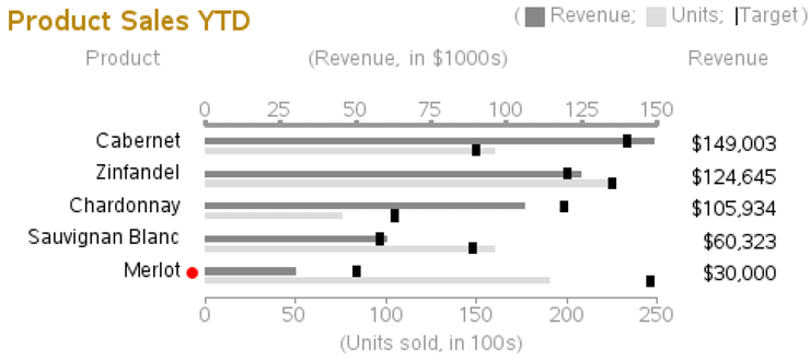
Plot 5 (Product Sales YTD)
Data for Plot 5:
Because we have to deal with grouped bars, this one is a little more difficult than the others. For example, we have to manipulate the data and generate two observations for each observation in the original data.
%let maxrevenue=150;
%let maxunits=250;
data data5;
input product $ 1-20 revenue rev_target units unit_target;
revenue2=revenue/1000;
units2=units/100;
rev_target2=rev_target/1000;
unit_target2=unit_target/100;
datalines;
Cabernet 149003 140000 16000 15000
Zinfandel 124645 120000 22500 22500
Chardonnay 105934 119000 7500 10500
Sauvignan Blanc 60323 58000 16000 14800
Merlot 30000 50000 19000 24600
;
run;
/* Re-arrange the data for grouped bar chart */
data data5; set data5;
groupvar=product;
barvar='Revenue'; value=revenue2; target=rev_target2; pct_target=value/target;
normval=value/&maxrevenue; normtarg=target/&maxrevenue;
output;
barvar='Units'; value=units2; target=unit_target2; pct_target=value/target;
normval=value/&maxunits; normtarg=target/&maxunits;
output;
run;
Annotation for Plot 5:
The annotate data is also a bit more complex, because rather than dealing with MIDPOINT and X values, we also have to include a GROUP value.
data anno5; set data5;
length function $8 color style $20 text $50;
when='a'; size=.;
/* Annotate a bar to represent the data rather than using the gchart bar */
if barvar eq 'Revenue' then color="&revcolor"; else color="&unitcolor";
function='move'; xsys='2'; x=0; ysys='2'; group=groupvar; midpoint=barvar; output;
ysys='7'; y=-1.5; output;
function='bar'; style='solid'; line=0; y=+3; x=normval; output;
line=.;
/* Annotate a thick mark for the 'target' value */
function='move'; xsys='2'; x=normtarg; ysys='2'; group=groupvar; midpoint=barvar; output;
function='move'; ysys='7'; y=+3; output;
function='draw'; ysys='7'; y=-6; size=4; color="black"; output;
size=.;
/* Labels to the right of graph */
xsys='3'; ysys='2'; hsys='3'; when='a';
function='label';
group=groupvar;
midpoint=barvar;
position='4';
style="&font";
color='black';
if barvar eq 'Revenue' then do;
x=95; text=trim(left(put(revenue,dollar12.0)));
output;
end;
/* Labels to left of graph */
xsys='2'; ysys='2'; when='a';
function='label';
x=0;
group=groupvar;
midpoint=barvar;
function='move'; output;
function='cntl2txt'; output;
function='label'; style="&font"; position='4';
xsys='9'; x=-3.0; ysys='9'; y=+1; text=groupvar; color='black';
color='black';
if barvar eq 'Revenue' then output;
/* Red dot beside 'poor' performance that needs attention */
if pct_target < .70 then do;
xsys='2'; ysys='2'; when='a';
function='label';
x=0;
group=groupvar;
midpoint=barvar;
function='move'; output;
function='cntl2txt'; output;
function='label'; style='"wingdings"'; position='4';
xsys='9'; x=-.6; ysys='9'; y=+1; text='6c'x; color='red'; output;
end;
run;
The PROC GCHART HBAR statement does not support having two axes (a separate axis for the two bars in the grouped bar pairs). Therefore, we need to annotate the axis line and the tick marks at the top of the graph.
data anno5b;
length function $8 color style $20 text $50;
when='a'; size=.; hsys='3';
/* Annotate axis line at top of graph */
color="&graytext"; line=1;
function='move'; xsys='1'; ysys='1'; x=0; y=100; output;
function='draw'; xsys='1'; ysys='1'; x=100; y=100; output;
/* Annotate tick marks on line at top of graph */
function='move'; xsys='1'; ysys='1'; x=100*(0*(150/6))/150; y=100; output;
function='draw'; ysys='7'; y=2; output;
function='cntl2txt'; output; function='label'; position='b'; text=trim(left(0*(150/6))); output;
function='move'; xsys='1'; ysys='1'; x=100*(1*(150/6))/150; y=100; output;
function='draw'; ysys='7'; y=2; output;
function='cntl2txt'; output; function='label'; position='b'; text=trim(left(1*(150/6))); output;
{and so on, for the other tick marks}
/* Labels at top of the columns */
fuction='move'; xsys='3'; x=0; ysys='1'; y=100; text=''; output;
function='move'; ysys='9'; y=8; output;
function='label'; style="&font"; color="&graytext"; size=5.5; ysys='3'; y=80;
xsys='3'; x=15; position='2'; text='Product'; output;
xsys='1'; x=45; position='2'; text='(Revenue, in $1000s)'; output;
xsys='3'; x=94; position='1'; text='Revenue'; output;
run;
data anno5; set anno5 anno5b;
run;
Create Plot 5:
Plotting the graph is similar to the others—use TITLE2 for a legend, run PROC GCHART, specify the ANNO= data set, and save the output in plot 5 to use later in PROC GREPLAY.
title1 height=2 " ";
title2 height=7 justify=left font=&fontb color=&browntext " Product Sales YTD"
justify=right height=5
font=&font color=&graytext "( "
font="webdings" color="&revcolor" '67'x
font=&font color=&graytext " Revenue; "
font="webdings" color="&unitcolor" '67'x
font=&font color=&graytext " Units; "
font=&font color="black" '|'
font=&font color=&graytext "Target ) "
;
title3 height=9pct " ";
title4 angle=90 height=8pct " "; /* blank space to left of bar chart */
title5 angle=-90 height=30pct " "; /* blank space to right of bar chart */
axis1 label=none order=('Cabernet' 'Zinfandel' 'Chardonnay' 'Sauvignan Blanc' 'Merlot')
value=(color=&backcolor justify=right font=&font ) style=0 offset=(3,3);
axis2 label=('(Units sold, in 100s)') minor=none major=(number=6)
value=(color=&graytext t=1 "0" t=2 "50" t=3 "100" t=4 "150" t=5 "200" t=6 "250")
color=&graytext offset=(0,0);
axis3 label=none value=none;
pattern1 v=solid color=&backcolor;
goptions xpixels=495 ypixels=240;
proc gchart data=data5 anno=anno5;
hbar barvar / group=groupvar type=sum sumvar=normval
gaxis=axis1 raxis=axis2 maxis=axis3
width=1.2 space=0 gspace=1.7
coutline=same nostats noframe
name="plot5" ;
run;
Plot 5 Results:
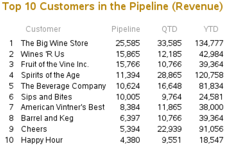
Plot 6 (Top 10 List)
Data for Plot 6:
Plot 6 is not really a plot at all. In the general sense it is a table. But the tool I am using to place all the graphs on the same page (PROC GREPLAY) works only with graphical output. I have to create this table using a “graph.” Therefore, my tool of choice is a blank PROC GSLIDE with annotated text. The data is fairly simple—just the top 10 stores and their values.
data data6;
input customer $ 1-25 pipeline qtd ytd;
datalines;
The Big Wine Store 25585 33585 134777
Wines 'R Us 15865 12185 42984
Fruit of the Vine Inc. 15766 10766 39364
Spirits of the Age 11394 28865 120758
The Beverage Company 10624 16648 81834
Sips and Bites 10005 9764 24581
American Vintner's Best 8384 11865 38000
Barrel and Keg 6397 10766 39364
Cheers 5394 22939 91056
Happy Hour 4380 9551 18547
;
run;
proc sort data=data6 out=data6;
by descending pipeline;
run;
Annotation for Plot 6:
Creating a graphical version of a table is a very useful thing. You might want to take special notice of this code. For each line of data, you output all the table values, each one at the desired column (X value). And the Y value is calculated based on the observation number of the data.
Note that, if desired, you can use an HTML= variable with HTML tags for data tips and drill-down links on each of the separate pieces of text that you annotate. You can also control the color of the annotated text and the background color behind the text.
/* Annotate the table values */
data anno6; set data6;
length text $100;
xsys='3'; ysys='3'; hsys='3';
rank=_n_;
function='label';
y=80-(rank*7);
x=5; position='4'; text=trim(left(rank)); output;
x=8; position='6'; text=trim(left(customer)); output;
x=60; position='4'; text=trim(left(put(pipeline,comma7.0))); output;
x=78; position='4'; text=trim(left(put(qtd,comma7.0))); output;
x=96; position='4'; text=trim(left(put(ytd,comma7.0))); output;
run;
/* Annotate the table column headers */
data anno6b;
length text $100;
xsys='3'; ysys='3'; hsys='3';
function='label';
color="&graytext";
y=82;
x=10; position='6'; text='Customer'; output;
x=60; position='4'; text='Pipeline'; output;
x=76; position='4'; text='QTD'; output;
x=94; position='4'; text='YTD'; output;
run;
data anno6; set anno6 anno6b;
run;
Create Plot 6:
Run PROC GSLIDE, specifying the annotate data set, and save the results in a GRSEG named PLOT6.
title1 height=8 justify=left font=&fontb color=&browntext
"Top 10 Customers in the Pipeline (Revenue)";
footnote;
goptions xpixels=360 ypixels=240;
proc gslide name="plot6" anno=anno6;
run;
Plot 6 Results:
GREPLAY Template
This is where we pull it all together.
Using the size of the whole page, in combination with the sizes of the individual graphs, design a custom GREPLAY template to display the six graphs (PLOT1–PLOT6) and the title slide (TITLES) on the same page. When you create the graphs, you can name the GRSEGs anything you want, but I find it very useful to use a number in the name (such as 1–6) that corresponds to the numbered areas of the GREPLAY template.
See the other GREPLAY examples for more details about designing GREPLAY templates, and calculating the X and Y percentage values for each of the areas of the template.
The following code first defines the six areas of the custom template (areas 0–6), and then “replays” the seven GRSEGs (titles, and plot1-plot6) into the custom template.
proc greplay tc=tempcat nofs igout=work.gseg;
tdef dashbrd des='Dashboard'
0/llx = 0 lly = 0
ulx = 0 uly = 100
urx =100 ury = 100
lrx =100 lry = 0
1/llx = 0 lly = 60
ulx = 0 uly = 90
urx =55 ury = 90
lrx =55 lry = 60
2/llx =60 lly = 60
ulx =60 uly = 90
urx =100 ury = 90
lrx =100 lry = 60
3/llx = 0 lly = 30
ulx = 0 uly = 60
urx =55 ury = 60
lrx =55 lry = 30
4/llx =60 lly = 30
ulx =60 uly = 60
urx =100 ury = 60
lrx =100 lry = 30
5/llx = 0 lly = 0
ulx = 0 uly = 30
urx =55 ury = 30
lrx =55 lry = 0
6/llx =60 lly = 0
ulx =60 uly = 30
urx =100 ury = 30
lrx =100 lry = 0
;
template = dashbrd;
treplay
0:titles
1:plot1 2:plot2
3:plot3 4:plot4
5:plot5 6:plot6
;
run;
And there you have it: the completed dashboard, which proves once again that a motivated SAS/GRAPH programmer can create just about any graph!