EXAMPLE 2 Using PROC GREPLAY For Custom Dashboard Layout
Purpose: Demonstrate how to create a custom SAS/GRAPH GREPLAY template and display multiple graphs in it.
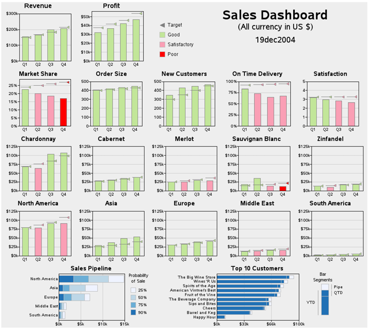
Building on Example 1, “Bar with Annotated Marker,” this example combines several of those “simple little bar charts” (and a few other graphics) together onto the same page into what is called an information dashboard. The actual code for the entire dashboard (over 1500 lines) can be downloaded from the author’s Web site. The code pertinent to creating a custom GREPLAY template and displaying graphs in it is described in detail here.
Overly Simple Dashboards (tiling)
Creating dashboards generally involves placing several graphs on the same page, and the extent to which you can control the exact size, proportions, and placement of those graphs can greatly influence the effectiveness of the dashboard. Some software simply “tiles” several graphs onto the same page (in simple rows and columns), and calls it a dashboard. Although the tiling technique is easy, the dashboards produced using that technique do not live up to the full potential of a well-designed dashboard with a custom layout.
SAS/GRAPH GREPLAY Procedure Dashboard
In this example, I demonstrate how to use SAS/GRAPH’s PROC GREPLAY to create a custom template in order to display 20 graphics together in a very carefully chosen custom dashboard layout. Using the PROC GREPLAY technique described here, you should be able to design custom dashboards with any layout you can imagine.
There are many factors to consider when deciding what graphs to put in your dashboard, and how they should be arranged on the page. That topic is beyond the scope of a simple example like this, and is covered in detail in Stephen Few’s excellent book Information Dashboard Design.
For this particular dashboard, I designed several graphs to answer the specific questions posed in DM Review’s Dashboard contest, and then printed separate copies of each graph (each one on a separate piece of paper). I tried many different physical arrangements, re-arranging the physical pieces of paper on a table top until I had an arrangement I liked. In general, I tried to put the most important graphs toward the top/left, and tried to keep similar graphs side-by-side for easy comparison.
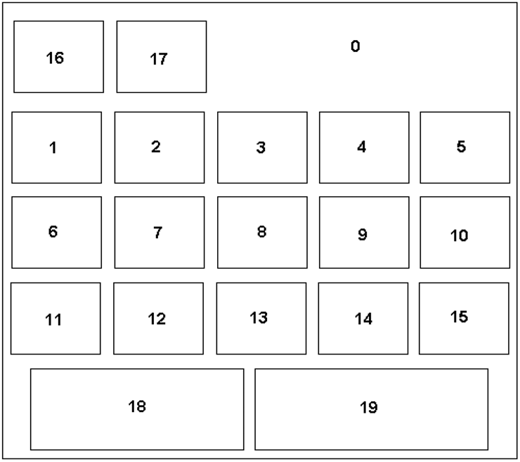
Once I had chosen the general layout, I drew a rough sketch of the layout (by hand, or using a drawing package). Here is the rough sketch:
Determining Coordinates
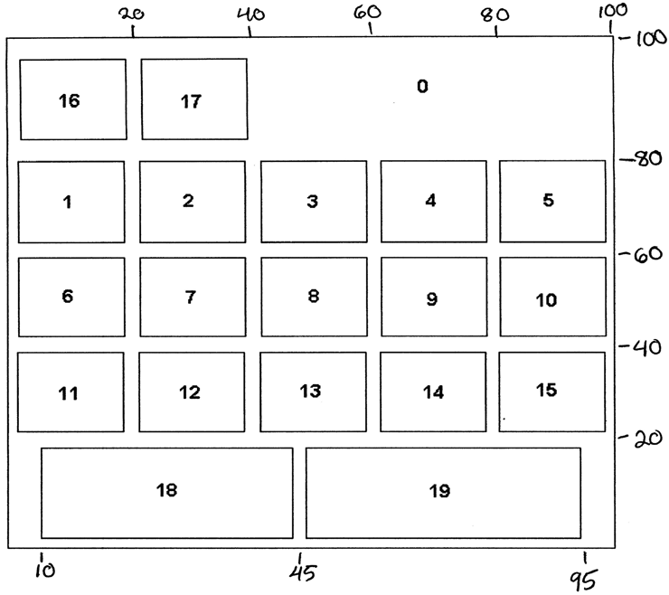
Once you have decided on the general layout, you will need to determine the X and Y coordinates for the four corners of each graph on the page. The units for the X and Y coordinates are in percentages of the screen, from 0 to 100, with the (0,0) being at the bottom/left, and (100,100) at the top/right. I find it helpful to use a printed copy of my rough layout, and physically write the estimated X and Y coordinates on the page, as shown in the image below.
Creating the GREPLAY Template
Once you have the X and Y coordinates for the corners of each graph, you can set up the custom GREPLAY template, by specifying each panel number, followed by the coordinates for the four corners of the graph that goes into that panel.
The number to the left of the “/” is the number ID for the panel in the template (these numbers correspond to the numbered areas in my rough sketch), and the other numbers are the X and Y coordinates for the four corners of the graph (llx=lower left X, lly=lower left Y, ulx=upper left X, uly=upper left Y, and so on). I usually start with nice even numbers for the X and Y values, and then make small adjustments later, if they are needed. GREPLAY templates are very flexible; you can put gaps between the graphs, overlap them, or even specify four corners of a non-rectangular area and let GREPLAY “stretch” the graph out of proportion to fill the area (which is sometimes useful for special effects).
proc greplay tc=tempcat nofs igout=work.gseg;
tdef dashbrd des='Dashboard'
/* overall titles (whole page) */
0/llx = 0 lly = 0
ulx = 0 uly =100
urx =100 ury =100
lrx =100 lry = 0
/* 2 graphs in top/left */
16/llx = 0 lly = 80
ulx = 0 uly =100
urx =20 ury =100
lrx =20 lry = 80
17/llx =20 lly = 80
ulx =20 uly =100
urx =40 ury =100
lrx =40 lry = 80
/* 1st row of 5 graphs */
1/llx = 0 lly = 60
ulx = 0 uly = 79
urx =20 ury = 79
lrx =20 lry = 60
2/llx =20 lly = 60
ulx =20 uly = 79
urx =40 ury = 79
lrx =40 lry = 60
{and so on...}
During the dashboard development process, I often find it useful to (temporarily) have a visible border outline around each of the rectangular areas. You can easily make the borders visible using the COLOR= option in the GREPLAY template, such as the following:
1/llx = 0 lly = 60
ulx = 0 uly = 79
urx =20 ury = 79
lrx =20 lry = 60
color=black
Now, we can set the size of the dashboard (using GOPTIONS XPIXELS= and YPIXELS=), and calculate the size of the individual graphs by applying the percent values (from the GREPLAY template) to the total size. I chose to make this dashboard 900 pixels wide, and 800 pixels tall:
goptions xpixels=900 ypixels=800;
To calculate the size of the individual graphs, you apply the percent values (from the GREPLAY template) to the total XPIXELS and YPIXELS values. For example, plot1 extends from 0 to 20% in the GREPLAY template’s X-direction, therefore XPIXELS=20% of 900, which is 180. Plot1 extends from 60 to 79% in the GREPLAY template’s Y-direction, therefore YPIXELS=(79–60)=19% of 800, which is 152.
goptions xpixels=180 ypixels=152;
Testing the GREPLAY Template
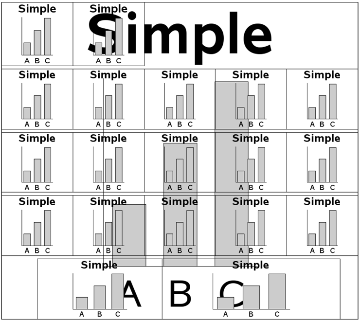
I often find it useful to “sanity check” my GREPLAY templates by creating a simple or trivial graph, and displaying it into all the areas of the template. This gives me a general idea of what the dashboard will look like. As I finish each of the real graphs, I replace the simple place-holder graphs with the real thing.
As you generate the individual graphs for your dashboard, you will want to save them in GRSEGs, and then use PROC GREPLAY to display each graph (GRSEG) in the desired area of the template. SAS/GRAPH can supply default GRSEG names, but you will want to specify your own (more mnemonic) names for the GRSEGs. That way you will know what the names are so you can use PROCGREPLAY to put them into the template. Specify the name using the NAME= option in each of the SAS/GRAPH procedures.
Here is some code to create a simple graph, and store it in a GRSEG named ‘simple’:
data foo;
input letter $1 value;
datalines;
A 1
B 2
C 3
;
run;
goptions gunit=pct htitle=18 ftitle="albany amt/bold" htext=12 ftext="albany amt";
axis1 label=none value=none major=none minor=none;
axis2 label=none;
pattern1 v=s c=graycc;
title "Simple";
proc gchart data=foo;
vbar letter / type=sum sumvar=value nostats width=15 space=8
raxis=axis1 maxis=axis2 noframe name=”simple";
run;
And here is the code to replay the “simple” graph into each of the areas of the GREPLAY template:
{some GREPLAY details omitted}
treplay
16:simple 17: simple 0: simple
1:simple 2:simple 3:simple 4:simple 5:simple
6:simple 7:simple 8:simple 9:simple 10:simple
11:simple 12:simple 13:simple 14:simple 15:simple
18:simple 19:simple;
The results do not look like a great dashboard, but they are useful:
Creating the Individual Graphs
Now we can create the actual graphs. I do not go into all the 1,000-plus lines of code for creating all the individual custom plots (you can download the full sample if you are interested in that), but instead I will show you generally how the title slide and one graph are created. The important thing to know is that you create all the graphs, and store each one in a named GRSEG entry.
The “titles” graph might look simple, but it is actually somewhat complex. PROC GSLIDE will let you easily add titles, but it does not give you much control over the placement of the titles (only left or right/center). Therefore, I use a blank GSLIDE (with no titles), and annotate the title text. This enables me to control the exact size and placement. I also annotate a custom legend on the titles GSLIDE. The titles GSLIDE covers the entire dashboard (to give me total flexibility if I want to put something else on the dashboard), but I only wanted the text and legend in the top-right area. If I had wanted text (or lines, logos, and so on) in other locations on the dashboard, I could have also annotated those using this GSLIDE.
Here is the code to generate the Annotate data set, and display it on the GSLIDE:
data titlanno;
length function $8 color style $20 text $50;
retain xsys ysys '3' hsys '3' when 'a';
function='label';
position='5';
x=75; y=97; color='black'; size=4; style="&fntb";
text='Sales Dashboard'; output;
{and so on, for the other annotated text and legend}
run;
goptions xpixels=900 ypixels=800;
title;
footnote;
proc gslide anno=titlanno name="titles";
run;
The code for plot1-plot17 is basically the same code as was explained in detail in Example 1, “Bar with Annotated Marker.” Below is the final code used to generate plot1 (the Market Share plot), and save the results in the plot1 GRSEG entry.
goptions xpixels=180 ypixels=160;
title "Market Share";
proc gchart data=metrics anno=targets;
vbar quarter / discrete type=sum sumvar=a_market_share
subgroup=ev_market_share nolegend
raxis=axis1 maxis=axis2 autoref cref=&crefgray clipref
coutline=&gray width=14 space=14 name="plot1";
run;
One thing you might notice in the code above is that I specify GOPTIONS XPIXELS= and YPIXELS= just before I create each graph. This is important, and affects the proportions of the graph and text. If you do not specify the correct xpixels and ypixels for each graph (in relation to the whole dashboard), then the graph will probably look stretched or squished in the dashboard, and you will possibly have text running outside of the boundaries the graph should be within. If you see strange problems like that, go back and double-check your xpixels and ypixels!
Replaying Graphs into Template
The following code replays the titles and plot1 GRSEG entries into their panels (areas 0 and 1) in the custom dashboard template. As you can see, I am still replaying the simple graph in all the other template panels, and I still have the border color turned on (so the borders are visible). The custom dashboard is starting to take shape.
goptions xpixels=900 ypixels=800;
{some greplay details omitted}
treplay
16:simple 17:simple 0:titles
1:plot1 2:simple 3:simple 4:simple 5:simple
6:simple 7:simple 8:simple 9:simple 10:simple
11:simple 12:simple 13:simple 14:simple 15:simple
18:simple 19:simple;
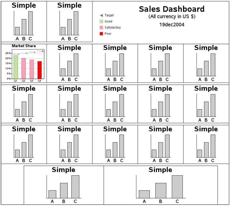
Once you have put all the graphs in their desired positions, you can turn off the border colors around each graph by deleting the COLOR= option from the GREPLAY template code.
Once you have generated all your graphs, and saved them in GRSEG entries, creating the final, complete dashboard is a simple matter of replaying them all into the template, as follows:
{some GREPLAY details omitted}
treplay
16:plot16 17:plot17 0:titles
1:plot1 2:plot2 3:plot3 4:plot4 5:plot5
6:plot6 7:plot7 8:plot8 9:plot9 10:plot10
11:plot11 12:plot12 13:plot13 14:plot14 15:plot15
18:plot18 19:plot19;