
EXAMPLE 14 Sparkline Table
Purpose: Create a table of custom sparklines.
When you are analyzing and comparing lots of data, it is often useful to see several plots on the same page. Sometimes you might use small multiples, rows and columns of graphs, paneled displays, or even dashboard layouts. For example, here is a multi-graph display from Example 3, “Paneling Multiple Graphs on a Page.”
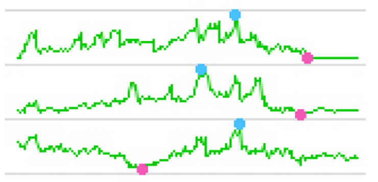
But when you want to pack the maximum number of line charts into the smallest possible space, you will probably want to use sparklines. Here is a small sparkline example:
There is not a built-in procedure option to create sparklines using PROC GPLOT, but with a little custom programming, PROC GPLOT can produce sparklines on par with the best of them.
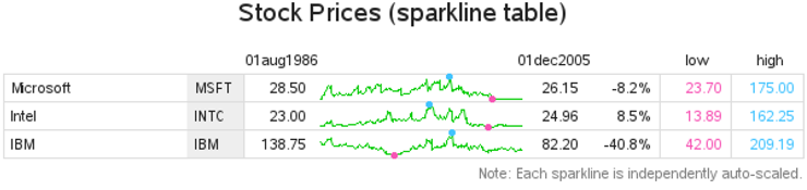
One of the typical uses of sparklines is to show stock market data, and that is what this example demonstrates. The example can be used in two ways: Those who are up to the challenge can use it to learn several very useful tricks to create custom graphs (using both data manipulation and annotation), and the example can also be used as is, to easily create sparkline plots of your own data.
First we will need some data. The data must contain a variable to identify which stock the line represents (“stock” is the text description), and dates and values for the points along the line (in this case we are using the closing price of the stock “close”). The sashelp.stocks data set (which ships with SAS) has data in the needed format, which makes it convenient to use for this example.
I make one slight enhancement. Rather than using only the full-text stock name, I think it is useful to also have the stock ticker abbreviation, so I add a variable named STICKER:
data rawdata; set sashelp.stocks (keep = stock date close);
if stock='Microsoft' then sticker='MSFT';
if stock='Intel' then sticker='INTC';
if stock='IBM' then sticker='IBM';
run;
So the data I am working with looks like this:
stock sticker date close
---------------------------------------------
IBM IBM 01DEC2005 $82.20
Intel INTC 01DEC2005 $24.96
Microsoft MSFT 01DEC2005 $26.15
{and so on, for other dates...}
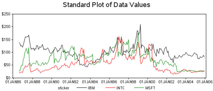
You can easily plot this data using a simple GPLOT procedure with the three lines overlaid, and this is a good starting point:
symbol value=none interpol=join;
axis1 label=none order=(0 to 250 by 50) minor=none offset=(0,0);
axis2 label=none minor=none;
proc gplot data=rawdata;
format date date7.;
format close dollar5.0;
plot close*date=sticker / vaxis=axis1 haxis=axis2;
run;
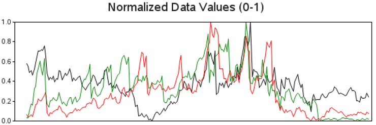
The first steps leading up to the sparkline involve data manipulation. First, you will want to “normalize” the values for each line, so that the values are scaled from 0 to 1. One way to do this is to determine the minimum and maximum (MIN_CLOSE and MAX_CLOSE) values of each line using PROC SQL, and then use a DATA step to calculate the normalized closing value (NORM_CLOSE):
proc sql noprint;
create table plotdata as
select plotdata.*,
min(close) as min_close, max(close) as max_close
from plotdata
group by sticker
order by sticker, date;
quit; run;
data plotdata; set plotdata;
norm_close=(close-min_close)/(max_close-min_close);
run;
Here is a plot of these normalized values, so you can see the effect this manipulation has made:
axis1 label=none order=(0 to 1 by .2) minor=none offset=(0,0);
axis2 label=none minor=none major=none value=none;
proc gplot data=plotdata;
plot norm_close*date=sticker / nolegend
vaxis=axis1 haxis=axis2;
run;
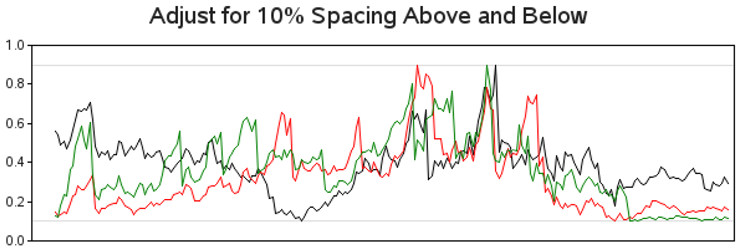
Next adjust the normalized values so they have a 10% spacing above the maximum and below the minimum values. I do this by reducing the values by 80% (which creates 20% spacing above the maximum values), and then adding 10% to shift the values upwards. The end result is 10% spacing above and below. This is something you might want to adjust based on your personal preference and the data you are plotting.
data plotdata; set plotdata;
norm_close=.80*(close-min_close)/(max_close-min_close)+.10;
run;
Here is a plot so you can see what effect the changes had on the data. I have added horizontal reference lines so you can easily see the 10% and 90% extents of the modified data.
proc gplot data=plotdata;
plot norm_close*date=sticker / nolegend
vaxis=axis1 haxis=axis2
vref=.1 .9 cvref=graydd;
run;
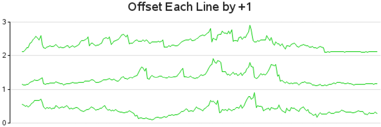
Now for the key step that essentially converts the GPLOT into sparklines and offsets each successive line by +1. With the values of each line normalized (0–1) and the values compressed so there is a little spacing above and below, simply adding an offset of +1 (in the Y-direction) to each successive line essentially spreads them out into a sparkline-like layout.
First I number each of the lines (adding a variable called ORDER), and then I use that number to add the offset to each line. I also insert some SAS missing values (norm_close=.) that I will use in conjunction with the SKIPMISS option so each line is not joined with the next successive line. As the name ORDER implies, I use the ORDER variable to control the order of the sparklines. (In this case I am using data order, but I could have sorted the data in some other way before assigning this ORDER variable to arrange the sparklines differently.)
data plotdata; set plotdata;
by sticker notsorted;
if first.sticker then order+1;
run;
proc sort data=plotdata out=plotdata;
by sticker date;
run;
data plotdata; set plotdata;
by sticker;
norm_close=norm_close+(order-1);
output;
if last.sticker then do;
norm_close=.;
output;
end;
run;
And you can plot the data to see the progress of the three sparklines thus far using:
axis1 label=none order=(0 to 3 by 1) minor=none offset=(0,0);
axis2 style=0 label=none major=none minor=none value=none;
symbol1 value=none interpol=join color=cx00cc00;
proc gplot data=plotdata;
plot norm_close*date=1 / skipmiss
noframe autovref cvref=graydd
vaxis=axis1 haxis=axis2;
run;
I wanted to show you the above (simplified) code to help you understand how the sparkline offset works, but let’s rewind and do that again, this time with a few enhancements.
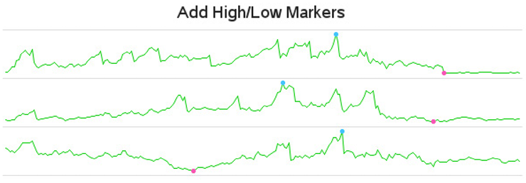
Many times it is useful to identify the high and low values on the sparklines (especially with stock market data). Below is the code rewritten to also calculate lines (actually single-
point lines) for the minimum and maximum values, and then merge these HIGH_CLOSE and LOW_CLOSE lines back with the main PLOTDATA.
proc sql noprint;
create table high_close as
select unique sticker, stock, date, norm_close as high_close
from plotdata group by sticker
having norm_close=max(norm_close);
create table low_close as
select unique sticker, stock, date, norm_close as low_close
from plotdata group by sticker
having norm_close=min(norm_close);
create table plotdata as select plotdata.*, high_close.high_close
from plotdata left join high_close
on plotdata.date=high_close.date and plotdata.sticker=high_close.sticker;
create table plotdata as select plotdata.*, low_close.low_close
from plotdata left join low_close
on plotdata.date=low_close.date and plotdata.sticker=low_close.sticker;
quit; run;
proc sort data=plotdata out=plotdata;
by sticker date;
run;
data plotdata; set plotdata;
by sticker;
norm_close=norm_close+(order-1);
high_close=high_close+(order-1);
low_close=low_close+(order-1);
output;
if last.sticker then do;
close=.;
norm_close=.;
low_close=.;
high_close=.;
output;
end;
run;
I also calculate a few values from the data to use in the axes. Specifically, I use PROC SQL to calculate the values and save them into macro variables. Then I use those macro variables in the axis statements.
proc sql noprint;
select count(unique(sticker)) into :y_max separated by ' ' from plotdata;
select lowcase(put(min(date),date9.)) into :mindate separated by ' ' from plotdata;
select lowcase(put(max(date),date9.)) into :maxdate separated by ' ' from plotdata;
select max(date)-min(date) into :days_by separated by ' ' from plotdata;
quit; run;
axis1 style=0 label=none major=none minor=none
order=(0 to &y_max) value=none offset=(0,0);
axis2 style=0 label=none major=none minor=none
order=("&mindate"d to "&maxdate"d by &days_by) value=none;
Below is the code to plot the newly modified data, overlaying the green lines with a blue line (for high values) and red line (for low values). The high and low lines have only one point each, and these are displayed as dots rather than as lines—each controlled by the symbol statements.
symbol1 value=none interpol=join color=cx00cc00; /* green line */
symbol2 value=dot h=5pt interpol=none color=cx42c3ff; /* blue dots - high value */
symbol3 value=dot h=5pt interpol=none color=cxf755b5; /* red dots - low value */
proc gplot data=plotdata;
plot norm_close*date=1 high_close*date=2 low_close*date=3 / overlay skipmiss
autovref cvref=graydd noframe
vaxis=axis1 haxis=axis2;
run;
That was a lot of extra work just to display the minimum and maximum values. But the ability to add those subtle touches is what makes custom graphs more useful, and it is what differentiates SAS software from its competitors.
You probably notice that the above lines are a little large for sparklines, given that they stretch all the way across the table. Our next step is to squeeze them in toward the center by adding offset space to the left and right in the axis statement.
axis2 style=0 label=none major=none minor=none
order=("&mindate"d to "&maxdate"d by &days_by)
value=none offset=(45,40);
{using same Gplot code as before}

We are now finished with the first phase of the customizations (data manipulations and axis options), and are ready to move on to the “annotation phase.”
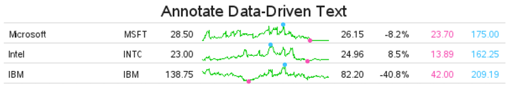
First we will consider the data-driven annotation. For each line (that is, each stock), we want to annotate some text to the left and right of the line plot in order to show the stock name and ticker, the beginning and ending values, the percent change going from the beginning to the ending value, and finally the minimum and maximum stock values.
I use PROC SQL to create ANNO_TABLE containing all the nonmissing data observations, and then I query the BEGIN_CLOSE and END_CLOSE values for each stock. I then merge those values back in with ANNO_TABLE. Finally I use the SQL procedure’s UNIQUE keyword to get just one observation per stock. As with most things in SAS, there are several ways you could accomplish this task. PROC SQL is my personal preference.
proc sql noprint;
create table anno_table as select * from plotdata having low_close^=.;
create table begin_close as
select unique sticker, close as begin_close
from rawdata group by sticker having date=min(date);
create table anno_table as select anno_table.*, begin_close.begin_close
from anno_table left join begin_close
on anno_table.sticker=begin_close.sticker;
create table end_close as
select unique sticker, close as end_close
from rawdata group by sticker having date=max(date);
create table anno_table as select anno_table.*, end_close.end_close
from anno_table left join end_close
on anno_table.sticker=end_close.sticker;
create table anno_table as
select unique order, sticker, stock, min_close, max_close, begin_close, end_close
from anno_table;
quit; run;
Now add annotate commands to the ANNO_TABLE data set in order to write out those text strings as annotated labels. I hardcode the X-values based on where I want the “columns” of text, and the Y-values are data-driven. Note that I am using position=’3’ for left-justified text, and position=’1’ for right-justified text.
data anno_table; set anno_table;
length text $65;
function='label'; position='3'; when='a';
ysys='2'; y=order-1;
xsys='1';
x=1; text=trim(left(stock)); output;
x=24; text=trim(left(sticker)); output;
position='1';
x=38; text=trim(left(put(begin_close,comma10.2))); output;
x=72; text=trim(left(put(end_close,comma10.2))); output;
x=81; text=trim(left(put((end_close-begin_close)/begin_close,percentn7.1))); output;
x=90; text=trim(left(put(min_close,comma10.2))); color="cxf755b5"; output;
x=99; text=trim(left(put(max_close,comma10.2))); color="cx42c3ff"; output;
color="";
run;
Plot the data using the same code as before, but add anno=anno_table to display the annotated text values on the graph:
proc gplot data=plotdata anno=anno_table;
plot norm_close*date=1 high_close*date=2 low_close*date=3 / overlay skipmiss
autovref cvref=graydd
vaxis=axis1 haxis=axis2;
run;
We have just about got a decent sparkline table now.
We will add one finishing touch. We need some column headings, and some vertical lines between the columns. Let’s create a second annotate data set for this. The MOVE and DRAW commands create the lines, the LABEL commands place the text at the top of the columns, and the BAR command fills in the gray area behind the stock-ticker column.
data anno_lines;
length function color $8;
xsys='1'; ysys='1'; color="graydd";
when='a';
function='move'; x=0; y=0; output;
function='draw'; y=100; output;
function='move'; x=30; y=0; output;
function='draw'; y=100; output;
function='move'; x=82; y=0; output;
function='draw'; y=100; output;
function='move'; x=91; y=0; output;
function='draw'; y=100; output;
function='move'; x=100; y=0; output;
function='draw'; y=100; output;
function='label'; color=''; position='2'; y=100;
x=35; text="&mindate"; output;
x=69; text="&maxdate"; output;
x=87; text="low"; output;
x=96; text="high"; output;
when='b';
function='move'; x=23; y=0; output;
function='bar'; color='grayee'; style='solid'; x=30; y=100; output;
run;
I use a blank TITLE2 to create some white space and make room for the column headings, and then specify the second Annotate data set using anno=anno_lines.
title "Add Column-Headers and Vertical Lines";
title2 height=20pt " ";
proc gplot data=plotdata anno=anno_table;
plot norm_close*date=1 high_close*date=2 low_close*date=3 / overlay skipmiss
autovref cvref=graydd
vaxis=axis1 haxis=axis2
anno=anno_lines;
run;

We have got a really sharp-looking sparkline table now. However, it still has one flaw: it does not show how the data in the lines are scaled. Sparklines do not provide enough space along the Yaxis to show values and tick marks, which let the user know how each line is scaled. Each line could be scaled so that they are all plotted with the minimum Y-axis values being zero. Or they could all be normalized together (that is, normalized against a common minimum and maximum value). Or, as in this case, each line is independently scaled from the minimum to the maximum value.
Therefore, to let the user know how the lines are scaled, I think it is useful to add a footnote:
footnote1 j=r c=gray "Note: Each sparkline is independently auto-scaled.";
Now for a neat trick: most SAS/GRAPH programmers use the default page size, and let the graph automatically spread out to fill the available space. But with something like a sparkline table, you want the sparklines to stay approximately the same (small) size no matter how many (or few) lines are in the table. Here is a trick you can use to dynamically set the page space based on the number of sparklines. Basically, I calculate a number equal to about 35 pixels per sparkline, plus about 33 pixels for the title and footnote, and use that as the YPIXELS= value.
proc sql noprint;
select 33+35*count(*) into :ypix separated by ' '
from (select unique sticker from rawdata);
quit; run;
goptions device=png xpixels=600 ypixels=&ypix;
Using this technique to control the size of the page, you can use this same code to generate sparkline tables containing as few, or as many, stocks as needed. Here is an example of some output produced using the same code to plot 21 stocks:
