EXAMPLE 10 Custom Box Plots
Purpose: Use data-driven/generalized Annotate facility code to draw a custom horizontal box plot.
It is easy to create vertical box plots (also known as box-and-whisker plots) with the SAS/GRAPH GPLOT procedure, using "symbol interpol=box". But there is no built-in support for horizontal box plots in PROC GPLOT. This is another situation where custom SAS/GRAPH programming comes in handy.
In this example, I demonstrate how to take the pre-summarized values describing a box plot, and create a custom horizontal box plot using the Annotate facility. This code should be easily re-usable for creating similar box plots with your own data, and it should also serve as a good starting point for you to write your own variations of custom box plots.
First, you will need to summarize your data, so that you know the median as well as the upper and lower values for the whiskers and box.
There are many techniques to calculate summary statistics in SAS; use whichever you are most comfortable with. The end result needs to be a SAS data set containing five numeric values for each “box,” arranged as follows:
data repdata;
input Name $ 1-20 lower_whisker lower_box Median upper_box upper_whisker;
datalines;
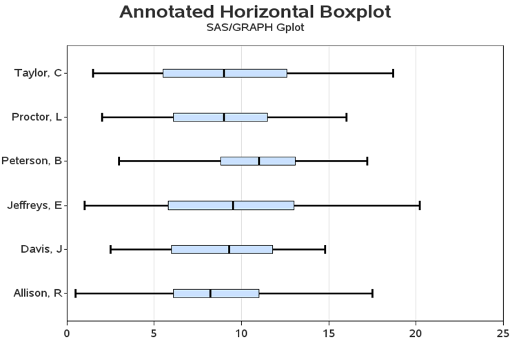
Allison, R 0.5 6.1 8.2 11.0 17.5
Jeffreys, E 1.0 5.8 9.5 13.0 20.2
Peterson, B 3.0 8.8 11.0 13.1 17.2
Proctor, L 2.0 6.1 9.0 11.5 16.0
Taylor, C 1.5 5.5 9.0 12.6 18.7
Davis, J 2.5 6.0 9.3 11.8 14.8
;
run;
To make the code easily re-usable, I define some macro variables for properties of the graph that you might want to change. This enables you to modify the look of the box plot in one central location. It should be obvious what these variables affect based on their mnemonic names (for example, BOXWIDTH is the distance from the vertical center of the box to the outside edge of the box, in the Y-direction).
%let boxwidth=1.5;
%let linewidth=.5;
%let linecolor=black;
%let boxcolor=cxCAE1FF;
This next DATA step turns the summary data into an annotate data set. Rather than interspersing my description with the code, I will give the description of the entire DATA step first, and then show the code (with graphic examples showing what each piece of the code does).
Note that as in most of my customized graphs, I use the data’s coordinate system (xsys/ysys = '2') so that my annotations will line up with the data values. Since the Y-values are character, you need to name your variable YC rather than the usual Y in the annotate data set.
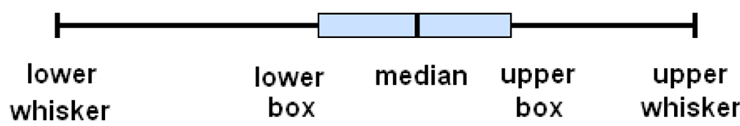
First, I draw the main horizontal line by extending out to the length of the whiskers using the annotate move/draw commands. Likewise, I draw the ends on the whiskers (vertical line at each end of the horizontal line). Note that when I need to move slightly in the Y direction, I change to ysys=’7’ (relative % coordinate system), and then move the BOXWIDTH down and up. For example, I move down one BOXWIDTH (that is, y=-1*&boxwidth), and then from that lower location I move up two BOXWIDTHs (that is, y=+2*&boxwidth).
Then I draw the colored box in the middle of the line. To draw a box, you first move to the lower-left coordinate, and then you draw a bar to the upper right. You can control the look of the box, using the LINE= and STYLE= variables. In this case, I first draw a solid box of the desired box color, and then draw an outline around the box using an empty box colored with the line color. And last, I draw a vertical line at the median using MOVE and DRAW annotate commands. Note that the use of the WHEN=’A’ function forces the annotated graphics to be drawn “after” (or on top of) the regular GPLOT plot markers.
data repanno; set repdata;
xsys='2'; ysys='2'; hsys='3'; when='a';
length function color $8 style $15;
size=&linewidth;
/* draw the long/horizontal Whisker line */
color="&linecolor";
ysys='2'; yc=Name;
function='move'; x=lower_whisker; output;
function='draw'; x=upper_whisker; output;
![]()
/* draw the vertical ends on the whiskers */
color="&linecolor";
ysys='2'; yc=Name;
function='move'; x=lower_whisker; output;
function='move'; ysys='7'; y=-1*&boxwidth; output;
function='draw'; line=1; y=+2*&boxwidth; output;
ysys='2'; yc=Name;
function='move'; x=upper_whisker; output;
function='move'; ysys='7'; y=-1*&boxwidth; output;
function='draw'; line=1; y=+2*&boxwidth; output;

/* draw the Box, using annotate 'bar' function */
color="&boxcolor";
ysys='2'; yc=Name;
function='move'; x=lower_box; output;
function='move'; ysys='7'; y=-1*&boxwidth; output;
function='bar'; line=0; style='solid'; x=upper_box;
y=+2*&boxwidth; output;

/* draw an empty black outline box, around the solid blue box */
color="&linecolor";
ysys='2'; yc=Name;
function='move'; x=lower_box; output;
function='move'; ysys='7'; y=-1*&boxwidth; output;
function='bar'; line=0; style='empty'; x=upper_box; y=+2*&boxwidth; output;

/* Median Line */
color="&linecolor";
ysys='2'; yc=Name;
function='move'; x=Median; output;
function='move'; ysys='7'; y=-1*&boxwidth; output;
function='draw'; line=1; y=+2*&boxwidth; output;
run;

Once you have created the Annotate data set, all you have to do is use PROC GPLOT to draw some empty axes and annotate your custom graphics onto the plot. In this case, I plot the median values and make the plot markers very small and the same color as the background, to get the empty axes.
goptions gunit=pct htitle=5 ftitle="albany amt/bold" htext=3.0 ftext="albany amt" ctext=gray33;
axis1 label=none value=(justify=right) offset=(8,8);
axis2 order=(0 to 25 by 5) minor=none label=none offset=(0,0);
title1 ls=1.5 "Annotated Horizontal Boxplot";
title2 "SAS/GRAPH Gplot";
symbol1 value=none interpol=none height=.001 color=white;
proc gplot data=repdata anno=repanno;
plot name*Median /
vaxis=axis1 haxis=axis2
autohref chref=graydd;
run;