Before diving into Photoshop, you must know which image mode you should use and understand the importance of color settings. No matter whether you're producing a one-color newsletter, a full-color logo, or a creation halfway between, this chapter can help you create much better imagery for both the Web and print.
You may have already discovered that Photoshop works a little differently from most other applications. To create those smooth gradations from one color to the next, Photoshop takes advantage of pixels. Bitmap images (or raster images) are based on a grid of pixels. The grid is smaller or larger depending on the resolution you're using. The number of pixels along the height and width of a bitmap image are the pixel dimensions of an image, measured in pixels per inch (ppi). The more pixels per inch, the more detail in the image.
Unlike vector graphics (mathematically created paths), bitmap images can't be scaled without losing detail. (See Figure 3-1 for an example of a bitmap image and a vector graphic.) Generally, you should use bitmap images at or close to the size you need. If you resize a bitmap image, it can become jagged on the edges of sharp objects. On the other hand, you can scale vector graphics and edit them without degrading sharp edges.
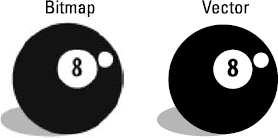
Photoshop can work on both bitmap and vector art. (See the path line around the vector shape layer and notice that the path isn't pixelated (or broken down into a step pattern created by the pixels). It gives you, as a designer, incredible opportunities when combining the two technologies.
Tip
For information on changing and adjusting image resolution, see Chapter 6 of this minibook.
Choose Image
Read on to see which image mode is best for your needs. When you're ready to make your mode selection, open a file and choose Image
Note
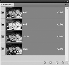
Along with a description of each image mode, we include a figure showing the Channels panel set to that mode. A channel simply contains the color information in an image. The number of default color channels in an image depends on its color mode. For example, a CMYK image has at least four channels — one each for cyan, magenta, yellow, and black information. Grayscale has one channel. If you understand the printing process, think of each channel representing a plate (color) that, when combined, creates the final image.
Bitmap mode offers little more than the ability to work in black and white. Many tools are unusable, and most menu options are grayed out in this mode. If you're converting an image to bitmap, you must convert it to grayscale first.
Use Grayscale mode, shown in Figure 3-2, if you're creating black-and-white images with tonal values, specifically for printing to one color. Grayscale mode supports 256 shades of gray in 8-bit color mode. Photoshop can work with grayscale in 16-bit mode, which provides more information, but may limit your capabilities when working in Photoshop.
When you choose Image
Tip
Using the Black & White adjustment is the best way to create a good grayscale image. Simply click and hold the Create New Fill or Adjustment Layer button at the bottom of the Layers panel and choose Black & White. Set the sliders to achieve the best black-and-white image and then choose Image
Use Duotone mode when you're creating a one- to four-color image created from spot colors (solid ink, such as Pantone colors). You can also use Duotone mode to create monotones, tritones, and quadtones. If you're producing a two-color job, duotones create a beautiful solution to not having full color.
Note
The Pantone Matching System (PMS) helps keep printing inks consistent from one job to the next. By assigning a numbered Pantone color, such as 485 for red, you eliminate the risk of one vendor (printer) using fire engine red and the next using orange-red for your company logo.
To create a duotone, follow these steps:
Choose Image

Choose Image
In the Duotone dialog box, choose Duotone from the Type drop-down list.
Your choices range from monotone (one-color) up to quadtone (four-color). Black is assigned automatically as the first ink, but you can change it, if you like.
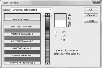
To assign a second ink color, click the white swatch immediately under the black swatch.
The Color Libraries dialog box appears, as shown in Figure 3-3.
Now comes the fun part: Type (quickly!) the Pantone or PMS number you want to access and then click OK.
There's no text field for you to enter the number, so don't look for one. Just type the number while the Color Libraries dialog box is open.
Try entering 300, to select PMS 300. You can already see that you've created a tone curve.
Click the Curve button to the left of the ink color to further tweak the colors.
Click and drag the curve to adjust the black in the shadow areas, perhaps to bring down the color overall. Then experiment with the results.
(Optional) If you like your duotone settings, store them by clicking the small Preset Options button to the right of the Preset text box, as shown in Figure 3-4. Type a name into the Name text box, browse to a location on your computer, and then click Save.
Tip
You can also use one of the presets that Adobe provides. Do this by selecting an option from the Presets drop-down menu at the top of the Duotone dialog box.
Tip
Click the Preset Options button to find your saved presets.
Duotone images must be saved in the Photoshop Encapsulated PostScript (EPS) format in order to support the spot colors. If you choose another format, you risk the possibility of converting colors into a build of CMYK (cyan, magenta, yellow, and black).
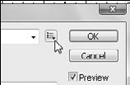
Click OK when you're finished.
Even if you don't work in Index color, you probably have saved a file in this mode. Indexed Color mode (see Figure 3-5) uses a color look up table (CLUT) to create the image.
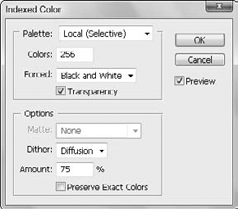
A CLUT contains all colors that make up an image, such as a box of crayons used to create artwork. If you have a box of only eight crayons that are used to color an image, you have a CLUT of only eight colors. Of course, your image would look much better if you used the 64-count box of crayons with the sharpener on the back, but those additional colors increase the size of the CLUT and the file size.
The highest number of colors that can be in Index mode is 256. When saving Web images, you often have to define a color table. We discuss the Save for Web & Devices feature (which helps you more accurately save an index color image) in Chapter 10 of this minibook.
Tip
Choose Image
RGB (Red, Green, Blue) mode, shown in Figure 3-6, is the standard format you work in if you import images from a digital camera or scan images on a scanner. For complete access to features, RGB is probably the best color mode to work in. If you're working on images for use on the Web, color copiers, desktop color printers, and onscreen presentations, stay in RGB mode.
Note
If you're having an image printed on a press (for example, if you're having it professionally printed), it must be separated. Don't convert images to CMYK mode until you're finished the color correction and you know that your color settings are accurate. A good print service may want the RGB file so that it can complete an accurate conversion.
CMYK (Cyan, Magenta, Yellow, Black) mode is used for final separations for the press. Use a good magnifying glass to look closely at anything printed in color and you may see the CMYK colors that created it. A typical four-color printing press has a plate for each color and runs the colors in the order of cyan, magenta, yellow, and then black.
Warning
Don't take lightly the task of converting an image into this mode. You need to make decisions when you convert an image to CMYK, such as where to print the file and on which paper stock, so that the resulting image is the best it can be. Talk to your print provider for specifications that are important when converting to CMYK mode.
The LAB (Lightness,A channel, and B channel) color mode is used by many high-end color professionals use because of its wide color range. Using LAB, you can make adjustments to luminosity (lightness) without affecting color. In this mode, you can select and change an L (lightness or luminosity) channel without affecting the A channel (green and red) and the B channel (blue and yellow).
LAB mode is also good to use if you're in a color-managed environment and want to easily move from one color system to another with no loss of color.
Tip
Some professionals prefer to sharpen images in LAB mode because they can select just the Lightness channel and choose Filter
Multichannel is used for many things; you can end up in this mode and not know how you got there. Deleting a channel from an RGB, a CMYK, or a LAB image automatically converts the image to Multichannel mode. This mode supports multiple spot colors.
You have more functionality in 16-bit and even 32-bit mode. Depending on your needs, you may spend most of your time in 8-bit mode, which is more than likely all you need.
Bit depth, or pixel depth or color depth, measures how much color information is available to display or print each pixel in an image. Greater bit depth means more available colors and more accurate color representation in the digital image. In Photoshop, this increase in accuracy also limits some available features, so don't use it unless you have a specific request or need for it.
To use 16-bit or 32-bit color mode, you also must have a source to provide you with that information, such as a scanner or camera that offers a choice to scan in either mode.