Using color in page layout
Looking at color controls and models
Discovering swatches and swatch libraries
Understanding bleeding and trapping
Looking at printing and preferences
Color is an important part of your layouts. It impacts the design and must be printed correctly. Advertisements often rely on color to relay brands or effective messages — think of the package delivery company based on brown or the purple-and-orange company known for overnight shipments. Similarly, the success of a printed piece greatly depends on how color is used in the layout. Color, used correctly, can enhance your message and, used consistently, helps create a brand identity. In this chapter, you find out some of the fundamental aspects of working with color and the basic instructions on how to prepare documents for printing.
Tip
For more information on general subjects about color, see Book I, Chapters 7 and 8, which cover subjects such as color modes, inks, and printers, and basic color correction across the programs in the Adobe Creative Suite.
You have several different color modes and options to choose when working in InDesign. Because the use of color in print media can be quite a science, you must have control over how your documents print on the page. In Chapter 4 of this minibook, we show you how to add color to drawings with the Color panel. In this section, we cover using the Color panel to choose colors and apply them to the elements on your page.
You should use swatches whenever possible because they use named colors that a service provider can match exactly. A swatch can have exactly the same appearance as any color you choose that's unnamed, but a swatch establishes a link between the color on the page and the name of a color, such as a Pantone color number. Discover more about these kinds of color in the later section "Using Color Swatches and Libraries."
You can use these color controls for choosing colors for selections in a document:
Stroke color: Choose colors for strokes and paths in InDesign. A hollow box represents the Stroke color control.
Fill color: Choose colors for filling shapes. A solid square box represents the Fill color control.
You can toggle between the Fill and Stroke color controls by clicking them. Alternatively, you can press X on the keyboard to toggle between selected controls.
Text color: When you're working with text, a different color control becomes active. The Text color control is visible and displays the selected text color. Text can have both the stroke and fill colored.
To apply colors to selections, you can click the Apply color button below the color controls in the Tools panel. Alternatively, you can select and click a color swatch.
Note
The default colors in InDesign are a black stroke and no fill color. Restore the default colors at any time by pressing D. This shortcut works while using any tool except the Type tool.
You can use any of three kinds of color models in InDesign: CMYK (Cyan, Magenta, Yellow, Black), RGB (Red, Green, Blue), and LAB colors (l ightness and A and B for the color-opponent dimensions of the color space). A color model is a system used for representing each color as a set of numbers or letters (or both). The best color model to use depends on how you plan to print or display your document:
If you're creating a PDF that will be distributed electronically and probably not printed, use the RGB color model. RGB is how colors are displayed on a computer monitor.
You must use the CMYK color model if you're working with process color: Instead of having inks that match specified colors, you have four ink colors layered to simulate a particular color. Note that the colors on the monitor may differ from the ones that are printed. Sample swatch books and numbers can help you determine which colors you need to use in a document to match colors printed in the end.
If you know that the document needs to be printed by professionals who determine what each color is before it's printed, it doesn't matter whether you use RGB, PMS (Pantone Matching System), or LAB colors. Make sure to use named colors (predetermined swatches are a good idea) so that the service provider knows which color should be printed. In this case, you're using spot colors, which are mixed inks that match the colors you specify in InDesign.
For more information on color models, check out Book I, Chapter 7. This chapter explains how colors are determined in the different color modes.
The Swatches panel and swatch libraries help you choose colors. Swatch libraries help you use colors for specific publishing purposes. The colors you use in a document can vary greatly depending on what you're creating the document for. For example, one publication you make with InDesign may be for a catalog that has only two colors; another may be for the Web, where many colors are available to you.
You can create, apply, and edit colors from the Swatches panel. In addition to using this panel to create and edit tints and gradients and then apply them to objects on a page, you can also create and save solid colors. Choose Window
To create a new color swatch to use in a document, follow these steps:
Click the arrow in the upper right corner to open the Swatches panel menu; choose New Color Swatch.
The New Color Swatch dialog box opens.
Type a new name for the color swatch or leave the color named by color values.
(The colors in the Swatches panel appear this way as a default.)
This name is displayed next to the color swatch when it's entered into the panel.
Choose the color type from the Color Type drop-down list.
Are you using a spot color (Pantone, for example) or CMYK (Cyan, Magenta, Yellow, Black)?
Choose the color mode.
From the Color Mode drop-down list, select a color mode. For this example, we use CMYK. Many of the other choices you see are prebuilt color libraries for various systems.
Create the color by using the color sliders.
Note that if you start with Black, you have to adjust that slider to the left to see the other colors.
Click OK or Add.
Click Add if you want to continue adding colors to the Swatches panel or click OK if this color is the only one you're adding. The color or colors are added to the Swatches panel.
You can make changes to the swatch by selecting it in the Swatches panel and then choosing Swatch Options from the panel menu.
Swatch libraries, also known as color libraries, are standardized sets of named colors that help you because they're the most commonly and frequently used sets of color swatches. You can avoid trying to mix your own colors, which can be a difficult or tedious process to get right. For example, InDesign includes a swatch library for Pantone spot colors and a different library for Pantone process colors. These libraries are quite useful if you're working with either color set. (See the earlier section "Understanding Color Models," where we explain the difference between spot and process colors.)
To choose a swatch from a swatch library, follow these steps:
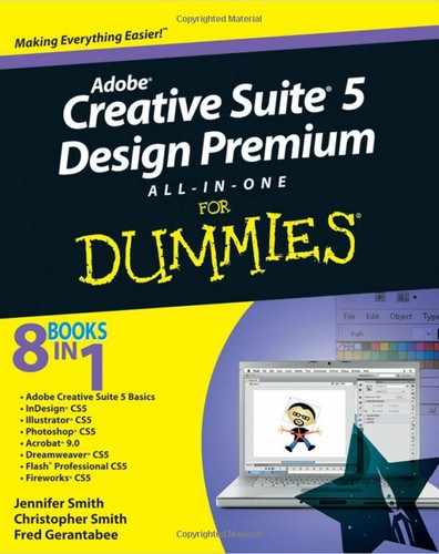
Choose New Color Swatch from the Swatches panel menu.
The New Color Swatch dialog box opens.
Choose the color type you want to work with from the Color Type drop-down list.
Choose from Process or Spot Color types.
Select a color library from the Color Mode drop-down list.
The drop-down list contains a list of color swatch libraries to choose from, such as Pantone Process Coated or TRUMATCH. After choosing a swatch set, the library opens and appears in the dialog box. For this example, we chose standard, solid-coated Pantone. If you're looking for the standard numbered Pantone colors, this set is the easiest to choose from. The Pantone solid-coated library of swatches loads.
Pick a swatch from the library.
Type a Pantone number, if you have one, in the Pantone text box. Most companies have set Pantone colors that they use for consistency. You can also scroll and click a swatch in the library's list of colors, shown in Figure 7-1.
Warning
Picking Pantone colors this way is rarely accurate. Spending money on the Pantone Color Bridge Set is a wise investment. Get more details about this guide at
www.pantone.comand search for Color Bridge.Click the Add button.
This step adds the swatch to your list of color swatches in the Swatches panel. You can add as many color swatches as you like.
When you finish adding swatches, click the Done button.
After you add a new color, the swatch is added to the list of swatches in the swatches panel and is ready to use in your project. Look in the swatches panel to see the newly added colors.
You can print your work from an InDesign document in many different ways, with many kinds of printers and processes. You can either use a printer at home or in your office, which are of varying levels of quality and design, or you can take your work into a professional establishment to print. Printing establishments (or service providers) also vary in the quality of production they can offer you.
The following subsections look at the different ways you can set up a document for printing and the kinds of issues you may encounter during this process.
If you want an image or span of color to go to the edge of a page, without any margins, you bleed it off the edge of the document. Bleeding extends the print area slightly beyond the edge of the page into the area that will be cut as usual during the printing process. When you print your work, you can turn on crop and bleed marks to show where the page needs to be trimmed and to make sure that the image bleeds properly. We cover this topic at the end of this chapter, in "Doing it yourself: Printing at home or in the office."
When you print documents, the printer is seldom absolutely perfect when creating a printed page with multiple inks. The registration (which determines the alignment of the separate colors when printed) will most surely be off. This discrepancy can potentially cause a gap between two colors on a page so that unprinted paper shows through between them. To solve this problem, use trapping, which overlaps elements on the page slightly so that the gap doesn't appear between elements. The basic principle of trapping is to spread the lighter of the colors into the other. See Figure 7-2 for an example.

Figure 7-2. Text as it appears in InDesign (left). Text (right) as it appears when printed with trapping applied.
InDesign has built-in software for trapping. The settings you specify are applied to the entire page. You choose settings in the Trap Presets panel. You can use the default settings, customize the trapping settings, or decide not to use trapping. To modify the default settings and then apply the customized settings, follow these steps:
Choose Window

The Trap Presets panel opens. The trapping presets in InDesign are document-wide, but you can assign individual trappings by using the Attributes panel (choose Window
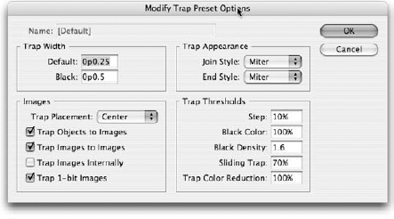
Double-click [Default] in the panel's list.
The Modify Trap Preset Options dialog box opens, as shown in Figure 7-3. The default settings are perfectly adequate for many printing jobs.
Change the trap preset options, if you know what's necessary, and then click OK to close the dialog box.
If you don't know what to change, investigate the options for a better understanding of how they work. You can also request settings from your print provider.
In the Trap Presets panel, choose New Preset from the panel menu.
The New Trap Preset dialog box opens.
Type an appropriate name for the new trap preset.
You see this name in the list of trap presets in the Trap Presets panel when it's opened. You might create a name for a printer that has different settings from another.
Review and make any changes to the new preset in the dialog box.
You can change the presets by using these options:
Trap Width: The default value specifies the width of the trap for any ink, except black, that you use in the document. Enter the value for black in the Black text field.
Images: Control how InDesign handles trapping between elements on the document page and any imported graphics on it. Use the Trap Placement drop-down list to define how images trap to objects on the page. When bitmap images are next to each other, select the Trap Images to Images check box.
Trap Appearance: Do some fine-tuning and change how the corner points appear in trapping. Select the way corner points appear by using the Join Style drop-down list; select how end points appear (overlapped or separated) by using the End Style drop-down list.
Trap Thresholds: Control how InDesign traps the areas between two colors in a document. You can control whether InDesign traps two objects of similar colors (for example, how different the colors have to be before InDesign starts trapping).
Click OK to create the trap preset.
The New Trap Preset dialog box closes and the customized preset is added to the panel.
To assign a trap preset to a number of pages (or all of them), click the arrow in the upper right corner of the Trap Preset panel and choose Assign Trap Preset from the panel menu. in the dialog box that opens, choose a trapping style and assign it to all pages or a range of pages. Click the Assign button to assign the preset before clicking the Done button.
Note
You have other ways to apply trapping to a document manually. This process goes beyond the scope of this book but is worthwhile to look into if you want to fully realize what trapping is all about. See InDesign CS5 Bible by Galen Gruman (Wiley) for more information on trapping.
If you're taking a file to a professional print service (service provider), you may have to save the .indd document in a different format. Even though all service providers should (in our opinion) have InDesign, not all of them do.
The two major groups of printers are PostScript and non-PostScript. PostScript printers read files written in the PostScript language. PostScript files describe the contents of each page and how they should look when printed. Most printers you find in a home or office aren't PostScript printers.
If you're giving a file to someone to print, you can pass on your work in a few different ways. You can give the person printing the document your original InDesign document. Of course, he (or the business) must have a copy of InDesign on hand to open the file. Or, you can send a PostScript file or PDF file to print. Sometimes, you have to ask about the preferred file type for opening and printing the document. You probably should send the original InDesign file (if you can) or a PDF file. When you create a PDF, your documents should print accurately.
The Package feature is used to check for quality in documents and tells you information about the document you're printing (such as listing its fonts, print settings, and inks). Using Preflight can help you determine whether your InDesign document has unlinked images or missing fonts before printing it. Choose File
You can determine whether any elements associated with the file are missing and then package it into a single folder to take the document to a service provider. Here's how:
Choose File
The Package dialog box opens. The Summary screen is open to begin with, and it shows you all current images and fonts in the document. Essentially, the summary is based on an analysis of the document.
Click Fonts in the list on the left side of the dialog box.
Any fonts in your document are listed on this screen. Select fonts from this list and click the Find Font button to discover where they're located. These fonts are saved directly into the package folder when you finish.
Click Links and Images in the list on the left side of the dialog box.
The Links and Images screen lists the images within your document. Find the image, update it, and repair links before packing the file. If any images aren't properly linked, your document is incomplete and prints with pictures missing. Also, make sure that if you're sending your work to a professional printer, you've properly converted your images to CMYK mode. For your desktop printer, RGB mode is fine.
When you're finished, click the Package button at the bottom of the dialog box.
Your document and all its associated files are saved into a folder. You're given the opportunity to name the folder and specify a location on your hard drive.
You've probably printed documents in the past, and perhaps you've even played with the printer settings. These settings depend on which kind of printer you're using and which associated printer drivers are installed on your system. Whichever operating system you work with and whichever printer you use, you have settings that control the printer's output. This section deals only with the more basic and common kinds of printing you may perform at home or in the office.
Choose File
This list describes the options you're most likely to use when printing InDesign documents:
General: Set the number of copies of the document you want to print and the range of pages to print. You can select the Reverse Order check box to print from the last to first page. Select an option from the Sequence drop-down list to print only even or odd pages instead of all pages. If you're working with spreads that need to be printed on a single page, select the Spreads check box.
Setup: Define the paper size, orientation (portrait or landscape), and scale. You can scale a page so that it's as much as 1,000 percent of its original size or as little as 1 percent. You can (optionally) constrain the scale of the width and height so that the page remains at the same ratio. The Page Position drop-down list is useful when you're using paper that's larger than the document you've created. This option helps you center the document on larger paper.
Marks and Bleed: Turn on or off many of the printing marks in the document, such as crop, bleed, and registration marks. For example, you may want to show these marks if a bleed extends past the boundaries of the page and you need to show where to crop each page. You see a preview of what the page looks like when printed, and you can select options to print page information (such as filename and date) on each page.
Output: Choose how to print pages — for example, as a separation or a composite, using which inks (if you're using separations), or with or without trapping. InDesign can separate and print documents as plates (which are used in commercial printing) from settings you specify.
Graphics: Control how graphics and fonts in the document are printed. The Send Data drop-down list controls bitmap images and specifies how much of the data from these images is sent to the printer. Here are some other options available when printing:
All: Sends all bitmap data
Optimized Subsampling: Sends as much image data as the printer can handle
Proxy: Prints lower-quality images mostly to preview them
None: Prints placeholder boxes with an X through them
Color Management: Choose how you want color handled when it's output. If you have profiles loaded in your system for your output devices, you can select the profiles here.
Advanced: Determine how you want images to be sent to the printer. If you don't have a clue about Open Prepress Interface (OPI), you can leave this setting at the default. Also known as image-swapping technology, the OPI process allows low-resolution images inserted into InDesign to be swapped with the high-resolution version for output.
Flattening needs to be addressed if you use a drop shadow, feather an object in InDesign, or apply transparency to any objects, even if they were created in Photoshop or Illustrator.
Use the preset Medium Resolution for desktop printers and High Resolution for professional press output.
Summary: You can't make modifications but you can see a good overview of all your print settings.
Tip
After you finish your settings, click the Save Preset button if you want to save the changes you've made. If you think you may print other documents with these settings repeatedly, using the Save Preset feature can be a great timesaver.
After you click the Save Preset button, the Save Preset dialog box opens, where you can enter a new name to save the settings. The next time you print a document, you can select the saved preset from the Print Preset drop-down list in the Print dialog box.
Click the Print button at the bottom of the Print dialog box when you're ready to print the document.