Using color in documents is one of the most important considerations in creating your projects. The colors you use, the mode you use them in, and even the way you select colors make a difference in the way you create a document and the final output of that document. Even though you can create a document that looks the same on a monitor in different color modes, how that file prints on paper is a different matter. Color is quite a broad subject, and in this chapter you find out the basic facts about how color affects the projects you work on.
Figuring out the kinds of colors you're using is important, and this decision is greatly determined by the kind of output you've planned for the document. Different color modes are appropriate for work for the Web and work you're having professionally printed. Monitors and printers have different modes for color, so you need to work with your files in different color modes (although you can change the mode after you start working on a file, if necessary).
You may also be in situations where particular colors are required in your work. You may be working with specific colors that a company needs in order to match its logo or creating an image that replicates how a building should be painted with specific colors of paint. You may need to use particular Pantone colors or color mixes — if not for the printing process, then for the purpose of matching a client's needs.
In this chapter, we introduce you to color modes and how to use them. You discover new terminology and how to find, mix, and add colors to your documents in the Creative Suite.
Several different color modes are available for use in Creative Suite applications. When you start a new document in Photoshop and Illustrator, you can choose the color mode you want to work in. In fact, both Photoshop and Illustrator help you by letting you choose a color mode in the New Document dialog box. The choice you make affects how colors are created. You can change the color mode later by choosing File
If you're working with print, generally you use CMYK mode. If you're working on files to be displayed on a monitor, RGB is the right choice.
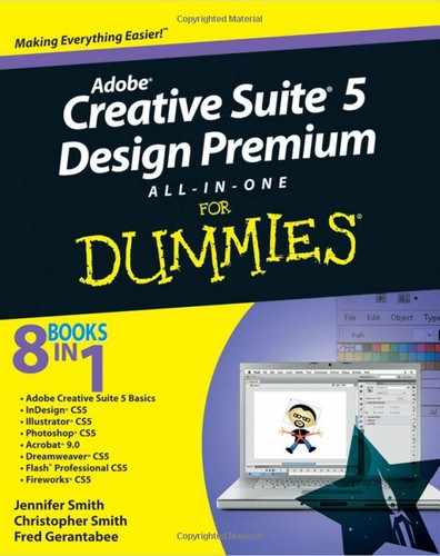
RGB (Red, Green, Blue) is the color mode used for onscreen presentation, such as an image displayed on the Web or a broadcast design for TV. Each color displayed onscreen has a certain level (between 0 and 100 percent) of red, green, and blue to create the color. In a Color panel, you can either use sliders to set the level in values, as shown in Figure 7-1, or enter a percentage into a text field (such as in CMYK Color mode).
Note
Note the exclamation point on the Color panel, which indicates that this color wouldn't reproduce correctly in CMYK mode. You can click the CMYK warning exclamation point to convert to a color that's suitable for the CMYK gamut. Color is discussed in Book IV, Chapter 3, including more details about how you can adjust the Color Settings dialog box.
When you create a Web page, the color is represented as a hexadecimal number, which starts with a pound sign (#) followed by three pairs of letters and numbers (A through F and 0 through 9) — the first pair for red, the second pair for green, and the last pair for blue. The lowest value (the least amount of the color) in a hexadecimal number is 0 (zero), and the highest value (the greatest amount of the color) is F. For example, #000000 is black, #FFFFFF is white, #FF0000 is red, and #CCCCCC is light gray. To see what a particular hexadecimal color looks like, go to Webmonkey at www.webmonkey.com/reference/Color_Charts.
RGB (Red, Green, Blue) color mode is the color standard for monitors and the Web, and CMYK — Cyan, Magenta, Yellow, and Key (or Black) — is the standard color mode for print media, particularly in commercial printing such as what a service provider does.
The CMYK color scheme is based on pigment (a substance used as coloring) color separation, and it describes how light reflects off pigments. When you work with this color mode, you create black by adding the maximum values of cyan, magenta, and yellow all at one time. You can create different levels of gray by combining equal, but not maximum, amounts of cyan, magenta, and yellow. White is simply the absence of all color. Many color printers now work by using the CMYK color model and can simulate almost any color by printing two colors very close to each other; however, some at-home desktop printer models made by Epson, Hewlett-Packard (HP), and Canon use their own color systems to print your work.
You've seen a lot of grayscale images (color images displayed or printed in black-and-white) because the pictures in this book were printed in grayscale. Grayscale refers to the different shades of gray that can be used when printing using only black ink on a white page. Halftone patterns are used to help simulate different color values, by adding dots to simulate shadows and gradients between colors. Halftone patterns are created when an image uses dots of varying diameter or when an image uses many small dots in the same area to simulate different shades of gray.
When you work with an image in Photoshop, the image has at least one (but typically more) color channels. A color channel stores information about a particular color in a selected image. For example, an RGB image has three color channels: one that handles the reds (R), one for handling green information (G), and the last for information about the blues (B). See Figure 7-2.
You can have, in addition to the three color channels, an alpha channel, which can hold the transparency information about a particular image. If you're working with a file format that supports transparency, you can add and use the alpha channel to save alpha information.
You can also use an alpha channel to save a selection. By choosing Select
In Photoshop, you can access the channels in your image by choosing Windows

When you create a document, you may have to consider which colors you use, or you may have the freedom to use an unlimited number of colors. If you print your documents, you can choose a specific set of colors to use. You may be restricted to only the two colors in a company logo, or you may have to print in grayscale. Finding the colors you need to use in each program is important — and then figuring out how to access those colors repeatedly in a document saves you a great deal of time.
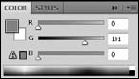
A swatch is a good way to choose a color, particularly when you intend to print a document. The Swatches panel in Creative Suite programs contains colors and sometimes gradients. (The Swatches panel, shown in Figure 7-3, is from Illustrator.) You can create libraries of swatches that contain colors you can use repeatedly across several documents.
You can choose libraries of swatches from the panel menu or load and save swatch libraries. You can customize a swatch library by adding or deleting colors.
Follow these steps to choose a color in a specified color mode:
In a program that has a Color panel, choose Window

The Color panel is available in Illustrator, InDesign, and Photoshop.
Click the Color panel menu to choose a new color mode.
Open this menu by clicking the arrow button in the upper-right corner of the Color panel.
Choose the RGB color mode from the panel menu that opens.
The panel switches to RGB color mode.
In the Color panel, click either the Fill box (solid square) or the Stroke box (hollow square) to choose the color you want to change.
If you click the Fill box, you can modify the color of a fill (the color inside a shape). If you click the Stroke box, you can modify the color of a stroke (the outline of a shape or a line).
Use the sliders in the Color panel to change the color values.
You can also change the percentage values to the right of each slider.
After you choose a color you're happy with, return to your document and create a new shape that uses the color.
Tip
Hold down the Shift key when adjusting any one-color slider and the other color sliders adjust proportionally to provide you with various tints from your original.
In the past, you had to consciously choose which colors you used on the Web. Some computer monitors were limited in the number of colors they could display. Nowadays, color monitors are much more advanced and can handle a full range of colors, so images on the Web are much more likely to be properly displayed.
Note
Though this statement doesn't have to do with color, Macintosh and Windows computers usually display your work differently because of gamma differences on these machines. Generally speaking, colors on a Mac appear lighter, and colors on a PC look darker.
Even though most computers can handle a full range of colors, you may have to consider color limitations. If you're designing a site specifically targeted at old computers or a certain user base, you may have to limit colors to the 256 Web-safe colors, which means that any other colors used are approximated, which can look poor. If your site will likely be viewed by users with older computers, consider these suggestions:
Use a Web-safe palette of 216 colors to design Web sites so that you specifically design with those older displays in mind and know what the pages will look like. This number is 216 instead of 256 because the lower number is compatible with both Mac and Windows computers. You can access this panel, usually known as Web-Safe Palette or Web-Safe RGB, from the Swatches panel menu in Illustrator and Photoshop.
Avoid using gradients, if possible. They use a wide range of colors (many unsupported in a limited Web panel).
Avoid dithering if you can. A color that's approximated because it can't be handled by someone's computer is dithered — the computer tries to use two or more colors to achieve the one you specified, causing a typically displeasing granular appearance. So a limited number of colors can have a negative effect on an image; notice the granular appearance on what should be the shape of a face in Figure 7-4.
If you keep the preceding suggestion list in mind, you're ready to start designing for the Web! Remember also that you don't have to worry about using the Web-safe palette of colors if you're designing primarily for more up-to-date computers.
