
Chapter 4. A 2D Graphics Test Bed
4.1. Introduction
Now that you are familiar with some aspects of WPF and have seen our promised test bed in use in building the Dürer renderer, we show you the details of the test bed—a framework for testing out ideas in graphics without a huge amount of overhead. There are actually two of these: one for 2D and one for 3D. This chapter introduces the 2D test bed; more complete documentation, along with the 3D test bed, are available on the book’s website. We refer to these as test beds because they resemble the test apparatus that an electrical engineer might use: a collection of instruments, power sources, and prototyping boards on which various circuits can be assembled and tested. Our design aims are modest: We want a basic framework in which it’s easy to write and debug simple programs. Ease of debugging is favored over speed; simplicity is favored over generality.
Throughout this book, we present exercises that involve writing small programs designed to investigate some subject that you’ve studied. For instance, when we discuss the mathematical modeling of shapes, we start with polygons and show how to make curves shaped by them. Figure 4.1 shows an example of this: You can take a closed polyline—a connect-the-dots sequence of segments in a plane—and perform a corner-cutting operation on it in which each segment is divided into thirds, the first and last thirds of each segment are removed, and the remaining segments are joined up in sequence.
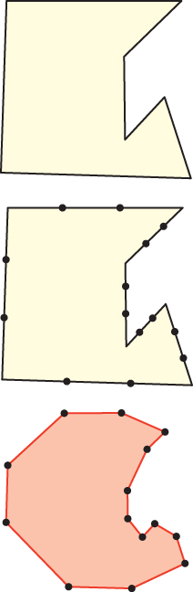
Figure 4.1: Top: A polyline in the plane. Middle: Each segment has been divided into thirds, and the division points have been marked with dots. Bottom: The middle thirds of the segments are connected together to form a new, smoother polyline.
It appears that if you do this repeatedly, the resultant polyline becomes increasingly smooth, approximating a smooth curve. While it’s possible (and valuable) to analyze this process mathematically, we believe that a picture is worth a thousand words and that interaction is worth many thousands more. We therefore give you the tools to answer a variety of questions you may have—such as whether the curve will always get smoother, whether there are starting polylines that result in curves that have sharp corners, regardless of the number of iterations, and what happens if you keep the middle half of each segment instead of the middle third—so that you can get a visceral understanding of the process. At the same time, writing programs to implement such ideas frequently helps you understand subtleties.
If we chose to discuss corner cutting for polylines rather than closed polylines, you would have to determine what to do with the starting and ending segments as you write the code; such boundary cases are often the source of both complexity and understanding, as well as errors.
We could have opted to explain how to draw individual points, and then how to draw lines, detect mouse clicks, and create menus and buttons and associate them with actions in your program, all of which are interesting and valuable topics. But we want you to be able to start learning graphics visually right away. To do that requires that we give you some tools whose inner workings you won’t yet understand.
With this goal in mind—providing easy-to-modify programs in which you can experiment with various ideas in graphics—the remainder of this chapter presents our 2D test bed.
Following the introduction of the 2D program, we show how to use it to implement corner cutting in 2D, and provide some exercises in which you can conduct some experiments that will prepare you for the ideas presented in later chapters.
The test-bed program itself is meant to isolate you, at this point, from understanding many of the details of a graphics program. All on-screen graphics eventually involve setting the color values for individual pixels on the screen. In Chapter 38 we discuss the underlying software and hardware that work at this low level. For now, we are letting that hardware and software do the heavy lifting for us so that we can work at a higher level of abstraction: We assume that we can create high-level shapes and images and that WPF and Direct3D will take care of making the pixels look the way we indirectly said they should.
4.2. Details of the Test Bed
As we said, our program is based on WPF, a subject to which entire books and thousands of web pages are devoted. In our experience, it is always easier to modify an existing program than to start from scratch. We therefore built the 2D test bed and included a sample program with it that does a number of things. You’ll typically use the test bed by copying this sample, deleting most of it, and then modifying the remainder. The sample displays things such as a photographic image, an image created in software, a polygon, a mesh, and a quiver of arrows (a collection of arrows specified by their basepoints and directions). It also has some buttons (one of which changes which software image is displayed) and a slider (which can be used to move one vertex of a polygon). From these examples, it should be easy for you to generalize and add your own interaction elements to the program.
Note that this program is constantly under development; we anticipate augmenting it as students indicate ways in which they would like to see it enhanced. Because those augmentations may cause minor changes to the program, we will include notes about any such changes on the book’s website. The website also includes more thorough documentation of the entities included in the test bed; this chapter is an introduction to the test bed and its use, not the complete documentation.
4.2.1. Using the 2D Test Bed
At this point in reading this chapter, you should pause, visit the book’s website, and download the 2D test bed as directed there. You should also prepare a development environment in which you would like to work. In the examples in this book, we used Visual Studio 2010 in a freely distributed “basic edition,” along with the Microsoft Windows SDK for browsing documentation, among other things. Follow the directions on the website for getting the 2D test bed up and running, and then experiment with the sample program: Try clicking a button or moving a slider and see what happens. Browse through the code to see if you can begin to piece together how it works. Then read on.
We assume that you are familiar with an integrated development environment like Visual Studio and that you know a programming language like C#, C++, or Java. (The test bed is written in C#, but anyone familiar with C++ or Java will find it easy to use C#.)
4.2.2. Corner Cutting
In Section 4.6, we develop the corner-cutting application step by step. To prepare for that exercise, download the Subdivide application from the book’s website and then run it. When the application starts, click several times in the main window to create a polygon; then click on the Subdivide button to see the corner-cutting operation, or the Clear button to start over.
Examine the Window1.xaml code. You’ll see the words “Subdivide” and “Clear”; the XAML code around these words creates the buttons you were clicking, and Click="b1Click" tells WPF that when one of those buttons is clicked, a procedure called b1Click should be invoked. We’ll see more details of this later; here, we want you to gain a broad picture of where the working parts of this example lie.
Now examine the Window1.xaml.cs code. The initializations for the Window1 class create a pair of Polygon objects, which are initialized in the constructor for Window1 and are then added to something called gp (for “graph paper”), which represents everything that will be drawn on the display. The polygon initialization code sets up certain properties for the polygons; lots of other properties could also be set, but these are left with their default values. Finally, the b2click and b1click procedures describe what should happen when the user clicks on the two buttons. Look at them briefly. The handling of the Clear button should seem reasonably simple to you; the handling of the Subdivide button is more complicated, but you can see that at its core, it involves multiplying various coordinates by 1/3 and 2/3, as you’d expect.
Those are the essential parts of the corner-cutting application. Almost everything else is boilerplate—the bits of code that make it easy to write applications like this. In fact, we created this corner-cutting application by starting with the test bed, which creates points, lines, arrows, a mesh, and various moving things, deleting most of them, and then editing the XAML to remove some user-interface components that weren’t needed and renaming a few others. With this example in mind, we can now look at the rest of the test bed.
4.2.3. The Structure of a Test-Bed-Based Program
As you learned in Chapter 3, WPF applications are typically specified in two parts: one in XAML, the other in C#. The two parts cooperate to make the whole. Indeed, one can have object classes that have this same two-part separation, or that are purely C#; our code has both types.
The highest-level portion of the application is called Testbed2DApp; it is implemented in the files Testbed2DApp.xaml (the XAML file) and Testbed2DApp.xaml.cs (the associated C# file).
The XAML file (see Listing 4.1) declares that Testbed2D is an object of class Application, which means that it has certain properties, events, and methods predefined; we use almost none of these, with the exception of the Startup event handler, which we’ll see in the C# file.1
1. Other events are things like OnExit, which occurs when the program exits, and Activated, which occurs when the application becomes the foreground application; all the details of every class in WPF are documented online, but part of the goal in the test bed is to shield you from having to know most of them.
Listing 4.1: The code in Testbed2DApp.xaml.
1 <Application x:Class="Testbed2D.Testbed2DApp"
2 xmlns="http://schemas.microsoft.com/winfx/2006/xaml/presentation"
3 xmlns:x="http://schemas.microsoft.com/winfx/2006/xaml"
4 Startup="AppStartingUp">
5 <Application.Resources />
6 </Application>
The code in Listing 4.1 simply declares an application and some information about where to find certain name resolutions (the xmlns lines) for this XML namespace. The key element, from our point of view, is the line Startup="AppStartingUp", which says that the Startup event is to be handled by code that will be found in the AppStartingUp method of the Testbed2D.xaml.cs file. This is the equivalent of main() in a C++ or Java program.
The corresponding C# file is shown in Listing 4.2. The keyword partial tells us that part of the class’s description is here, but part of it is elsewhere (in the XAML file). The AppStartingUp method has been defined to create a Window1 and to show it. The arguments to AppStartingUp are unused. The remaining event handlers, methods, etc., for the Testbed2DApp remain unchanged from the defaults inherited from the Application class.
Listing 4.2: The corresponding C# file, Testbed2DApp.xaml.cs.
1 using System;
2 using ...
3
4 namespace Testbed2D
5 {
6 public partial class Testbed2DApp : Application
7 {
8 void AppStartingUp(object sender, StartupEventArgs e)
9 {
10 Window1 mainWindow = new Window1();
11 mainWindow.Show();
12 }
13 }
14 }
So, if we run the Testbed2DApp, upon startup a Window1 will be created and shown.
This Window1 class is somewhat richer than the Testbed2DApp class: It corresponds to the main window of a conventional application and includes things like a menu bar, buttons, and sliders, as well as a large area in which we can draw things. The arrangement of these items is determined in the Window1.xaml file: When you want to add a button to the test bed, you’ll edit that file; when you want to arrange a connection between a slider drag and a certain action in your program, you’ll edit that file, etc.
The Window1.xaml.cs file is concerned almost entirely with creating the contents of the one large area in which we can draw things.
We’ll examine both of the Window1 files now. We’ll omit large sections of each, sections that are repetitive or boilerplate, and concentrate on the details that you’ll use as you write your own programs.
A complex XAML file like Window1.xaml (see Listing 4.3) can describe several things at once: layout (the positioning of things within the window), event handling (what happens when you press a keyboard key or click on a button), styles (the font in which text appears, the color of a button), etc. For now, we’ll concentrate on the layout aspects. Start by examining the code and trying to figure out what’s going on, and we’ll explain a few details shortly.
Listing 4.3: The XAML code for the test bed.
1 <Window
2 x:Class="Testbed2D.Window1"
3 xmlns="http://schemas.microsoft.com/winfx/2006/ ..."
4 xmlns="http://schemas.microsoft.com/winfx/2006/xaml/presentation"
5 xmlns:x="http://schemas.microsoft.com/winfx/2006/xaml"
6 xmlns:h="clr-namespace:Testbed2D"
7 Title="2D Testbed"
8 KeyDown="KeyDownHandler"
9 Height="810"
10 Width="865"
11 >
12 <DockPanel LastChildFill="True">
13 <Menu DockPanel.Dock="Top">
14 <MenuItem Header="File">
15 <MenuItem Header="New" Background="Gray"/>
16 <MenuItem Header="Open" Background="Gray" ...
17 </MenuItem>
18 <MenuItem Header="Edit"/> ...
19 </Menu>
20
21 <StackPanel DockPanel.Dock ="Left" Orientation="Vertical" Background="#ECE9D8">
22 <TextBlock Margin="3" Text="Controls"/>
23 <Button Margin="3,5" HorizontalAlignment="Left" Click="b1Click">Next </Button>
24 <Button Margin="3,5" HorizontalAlignment="Left" Click="b2Click">Do It </Button>
25 <Slider Width="100" Value="0" Orientation="Horizontal"
26 ValueChanged="slider1change" HorizontalAlignment="Left"
27 IsSnapToTickEnabled="True" Maximum="20" TickFrequency="2"
28 AutoToolTipPlacement="BottomRight" TickPlacement="BottomRight"
29 AutoToolTipPrecision="2" IsDirectionReversed="False"
30 IsMoveToPointEnabled="False"/>
31
32 </StackPanel>
33 <h:GraphPaper x:Name="Paper">
34 </h:GraphPaper>
35 </DockPanel>
36
37 </Window>
First, there are several namespaces involved in this code: We use standard WPF entities, which are defined in a WPF namespace, as well as entities like our GraphPaper class, which are defined in the Testbed2D namespace. The initial xmlns statements say that we’ll use the namespaces that WPF requires. We’ll explain the last two xmlns statements shortly.
Recall that each large-scale element (Window, DockPanel, StackPanel, etc.) is paired with a closing for that element (/Window, /DockPanel, etc.). Between these are other items that constitute the content of these large-scale elements. Thus, everything in the XAML file is between Window and /Window, indicating that everything will be within a window.
Examining the XAML, we see that the window contains a DockPanel, which in turn contains everything else. A DockPanel is a panel (a rectangular area of the window) in which other elements can be placed, and such elements are automatically placed relative to the boundaries of the DockPanel in a way indicated by the XAML. For instance, line 17,
<Menu DockPanel.Dock="Top">
indicates that we want a Menu in the DockPanel, and we want it docked (attached) at the Top of the panel. Other options are Bottom, Left, Right, and None. The dock panel also contains a StackPanel, docked at the left, and a GraphPaper, whose docking position is unspecified. Because the DockPanel has its LastChildFill property set to True, this GraphPaper will fill up all the available space in the DockPanel. We’ll soon discuss what a GraphPaper actually is; for now, suffice it to say that it’s a specialized kind of Canvas.
WPF transforms this entire specification of the layout into a user interface that looks the way you’ve specified it should look. There’s no need to say how many pixels tall the menu bar is, for instance, and if the user resizes the application while it’s running, reasonable things will happen automatically to adjust the layout appropriately. This is one of the enormous advantages of the XAML portion of WPF: The language for specifying the appearance of a user interface is very high-level.
Continuing down a level, it’s easy to read the MenuItem blocks of XAML: They say that there’s a File menu with elements New and Open, and an Edit menu, among other things. (Some of these use the <TAG ... /> syntax, in which a final / in a tag replaces the closing </TAG>.)
Modify the menu bar to add a new menu, named Foo, with menu items named Bar and Baz, and rerun the program to ensure that they appear. Then remove them.
In the StackPanel (which simply adds elements from the top down, “stacking” them from top to bottom2) we find a TextBlock, two Buttons, and a Slider. The TextBlock serves as a label for this panel (it says “Controls”). The buttons and slider let us control the appearance of the canvas. The Margins in each tell WPF how much room we’d like around the sides of each element in the StackPanel; the HorizontalAlignment tells WPF how to position the item within any additional space. The Click=b1Click specifies what method (in this case, b1click) should be called when the user clicks the Next button. And finally, between the <Button> and </Button> tags, we have the button’s content, which is just a simple piece of text.
2. This top-to-bottom order is because the StackPanel has its Orientation set to Vertical; if it were Horizontal, the stacking would be left-to-right.
The Slider in lines 25–30 is similar: We’ve set several options, specifying the slider’s width, its initial value (0), its maximum value (20, when the slider thumb is all the way to the right), the fact that it should be horizontal, where to place tick marks, and how many to place. The most interesting feature is the ValueChanged=slider1change, which means that when the user changes the slider’s value, WPF should call the slider1change method of the Window1 class.
We’ve now examined almost all the XAML code. You could probably, with some confidence, edit this file to add a few more buttons and a few more sliders, or even figure out how to change the colors of the buttons, or break the StackPanel into a pair of StackPanels, one for buttons and one for sliders, side by side. (Hint: You could include both in a new DockPanel with its orientation being horizontal.)
Add a new button or slider to the StackPanel, but don’t include the Click= or ValueChanged=, respectively. Run your program to ensure that the new item actually appears where you expect it.
Rearrange the Controls StackPanel, as suggested above, into one panel full of buttons and another panel containing only sliders. Verify that your modification works.
If you were to add a new button, set Click=b3Click, and then try to compile the application, it would fail because you’d need to write the b3click method of the Window1 class; we’ll discuss this in more detail in a moment.
Add a button with Click=b3Click, and verify that the application no longer works. Try to parse the error message and make sense of it. Then remove the new button.
The last item in the XAML code is a GraphPaper. The syntax here is a little peculiar. Listing 4.4 shows the XAML code, much reduced.
Listing 4.4: The part of Window1.xaml that creates a GraphPaper.
1 <Window
2 x:Class="Testbed2D.Window1"
3 xmlns= ..."
4 xmlns:h="clr-namespace:Testbed2D"
5 ...>
6 ...
7 <h:GraphPaper x:Name="Paper">
8 </h:GraphPaper>
9 </DockPanel>
10
11 </Window>
The highlighted xmlns line indicates that the XML namespace called h refers to the Common Language Runtime (clr) namespace defined by Testbed2D. This means that GraphPaper is not a standard WPF class, but rather a class defined by this project, a class called GraphPaper instead of WPF’s Canvas class. In fact, a GraphPaper is a lot like a Canvas (it is, in fact, derived from Canvas), except that it comes with a graph-paper-like grid and coordinate axes predrawn, and distances on a GraphPaper are measured in millimeters rather than in WPF units (which are sized at 1/96 of an inch).3 We won’t examine the entire description of the GraphPaper class; we’ll just use it. After you’ve read the next two chapters, it’ll be worth your time to examine the XAML and C# that together define GraphPaper.
3. There’s one exception: If you set your display’s dpi setting to something that does not match the actual number of dots per inch of your physical display, then a WPF unit will not appear as 1/96 of an inch.
Down at the bottom of the Window1 XAML file we create an instance of a GraphPaper; to do so, we have to say that it’s an h:GraphPaper, telling the program what namespace to find it in. We also give it a name—Paper—by which we can refer to it within the C# file.
Figure 4.2 shows the appearance of the program when it’s run. All the interesting content is generated by the C# code, but the entire appearance of the interface is determined by the XAML code.
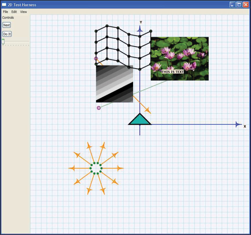
Figure 4.2: The Testbed2D application running. All the things in the large graph-paper window are drawn by the Window1.xaml.cs code and are not described in the XAML file.
4.3. The C# Code
The associated C# code (Window1.xaml.cs) is also relatively simple (see Listing 4.5). There is no fancy software engineering involved; this test bed is meant to act as the equivalent of a pad of scratch paper, not as a foundation for large systems. If you plan to build a large application atop WPF, you should get familiar with WPF itself, not the distilled portion of it that we have used for this 2D test bed.
Recall that we’ve only partially described a Window1 in the XAML; the C# file contains the remainder of the definition. Because we’re displaying a polygon, three images, a mesh, and a quiver of arrows in this sample, we’ll declare each of those as an instance variable for the class. If you were to write a program that needed to display only a single image, you’d delete all but one of these.
Listing 4.5: The C# portion of the Window1 class definition.
1 using ...
2
3 namespace Testbed2D
4 {
5 public partial class Window1 : Window
6 {
7 GraphPaper gp = null;
8
9 Polygon myTriangle = null;
10 GImage myImage1 = null;
11 GImage myImage2 = null;
12 Mesh myMesh = null;
13 Quiver myQuiver = null;
14
15 // Are we ready for interactions like slider-changes to
16 // alter the parts of our display (like polygons or images
17 // or arrows)?
18 // Probably not until those things have been constructed!
19 bool ready = false;
20
21 public Window1()
22 {
23 InitializeComponent();
24 InitializeCommands();
25
26 // Now add some graphical items in the main Canvas,
27 // whose name is "GraphPaper"
28 gp = this.FindName("Paper") as GraphPaper;
29
30 // A triangle whose top point will be dragged
31 // by the slider.
32 myTriangle = new Polygon();
33 myTriangle.Points.Add(new Point(0, 10));
34 myTriangle.Points.Add(new Point(10, 0));
35 myTriangle.Points.Add(new Point(-10, 0));
36 myTriangle.Stroke = Brushes.Black;
37 myTriangle.StrokeThickness = 1.0; // 1 mm thick line
38 myTriangle.Fill = Brushes.LightSeaGreen;
39 gp.Children.Add(myTriangle);
40
41 // A draggable Dot, which is the basepoint of an arrow.
42 Dot dd = new Dot(new Point(-40, 60));
43 dd.MakeDraggable(gp);
44 gp.Children.Add(dd);
45
46 Arrow ee = new Arrow(dd, new Point(10, 10),
47 Arrow.endtype.END);
48 gp.Children.Add(ee);
49 [lots more shape-creating code omitted]
50 ready = true; // Now we’re ready to have sliders and
51 // buttons influence the display.
52 }
53 [interaction-handling code omitted]
The constructor for Window1 first initializes the component—a step that’s required for any top-level WPF window, causing all the subparts to be laid out; it then initializes the menu- and keyboard-command handling. Following this, we add the graphical items to the GraphPaper that we named Paper; we locate that with the FindName method. A Canvas has a Children collection, and with gp.Children.Add(myTriangle), we make the triangle we’ve created a child of the Canvas, which makes it get displayed within the Canvas.
Now let’s look at the details of the creation of the triangle. We declare the triangle to be a new Polygon and then add several Points to the Polygon. This describes the geometry of the triangle, but not its appearance. In WPF, appearance is characterized by a Stroke (how lines are drawn) and a Fill (how regions are filled in), each of which is defined by a Brush, which can be remarkably complex; in our case, we’ll use simple predefined strokes and fills, available from the Brushes class. The lines will be drawn in black, and the triangle will be filled with a light green color. The thickness of the stroke is set to 1.0; because of the way GraphPaper is defined, that’s 1. 0 mm. Indeed, recall that all units in a GraphPaper refer to millimeters. The grid is based on 5 mm distances between grid lines, and the triangle we’ve created will be 10 mm tall (although with a brush thickness of 1. 0, it will actually be slightly taller; we imagine the brush being dragged around the outline, with the brush center passing along the geometric figure4). In summary, the GraphPaper called Paper provides a place in which to draw geometric shapes; the units used on the graph paper are millimeters, and the coordinates have been set up so that (0, 0) is positioned more or less in the center of the canvas, with the first coordinate increasing as we move to the right and the second coordinate increasing as we move up. This latter coordinate direction is not the choice made in WPF, in which the second coordinate would increase as we move downward.
4. The brush in this case actually draws lines that are mitered at the corners so that the shape remains triangular; this can be adjusted as a property of the Brush, however. At very sharp corners, the miter can extend a long distance; because of this, one can also set a MiterLimit.
4.3.1. Coordinate Systems
Why does the second coordinate increase downward in WPF? There are a number of possible justifications for this (some of which may not even have been in the designers’ minds), and some reasonable criticisms as well. The natural criticism is that anyone who has studied mathematics is used to the conventional Cartesian coordinates, in which the y-axis points upward; those only slightly more familiar with mathematics are used to angles measured from the x-axis and increasing as the other ray of the angle moves counterclockwise. Why, with all these years of experience, would one change things?
The counterargument is that several other things are naturally described with a coordinate that increases as we move downward. Matrices, for instance, have row and column indices, with the first row at the top, the second row below it, etc. If we think of a matrix as containing a collection of grayscale values, we can think of it as describing a black-and-white image. It would be nice if, when it was displayed “in the obvious way,” the resultant image looked the way we expected from the matrix representation (see Figure 4.3). But if we use Cartesian coordinates in the obvious way, the resultant image ends up upside down. [By the way, there’s the further problem that matrix indices are almost always given as “(row, column)” pairs; unfortunately, the column corresponds to horizontal position and the row to vertical position, which is exactly the opposite of the (x, y) convention of both Cartesian and WPF coordinates.]
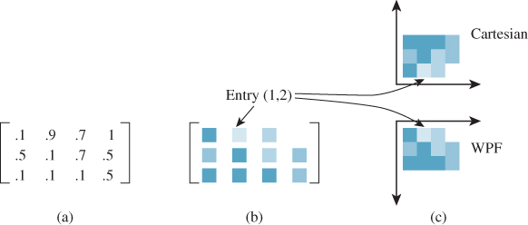
Figure 4.3: (a) A 3 × 4 matrix with entries between 0 and 1 representing various shades of gray, from black (0) to white (1). If we convert each entry to a small rectangle of the corresponding shade of blue, we get the “shaded matrix” shown in (b). (c) If we display the matrix by displaying the values in column j and row i as a small square centered at location (i, j) in the Cartesian plane, the resultant image is flipped across the horizontal axis. If, on the other hand, we do the same thing in WPF coordinates, the result is not inverted.
A further argument, beyond images, is that text in Western writing flows from top to bottom and from left to right, and thus our way of thinking about 2D layout also flows in that way. Furthermore, our conventional interfaces start at the top (that’s where the menu bar is) and draw our eyes downward into the content. Finally, many early raster graphics systems tended to describe the individual pixels in this way, with (0, 0) in the top-left corner of the screen.
Regardless of the rationale, this is the convention chosen by the WPF developers. Fortunately, they also included a mechanism by which one can change the coordinates used in a canvas.5 Thus, our test bed has conventional Cartesian coordinates.
5. More precisely, they included something that says how canvas coordinates should be converted to coordinates in the containing object—a window, a panel, etc.—and this allows us to invert the y-coordinate and to move (0, 0) to the center of the canvas, much as we did with the clock example in Chapter 2.
A second version of the test bed, using the y-increases-down coordinate system, is also available on the book’s website. You’ll probably choose to use that version when you’re experimenting with image data, for instance.
4.3.2. WPF Data Dependencies
Our triangle is a Polygon made from three Points. Built into WPF is the capability to determine when things have changed in a way that necessitates redrawing. When we say that the GraphPaper is to add this triangle to its collection of children, we’re not saying anything about actually drawing the triangle. When WPF decides that it needs to display the canvas, it displays all the canvas’s children. We have simply told it what one of those children is. One thing that prompts WPF to redisplay the canvas is the information that one of the children has changed. For example, if we removed the triangle as a child, the canvas would be automatically redisplayed, with the triangle absent. If we somehow changed the triangle, that too would prompt a redisplay.
Unfortunately, this “watching for changes in children” extends to only a certain level of detail. If the Collection of Points that makes up the Polygon changes, this in fact becomes a change in the Polygon itself, which prompts a redisplay of the containing GraphPaper. But what does it mean for a Collection to change? The designers of WPF chose to make it mean “the collection of references must change” rather than “one of the objects referred to by the references must change.” Thus, deleting or inserting an item in the collection is treated as a change, but merely altering an item—for example, changing the x-coordinate of the first point—is not. So, if we alter the first coordinate of the first Point that defines the polygon, nothing happens: The Point itself changes, but the Collection containing the Point does not recognize the change and propagate it. Instead, we can remove the Point from the collection, create a new Point with a changed coordinate, and insert this new Point into the collection, resulting in a change that propagates upward. We’ll see details of this in the next section.
The choice of what constitutes a “change” in a system like WPF can have a huge impact on performance: If it’s too fine-grained, all the platform’s computational power will be spent watching for changes; if it’s too coarse-grained, application programmers will need to do lots of change notifications and may eventually abandon the system-provided change tracking in favor of handling it all themselves, because they can then do so consistently.
4.3.3. Event Handling
WPF takes user interaction, in the form of key presses, mouse clicks, and mouse drags, and treats them as events. When an event is detected, it sets off a complex sequence of activities, which ends with some event handler being called by WPF. To be more precise, a great many event handlers may be called by WPF, but in our case, we’ll use just a single handler for an event and then mark the event as “handled” so that no further handlers will be called. Sometimes the event handlers are part of WPF; sometimes they are callback procedures provided by the application programmer.
In particular, when WPF detects that a button has been clicked, it invokes that button’s Click handler. In the case of our first button (defined on line 25 in Listing 4.3), we set the Click handler to be b1Click back in the XAML code. The b1Click method is rather simple: It prints a debugging message and then declares that this click has been handled by setting a flag on the event (see Listing 4.6).
Listing 4.6: The handler for a click on the first button.
1 public void b1Click(object sender, RoutedEventArgs e)
2 {
3 Debug.Print("Button one clicked!
");
4 e.Handled = true; // don’t propagate the click any further
5 }
The sender in this code is the entity in WPF from which the click was relayed to us; this relaying of clicks is part of a complex hierarchy, one that we can largely ignore, in which a click on a piece of text displayed on a button in a grid on a canvas will trigger responses from the text object, the button, the grid, and the canvas. To break this chain of events, we set the RoutedEventArgs Handled field to True, which says that we’ve processed the button click, and no other part of our code needs to do anything about it.
A more complex example of event handling is demonstrated by the handler for a change in the value of the slider, namely slider1change, which is shown in Listing 4.7. As you can see, we print a message indicating the new value (e.NewValue) that was passed in, and then adjust the x-coordinate of the triangle’s first point. Rather than removing and reinserting the point, we simply reassign the entire Points array, since there are only three points. This causes the triangle to be marked as “changed,” which provokes a redisplay of the entire canvas, with the result that as we adjust the slider with the mouse, the top of the triangle moves from side to side.
Listing 4.7: The slider1change method that moves a triangle vertex.
1 void slider1change(
2 object sender,
3 RoutedPropertyChangedEventArgs<double> e)
4 {
5 Debug.Print("Slider changed, ready = " + ready +
6 ", and val = " + e.NewValue + ".
");
7 e.Handled = true;
8 if (ready)
9 {
10 PointCollection p = myTriangle.Points.Clone();
11 Debug.Print(myTriangle.Points.ToString());
12 p[0].X = e.NewValue;
13 myTriangle.Points = p;
14 }
15 }
What about the flag called ready in lines 19 and 50 of Listing 4.5, and line 8 of Listing 4.7? Well, in the course of creating the Window1 in our application, WPF creates the slider and sets its initial value to the predetermined value in the XAML code. That in turn raises a ValueChanged event,6 which makes WPF invoke the slider1change method. But all this happens in the course of the InitializeComponent process, so the triangle has not yet been created. If we try to alter the coordinates of one of its Points, that’ll be a bug. We therefore ignore all events like this until the Window1 is ready, as indicated by the ready flag.
6. The value has changed from “undefined” to the specified initial value.
Modify the test bed so that it displays a diamond-shaped object rather than a triangle, and make the slider adjust the x-coordinate of both the top and bottom vertices at the same time (and in the same direction). Add a second slider, and make it vary the y-coordinate of the left and right vertices of the diamond too.
4.3.4. Other Geometric Objects
The test bed also supports several kinds of geometry besides polygons. These include dots, which are like points but are displayed and have a tool-tip that says where they’re located; arrows (used for depicting vectors) and quivers, which are collections of arrows; segments, which are line segments between either points or dots; meshes; and images. The details of these various entities are given on the book’s website.
4.4. Animation
As you saw in Chapter 2, WPF contains tools for creating animations. You can animate almost any kind of value—a double, a Point, etc.—and then use that changing value to make the display change. You can define animations in XAML code or in C#. For XAML, there are many predefined animations that you can combine to make quite complex motions. In C# code, you can use these predefined animations or you can create your own using arbitrarily complex programs. You might, for instance, write a program that computes the position of a bouncing ball over time, and then use that varying position to control the location of some shape (like a disk) shown on the display. Writing the simulation program in XAML isn’t really feasible, so it’s more natural to write such a program in C#.
In our sample, we have just one animation, but it shows off the key ideas (see Listing 4.8). In the code, we constructed a segment with one endpoint being at a Dot called p1. In this code, we animate a point by specifying the starting and ending locations, how long the animation should take (it starts at time 0, i.e., when the program is run, and takes five seconds), and the fact that it should auto-reverse and should repeat forever. (This relatively simple animation is an example of something that could be easily described in XAML, by the way.) The result is a point that moves back and forth between the two specified locations over time. Note that this point is not actually displayed on the GraphPaper; it’s just a Point whose value changes constantly. But the line p1.BeginAnimation(Dot.PositionProperty, animaPoint1); says that the PositionProperty of the Dot called p1 should be animated by animaPoint1; this causes that Dot to move back and forth on the display. Once again, WPF’s dependency mechanism is doing the hard work: It is detecting every change in animaPoint1 and making sure that the PositionProperty of p1 is changed as well; this property is what determines the location of the Dot on the canvas so that we see motion.
Listing 4.8: Code to animate a Point.
1 PointAnimation animaPoint1 = new PointAnimation(
2 new Point(-20, -20),
3 new Point(-40, 20),
4 new Duration(new TimeSpan(0, 0, 5)));
5 animaPoint1.AutoReverse = true;
6 animaPoint1.RepeatBehavior = RepeatBehavior.Forever;
7 p1.BeginAnimation(Dot.PositionProperty, animaPoint1);
 We’ve been working with
 Points quite freely, assigning values to their x- and y-coordinates. Rigid adherence to object-oriented programming doctrine might require that we treat these coordinates as instance variables to be hidden, and that we access them only through accessor/mutator (or get/set) methods. In fact, a Point is rather more like a Pascal record or a C struct than a typical C++ or Java object. In blurring the distinction between records (collections of related values) and objects, C# allows such uses, which can have a huge impact on efficiency with relatively little impact on debuggability.
4.5. Interaction
We already discussed how button clicks and slider-value changes are handled in the test bed (and in WPF in general): A Click or ValueChanged method is called.
Keyboard interaction is a little different. Key presses that happen anywhere in the main Window are handled in two stages: First, some of them are recognized as commands (like “Alt-X” for “Exit the program”); second, those not recognized as commands are handled by a method called KeyDownHandler, which responds to all key presses by either ignoring them (for presses on modifier keys like Control or Shift) or displaying a small dialog box indicating which key was pressed. As you write more complex programs, you may want to adapt this part of the code to do particular things when certain keys are pressed.
Finally, the actions taken when menu items are selected get defined in the InitializeCommands method. For many commands (like Application.Close, indicating that the application should close a window), there’s already a predefined way to handle them and a predefined key press associated with the command. For these, one can simply write things like CommandBindings.Add(new CommandBinding(ApplicationCommands.Close, CloseApp)); where CloseApp is a small procedure that pops up a dialog to confirm that the user does, in fact, want to close the application. For others, slightly more complex mechanisms must be invoked. As we do not expect you to add any new commands, we leave it to you to decide whether to examine the mechanism for doing so.
4.6. An Application of the Test Bed
Let’s now return to the corner-cutting example we discussed at the beginning of the chapter. To create an application that demonstrates this, we’ll need to remove most of the code in Window1.cs and start with a simple polygon created by the user. We’ll describe the interaction sequence and then write the code.
The GraphPaper starts out empty; there are two buttons, labeled “Clear” and “Subdivide”. When the user clicks on the graph paper a polygon P1 appears, with vertices at the clicked locations (after two clicks, the polygon consists of two identical line segments; after three, a triangle; etc). When the user clicks the Subdivide button, a subdivided version, P2, of the first polygon appears; subsequent clicks on Subdivide replace P1 with P2, and P2 with a subdivided version of P2, etc. so that a polygon and its subdivision are always both shown. A click on the Clear button clears the graph paper. Once the user has subdivided the polygon, we disable further clicks on the graph paper; you might want such clicks to add new points to the subdivided polygon, but it’s not clear where, in the subdivided polygon, the new points ought to be added, and so we simply avoid the issue.
With that description in mind, let’s write the code.7 We’ll need an isSubdivided flag (initially false) to tell us whether the user has subdivided the polygon or not. The Clear button should reset this, as well as clearing the graph paper. And if there are no points in the polygon yet, Subdivide should have no effect.
7. The entire program is available on the book’s website for download.
We start from a copy of the test bed code, and modify the XAML to remove the slider and to change the text on the buttons:
1 <StackPanel DockPanel.Dock ="Left"
2 Orientation="Vertical" Background="#ECE9D8">
3 <TextBlock Margin="3" Text="Controls"/>
4 <Button Margin="3,5" HorizontalAlignment="Left"
5 Click="b1Click">Subdivide </Button>
6 <Button Margin="3,5" HorizontalAlignment="Left"
7 Click="b2Click">Clear</Button>
8 </StackPanel>
Now we modify the C# code in Window1.xaml.cs. We start by initializing both polygons to be empty:
1 public partial class Window1 : Window
2 {
3 Polygon myPolygon = new Polygon();
4 Polygon mySubdivPolygon = new Polygon();
5 bool isSubdivided = false;
6 GraphPaper gp = null;
7 [...]
8 public Window1()
9 {
10 [...]
11 initPoly(myPolygon, Brushes.Black);
12 initPoly(mySubdivPolygon, Brushes.Firebrick);
13 gp.Children.Add(myPolygon);
14 gp.Children.Add(mySubdivPolygon);
15
16 ready = true; // Now we’re ready to have sliders
17 // and buttons influence the display.
18 }
The polygon initialization procedure also sets the polygons to have different colors and a standard line thickness, and to make sure that when two edges meet at a sharp angle they are truncated, as shown at the bottom of Figure 4.4, instead of having the joint extended in a long miter as shown in the middle.
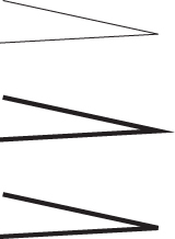
Figure 4.4: When we thicken the vertex join at the top, we must miter it, as shown in the middle. At the bottom, the miter is limited.
1 private void initPoly(Polygon p, SolidColorBrush b)
2 {
3 p.Stroke = b;
4 p.StrokeThickness = 0.5;// 0.5 mm thick line
5 p.StrokeMiterLimit = 1; // no long pointy bits
6 p.Fill = null; // at vertices
7 }
Handling a click on the Clear button is straightforward: We simply remove all points from each polygon and set the isSubdivided flag back to false:
1 // Clear button
2 public void b2Click(object sender, RoutedEventArgs e)
3 {
4 myPolygon.Points.Clear();
5 mySubdivPolygon.Points.Clear();
6 isSubdivided = false;
7
8 e.Handled = true; // don’t propagate click further
9 }
The Subdivide button is more complex. First, if the polygon is already subdivided, we want to replace myPolygon’s points with those of the subdivided polygon. Then we can subdivide myPolygon and put the result into mySubdivPolygon. Subdivision amounts to determining, for each vertex, the previous and next vertices and then combining coordinates in a two-thirds-to-one-third fashion to find the location of the corner-cutting points. (This combination is closely analogous to the idea of averaging the coordinates of two points to find the coordinates of the midpoint of the segment between them, which you’ll recall from elementary geometry.)
1 // Subdivide button
2 public void b1Click(object sender, RoutedEventArgs e)
3 {
4 Debug.Print(Subdivide button clicked!
");
5 if (isSubdivided)
6 {
7 myPolygon.Points = mySubdivPolygon.Points;
8 mySubdivPolygon.Points = new PointCollection();
9 }
10
11 int n = myPolygon.Points.Count;
12 if (n > 0)
13 {
14 isSubdivided = true;
15 }
16 for (int i = 0; i < n; i++)
17 {
18 int nexti = (i + 1) % n; // index of next point.
19 int lasti = (i + (n - 1)) % n; // previous point
20 double x = (1.of/3.of) * myPolygon.Points[lasti].X
21 +(2.0f/3.0f) * myPolygon.Points[i].X;
22 double y = (1.0f/3.0f) * myPolygon.Points[lasti].Y
23 +(2.0f/3.0f) * myPolygon.Points[i].Y;
24 mySubdivPolygon.Points.Add(new Point(x, y));
25
26 x = (1.0f/3.0f) * myPolygon.Points[nexti].X
27 +(2.0f/3.0f) * myPolygon.Points[i].X;
28 y = (1.0f/3.0f) * myPolygon.Points[nexti].Y
29 +(2.0f/3.0f) * myPolygon.Points[i].Y;
30 mySubdivPolygon.Points.Add(new Point(x, y));
31 }
32 e.Handled = true; // don’t propagate click further
33 }
Finally, we must handle mouse clicks. Anytime the user presses the mouse button, we want to add a new vertex to the polygon unless it’s already subdivided. We therefore check the isSubdivided flag, and if it’s false, we add the point to our Polygon.
1 public void MouseButtonDownA(object sender,
2 RoutedEventArgs e)
3 {
4 if (sender != this) return;
5 System.Windows.Input.MouseButtonEventArgs ee =
6 (System.Windows.Input.MouseButtonEventArgs)e;
7 if (!isSubdivided)
8 {
9 myPolygon.Points.Add(ee.GetPosition(gp));
10 }
11 e.Handled = true;
12 }
13 }
14 }
That’s it! You can run the program to see how well it works. When you click only two points, your polygon looks like a line segment. When you then subdivide, the line segment appears shorter. Explain to yourself why subdividing again doesn’t make it shorter still.
A similar process can be used to take a 3D polyhedron and “cut corners” in an attempt to smooth it out. Will it always get smoother? We’ll discuss this further in Chapter 23. In the meantime, having seen how rapidly subdivision seems to smooth out curves, you can ask yourself, “How could I analyze whether the curve approaches a limit, and whether such a limit is smooth at a particular point?” This is addressed (for a somewhat different subdivision method, but the principles are similar) in Chapter 22.
4.7. Discussion
We’ve given you the tools to create simple applications in WPF for experimenting with ideas from graphics, and worked through a subdivision application as an example of using those tools. The exercises in this chapter will give you the opportunity to explore the power of the 2D test bed, and to discover some interesting ideas in graphics that you’ll encounter again later in this book. We strongly advise you to complete at least a couple of these exercises so that working with this framework will be simple for you in the future.
This test bed was built for a reason. Lots of years of working in computer graphics have taught us another principle:
 The First Pixel Principle
The first pixel is the hardest.
When you write a new program in graphics, the most common first result is a completely black screen. That’s almost impossible to debug, because any of a million things could be causing the problem. Usually when you manage to get anything to show up on the screen, you’re finished with a great deal of your debugging. It’s therefore proven useful to start with a program that does something like what you’re trying to do, and to gradually modify it until it does do what you want, but make the modifications so that at every stage you can tell, by looking at it, that it’s doing what you expected. The test bed provides you with a starting point for a whole host of possible programs. We hope it will save you countless hours of debugging.
4.8. Exercises
Exercise 4.1: Modify the corner-cutting program to place the cutoff points one-fourth and three-fourths of the way along the line; describe the results.
Exercise 4.2: Modify the corner-cutting program to be a “dualizing” program: It replaces a polygon with its dual, a polygon whose vertices are the midpoints of the original polygon, connected in the same order, so that the dual of a square is a diamond. Experiment: Does repeated dualizing tend to remove crossings of self-intersecting polygons? Can you find a polygon whose successive duals are always self-intersecting?
Exercise 4.3: Modify the test bed to display only a single image (e.g., the water lilies) until a button is clicked; each time the button is clicked, a new image should be displayed (perhaps cycling through a collection of four or five images). To make a new image appear, you’ll need to update the BitmapSource. This exercise is somewhat harder than the previous ones, because we’ve given you less guidance.
Exercise 4.4: Read about motion-induced blindness at the end of Chapter 5, and then write a program that lets you experiment with it, including changing the grid spacing and colors, changing the color and size of the “disappearing” dots, and altering the speed with which the grid rotates. Try to determine the settings that induce the “blindness” in you most effectively.