
We are almost done programming our drum machine. However, we would like to end this project by introducing you to the ttk-themed widgets.
On many platforms such as Windows and X11, Tkinter does not bind to the native platform widgets. The Tk toolkit (and Tkinter) originally appeared on X-Window systems, hence, it adopted the motif look and feel, which was the de facto standard for GUI development on X-Window systems. When Tk was ported to other platforms, such as Windows and Mac OS, this Motif style started appearing out of place with the look of these platforms.
Due to this, some even argue that Tkinter widgets are rather ugly and do not integrate well with such desktop environments.
Another criticism of Tkinter is based on the fact that Tkinter mixes logic and styling by allowing both to be changed as widget options.
It was also criticized to lack any kind of theming support. While we saw an example of centralized styling via the option database, the method required styling to be done at the widget level. It does not allow for selective styling of two button widgets differently, as an example. This made it difficult for developers to implement visual consistency for similar groups of widgets while differentiating them from other groups of widgets. As a result of this, many GUI developers moved to Tkinter alternatives such as wxPython , glade , PyQT , and others.
With Tkinter 8.5, the makers of Tkinter have tried to address all these concerns by introducing the ttk module, which may be considered as an advance to the original Tkinter module.
Let us take a look at some of the features offered by the ttk-themed widgets module.
One of the first things that ttk does is that it provides a set of built-in themes that allows Tk widgets to look like the native desktop environment in which the application is running.
Additionally, it introduces six new widgets: Combobox, Notebook, Progressbar, Separator, Sizegrip, and Treeview to the list of widgets, in addition to supporting 11 core Tkinter widgets, which are Button, Checkbutton, Entry, Frame, Label, LabelFrame, Menubutton, PanedWindow, Radiobutton, Scale, and Scrollbar.
To use the ttk module, we first import it into the current namespace:
import ttk
You can display the ttk widgets as follows see the code in 3.10.py):
ttk.Button(root, text='ttk Button').grid(row=1, column=1)
ttk.Checkbutton(root, text='tkCheckButton').grid(row=2, column=1)
For a comparison of displays between the normal Tkinter widgets and the counterpart ttk widgets, see the code in 3.10.py, which produces a window, as shown in the following screenshot. Notice how the widgets look like more native widgets on your platform.
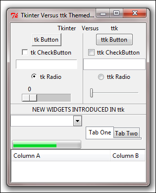
3.10.py also shows dummy examples of all the new widgets introduced in the ttk module.
Tip
You can even override the basic Tkinter widgets by importing ttk after Tkinter as follows:
from Tkinter import *
from ttk import *
This causes all widgets common to Tk and ttk to be replaced by ttk widgets.
This has the direct benefit of using the new widgets, which gives a better look and feel across platforms.
However, the disadvantage of this kind of import, is that you cannot distinguish the module from which the widget classes are imported. This is important because Tkinter and ttk widget classes are not completely interchangeable. In this case, an unambiguous solution is to import them, as shown in the following codeimport Tkinter as tk
import ttk
While most of the configuration options for Tkinter and ttk widgets are common, ttk-themed widgets do not support styling options such as fg, bg, relief, border, and more. This is purposefully removed from ttk in an attempt to keep logic and styling in different controls.
Instead, all styling-related options are handled by the respective style names. In a standard ttk module, each widget has an associated style name. You can retrieve the default style name of a widget using the widget.winfo_class() method.
For instance consider a ttk button:
>>> b = ttk.Button()
>>> b.winfo_class()
This prints Tbutton, which is the default style name for ttk.Button. For a list of default ttk style names for different widgets, refer to the The ttk widgets section in Appendix B, Quick Reference Sheets.
In addition to the default style, you can assign a custom style class to a widget or group of widgets. To set up a new style you use:
x = ttk.Style()
To configure the style options for a default style, you use the command:
x.configure('mystyle.Defaultstyle', **styling options)
To use the new style on a widget you use the command:
ttk.Widget(root, style='mystyle.Defaultstyle')
Next we will discuss about ttk theming.
Style is used to control the appearance for individual widgets. Themes, on the other hand, control the appearance of the entire GUI. More simply put, a theme is a collection of styles. Grouping styles into themes lets the user switch designs for the entire GUI all at once. Like styles, all themes are uniquely identified by their name. The list of available themes can be obtained as follows:
>>> x = ttk.Style()
>>>x.theme_names()
('winnative', 'clam', 'alt', 'default', 'classic', 'xpnative')
To obtain the name of the currently active theme:
>>>x.theme_use()
'xpnative'
You can change to another theme using:
x.theme_use('yournewthemename')
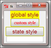
Let us see various styling- and theming-related options of ttk through a dummy example (refer to the code in 3.11.py, which produces a window like the one shown in the following screenshot):
from Tkinter import *
import ttk
root= Tk()
x = ttk.Style()
x.configure('.', font='Arial 14', foreground='brown', background='yellow')
x.configure('danger.TButton', font='Times 12', foreground='red', padding=1)
ttk.Label(root, text='global style').pack()
ttk.Button(root, text='custom style', style='danger.TButton').pack()
# Different  styling for different widget states
x.map("s.TButton", foreground=[('pressed', 'red'), ('active', 'blue')])
ttk.Button(text="state style", style="s.TButton").pack()
# Overriding current theme styles
curr_theme = x.theme_use()
x.theme_settings(curr_theme, { "TEntry": { "configure":  {"padding": 2}, "map": {"foreground": [("focus", "red")]}  }})
ttk.Entry().pack()
root.mainloop()
The description of the code is listed as follows:
- The first three lines of code imports
Tkinterandttk,and sets up a new root window. - The next line
x = ttk.Style()is where you give a namexto your style. - The next line configures a program-wide style configuration using
x.configure. The dot character (.), which is the first argument ofconfigure, means that this style would apply to the Toplevel window and to all its child elements. This is the reason why all of our widgets get to have a yellow background. - The next line creates an extension (
danger) to the default style (TButton). This is how you create custom styles, which are variations to a base default style. - The next line creates a
ttk.labelwidget. Since we have not specified any style for this widget, it inherits the global style specified for the Toplevel window. - The next line creates a
ttk.buttonwidget and specifies it to be styled using our custom style definition of'danger.TButton.'This is why the foreground color of this button turns red. Notice how it still inherits the background color, yellow ,from the global Toplevel style that we defined earlier. - The next two lines of code demonstrate how ttk allows for styling different widget states. In this example we styled different states for a
ttk.buttonwidget to display in different colors. Go ahead and click on this second button to see how different styles apply to different states of a button. Here we usemap(style, query_options, **kw)to specify dynamic values of style for changes in state of the widget. - The next line fetches the current applicable theme. It then overrides some of the options for the theme's Entry widget using:
x.theme_settings('themename', ***options)
Now that we know how to make our widgets look more like native platform widgets, let us change the Play and Stop buttons for our drum machine to ttk.button. Let us also change the Loop check button from Tkinter Checkbutton to ttk Checkbutton.
- We first import
ttkinto our namespace and appendttkto theplayandstopbuttons as follows (see the code in3.12.py):import ttk
- We then simply modify the buttons and check button in the
create_play_barmethod as follows:button = ttk.Button() loopbutton = ttk.Checkbutton(**options)
Also, note that we cannot modify the Tkinter buttons that we have used in our pattern editor. This is because our code extensively plays on the button's background color to decide logic. The ttk buttons do not have the configurable
bgoption, hence, cannot be used for buttons in our right drum pad. - As a quick ending exercise let us add an image in the right-hand side of the play bar. Let us also add an icon for our Toplevel window (refer to the code in
3.12.py):To add an image we add this to our
create_play_barmethod:photo = PhotoImage(file='images/sig.gif') label = Label(playbar_frame, image=photo) label.image = photo label.grid(row=ln, column=35, padx=1, sticky=E)
To add a Toplevel icon, we add the following line to our
Mainmethod:if os.path.isfile('images/beast.ico'):self.root.iconbitmap('images/beast.ico')
This concludes the last iteration of this project. In this iteration, we first saw how and why to use ttk-themed widgets to improve the look and feel of our programs.
We then used ttk buttons and ttk checkbuttons in our drum program to improve its look. We also saw the reasons why certain Tkinter buttons in our program could not be replaced by ttk buttons.