
Let us wrap up this project by looking at the graphing abilities of the Tkinter canvas widget.
In this recipe we will see how we can plot:
- Pie chart
- Scatter chart
- Bar graph
- Embedding matplotlib graphs
Let's look at the pie chart first:
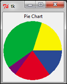
- You can easily create pie charts in Tkinter using the Canvas widget's
create_arcmethod. A sample Pie Chart code is provided in7.08 pie chart.py:import Tkinter root = Tkinter.Tk() def prop(n): return 360.0 * n / 1000 Tkinter.Label(root, text='Pie Chart').pack() c = Tkinter.Canvas(width=154, height=154) c.pack() c.create_arc((2,2,152,152), fill="#FAF402", outline="#FAF402", start=prop(0), extent = prop(200)) c.create_arc((2,2,152,152), fill="#00AC36", outline="#00AC36", start=prop(200), extent = prop(400)) c.create_arc((2,2,152,152), fill="#7A0871", outline="#7A0871", start=prop(600), extent = prop(50)) c.create_arc((2,2,152,152), fill="#E00022", outline="#E00022", start=prop(650), extent = prop(200)) c.create_arc((2,2,152,152), fill="#294994", outline="#294994", start=prop(850), extent = prop(150)) root.mainloop()The description of the code is as follows:
- Each portion of the pie chart is drawn by changing the two following
create_arcoptions:start: This option specifies the start angle. Default is0.0.extent: This option specifies the size ofarcrelative to the start angle. Default is90.0.
- Each portion of the pie chart is drawn by changing the two following
- Next, we'll plot a sample scatter chart:
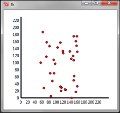
Similarly, we can use
create_lineto draw the x and y axes andcreate_ovalto draw the scatter plots, as shown in the preceding screenshot here. A sample scatter plot code is provided in the7.09 scatter plot.pyPython file:import Tkinter import random root = Tkinter.Tk() c = Tkinter.Canvas(root, width=350, height=280, bg='white') c.grid() #create x-axis c.create_line(50, 250, 300, 250, width=3) for i in range(12): x = 50 + (i * 20) c.create_text(x, 255, anchor='n', text='%d'% (20*i)) # create y-axis c.create_line(50, 250, 50, 20, width=3) for i in range(12): y = 250 - (i * 20) c.create_text(45, y, anchor='e', text='%d'% (20*i)) #create scatter plots from random x-y values for i in range(35): x,y = random.randint(100,210), random.randint(50,250) c.create_oval(x-3, y-3, x+3, y+3, width=1, fill='red') root.mainloop()
- Now, let's plot a sample bar graph:
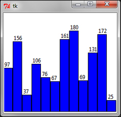
A bar graph can be easily generated using the Canvas widget's
create_rectanglemethod. A sample bar graph code is provided in7.10 bar graph.py:import Tkinter import random root = Tkinter.Tk() cwidth = 250 cheight = 220 barWidth = 20 canv = Tkinter.Canvas(root, width=cwidth, height=cheight, bg= 'white') canv.pack() plotdata= [random.randint(0,200) for r in xrange(12)] for x, y in enumerate(plotdata): x1 = x + x * barWidth y1 = cheight - y x2 = x + x * barWidth + barWidth y2 = cheight canv.create_rectangle(x1, y1, x2, y2, fill="blue") canv.create_text(x1+3, y1, text=str(y), anchor='sw') root.mainloop() - Finally, we're going to look at how to embed matplotlib graphs in Tkinter Toplevel window.
Using Tkinter Canvas to draw graphs may work fine for trivial cases. However, Tkinter may not be the best library when it comes to drawing more sophisticated and interactive graphs.
In fact, matplotlib is used in conjunction with the NumPy module is the preferred choice when it comes to producing professional-quality graphs with Python.
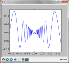
Although a detailed discussion on matplotlib is beyond the scope of this book, we will take a brief look at embedding matplotlib-generated graphs on a Tkinter canvas.
Tip
If you are interested in exploring advanced graphing with Python, you can install matplotlib and NumPy (a dependency for matplotlib) with the help of the installation instructions available at http://matplotlib.org/users/installing.html
import Tkinter as Tk
from numpy import arange, sin, pi
from matplotlib.backends.backend_tkagg import FigureCanvasTkAgg, NavigationToolbar2TkAgg
from matplotlib.figure import Figure
root = Tk.Tk()
#creating the graph
f = Figure(figsize=(5,4), dpi=100)
a = f.add_subplot(111)
t = arange(-1.0,1.0,0.001)
s = t*sin(1/t)
a.plot(t,s)
# embedding matplotlib figure 'f' on a tk.DrawingArea
canvas = FigureCanvasTkAgg(f, master=root)
canvas.get_tk_widget().pack(side=Tk.TOP, fill=Tk.BOTH, expand=1)
#creating toolbar
toolbar = NavigationToolbar2TkAgg( canvas, root )
toolbar.update()
root.mainloop()
This completes our brief discussion on the graphing abilities of Tkinter.
In this iteration, we saw how to use Tkinter Canvas to draw basic graphs such as pie chart, scatter plots, and bar graphs.
We also saw how to embed more sophisticated matplotlib graphs, on the Tkinter drawing area.