
Having seen all the core Tkinter widgets, let us now turn our attention to the second component of GUI programming—the question of where to place those widgets.
This is taken care of by the geometry manager options of Tkinter. This component of GUI programming involves deciding the position of the widget, overall layout, and relative placement of various widgets on the screen.
Recall that we used the pack() method for adding widgets to the dummy application we developed in the previous section. pack() is an example of geometry management in Tkinter.
pack() is not the only way you can manage the geometry in your interface. In fact, there are three geometry managers in Tkinter that let you specify the position of widgets inside a Toplevel or parent window.
The geometry managers are as follows:
pack: This is the one we have used so far. Simple to use for simpler layouts but may get very complex for slightly complex layouts.grid: This is the most commonly used geometry manager that provides a table-like layout of management features for easy layout management.place: This is least popular, but provides the best control for absolute positioning of widgets.
Let us now see examples of all three geometry managers in action.
The pack geometry derives its name from the fact that it literally packs widgets on a first-come-first-serve basis in the space available in the master frame in which widgets are pushed.
The pack geometry manager fits "slave widgets" into "parent spaces". When packing the slave widgets, the pack manager distinguishes between three kinds of spaces:
- The unclaimed space
- The claimed but unused space
- The claimed and used space
The most commonly used options in pack() include:
side:LEFT,TOP,RIGHT, andBOTTOM(these decide the alignment of the widget)fill:X,Y,BOTH, andNONE(these decide whether the widget can grow in size)expand:1/0orYes/No(corresponding to values respectively)anchor:NW,N,NE,E,SE,S,SW,W, andCENTER(corresponding to the cardinal directions)- Internal padding (
ipadxandipady) and external padding (padxandpady), which all defaulted to a value of zero
Let's take a look at some demo code that illustrates some of the pack features. Here's the code snippet (code 1.04.py) that generates a GUI like the following screenshot:
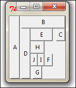
from Tkinter import *
root = Tk()
Button(root, text="A").pack(side=LEFT, expand=YES, fill=Y)
Button(root, text="B").pack(side=TOP, expand=YES, fill=BOTH)
Button(root, text="C").pack(side=RIGHT, expand=YES, fill=NONE, anchor=NE)
Button(root, text="D").pack(side=LEFT, expand=NO, fill=Y)
Button(root, text="E").pack(side=TOP, expand=NO, fill=BOTH)
Button(root, text="F").pack(side=RIGHT, expand=NO, fill=NONE)
Button(root, text="G").pack(side=BOTTOM, expand=YES, fill=Y)
Button(root, text="H").pack(side=TOP, expand=NO, fill=BOTH)
Button(root, text="I").pack(side=RIGHT, expand=NO)
Button(root, text="J").pack(anchor=SE)
root.mainloop()
The description of the code is listed as follows:
- When you insert button A in the
rootframe, it captures the left-most area of the frame, it expands, and fills the Y dimension. Because expand and fill options are specified in affirmative, it claims all the area it wants and fills the Y dimension. If you increase the size of the root window pulling it down, you will notice that the button A expands in the downward direction (along the Y coordinate) but a side-wise increase in the window does not result in a horizontal increase in the size of button A. - When you insert the next button, B, into the root window, it picks up space from the remaining area but aligns itself to
TOP, expand-fills the available area, and fills both X and Y coordinates of the available space. - The third button, C, adjusts to the right-hand side of the remaining space. But because fill is specified as
NONE, it takes up only that much space as is required to accommodate the text inside the button. If you expand the root window, the button C will not change its size. - The
anchorattribute used in some lines provides a means to position a widget relative to a reference point. If theanchorattribute is not specified, thepackmanager places the widget in the center of the available space or the packing box. Other allowed options include the four cardinal directions (N,S,E, andW) and a combination of any two directions. Therefore, valid values for theanchorattribute are:CENTER(default),N,S,E,W,NW,NE,SW, andSE.
The description for the rest of the lines is left as an exercise for you to explore. The best way to study this piece of code would be to comment out all lines of code and introduce each successive button one after another. At each step, try to resize the window to see the effect it has on various buttons.
We will use the pack geometry manager in some of our projects, so it would be a worthwhile exercise to get acquainted with pack and its options.
For a complete pack manager reference refer to the The pack manager section in Appendix B, Quick Reference Sheets.
Tip
Where should you use the pack() geometry manager?
Using the pack manager is somewhat complicated compared to the grid method that we will discuss next, but it is a great choice in situations such as:
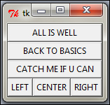
- Having a widget fill the complete container frame
- Placing several widgets on top of each other or in a side by side position (as in the previous screenshot). See code
1.05.py.
While you can create complicated layouts by nesting widgets in multiple frames, you can find the grid geometry manager more suitable for most of the complex layouts.
The grid geometry manager is most easy to understand and, perhaps, the most useful geometry manager in Tkinter. The central idea of the grid geometry manager is to divide the container frame into a two-dimensional table divided into a number of rows and columns. Each cell in the table can then be targeted to hold a widget. In this context, a cell
is an intersection of imaginary rows and columns. Note that in the grid method, each cell can hold only one widget. However, widgets can be made to span multiple cells.
Within each cell you can further align the position of the widget using the STICKY option. The sticky option decides how the widget is expanded, if its container cell is larger than the size of the widget it contains. The sticky option can be specified using one or more of the N, S, E, and W, or NW, NE, SW, and SE options.
Not specifying stickiness defaults to stickiness to the center of the widget in the cell.
Let us now see a demo code that illustrates some of the features of the grid geometry manager. The code in 1.06.py generates a GUI-like figure as shown:
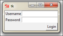
from Tkinter import *
root = Tk()
Label(root, text="Username").grid(row=0, sticky=W)
Label(root, text="Password").grid(row=1, sticky=W)
Entry(root).grid(row=0, column=1, sticky=E)
Entry(root).grid(row=1, column=1, sticky=E)
Button(root, text="Login").grid(row=2, column=1, sticky=E)
root.mainloop()
The description of the code is listed as follows:
- Take a look at the grid position defined in terms of rows and column positions for an imaginary grid table spanning the entire frame. See how the use of
sticky=Won both labels makes them stick to the west or left-hand side, resulting in a clean layout. - The width of each column (or height of each row) is automatically decided by the height or width of the widgets contained in the cell. Therefore, you need not worry about specifying the row or column width as equal. You may specify the width for widgets, if you need that extra bit of control.
- You can use the argument
sticky=N+S+E+Wto make the widget expandable to fill the entire cell of the grid.
In a more complex scenario, your widgets may span across multiple cells in the grid. To enable a grid to span multiple cells, the grid method offers very handy options such as rowspan and columnspan.
Furthermore, you may often need to provide some padding between cells in the grid. The grid manager provides padx and pady options to provide padding to place around the widget in a cell.
Similarly, there are ipadx and ipady options for internal padding. The default value of external and internal padding is 0.
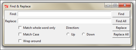
Let us see an example of the grid manager, where we use most of the common arguments to the grid method such as row, column, padx, pady, rowspan, and columnspan in action.
The code 1.08.py is a demonstration of
grid() geometry manager options:
from Tkinter import *
top = Tk()
top.title('Find & Replace')

Label(top,text="Find:").grid(row=0, column=0, sticky='e')
Entry(top).grid(row=0,column=1,padx=2,pady=2,sticky='we',columnspan=9)

Label(top, text="Replace:").grid(row=1, column=0, sticky='e')
Entry(top).grid(row=1,column=1,padx=2,pady=2,sticky='we',columnspan=9)

Button(top, text="Find").grid(row=0, column=10, sticky='ew', padx=2, pady=2)
Button(top, text="Find All").grid(row=1, column=10, sticky='ew', padx=2)
Button(top, text="Replace").grid(row=2, column=10, sticky='ew', padx=2)
Button(top, text="Replace All").grid(row=3, column=10, sticky='ew', padx=2)

Checkbutton(top, text='Match whole word only').grid(row =2, column=1, columnspan=4, sticky='w')
Checkbutton(top, text='Match Case').grid(row =3, column=1, columnspan=4, sticky='w')
Checkbutton(top, text='Wrap around').grid(row =4, column=1, columnspan=4, sticky='w')

Label(top, text="Direction:").grid(row=2, column=6, sticky='w')
Radiobutton(top, text='Up', value=1).grid(row=3, column=6, columnspan=6, sticky='w')
Radiobutton(top, text='Down', value=2).grid(row=3, column=7, columnspan=2, sticky='e')

top.mainloop()
Notice how just 14 lines of core grid manager code generates a complex layout such as the one shown in the following screenshot. In contrast, developing this with the pack manager would have been much more tedious:
Another grid option that you can sometimes use is the widget.grid_forget() method. This method can be used to hide the widget from the screen. When you use this option, the widget exists in its place but becomes invisible. The hidden widget may be made visible again but any grid options that you had originally assigned to the widget will be lost.
Similarly, there is a widget.grid_remove() method that removes the widget, except that in this case when you make the widget visible again, all its grid options will be restored.
For a complete grid() reference, refer to the the The grid manager section in Appendix B, Quick Reference Sheets.
Tip
Where should you use the grid() geometry manager?
The grid manager is a great tool for developing complex layouts. Complex structures can be easily achieved by breaking the container widget into grids of rows and columns and then placing the widgets in grids where they are wanted.
It is also commonly used in developing different kinds of dialog boxes.
Now we will delve into configuring grid column and row sizes.
Different widgets have different heights and widths. So when you specify the position of a widget in terms of rows and columns, the cell automatically expands to accommodate the widget.
Normally the height of all grid rows is automatically adjusted to be the height of its tallest cell. Similarly, the width of all grid columns is adjusted to be equal to the width of the widest widget cell.
If you then want a smaller widget to fill a larger cell or to stay at any one side of the cell, you use the sticky attribute on the widget to control that.
You can, however, override this automatic sizing of columns and rows using the following code:
w.columnconfigure(n, option=value, ...)  AND
w.rowconfigure(N, option=value, ...)
Use these to configure the options for a given widget, w, in the column, n, specifying values for the options, minsize, pad, and weight.
The options available here are as mentioned in the following table:
The columnconfigure() and rowconfigure() methods are often used to implement dynamic resizing of widgets, especially on resizing the root window.
The place geometry manager is the most rarely used geometry manager in Tkinter. Nevertheless, it has its uses in that it lets you precisely position widgets within its parent frame using the X-Y coordinate system.
The place manager can be assessed using the place() method on all standard widgets.
The important options for place geometry include:
- Absolute positioning (specified in terms of
x=Nory=N) - Relative positioning (key options include
relx,rely,relwidth, andrelheight)
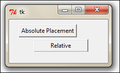
Other options commonly used with place() include width and anchor (the default is NW). Refer to the code in 1.09.py for a demonstration of the common place option:
from Tkinter import *
root = Tk()
# Absolute positioning
Button(root,text="Absolute Placement").place(x=20, y=10)
# Relative positioning
Button(root, text="Relative").place(relx=0.8, rely=0.2, relwidth=0.5, width=10, anchor = NE)
root.mainloop()
You may not see much of a difference between absolute and relative positions simply by looking at the code or the window frame. If, however, you try resizing the window, you will notice that the button placed absolutely does not change its coordinates, while the relative button changes its coordinates and size to fit the new size of the root window.
For a complete place() reference, check out the The place manager section in Appendix B, Quick Reference Sheets.
Tip
When should you use the place manager?
The place
manager is useful in situations where you have to implement the custom geometry managers where the widget placement is decided by the end user.
While pack() and grid() managers cannot be used together in the same frame, the place() manager can be used with any other geometry manager within the same container frame.
The place manager is rarely used. This is because if you use it you have to worry about the exact coordinates. If say you make a minor change for one widget, it is very likely that you will have to change the X-Y values for other widgets as well, which can be very cumbersome.
We will not use the place manager in our projects. However, knowing that options for coordinate-based placement exist can be helpful in certain situations.
This concludes our discussion on geometry management in Tkinter.
In this section you implemented examples of pack, grid, and place geometry managers. You also understood the strength and weaknesses of each geometry manager.
You learned that pack is best for a simple side-wise or top-down widget placement. You also saw that the grid manager is best suited for handling complex layouts. You saw examples of the place geometry manager and the reasons why it is rarely used.
You should now be in a position to plan and execute different layouts for your programs using these geometry managers of Tkinter.