
Our first goal is to implement the visual elements of the text editor. As programmers, we have all used notepad or some code editor to edit our code. We are mostly aware of the common GUI elements of a text editor. So, without much of an introduction, let's get started.
The first phase implements the following six widgets:
- Menu
- Menubutton
- Label
- Button
- Text
- Scrollbar
Although we will cover all these in detail, you might find it helpful to look at the widget-specific options in the documentation of Tkinter maintained by its author Frederick Lundh at http://effbot.org/tkinterbook/.
You might also want to bookmark the official documentation page of Tck/Tk located at http://www.tcl.tk/man/tcl8.5/TkCmd/contents.htm.
The latter site includes the original Tcl/Tk reference. While it does not relate to Python, it provides a more detailed overview of each widget and is an equally useful reference. (Remember, Tkinter is just a wrapper around Tk)
You can also read the documentation provided with the original source code of Tkinter by typing these two lines in the interactive Python shell:
>>> import Tkinter
>>>help(Tkinter)
In this iteration, we will complete the implementation of most of the visual elements of the program.
Note
We will be using the pack() geometry manager to place all the widgets. We have chosen the pack manager because it is ideally suited for placing widgets side by side or in a top-down position. Fortunately in a text editor, we have all widgets placed either side-by-side or in top-down locations. Thus, it suits to use the pack manager. We could have done the same with the grid manager as well.
- First, we will start by adding the Toplevel window, one that will contain all other widgets using the following code:
from Tkinter import *
root = Tk()
# all our code is entered here
root.mainloop()
- In this step we add the top menu buttons to our code. See the code in
2.01.py. Menus offer a very compact way of presenting a large number of choices to the user without cluttering the interface. Tkinter offers two widgets to handle menus.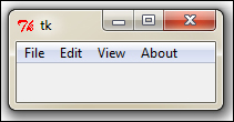
To add top-level menu buttons, you use the following command:
mymenu = Menu(parent, **options)
For example, to add a File menu, we use the following code:
# Adding Menubar in the widget
menubar = Menu(root)
filemenu = Menu(menubar, tearoff=0 ) # File menu
root.config(menu=menubar) # this line actually displays menu
Similarly, we add the Edit, View, and About menus at the top. Refer to step 2 of
2.01.py.Most of the Linux platforms support tear-off menus. When
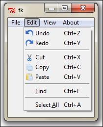
tearoffis set to1(enabled), the menu appears with a dotted line above the menu options. Clicking on the dotted line enables the user to literally tear off or separate the menu from the top. However, as this is not a cross-platform feature, we have decided to disable tear-off, marking it astearoff = 0. - Now we will add menu items within each of the four menu buttons. As previously mentioned, all drop-down options are to be added within the menu instance. In our example, we add five drop-down menu choices in the File menu, namely New, Open, Save, Save As, and Exit menu items. See step 3 of
2.02.py.Similarly, we add the following menu choices for other menus:
- Under Edit we have Undo, Redo, Cut, Copy, Paste, Find All, and Select All
- Under View we have Show Line Number, Show Info Bar at Bottom, Highlight Current Line, and Themes
- Under About we have About and Help
The format for adding menu items is as follows:
mymenu.add_command(label="Mylabel", accelerator='KeyBoard Shortcut', compound=LEFT, image=myimage, underline=0, command=callback)
For example, you would create the Undo menu item using the following syntax:
mymenu.add_command(label="Undo", accelerator='Ctrl + Z', compound=LEFT, image=undoimage, command=undocallback)
- Next we will add some labels. We will add the top label, which will later hold the shortcut buttons. We will also add a label to the left-hand side to display the line numbers:
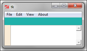
The top label has been marked in a green background and the side label in a light cream background for illustration purposes.
Note
When working with the
packgeometry manager, it is important to add widgets in the order they will appear. This is becausepack()uses the concept of available space to fit the widgets. If we do not maintain the order, the widgets will start occupying places in the order they are introduced. This is why we cannot introduce the text widget before the two label widgets as they appear higher up in the display.Having reserved the space, we can later add shortcut icons or line numbers keeping the label as the parent widget. Adding labels is easy, we have done that in the past. See the code in
2.02.pystep 4. The code is as follows:shortcutbar = Frame(root, height=25, bg='light sea green') shortcutbar.pack(expand=NO, fill=X) lnlabel = Label(root, width=2, bg = 'antique white') lnlabel.pack(side=LEFT, anchor='nw', fill=Y)
We have applied a colorful background to these two labels for now to differentiate it from the body of the Toplevel window.
- Lastly, let's add the Text widget and Scrollbar widget to our code. Refer to step 5 of the code
2.02.py.textPad = Text(root) textPad.pack(expand=YES, fill=BOTH) scroll=Scrollbar(textPad) textPad.configure(yscrollcommand=scroll.set) scroll.config(command=textPad.yview) scroll.pack(side=RIGHT, fill=Y)
The code is similar to all other code that we have used so far to instantiate widgets. Notice, however, that the scrollbar is configured to
yviewof the Text widget and the Text widget is configured to connect to the Scrollbar widget. This way, we cross connected both the widgets to each other.Now when you go down the Text widget, the scrollbar reacts to it. Alternatively, when you pull the scrollbar, the Text widget reacts in return.
Some new menu-specific options introduced here are as follows:
accelerator: This option is used to specify a string, typically the keyboard shortcut, which can be used to invoke the menu. The string specified as the accelerator appears next to the text of the menu item. Please note that this does not automatically create bindings for the keyboard shortcut. We will have to manually set them up, as we will see later.compound: Specifying acompoundoption to the menu item lets you add images beside the common text label of the menu. A specification such asCompound=LEFT, label= 'mytext', image=myimagemeans that the menu item has a compound label comprising of a text label and an image, where the image is to be placed on the left-hand side of the text. The images we use here are stored and referenced from a separate folder calledicons.underline: Theunderlineoption lets you specify the index of a character in the menu text to be underlined. The indexing starts at 0, which means that specifyingunderline=1underlines the second character of the text. Besides underlining, Tkinter also uses it to define the default bindings for keyboard traversal of menus. This means that we can select the menu either with the mouse pointer, or with the Alt +<character_at_the_underlined_index>shortcut.
Therefore, to add the New menu item within the File menu, we use the following code:
filemenu.add_command(label="New", accelerator='Ctrl+N', compound=LEFT, image=newicon, underline=0, command=new_file)
Similarly, we add menu choices for the Edit menu.
Other than the normal menu type that we implement for the New and Edit menus, Tkinter offers three more varieties of menu:
Our View menu demonstrates all these three types of menus as shown in the following screenshot:
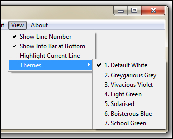
The first three choices under the View menu let the user select whether or not they want a certain thing to happen. The user can check/uncheck options against these menus and are examples of the Checkbutton menu.
The fourth menu choice under View menu reads as Themes. Hovering over this menu opens another list of choices. This is an example of a Cascade menu as it only serves the purpose of opening up another list of choices.
Within the Cascade menu, you are presented with a list of choices for your editor theme. You can, however, select only one of the themes. Selecting one theme unselects any previous selection. This is an example of the Radiobutton menu.
An example format for adding these three types of menu is as follows:
viewmenu.add_checkbutton(label="Show Line Number", variable=showln)
viewmenu.add_cascade(label="Themes", menu=themesmenu)
themesmenu.add_radiobutton(label="Default White", variable=theme)
Now that we need to track whether or not a selection has been made, we track it by adding a variable that can be BooleanVar(), IntVar(), or Stringvar() as we discussed in Project 1, Meet Tkinter.
For a complete list of configuration options for the Menubutton and Menu widgets, refer to the The basic widget methods section in Appendix B, Quick Reference Sheets.