Creating Color Treatments
Though the Color Effect can be used for corrective work, we typically use Color Correction mode for that type of work. Instead, the Color Effect is generally used just for color treatments. Let’s look at how it can be used to create a few different types of treatments.
To use the Color Effect to create treatments:
1. If the Running the Sahara project is not open from the last lesson, open Media Composer, select the RUNNING THE SAHARA project on the left side of the Open Project dialog box, and click the OPEN button.
The Project window opens and lists all the bins associated with this project. The bin you’ll use in this lesson is the RTS PT2 FX Sequences bin, which contains a number of sequences you’ll use throughout this book.
2. Double-click the RTS PT2 FX SEQUENCES bin in the Project window to open it.
We’d like to create a freeze frame of a clip already edited into the sequence. Fortunately, that’s very easy to do.
3. In the RTS PT2 FX Sequences bin window, double-click the RTS FX PT2 LESSON 05 sequence. The sequence appears in the Record monitor.
Creating a Black and White Image
You might think that creating a black and white image is as easy as removing all of the color. But it actually involves a bit more than that. That’s because a good black and white image needs a proper balance of the grayscale, and often that isn’t what you’re left with when you remove all of the color.
To create a black and white image:
1. Park on the first clip in the RTS FX PT2 LESSON 05 sequence. Let’s make this shot black and white.
2. Choose TOOLS > EFFECT PALETTE to open the Effect Palette.
3. On the left side of the palette, click the IMAGE category.
4. Click and drag the COLOR EFFECT from the right side of the palette (see Figure 5.1) to the first clip in the Timeline.
Figure 5.1 The Color Effect in the Image category.
5. Enter Effect mode. The Effect Editor opens, displaying the available effect parameters within the Color Effect, as shown in Figure 5.2.
6. Locate the CHROMA ADJUST parameter group and drag the SAT (Saturation) slider all the way to the left to remove all of the color from the clip.
7. Play through the clip.
Figure 5.2 The Color Effect’s parameters.

One of the problems with this clip is that it is quite dark. As a result, the black and white image is composed of lower- to mid-grayscale values and appears quite muddy. To create a good black and white image, we need the tones to be more widely distributed from black to white.
While it might seem that the tool to use for this is Contrast, the problem with Contrast is that it moves the blacks and whites by equal amounts either in or out from the midtones. Usually that isn’t what a shot requires. Instead, we want to manipulate lighter grays and darker grays independently so that they can be adjusted the amount that each requires. To do this, we can use the Luma Range parameter group. (See Figure 5.3.)
Figure 5.3 The Luma Range parameter group.
There are three parameters within Luma Range: B Point (for black point), W Point (for white point), and Gamma. B Point and W Point define the whitest white and the blackest black in the image. By default they are set to the values of 16 for black and 235 for white. These values correspond to the digital bit values for video black and video white and are defined in video standards as the displayed limits for the grayscale. They are used not only by broadcasters but also by television manufacturers to calibrate the minimum and maximum values that will be displayed. Although it is possible to define blacks below 16 and whites above 235, these values are usually not visible. Indeed, broadcasters are especially picky about black levels and may reject a program that has values below video black.
Tip: The pop-up menu at the top of the Luma Range parameter group sets the display limits for all of the parameters in this group. As long as the default of 16–235 is selected in this menu, it is not possible to exceed these values using Luma Range. Instead, values that occur beyond these limits are “crushed” at those limits.
Gamma adjusts the tones between the white and black points. It is sometimes mistakenly referred to as the midtone adjustment, but it actually adjusts all colors from the black point to the white point using what is referred to as a response curve.
An increase in gamma will brighten the midrange tones the most but will also brighten all other tones. The effect then will gradually fall off the further the tones are from the middle. Figure 5.4 shows what basic gamma curves look like and how they affect the dark, midtone, and light areas of an image.
Figure 5.4 Normal gamma, increased gamma, and reduced gamma curves.
Finishing the Black and White Look
Now let’s finish our black and white look using the Luma Range parameters. The image needs a good white and black, so let’s use the B Point and W Point settings to establish a nice tonal range.
To finish the black and white look:
1. Set W POINT setting to 175 and B POINT setting to 35.
Notice how much better our image looks already. With a well-defined black and white we have a much more pleasing image. But the image is still weighted too much toward the lower middle grays. We can correct that by raising the gamma.
2. Set GAMMA to 25.
3. Play through the clip.
It looks a lot better now, doesn’t it? Previously, the man was quite indistinct from the background. Now he stands out nicely. Great job!
The numbers provided work for this shot, but you’ll have to experiment with other shots to determine what values work best for a given image.
Learning how to get a good black and white look is one of the core fundamentals in color correction and is the key to making a shot look good. To see what we mean, let’s go one step further and restore the color to the image. To make this easy to see, the same shot has been edited twice into the lesson sequence.
To restore the color:
1. Set the SAT (saturation) parameter back to 0 (zero) to restore the color.
2. Exit Effect mode and play through this clip and the repeat that follows. Notice how much better the first image looks than the image you started with. However, since the image is now brighter, the color doesn’t appear as saturated as it was. Let’s fix that by boosting the saturation.
3. Set the SAT parameter to 50.
4. Exit Effect mode and play through the two clips.
Tip: This technique can be a great way to fix a shot that is muddy and indistinct. Until you become comfortable “seeing through the color” to the grayscale, you may want to use the technique of removing the color, getting the grayscale right, and then restoring the color.
Creating a Sepia Tone Treatment
Now let’s move to the third clip in the sequence. Let’s tint this clip with a sepia tone, to simulate the look of an old photograph.
To create a sepia tone treatment:
1. Park on the third clip in the sequence.
2. Add a COLOR EFFECT to it and enter Effect mode.
Much as with the previous treatment, to create a sepia tone, we first need to get a good-looking black and white image. This time, though, we want to adjust the luminance values so that the image has the tonal range of an old, faded photograph. We can do this by pushing the image toward the lighter tonal range.
3. Set the SAT parameter to 0.
Unlike the previous clip, this one has good blacks and whites. We can skip setting the black and white points and move on to the gamma.
4. Set GAMMA to 40.
Now we have a nice “high tone” black and white image ready to be tinted. The Color Gain parameter group allows us to manipulate the image directly using the colors red, green, and blue. But how do those parameters affect the image?
Colors and Complements
Red, green, and blue are the primary colors of the video color space. These color spaces are generally referred to as either Rec.709 for high definition video or Rec.601 for standard definition video. Increasing a primary color adds it to the image. For example, increasing green makes the image greener.
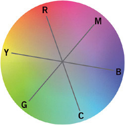
What if we have a black and white image? How can you remove green where no green apparently exists? In actuality, reducing a primary color adds that color’s complement. A complementary color is opposite in hue from the primary color. If you were to think of color as a wheel, a color’s complement is 180° away from that color. In the video color space, the complement for red is cyan, the complement for green is magenta, and the complement for blue is yellow, as shown in Figure 5.5. Therefore, you can think of removing red as adding cyan, removing green as adding magenta, and removing blue as adding yellow.
Figure 5.5 Video color space represented as a circle.
Adding the Sepia Tone
Sepia is a mix of red and yellow. Therefore, what we want to do is add red and remove blue (removing blue adds its complement, yellow). As mentioned earlier, we will use the Color Gain parameter group to add the tint.
To create a sepia tone:
1. Set the RED parameter to 120.
2. Set the BLUE parameter to 85.
The amount of red and yellow you add will change the tint of sepia you create. Usually you want to add more red than yellow so that the sepia tone stays in the warm region. But the exact mix is really a matter of personal choice.
3. If desired, experiment with the RED and BLUE parameters to see what tint other combinations of the two create.
Creating a “Night Vision” Treatment
Take a look at the fourth shot in the Timeline. It was shot using very little light and, as a result, is quite indistinct. Since there’s not a lot of information to work with, the producer thought it might look good if we made it look like it was originally shot with infrared “night vision” photography. Since the data we need wasn’t recorded, we cannot easily simulate the actual tone response of an infrared camera. However, we can create a look that simulates infrared photography and perhaps improve the shot while we’re at it.
Just as with the other treatments, we need to first get a good grayscale image. The problem with this shot is that, except for around the campfire, there really aren’t a lot of tones other than slight variations of dark gray. That’s okay, as the look is mostly dark tones except for very bright, hot sources (such as the fire), but we still need to open up the tones a bit to make it easier to see the interview subject.
To create a “night vision” treatment:
1. Park on the fourth clip in the Timeline (RUNNER 1 NIGHT INT) and apply a COLOR EFFECT to it.
2. As with the other treatments, set SAT to 0 (zero). Now let’s try to bring some detail out of the image.
3. Set GAMMA to 30. While that brightens up the image, there aren’t any dark blacks in the image now. We need to correct that by changing the black point.
4. Set the B POINT setting to 42.
That looks better. We’ve stretched the blacks out a bit, and the interview subject is a bit more distinct, but the shot could still have better contrast. Let’s see what happens when we tint the shot.
5. Set the GREEN color gain to 150.
See how adding green gives us more apparent contrast? That’s because increasing the green channel actually increases the value of the data within the green channel. Due to the nature of digital video, adjusting the green channel has the most direct impact on the image contrast and brightness. But the green isn’t the intense color that is often associated with night vision photography. We can improve the green by removing the other two primary colors.
6. Set the RED and BLUE color gains to 75. That looks much better.
7. Play through the clip to see the finished effect.
Color Effect and Video Output
When you use the Color Effect, you run the risk of creating effects that exceed the signal limits allowed for a broadcast program. If you are just producing something for the Web, this isn’t a big deal, but if you are delivering a program that will be broadcast by an on-air or cable/satellite network, you need to pay attention to the signal that is generated by the Color Effect.
The top two parameter groups—Luma Adjust and Luma Range—aren’t very risky because after them comes the Luma Clip parameter group. This will clip the levels at video black and video white. (Remember that the values 16 and 235 are equivalent to video black and video white.) But the Chroma Adjust, Chroma Style, and Color Gain parameter groups all come after the Luma Clip group. If you make adjustments here, you might create “illegal” color levels.
Fortunately, Media Composer includes a Safe Color Limiter effect that can be stacked on top of a Color Effect to prevent the output of the effect from exceeding the standard limits applied by virtually all broadcasters. This effect is located in the Image category in the Effect Palette. (See Figure 5.6.) The Safe Color Limiter is typically applied by placing it over the shots that require limiting, usually on a higher track. We will return to this effect and show how to place and configure it in Lesson 7, “Multilayer Effects.”
Figure 5.6 The Safe Color Limiter effect.