
Creating a Chart
Access considers a chart to be a type of report, so you create one much like you create a report. Just follow along with the Wizard.
The Chart Wizard works basically the same for all charts, but the screens vary a little. So first, we'll create a simple pie chart based on a single field, then we'll try a bar chart.
Creating a Simple Pie Chart
A pie chart is good for relating parts to a whole.
To create a pie chart, follow these steps:
Open the database that contains the table or query that you want to chart.
Select Chart Wizard.
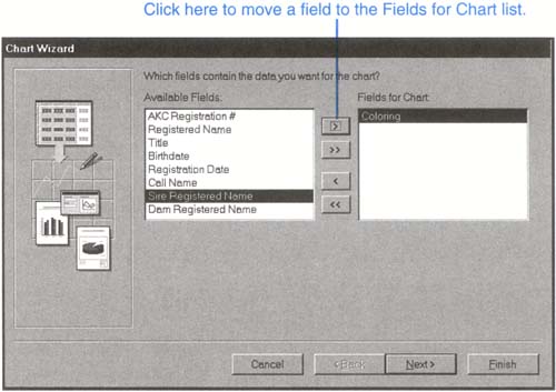
Open the drop-down list at the bottom of the dialog box and select the table or query that contains the data you want to chart. Then click OK, and the Chart Wizard starts (see Figure 23.1).
Don't Select Too Many!
Select only one field for a pie chart or two fields for most other chart types. Otherwise, either all the fields will not show up on the chart or the chart will look crowded.
Select a field from the Available Fields list, and click the > button to move it to the Fields for Chart list. Since I'm making a pie chart, which can accommodate only one field, I'll just select Coloring. Click Next > to move on.
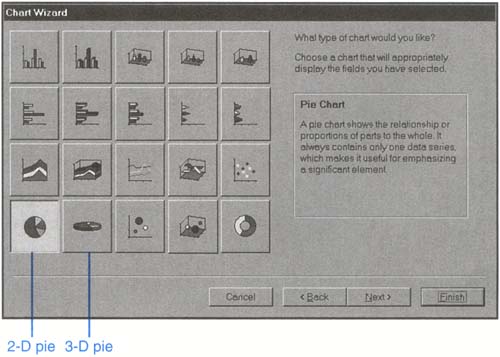
Choose which chart type you want (see Figure 23.2). Click on one of the pie chart pictures and read the description that appears. Notice that most chart types have both three-dimensional and two-dimensional versions. When you're satisfied with your choice, click Next >.
Figure 23.2. Select the chart type.
Next you'll see a layout screen. This screen is important with more complicated charts, but with our pie chart, there's nothing much to do, so just click Next > to move on.
The last Chart Wizard screen asks for a title. Enter one.
Click Yes, display a legend or No, don't display a legend. (I recommend Yes if you don't know which to pick.) Then click Finish. Your chart appears in Print Preview. Mine is shown in Figure 23.3.
Figure 23.3. The finished pie chart.

Line and bar charts both show data over time. For instance, you might show your sales over several years. Let's do that in the following steps:
Follow the first three steps of the procedure in "Creating a Simple Pie Chart" earlier in this lesson, so that the New Report dialog box is displayed and you've chosen Chart Wizard as the report type.
Choose the table or query you want to work with from the drop-down list. For the Northwind Traders database example, I'm picking Sales by year. Then click OK, and the first screen of the Chart Wizard is displayed.
Add the fields you want to work with to the Fields for Chart list, as you did with the pie chart. You'll want to pick at least two fields, since a bar chart has two axes. For instance, I'm picking Subtotal and Year. Then click Next >.
You'll be asked to select a chart type (as in Figure 23.2). Click one of the bar charts then click Next >. You'll see the layout screen (see Figure 23.4).
New Database?
Since our kennel example doesn't have appropriate fields in it for this example, I'll be using the Northwind Traders database, the sample database that came with Access. It's in the Samples folder in your Access folder on your hard disk. You can open it and follow along if you like. See Lesson 6 for a refresher on opening database files.
If the fields are not correct, drag them from the chart back to the right side of the dialog box to remove them from the chart, then drag the correct fields onto the correct spots. When everything is correct, click Next >.
In the next box that appears, enter a title, choose whether to use a legend, then click Finish.
Depending on the table you used, you may be asked to enter extra information. For example, I was asked to input a start date and an end date. I used 1/1/93 as the start and 1/1/95 as the end date.
Figure 23.4. Make sure that Access has correctly guessed how you want the fields positioned on the chart.

After you've answered all the questions, your chart appears. Mine is shown in Figure 23.5.
Figure 23.5. A simple bar chart created with the Northwind Traders database that comes with Access.
