Converting to Black and White
One of my favorite features in Elements is its black-and-white conversion tool. Well, it’s not really a tool, it’s more like a dialog where you decide how you want your color photo converted into black and white. It’s a very visual way to make the jump from color to black and white, and if you can point-and-click, you can do it. Here’s how it’s done:
Step One:
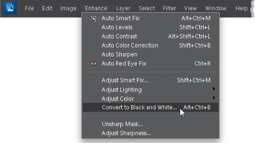
Open the color photo you want to convert to black and white (yes, you need to start with a color photo), and then go under the Enhance menu and choose Convert to Black and White (as shown here).
Step Two:
When you choose Convert to Black and White, a dialog appears and your photo (behind the dialog) is converted to black and white on the spot (in other words, you get a live preview of your changes). At the top of the dialog is a before and after, showing your color photo on the left, and your black-and-white conversion on the right, which honestly is of little help, especially since you can see your full-sized photo behind the dialog. Anyway, your first step is to choose which style of photo you’re converting from the list of styles on the lower-left side of the dialog. These styles are really just preset starting points that are fairly well-suited to each type of photo. The default setting is Scenic Landscape, which is a fairly non-exciting setting. Since I’m generally looking to create high-contrast, black-and-white photos with lots of depth, I recommend the Vivid Landscapes style, which is much punchier. Go ahead and choose that now, just so you can see the difference.
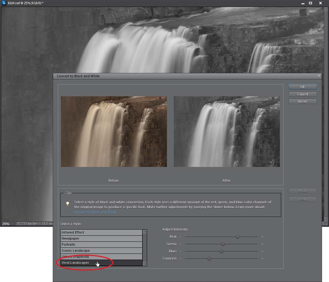
Whether you stay with the default Scenic Landscape, or try my suggested Vivid Landscapes (or any of the other styles to match the subject of your photo), these are just starting places—you’ll need to tweak the settings to really match your photo, and that’s done by dragging the four Adjust Intensity sliders that appear on the bottom-right side of the dialog. The top three (Red, Green, and Blue) let you tweak ranges of color in your photo. So, for example, if you’d like the rocks darker, you’d drag the Red slider to the left, as shown here. If you want the water brighter, which is mostly blue, you’d drag the Blue slider to the right. There’s green in the rocks, too, so moving the Green slider to the left will also darken the rocks.

Step Four:
So, basically, you use those three sliders to come up with a mix that looks good to you. You don’t have to use these sliders, but if you can’t find one of the presets that looks good to you, find one that gets you close, and then use the Red, Green, and Blue sliders to tweak the settings. The fourth slider, Contrast, does just what you’d expect it would—if you drag to the right, it adds contrast (and to the left removes it). I’m very big on high-contrast black-and-white prints, so I wouldn’t hesitate to drag this a little to the right just to create even more contrast (so, personally, I’m more likely to start with a preset, like Vivid Landscapes, and then use the Contrast slider, as shown here, than I am to spend much time fooling with the Red, Green, and Blue sliders. But hey, that’s just me).
