Correcting Color and Contrast Using Color Curves
Users of the full professional version of Adobe Photoshop have had the benefit of using Curves since version 1, and it’s the pros’ choice for color correction without a doubt. There’s only one problem—it’s a bit hard for most folks to master. That’s why you’ll fall in love with the Color Curves adjustment—it makes using Curves so easy, it will actually make pro users of Photoshop jealous. Adobe has done a really brilliant job of giving us the power of Curves without the hassles and steep learning curve. Life is good.
Step One:
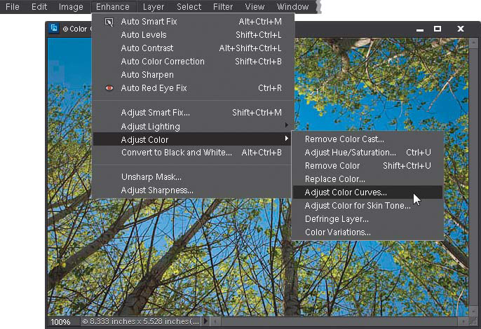
Open the photo you want to adjust with Color Curves (a typical situation might be a photo that lacks contrast or has an obvious color cast, but in reality most photos can benefit from a short trip to Color Curves, so don’t just save it for really messed up photos). Then go under the Enhance menu, under Adjust Color, and choose Adjust Color Curves (as shown here).
MATT KLOSKOWSKI
Step Two:
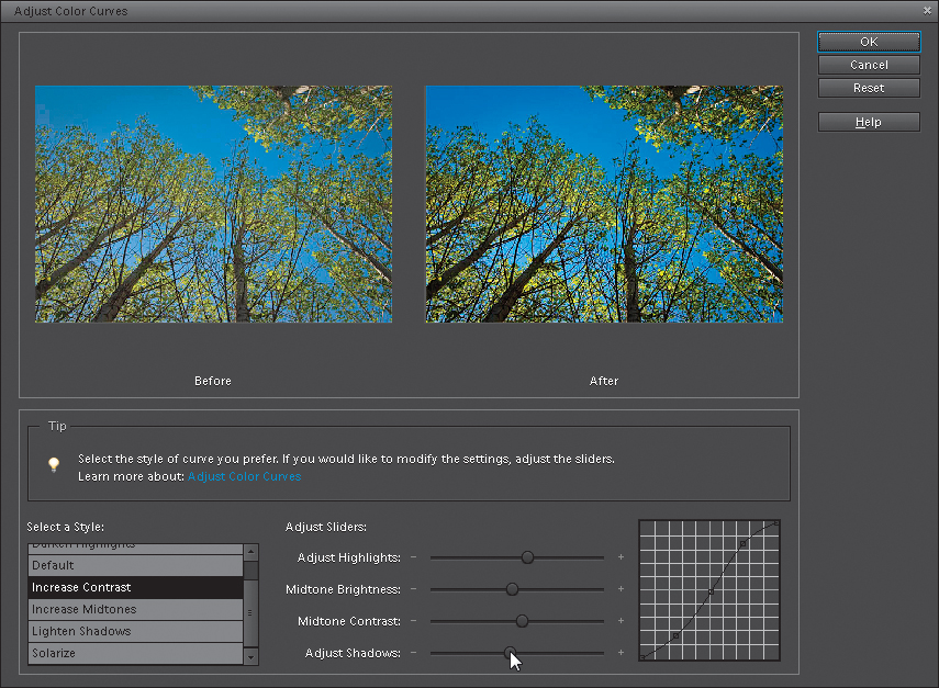
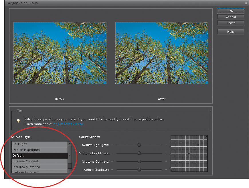
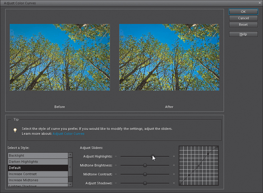
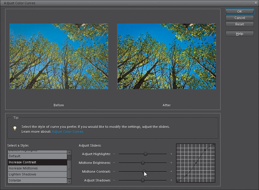
When the Adjust Color Curves dialog first appears, you’ve got two options for using it. First there’s the simple fix (I know, it’s not the official name, but it’s what we call it). This simple fix lets you simply select what you’d like to do with your photo from a list of choices on the bottom-left side of the dialog (you can compare the before and after views to see if you’re happy with the changes). Just click on a choice in the Select a Style list and it applies a color curve for you. Easy enough, right? (By the way, don’t click on Solarize unless you’ve had a few glasses of Merlot first.) Note: You can only apply one curve at a time. If you want to apply more than one style adjustment, click OK, then reopen the Adjust Color Curves dialog and select another adjustment to add it.
So, you might get lucky and find a choice that works great for you right off the bat. Your photo will look better, and life will be good. However, to reveal the real power of these curves, you’ll need to go to Adjust Sliders at the bottom right of the dialog. That’s where you’ll see four sliders and the curve itself. Now, as you drag the sliders, you’ll see how the curve is affected. For example, drag the Adjust Highlights slider to the right, and you’ll see the top-right curve point move upward. That’s because the highlights are controlled by that upper-right point.
Step Four:
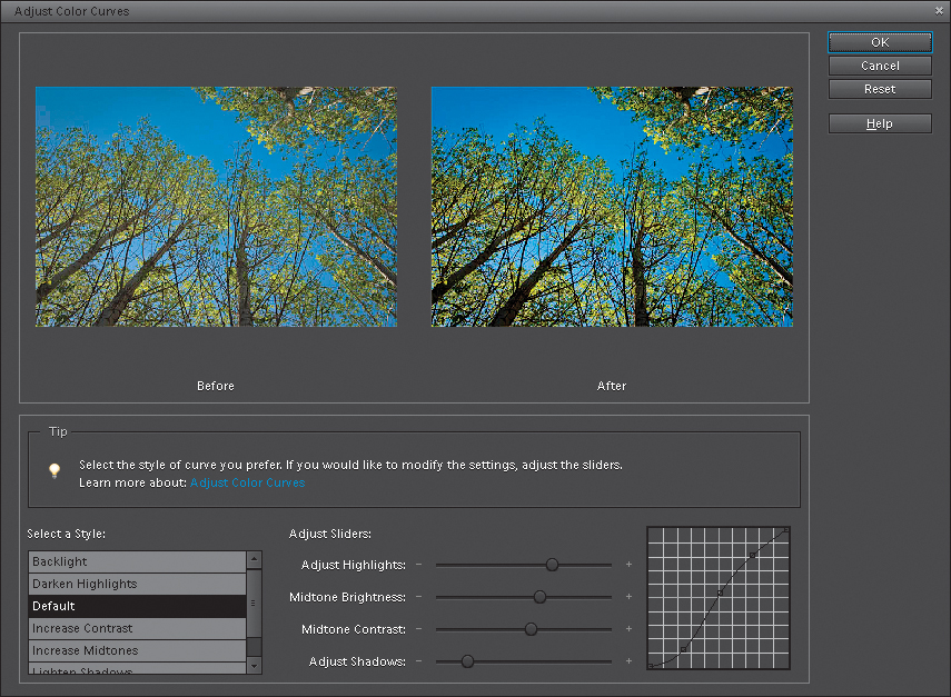
The center point represents the mid-tones in your photo. Try dragging the Midtone Brightness slider to the right, and look over at the curve. See how the center point moves upward? Now, drag the Midtone Contrast slider to the left, and watch how the contrast increases. Anytime you make the curve steeper, it adds contrast to your photo, but you don’t want it to get too steep, or your photo will lose quality. Lastly, drag the Adjust Shadows slider to the left. Notice how the shadow point on the curve (the far-left point) moves downward, darkening the shadow area. These sliders make it easy to adjust the tone and contrast in your photo without having to manually move points on the curve (like you do in the pro version of Photoshop).
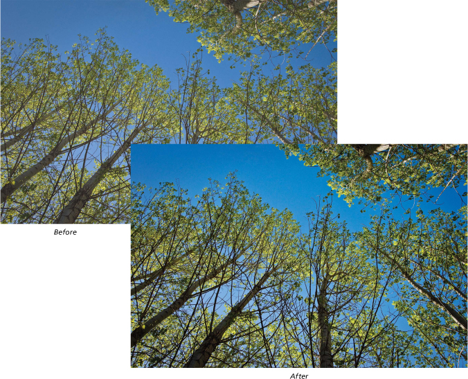
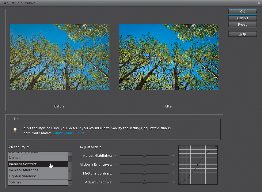
Now, let’s click the Reset button and start over from scratch. Let’s fix the problem photo we have here, using nothing but Adjust Color Curves. First, let’s start with the preset styles and see if any of them look better than our current photo. To me, the Increase Contrast style looks better than the original photo, so go ahead and click on that. It makes a great starting point for our correction.
Step Six:
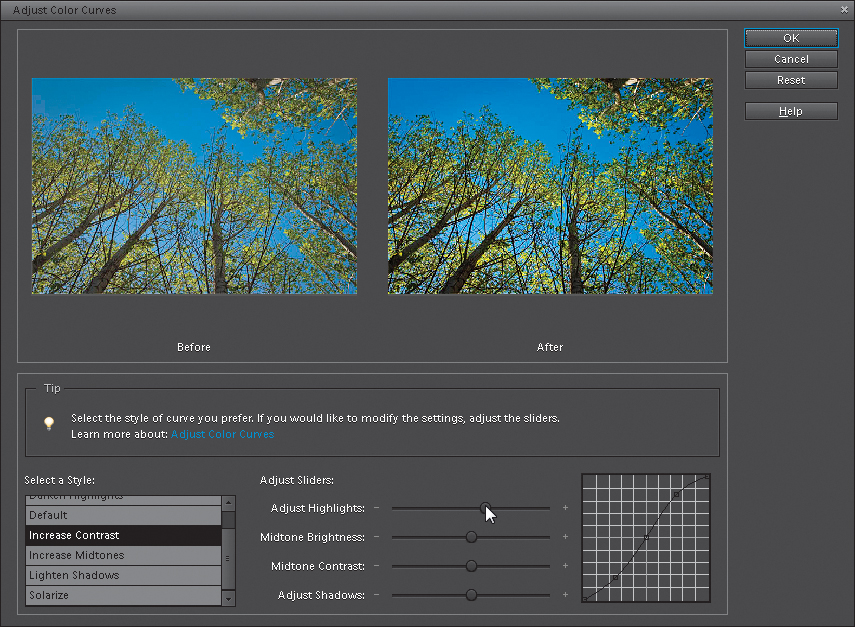
Okay, here’s the problem (at least as I see it). Although we increased the contrast, and I think the photo certainly looks better than it did, it seems a little dark, and it looks like it’s lacking highlights. So, drag the Adjust Highlights slider over to the right a little bit and see how that looks. Now, to me, that looks better (but hey, that’s just me. There is no official government agency that determines whether your photo has enough highlights or not, so the choice is really up to you—the photographer). In fact, since it’s up to you (or me, in this case), I think I might even drag it a little farther to the right, to really open up the highlights.
Now, if it were me (and it is, by the way), I’d then drag the Midtone Contrast slider to the right a bit to add more contrast in the midtones. I won’t do this for every photo, but for this photo, it seems to look better. That’s the great thing about these sliders—you can drag one to the left, and if your photo looks better, then great. If it doesn’t, drag it to the right and see how that looks. If it looks better when you drag it to the right, then great. If not, drag it back to the center and leave it alone. In this case, I dragged both ways, and I like the way the mid-tone contrast looked when I had the slider dragged to the right a bit, so that’s where I’m leaving it.
Step Eight:
My final two tweaks are to drag the Midtone Brightness slider to the left, then the right, to see which one looks better. I like the way it looks when I drag it to the left, so to the left it stays. I know this sounds like a really simplistic way to adjust your photos, but it’s deeper than you think. If you drag a slider in either direction, and your photo looks better, then how could that be wrong? Lastly, let’s drag the Adjust Shadows slider. Dragging just a little bit to the left seemed to make the shadow areas darker, while dragging it to the right made them look washed out. So, needless to say, I left it a little to the left. If you look at the curve itself, you’ll see the classic “S” shape (known as the “S” curve), which is pretty common in curve correction, as that shape adds contrast and helps to make colors rich and saturated. So, in short, don’t be afraid to slide those sliders.