Making Your Colors More Vibrant
Besides the White Balance control, there’s only one other adjustment for color that you want to use to make your colors more vibrant, and that’s the Vibrance slider. Rather than making all your colors more saturated (which is what the Saturation slider does), the Vibrance slider is smarter—it affects the least saturated colors the most, it affects the already saturated colors the least, and it does its darndest to avoid flesh tones as much as possible. It’s one very savvy slider, and since it came around, I avoid the Saturation slider at all costs.
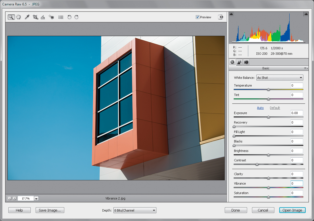
Step One:
Here’s an image where the colors are kind of flat and dull. If I used the Saturation slider, every color in the image would get the same amount of saturation, so I do my best to stay away from it (in fact, the only time I use the Saturation slider anymore is when I’m removing color to create a color tint effect or a black-and-white conversion).
SCOTT KELBY
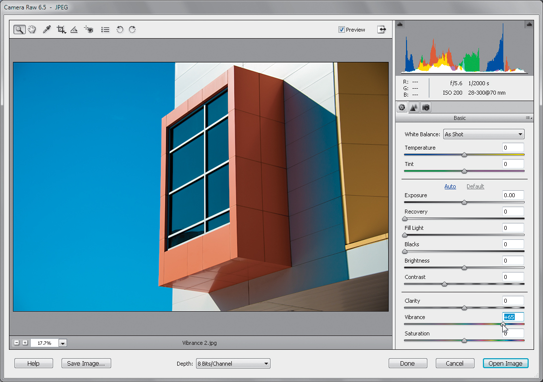
Step Two:
Drag the Vibrance slider to the right, and you’ll notice the colors become more vibrant (it’s a well-named slider), but without the color becoming cartoonish, which is typical of what the Saturation slider would do. You’ll notice in the image here that the color isn’t “over the top” but rather subtle, and maybe that’s what I like best about it.