Choosing your color mode
Using the Swatches and Color panels
Working with strokes and fills
Changing the width and type of your strokes
Saving and editing colors
Discovering patterns
Employing gradients and copying color attributes
Exploring the Live Trace and Live Paint features
This chapter is all about making your brilliant illustrations come alive with color. Here, we show you how to create new and edit existing colors, save custom colors that you create, create and use patterns and gradients, and even apply color attributes to many different shapes.
Every time that you create a new file, you choose a profile. This profile determines, among other things, which color mode your document will be created in. Typically, anything related to Web, mobile, and video is in RGB mode, and the print profile is in CMYK. You can also simply choose Basic CMYK or Basic RGB. Here are the differences between the color modes:
Basic CMYK (Cyan, Magenta, Yellow, and Black): This mode is used if you're taking your illustration to a professional printer and the files will be separated into cyan, magenta, yellow, and black plates for printing.
Basic RGB (Red, Green, Blue): Use this mode if your final destination is the Web, mobile device, video, color copier or desktop printer, or screen presentation.
The decision that you make affects the premade swatches, brushes, styles, and a slew of other choices in Adobe Illustrator. This all helps you to avoid sending an RGB color to a print shop. Ever see how that turns out? If your prepress person doesn't catch that the file isn't CMYK and sends an RGB file as separations (cyan, magenta, yellow, and black) to a printer, you can end up with a black blob instead of your beautiful illustration.
Tip
You can change the color mode at any time without losing information by choosing File
Accessing color from the Control panel is probably the easiest way to make color choices, as using the Fill and Stroke drop-down lists allow you to quickly access the Swatches panel, as shown in Figure 9-1, and at the same time, make sure that the color is actually applying to either the fill or stroke. How many times have you mixed up colors and assigned the stroke color to the fill or vice versa?

You can also access the Swatches panel, which you open by choosing Window
You may notice some odd color swatches — for example, the cross hair and the diagonal line.
Illustrator objects are created from fills (the inside) and strokes (border or path). Look at the bottom of the toolbox for the Fill and Stroke color boxes. If you're applying color to the fill, the Fill color box must be forward in the toolbox. If you're applying color to the stroke, the Stroke color box must be forward.
Table 9-1 lists keyboard shortcuts that can be a tremendous help to you when applying colors to fills and strokes.
Table 9-1. Color Keyboard Shortcuts
Function | Keyboard Shortcut |
|---|---|
Switch the Fill or Stroke color box position | X |
Inverse the Fill and the Stroke color boxes | Shift+X |
Default (black stroke, white fill) | D |
None | / |
Last color used | < |
Last gradient used | > |
Color Picker | Double-click the Fill or Stroke color box |
Tip
Try this trick: Drag a color from the Swatches panel to the Fill or Stroke color box. This action applies the color to the color box that you dragged to. It doesn't matter which is forward!
To apply a fill color to an existing shape, drag the swatch directly to the shape. Select a swatch, hold down Alt+Shift+Ctrl (Windows) or Option+Shift+
Access the Stroke panel by clicking the Stroke hyperlink in the Control panel. In the Stroke panel, you can choose caps (the end of a line), joins (the end points of a path or dash), and the miter limit (the length of a point). The Stroke panel also enables you to turn a path into a dashed line.
As you can see in Figure 9-2, you can choose, in the Stroke panel options, to align the stroke on the center (default) of a path, the inside of a path, and the outside of a path. Figure 9-3 shows the results.
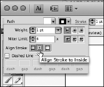
This feature is especially helpful when stroking outlined text. See Figure 9-3 to compare text with the traditional centered stroke, as compared to the new option for aligning the stroke outside of a path.

Note
You can't adjust the alignment of a stroke on text unless you change the text to outlines first. Select the Selection tool and choose Type
You can also customize the following aspects of a stroke in the Stroke panel:
Tip
To create a dashed line, specify a dash sequence by entering the lengths of dashes and the gaps between them in the Dash Pattern text fields (see Figure 9-4). The numbers entered are repeated in sequence so that after you set up the pattern, you don't need to fill in all the text fields. In other words, if you want an evenly-spaced dashed stroke, just type the same number in the first and second text fields, and all dashes and spaces will be the same length (say, 12 pts). Change that to 12 in the first text field and 24 in the next, and now you have a larger space between the dashes.

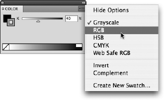
The Color panel (access it by choosing Window
Tip
Ever want to create tints of a CMYK color but aren't quite sure how to adjust the individual color sliders? Hold down the Shift key while adjusting the color slider of any color and watch how all colors move to a relative position at the same time!
As shown in Figure 9-5, the panel menu offers many other choices. Even though you may be in the RGB or CMYK color mode, you can still choose to build colors in Grayscale, RGB, HSB (Hue, Saturation, Brightness), CMYK, or Web Safe RGB. Choosing Invert or Complement from the panel menu takes the selected object and inverses the color or changes it to a complementary color, respectively. You can also choose the Fill and Stroke color boxes in the upper-left corner of the Color panel.
You see the infamous cube and exclamation point in the Color panels in most of Adobe's software. The cube warns you that the color you've selected isn't one of the 216 nondithering, Web-safe colors, and the exclamation point warns you that your color isn't within the CMYK print gamut. In other words, if you see the exclamation point in the Color panel, don't expect that really cool electric blue you see on-screen to print correctly — it may print as dark purple!
Tip
Click the cube or exclamation point symbols when you see them to select the closet color in the Web safe or CMYK color gamut.
Saving colors not only keeps you consistent, but it makes edits and changes to colors easier in the future. Any time you build a color, drag it from the Color panel to the Swatches panel to save it as a color swatch for future use. You can also select an object that uses the color and click the New Swatch button at the bottom of the Swatches panel (refer to Figure 9-1 to see this button). To save a color and name it at the same time, Alt-click (Windows) or Option-click (Mac) the New Swatch icon. The New Swatch dialog box opens, where you can name and edit the color if you want. By double-clicking a swatch in the Swatches panel, you can open the options at any time.
A color in the Swatches panel is available only in the document in which it was created. Read the next section on custom libraries to see how to import swatches from saved documents.
When you save a color in the Swatches panel, you're essentially saving it to your own custom library. You import the Swatches panel from one document into another by using the Libraries feature.
Retrieve colors saved in a document's Swatches panel by selecting the Swatch Libraries menu button at the bottom of the Swatches panel and dragging down to Other Library. You can also access swatch libraries, including those in other documents, by choosing Window
Tip
You can also click the Swatch Libraries button to access color libraries for Pantone colors, Web colors, and some neat creative colors, such as jewel tones and metals.
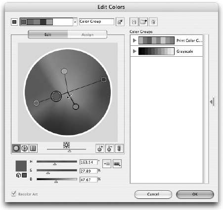
Perhaps you failed at color in art class or just don't feel that you're one of those people who picks colors that look good together. In Illustrator CS4, you can use the Color Guide to find colors and save them to organized color groups in your Swatches panel. You can create color schemes based on 23 classic color-harmony rules, such as the Complementary, Analogous, Monochromatic, and Triad options, or you can create custom harmony rules.
Sounds complicated, doesn't it? Fortunately, all you have to do is choose a base color and then see what variations you come up with according to rules you choose. Give it a try:
Choose Window
Color Guide.
The Color Guide appears, as shown in Figure 9-7.
Select a color from your Swatches panel. If your Swatches panel is not visible choose Window
Swatches.Immediately, the Color Guide panel kicks in to provide you with colors that are related to your original swatch.
Change the Harmony Rules by clicking the Edit Colors button at the bottom of the Color Guide panel.
The Edit Colors dialog box, as shown in Figure 9-8, appears.
You could spend days experimenting in the Edit Colors dialog box, but for the scope of this book, you dive into changing simple harmony rules. To do this, click the Harmony Rules arrow to the right of the color bar. A drop-down list appears with many choices as to how you want colors selected, as shown in Figure 9-9. Choose a color harmony.
Save your color selection as a color group by clicking the New Color Group icon.
If you like, you can rename the color group by double-clicking the group name in the Color Group section of the Live Color window.
Click OK.
The color group is added to the Swatches panel.


Tip
You don't have to go through the Edit Colors dialog box in order to save a group of colors. You can Ctrl-click (Windows) or
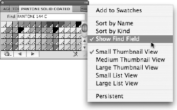
If you're looking for the typical Pantone Matching System-numbered swatches, click the Swatch Libraries menu button at the bottom of the Swatches panel. From the drop-down list, choose Color Books and then Pantone solid coated, or whatever Pantone library you want to access.
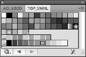
Colors for the Pantone numbering system are often referred to as PMS 485, or PMS 201, or whatever number the color has been designated. You can locate the numbered swatch by typing the number into the Find text field of the Pantone panel, as shown in Figure 9-10. When that number's corresponding color is highlighted in the panel, click it to add it to your Swatches panel. Many users find it easier to see colored swatches by using the List View. Choose Small List View or Large List View from the panel menu.
Edit colors in the Swatches panel by using the Swatch Options dialog box (as shown in Figure 9-11), which you access by double-clicking the color or by choosing Swatch Options from the Swatches panel menu.

Use the Swatch Options dialog box to
Change the color values: Change the values in a color by using the sliders or by typing values into the color text fields. Having the ability to enter exact color values is especially helpful if you're given a color build to match. Select the Preview check box to see results as you make the changes.
Use global colors: If you plan on using a color frequently, select the Global check box. If the Global check box is selected and you use the swatch throughout the artwork, you only have to change the swatch options one time and all instances of that color are updated.
One important option to note in the Swatch Options dialog box is the Color Type drop-down list. You have two choices here: spot color and process color. What's the difference?
Spot color: A color that isn't broken down into the CMYK values. Spot colors are used for 1–2 color print runs or when precise color matching is important.
Suppose that you're printing 20,000 catalogs and decide to run only 2 colors, red and black. If you pick spot colors, the catalogs have to go through the press only two times: once for black and once for red. If red were a process color, however, it'd be created out of a combination of cyan, magenta, yellow, and black inks, and the catalogs would need to go through the press four times in order to build that color. Plus, if you went to a print service and asked for red, what color would you get? Fire-engine red, maroon, or a light and delicate pinkish-red? But if the red you pick is PMS 485, your printer in Lancaster, Pennsylvania can now print the same color of red on your brochure as the printer doing your business cards in Woburn, Massachusetts.
Process color: A color that's built from four colors (cyan, magenta, yellow, and black). Process colors are used for multicolor jobs.
For example, you'd want to use process colors if you're sending an ad to a four-color magazine. The magazine printers certainly want to use the same inks they're already running, and using a spot color would require another run through the presses in addition to the runs for the cyan, magenta, yellow, and black plates. In this case, you'd take any spot colors created in corporate logos and such and convert them to process colors.
Choose the Spot Colors option from the Swatches panel menu to choose whether you want spot colors changed to Lab or CMYK values:
Choose Lab to get the best possible CMYK conversion for the actual spot color when using a color-calibrated workflow.
Choose CMYK (default) to get the manufacturer's standard recommended conversion of spot colors to process. Results can vary depending upon printing conditions.
Using patterns can be as simple or as complicated as you want. If you become familiar with the basics, you can take off in all sorts of creative directions. To build a simple pattern, start by creating the artwork that you want to use as a pattern on your artboard — polka dots, smiley faces, wavy lines, whatever. Then select all the components of the pattern and drag them to the Swatches panel. That's it, you made a pattern! Use the pattern by selecting it as the fill or stroke of an object.
Note
You can't use patterns in artwork that will then be saved as a pattern. If you have a pattern in your artwork and try to drag it into the Swatches panel, Illustrator kicks it back out with no error message. On a good note, you can drag text right into the Swatches panel to become a pattern.
You can update patterns that you created or patterns that already reside in the Swatches panel. To edit an existing pattern, follow these steps:
Click the pattern swatch in the Swatches panel and drag it to the artboard.
Deselect the pattern and use the Direct Selection tool to change its colors or shapes or whatever.
Keep making changes until you're happy with the result.
To update the pattern with your new edited version, use the Selection tool to select all pattern elements and Alt+drag (Windows) or Option+drag (Mac) the new pattern over the existing pattern swatch in the Swatches panel.
When a black border appears around the existing pattern, release the mouse button.
All instances of the pattern in your illustration are updated.
Tip
If you want to add some space between tiles, as shown in Figure 9-12, create a bounding box using a rectangle shape with no fill or stroke (representing the repeat that you want to create). Send it behind the other objects in the pattern and drag all objects, including the bounding box, to the Swatches panel.
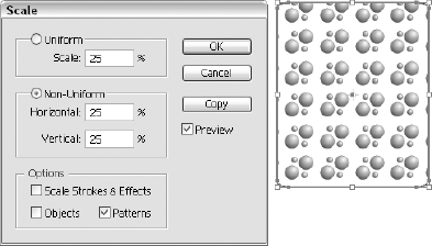
We cover transformations in detail in Chapter 10 of this minibook, but some specific transform features apply to patterns. To scale a pattern, but not the object that it's filling, double-click the Scale tool. In the Scale dialog box that appears, type the value that you want to scale but deselect all options except for Patterns, as shown in Figure 9-13. This works for the Rotate tool as well!
Create gradients for nice smooth metallic effects or just to add dimension to illustrations. If you're not sure which swatches are considered gradients, choose Gradient from the Show Swatch Kinds button at the bottom of the Swatches panel.
Once applied, you can access the Gradient panel (as shown in Figure 9-14) by choosing Window
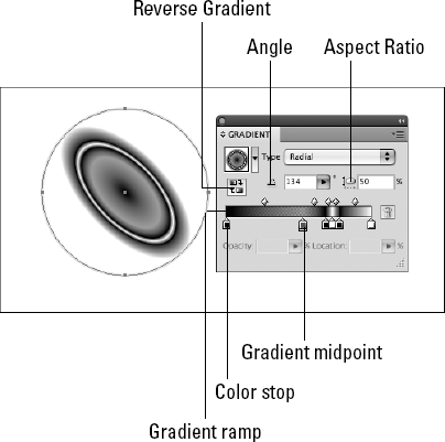
On the Gradient panel, use the Type drop-down list to choose a Radial gradient (one that radiates from the center point) or a Linear gradient (one that follows a linear path).
Use the Gradient tool to change the direction and distance of a gradient blend as follows:
Select an object and apply any existing gradient from the Swatches panel to its fill.
Choose the Gradient tool (press G) and drag in the direction that you want the gradient to go.
Drag a long path for a smooth, long gradient. Drag a short path for a short, more defined gradient.
To create a new gradient, click on the basic B & W Linear Gradient swatch in the Swatches panel (this puts you at a good base point), and then follow these steps:
With the Gradient panel options visible, click the gradient box at the bottom of the panel.
Two color stops appear, one on each end.
Activate a color stop by clicking it.
When a color stop is active, the triangle on the top turns solid.
Choose Window
Color to access the Color panel and then click the triangle in the upper-right corner to open the panel menu; choose RGB or CMYK colors.Click the gradient ramp (across the bottom) in the Color panel to pick a random color (or enter values in the text fields to select a specific color) for the active color stop in the Gradient panel.
Repeat this step to select colors for other color stops.
To add additional color stops, click beneath the gradient ramp and then choose a color from the Color panel. You can also drag a swatch from the Swatches panel to add a new color to the gradient. To remove a color stop, drag it off the Gradient panel.
Tip
In CS4, you can click the gradient ramp to add additional colors and also change the opacity of that location of the ramp by entering values in the Opacity text box. This is a great way to create stripes and other reflective gradients.
Create several shapes with different fill and stroke attributes, or open an existing file that contains several different objects.
Select the Eyedropper tool and click a shape that has attributes you want to copy.
Alt-click (Windows) or Option-click (Mac) another object to apply those attributes.
Not only is this technique simple, but you can change the attributes that the Eyedropper applies. Do so by double-clicking the Eyedropper tool; in the dialog box that appears, select only the attributes that you want to copy.
If you're looking for good source art to use to experiment with color, look no further than your own sketches and scanned images. You can automatically trace bitmap images by using a variety of settings that range from black-and-white line art to vector art with multitudes of color that can be extracted from your image.
To use the Live Trace feature, follow these steps:
Choose File
Place and select an image that you want to trace.The file you place can be a logo, a sketch, or even a photo. Notice that after you place the image, the Control panel offers additional options.
Click the arrow to the right of the Live Trace button.
This drop-down list provides Live Trace presets that may help you better trace your image.
Scroll to the bottom and choose Tracing Options.
The Tracing Options dialog box appears.
Select the Preview check box and experiment with the various settings, as shown in Figure 9-15.
When you find the setting that works best for your image, click the Trace button.
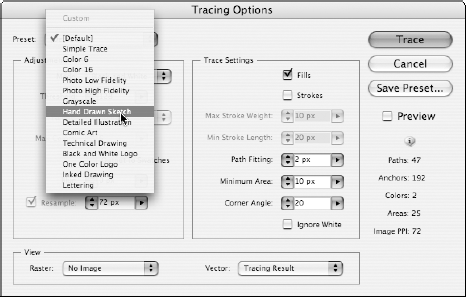
You can return to the Tracing Options dialog box and change settings over and over again until you find the best one.
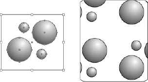
If you want to give it a try, follow these steps to put together an example to experiment with:
With the Ellipse tool, create a circle on your page.
Make it large enough to accommodate two or three inner circles.
Press D (just D, nothing else).
As long as you're not on the Type tool, you revert to the default colors of a black stroke and a white fill.
Double-click the Scale tool and enter 75% in the Uniform Scale text box.
Press the Copy button and then click OK.
You see a smaller circle inside the original.
Press Ctrl+D (Windows) or
+D (Mac) to duplicate the transformation and create another circle inside the last one.
Choose Select
All or press Ctrl+A (Windows) or+A (Mac) to activate the circles you just created.Make sure that the Fill swatch is forward.
The Fill swatch is at the bottom of the toolbox.
Use the Swatches or Color panel and choose any fill color.
Select the Live Paint Bucket tool and move the cursor over the various regions of the circles.
See how the different regions become highlighted?
Click when you have the region activated that you want to fill.
Now try it with other fill colors in different regions, as shown in Figure 9-16.

A companion feature to the Live Paint bucket is support for gap detection. With this feature, Illustrator automatically and dynamically detects and closes small to large gaps that may be part of the artwork. You can determine whether you want paint to flow across region gap boundaries by using the Gap Options dialog box, accessibly by choosing Object

Note
Before you save a file for an older version of Illustrator that uses the Live Paint feature, it's best to first select the occurrences of Live Paint and choose Object