
In This Chapter
With all the incredible things you can do in Photoshop, you can easily forget the basics. Yes, you can create incredible compositions with special effects, but if the people look greenish, it detracts from the image. Get in the habit of building good clean images before heading into the artsy filters and fun things. Color correction isn't complicated, and if done properly, it'll produce magical results in your images. In this chapter, you discover how to use the values you read in the Info panel and use the Curves panel to produce quality image corrections.
Before making adjustments, look at the image's histogram, which displays an image's tonal values, to evaluate whether the image has sufficient detail to produce a high-quality image. In Photoshop CS4, choose Window
Note
The greater the range of values in the histogram, the greater the detail. Poor images without much information can be difficult, if not impossible, to correct. The Histogram panel also displays the overall distribution of shadows, midtones, and highlights to help you determine which tonal corrections are needed.
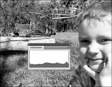
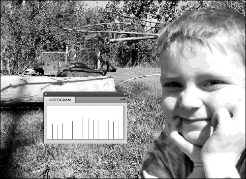
Figure 7-1 shows a good full histogram that indicates a smooth transition from one shade to another in the image. Figure 7-2 shows that when a histogram is spread out and has gaps in it, the image is jumping too quickly from one shade to another, producing a posterized effect. Posterization is an effect that reduces tonal values to a limited amount, creating a more defined range of values from one shade to another. Great if you want it, yucky if you want a smooth tonal change from one shadow to another.
So how do you get a good histogram? If you're scanning, make sure that your scanner is set for the maximum amount of colors. Scanning at 16 shades of gray gives you 16 lines in your histogram ...not good!
Tip
If you have a bad histogram, we recommend that you rescan or reshoot the image. If you have a good histogram to start with, keep the histogram good by not messing around with multiple tone correction tools. Most professionals use the Curves feature ...and that's it. Curves (choose Image
Figure 7-3 shows what happens to a perfectly good histogram when someone gets a little too zealous and uses the entire plethora of color correction controls in Photoshop. Just because the controls are there doesn't mean that you have to use them.

Warning
If you see a Warning icon appear while you're making adjustments, double-click anywhere on the histogram to refresh the display.
Don't panic if your histogram is smashed all the way to the left or right. The bars of the histogram represent tonal values. You can break down the types of images, based upon their values, into three key types:
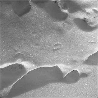
High key: A very light-colored image, such as the image shown in Figure 7-4. Information is pushed toward the right in the histogram. Color correction has to be handled a little differently for these images to keep the light appearance to them.
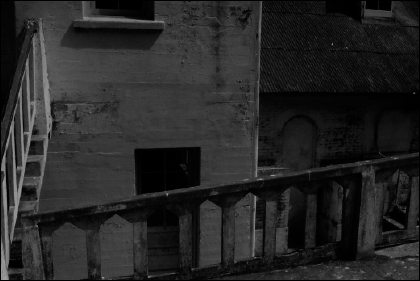
Low key: A very dark image, such as the image shown in Figure 7-5. Information is pushed to the left in the histogram. This type of image is difficult to scan on low-end scanners because the dark areas tend to blend together with little definition.
Mid key: A typical image with a full range of shades is considered mid key, such as the image shown in Figure 7-6. These images are the most common and easiest to work with. In this chapter, we deal with images that are considered mid key.


To produce the best possible image, try to avoid correcting in CMYK (Cyan, Magenta, Yellow, Black) mode. If your images are typically in RGB (Red, Green, Blue) or LAB mode (L for lightness, and A and B for the color-opponent dimensions), keep them in that mode throughout the process. Convert them to CMYK only when you're finished manipulating the image.
Tip
Don't forget! Press Ctrl+Y (Windows) or
Set up these items before starting any color correction:
Select the Eyedropper tool; on the Options bar, change the sample size from Point Sample to 3 by 3 Average in the Sample Size drop-down list.
This setting gives you more accurate readings.
If the Histogram panel isn't already visible, choose Window
Histogram.
If the Info panel isn't already visible, choose Window
Info to show the Info panel so that you can check values.Make sure that your color settings are correct.
If you're not sure how to check or set up color settings, see Chapter 3 of this minibook.
A tone curve represents the density of an image. To get the best image, you must first find the highlight and shadow points in the image. An image created in less-than-perfect lighting conditions may be washed out or have odd color casts. See Figure 7-7 for an example of an image with no set highlight and shadow. Check out Figure 7-8 to see an image that went through the process of setting a highlight and shadow.

To make the process of creating a good tone curve more manageable, we've broken the process into four parts:
Even though each part has its own set of steps, you must go through all four parts to accomplish the task of creating a good tone curve (unless you're working with grayscale images, in which case you can skip the neutral part). In this example, an adjustment layer is used for the curve adjustments. The benefit is that you can turn off the visibility of the adjustment at a later point or double-click the adjustment layer thumbnail to make ongoing edits without destroying your image.
In the non-computer world, you'd spend a fair amount of time trying to locate the lightest and darkest parts of an image. Fortunately, you can cheat in Photoshop by using some of the features in the Curves panel. Here's how you access the panel:
With an image worthy of adjustment — one that isn't perfect already — choose Window
Layer (if the Layers panel isn't already open).Click and hold on the Create New Fill or Adjustment Layer button at the bottom of the Layers panel and select Curves.
The Adjustments panel appears with the Curves panel active, as shown in Figure 7-9.
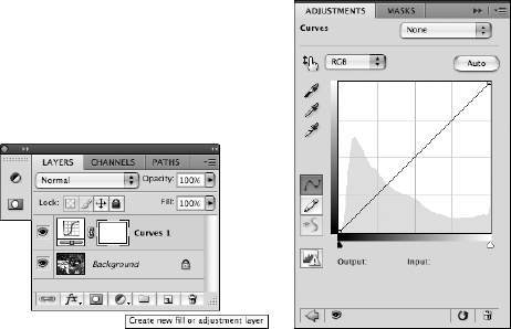
Notice the grayed-out histogram behind the image in the Curves panel. The histogram aids you in determining where you need to adjust the image's curve.
Note
If you're correcting in RGB (as you should be!), the tone curve may be opposite of what you think it should be. Instead of light to dark displaying as you'd expect, RGB displays dark to light. Now think about it: RGB is generated with light, and no RGB means that there's no light and you therefore have black. Turn all RGB on full force, and you create white. Try pointing three filtered lights, one red, one green, and one blue. The three lights pointed in one direction really do create white.
If working with RGB confuses you, simply select Curve Display Options from the panel menu in the upper-right corner of the Adjustments panel. When the Curves Display dialog box appears, as shown in Figure 7-10, select the Pigment/Ink % radio button and click OK.

Note that in the Curves panel, you see a Preset drop-down list that offers quick fixes using standard curves for certain corrections. These settings are great for quick fixes, but for the best image, create a custom curve.
The first thing you need to do in the Curves panel is determine the lightest and the darkest parts of the image, which is referred to as locating the highlight and shadow:
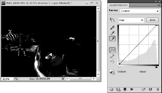
Before starting the correction, click once on the Set Black Point eyedropper (as shown in Figure 7-11).
Hold down the Alt (Windows) or Option (Mac) key and click the shadow input slider, as shown in Figure 7-11.
When you Alt/Option+click, the clipping preview turns on, revealing the darkest area of the image.
If you don't immediately see a dark area in the clipping preview, you can drag the shadow input slider to the left while holding down the Alt/Option key.
While still holding down the Alt/Option key, hold down the Shift key and click directly on the image in that dark region.
This drops a color sampler on the image that will help you reference that point later.
Repeat Steps 1–3 with the highlight input slider. Select the Set White Point eyedropper in the Curves panel.
Hold down the Alt/Option key and click the highlight input slider.
Again, you can drag the slider toward the right if the lightest point doesn't immediately show up.
When you locate the lightest point, as indicated by the lightest point in the clipping preview, you can (still holding down on the Alt/Option key) Shift+click it to drop a second color sampler. See Figure 7-12.

Now that you've determined the lightest and darkest points in the image, set their values:
Set the highlight values by double-clicking the Set White Point eyedropper (the white eyedropper on the left side of the Curves panel).
When you double-click the Set White Point eyedropper, the Color Picker dialog box appears.
Enter a generic value for the lightest point in your image: Type 5 into the Cyan text box, type 3 into the Magenta text box, type 3 into the Yellow text box, leave the Black text box at 0 (zero), and then click OK.
The Black value helps to correct most images for print and online.
With the Set White Point eyedropper still selected, click once on the color sampler that you dropped on the image, indicating the lightest point in the image.
Now, set your shadow point.
Double-click the Set Black Point eyedropper.
The Color Picker dialog box appears.
Type 65 in the Cyan text box, type 53 in the Magenta text box, type 51 in the Yellow text box, type 95 into the Black text box, and then click OK.
As with the highlight value, the Black value is a generic value that works for most print and online images.
With the Set Black Point eyedropper still selected, click once on the color sampler that you dropped on the image, indicating the darkest point in the image.
You may have heard the statement, "Open up the midtones". This phrase essentially means that you're lightening the midtonal values of an image. In many cases, opening up the midtones is necessary to add contrast and bring out detail in your image.
To adjust the midtones, follow these steps:
In the Curves panel, click the middle of the curve ramp to create an anchor point; drag up slightly.
The image lightens. (If you're in Pigment/Ink % mode, drag down to lighten the image.) Don't move a dramatic amount and be very careful to observe what's happening in your Histogram panel (which you should always have open when making color corrections).
Because you set highlight and shadow (see preceding section) and are now making a midtone correction, you see the bars in the histogram spreading out.
To adjust the three-quarter tones (the shades around 75 percent), click halfway between the bottom of the curve ramp and the midpoint to set an anchor point.
Use the grid in the Curves panel to find it easily. (In Pigment/Ink %, the three-quarter point is in the upper section of the color ramp.) Adjust the three-quarter area of the tone curve up or down slightly to create contrast in the image. Again, keep an eye on your histogram!
If you're working on a grayscale image, your tonal correction is done.
If you're working on a color image, keep the Curves panel open for the final steps, which are outlined in the next section.
The last steps in creating a tone curve apply only if you're working on a color image. The key to understanding color is knowing that equal amounts of color create gray. By positioning the mouse cursor over gray areas in an image and reading the values in the Info panel, you can determine what colors you need to adjust.
With your Curves panel open, position it so that you can see the Info panel.
If the Info panel is buried under another panel or a dialog box, choose Window
Position your cursor over your image and, in the Info panel, look for the RGB values in the upper-left section.
You see color values and then forward slashes and more color values. The numbers before the slash indicate the values in the image before you opened the Curves panel; the numbers after the slash show the values now that you've made changes in the Curves panel. Pay attention to the values after the slashes.
Position the cursor over something gray in your image.
It can be a shadow on a white shirt, a counter top, a road — anything that's a shade of gray. Look at the Info panel. If your image is perfectly color balanced, the RGB values following the forward slashes should all be the same.
If your color isn't balanced, click the Set Gray Point eyedropper in the Curves panel and click the neutral or gray area of the image.
The middle eyedropper (Set Gray Point) is a handy way of bringing the location that you click closer together in RGB values, thereby balancing the colors.
Curves can be as complex or as simple as you make them. As you gain more confidence using them, you can check neutrals throughout an image to ensure that all unwanted color casts are eliminated. You can even individually adjust each color's curve by selecting it from the Channel drop-down list in the Curves panel.
When you're finished with color correction, using the Unsharp Mask filter on your image is a good idea. Chapter 6 of this minibook shows you how to use this filter.
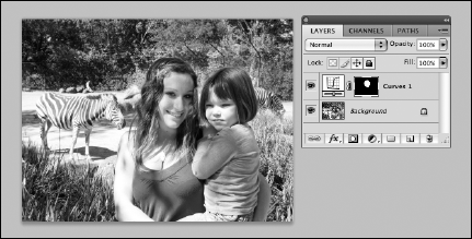
You may go through a curve adjustment only to discover that some areas of the image are still too dark or too light. Because you used an adjustment layer, you can turn off the correction or change it over and over again with no degradation to the quality of the image. Here are the steps you can take if you still have additional adjustments to make to an image, such as lightening or darkening other parts of the image:
Select the area of the image that needs adjustments.
See Chapter 4 of this minibook if you need a refresher on how to make selections in Photoshop.
Choose Select
ModifyFeather to soften the selection.The Feather dialog box appears.
Enter a value into the Feather dialog box.
If you're not sure what value will work best, enter 15 in the Feather Radius text field and click OK.
Tip
You can also click the Refine Edge button in the Options panel (when you have a selection tool active) to preview the feather amount.
If the Layers panel isn't visible, choose Windows
Layers; click and hold on the Create New Fill or Adjustment Layer icon and select Curves.In the Curves panel, click the middle of the curve ramp to create an anchor point; drag up or down to lighten or darken your selected area.
Notice in the Layers panel (see Figure 7-13) that your adjustment layer, Curves 1 by default, has a mask to the right of it. This mask was automatically created from your selection. The selected area is white; unselected areas are black.
With your adjustment layer selected in the Layers panel, use the Brush tool to paint white to apply the correction to other areas of the image; paint with black to exclude areas from the correction.
You can even change the opacity with the Brush tool in the Options bar at the top to apply only some of the correction!
If you go through all the work of making color corrections to your images and you still get printed images that look hot pink, it may not be you! Test your printer by following these steps:
Create a neutral gray out of equal RGB values (double-click the Fill Color swatch in the Tools panel).
Create a shape, using your neutral gray as the fill color.
For example, you can use the Ellipse tool to create a circle or oval.
Choose File
Print and click OK to print the image from your color printer.
If you're seeing heavy color casts, adjust your printer; cleaning or replacing the ink cartridge may fix the problem. Check out Chapter 10 of this minibook for more about printing your Photoshop files.