
Step 3: Assess Fit and Apply Remedies If Necessary
Reminder of Fit Steps
Once we have produced
an initial regression analysis including diagnostics, the next step
is to assess initial fit.
As we have learned in
the first sections of this chapter, regression fit is concerned with
the question “does my data make a straight-line shape?”
In other words, for particular relationships in the regression analysis,
does most of the data lie close to the best possible straight line?
You typically answer this question through three major means:
-
Characteristics of the data: Linear regression has certain assumptions, regarding the shape of the data distribution. These are fairly mechanical, but need to be done before proceeding to other fit assessments.
-
Overall summary (“global”) assessments of fit are essentially single-measure assessments of fit across the entire model; therefore they are called global measures. These are:
-
The R² statistics
-
The ANOVA F-statistic
-
The following sections
discuss the practical implementation of the two data assumptions and
the two major global fit diagnostics.
Fit Part 1: The Initial Data Assumptions
Summary of Data Assumptions
There are a variety
of data checks that are related to traditional assumptions of multiple
regression. Some of these problems are fairly serious if they are
violated; others are serious only if they are found to be problematic
at extreme levels. These are the major assumptions, which the following
sections talk about in detail:
-
Model structure
-
Multicollinearity
-
Data shape issues:
-
Non-linearity
-
Heteroscedasticity
-
-
Outlier effects
-
Normality of residuals
-
Autocorrelation
-
Missing data
Each of these is explained
in the following sections, and the associated diagnostic tests and
remedies explained.
Diagnostic Issue #1: Model Structure
Multiple linear regression
makes the assumption that the model (e.g. that seen in Figure 13.1 Reminder of the core textbook model above) is correct, in other words that a) there is a single
dependent variable, predicted by b) a group of independent variables
that are not themselves interrelated. Multiple regression of this
basic type does not allow for different, more creative models such
as the following:
-
Causal relationships between the independent variables. We call this endogeneity. For example, in the case example in Figure 13.1 Reminder of the core textbook model, aside from the supposition that satisfaction and trust affect sales, higher satisfaction might also lead to higher trust. You should consider theoretically whether the predictors should or could cause each other.
-
Feedback loops. The dependent variable may itself cause its own predictors. For example, higher sales reinforces its own predictors in that higher sales levels can cause higher trust because there is more interaction. How much of the correlation between trust and sales seen in Chapter 8 is due to trust causing sales (as originally thought) or how much is due to initial sales causing customers to construct a sense of trust in their own minds as they seek to avoid cognitive dissonance brought about by their buying choices? This may form a feedback loop.
Solutions
for Complex Model Structures
Various (slightly) more
advanced statistical techniques can model these sorts of models, such
as structural equation modelling (available
through PROC CALIS) and two-stage least squares
regression (available through PROC SYSLIN). These
techniques are beyond the scope of this text, but understanding the
multiple linear regression model gives the basis for easily extending
to the other techniques. I also suggest, if you believe you have either
endogeneity or feedback (see the next section for diagnosis), that
you compare a standard regression as per this chapter with two-stage
least squares or structural equation modeling results.
Diagnosing
Complex Model Structures
There are more or less
complex diagnostic tests, including:
-
Theory and logic: By far the most important test for either endogeneity or feedback is your careful consideration of what theory says about how the variables work (i.e. previously published theories of causes, effects and dynamics surrounding your main variables). If you are interested in customer loyalty, you should read the best sources (such as the Journal of Marketing in this case) on what the best thinkers in the field believe causes loyalty, what loyalty in turn affects, why, and how the inter-dynamics of these variables operate. If you don’t apply theory and logic, you are really just guessing when you throw variables together in a regression. You can also use your own logic in considering the relationships between variables. A further consideration is what previous studies have actually statistically found to be the case. If either theory, logic or overwhelming prior findings suggest either endogeneity or feedback, consider the alternatives discussed previously (structural equation modeling is probably best).
-
Correlations as a back-up diagnostic only: Another simple way to assess endogeneity (independent variables causing each other) is to look for moderate to strong correlations between independent variables. For instance, if you run the correlations between the major variables in the chapter case study, as seen in Chapter 8, you will note correlations between a few predictor variables, such as trust and enquiries (r = .57) and small and trust (r = -.50) which are moderate but not massive. Such correlations do not necessarily mean there is justification to infer inter-causation; you would only make that assumption in conjunction with theoretical justification. You can implement two-stage least squares in SAS through PROC SYSLIN. However, I would go for structural equation modeling first. Note that it’s harder to assess feedback loops via correlations.
-
When implementing the more complex techniques mentioned above, you can make formal statistical comparisons between the basic regression model and these more advanced models. Structural equation modeling is especially good for this. Such comparisons are assessments of whether endogeneity, feedback loops, and other complex models apply.
Avoid the mistake of
assuming endogeneity or feedback just because there are strong inter-correlations
between independent variables; this can occur naturally. Also, relatively
moderate correlations can suggest (not prove) endogeneity, but extremely
high independent variable correlations (say .90 or above) probably
indicate a different problem, called multicollinearity, as discussed
next.
Diagnostic Issue #2: Multicollinearity
Collinearity refers
to very strong associations between independent variables in their
impact on the dependent variable, but where this
strong effect is more of a statistical association than a theoretically-justified
causal one. Extremely highly correlated independent
variables can exhibit multicollinearity. Where the effect of two independent
variables on a dependent variable is very similar, the estimation
of the regression equation can become unstable. This is more of a
problem when your aim is to explain a dependent variable rather than
merely predict it – multicollinearity doesn’t affect
overall prediction but can affect the structure of the regression
slopes.
For example, say that
you wish to use employee tenure as an explanatory variable. You test
this through two means: first, the amount of time the employee has
been in the company (organization tenure), and second, the amount
of time the employee has been in the job (job tenure). However, if
the vast majority of employees have been in the same job since they
joined, their organizational and job tenures will be identical and
therefore these two variables will be too highly correlated, and their
joint effect can adversely affect the equation. Note that this is
not really endogeneity; it’s more an issue of two measures
with similar meaning.
Diagnosing
Multicollinearity
There are several checks
of multicollinearity; I suggest using three:
Variance
inflation factors (VIFs): When you ask for your
options in the syntax, the output provides two tables related to diagnosing
whether you have this multicollinearity problem. The first is the
“Parameters” table seen in Figure 13.13 VIFs as a multicollinearity diagnostic in SAS, where one of the columns gives Variance Inflation Factors
(VIF) statistics that indicate whether you have dangerous levels of
multicollinearity. Generally practitioners suggest that you
may have a multicollinearity if one of more VIFs are bigger than 10 (some
suggest that VIFs much bigger than the others might be worth looking
at). In Figure 13.13 VIFs as a multicollinearity diagnostic in SAS we see that
all the VIFs are lower than 2, so multicollinearity is probably not
an issue. However, you should usually also check condition indices
as discussed next.
Figure 13.13 VIFs as a multicollinearity diagnostic in SAS

Condition
indices: In addition, choice of the collinearity
option in SAS regression provides another output table with Condition
Index statistics. Follow this general rule: you
may have “dangerous” levels of multicollinearity if
the highest condition number is higher than 100. If you have a very
high Condition Number >100, go back to the VIFs and variable correlations,
where highly correlated predictors or those with joint high VIFs are
probably the culprits.
Correlations
between independent variables: Before you run
a regression, run a correlation analysis (again, see the correlation
matrix such as that in Chapter 8). Check the correlation matrix for
extremely large inter-correlations between independent variables.
Those correlated approximately 0.9 or above may have the problem of
multicollinearity. (Note again that correlations this high probably
do not indicate endogeneity.)
What
To Do If You Have High Multicollinearity
There are several solutions
to high multicollinearity:
-
Remove one of the unimportant collinear predictors: One solution is to remove one of the offending variables altogether if it is not a core predictor variable – for instance, if organizational and job tenure are too collinear, perhaps use only one and remove the other (i.e. re-run the regression without one of them).
-
Combine similar predictors into aggregate variables: If two or more variables are collinear and they are very similar in construct, then perhaps consider aggregating such variables into a single construct if that option seems logical (see Chapter 4 and Chapter 9 on multi-item scales).
-
Adjustment: There are also other solutions, such as ridge regression, which you can read about in more advanced texts.
Diagnostic Issue #3: Data Shape Issues
There are two issues
with overall shape of the regression data that should be diagnosed.
These issues are:
-
Non-linearity: When the true relational shape between a predictor and the dependent variables is a shape other than a straight line.
-
Heteroscedasticity: When the relationship could be linear but the residuals from the regression are not regular.
The following sections
discuss the differences between these issues, how to diagnose the
issues, and how to remedy these issues.
Two
Types of Data Shape Issues
There are two major
distinctions in the data shape diagnostics. Figure 13.14 A fundamentally nonlinear pattern and Figure 13.15 Heteroscedasticity (straight line but with uneven residuals) give two particular
illustrations of the difference:
In Figure 13.14 A fundamentally nonlinear pattern, we see an example of non-linearity.
Here, a straight line would not be the correct shape to define the
data. You would need to find a mathematical shape that looks like
the data seen here: it would need to rise, fall, and then rise again.
It happens that a cubic equation does exactly that. You would need
to fit a perfect cubic equation to the data.
Figure 13.14 A fundamentally nonlinear pattern

In Figure 13.15 Heteroscedasticity (straight line but with uneven residuals), we see an example of data in a fan shape, where you could
probably not do better than a straight line. However, the straight
line fits the data better at low levels of the independent variable,
where the data is packed in a more closely defined line, than in higher
levels of the predictor, where the data have spread out. As you can
see, the residuals (the extent to which the straight line misses the
actual data) will get bigger from left to right. This type of issue
– of which this is only one example – is an issue known
as heteroscedasticity. The
absence of heteroscedasticity – where the data is evenly distributed
along the straight line – is known as homoscedasticity.
Figure 13.15 Heteroscedasticity (straight line but with uneven residuals)

Having discussed the
differences between the patterns, the next sections discuss the effect
these issues can have on your regression.
The
Effects of Non-Linearity or Heteroscedasticity
The following are the
implications of finding data issues:
-
Nonlinearity is a fundamentally interesting finding, which suggests that your initial linear regression is not quite right as a model. Usually, you need to change the fundamental mathematical shape against which you are comparing the data, and compare the data against the new model.
-
Heteroscedasticity, on the other hand, is usually a less serious issue, because the correct underlying shape is a straight line. Usually, the sizes of the slopes – the crucial issue in regression – are not overly affected. The fact that the residuals are not even across the length of the regression line does, however, sometimes affect confidence intervals and p-values, therefore accuracy assessments.
It is therefore important
to diagnose and distinguish between non-linearity and heteroscedasticity.
The following section discusses the common first diagnostic test,
namely analyzing residual plots.
Using
Residual Plots to Diagnose Data Shape Issues
How do you diagnose
non-linear or heteroscedastic patterns? In Figure 13.14 A fundamentally nonlinear pattern and Figure 13.15 Heteroscedasticity (straight line but with uneven residuals), I used examples
that used the raw data plots between one independent variable and
the dependent variable at a time. However, although you should certainly
plot these raw variable pairs prior to looking at a regression, they
do not always diagnose data shape issues. The reason for this is that
in a multiple regression the influence of multiple independent variables
are simultaneously considered in patterns.
Therefore, we need a
plot that assesses the data shapes after all variables have been considered
together as a set. This is made possible through residual
plots in regression. The next sections discuss
what residual plots are, and discuss how to diagnose them.
Understanding
Residual Plots
After running an initial
regression, SAS and other software produce plots of how each data
point misses the regression line, i.e. residual plots. There is one
overall residual plot for the whole regression equation (see the left
panel of Figure 13.16 Example of the main residual plot and a partial residual plot for the case
example) and another “partial” residual plot for each
independent variable (see below for the example for trust).
Figure 13.16 Example of the main residual plot and a partial residual plot

A “partial”
residual plot such as that seen in the right hand panel of Figure 13.16 Example of the main residual plot and a partial residual plot is a graph showing how badly the regression line misses
the actual data (the residual) at various levels of the independent
variables. Figure 13.17 Illustrative explanation of a residual plot unpacks this
residual graph with an explanation of the axes.
Figure 13.17 Illustrative explanation of a residual plot

The point of any residual
graph is that it tells you about how the data miss the straight line,
which is represented by the horizontal zero (0) line. Points close
to the zero line lie close to the regression line.
Note that the main regression
residual graph is a slightly different thing, although substantially
the same idea. This graph is an overall view of the residuals. The
horizontal axis (predicted levels of the dependent variable) essentially
gives each observation’s values on all the independent variables
simultaneously. The vertical axis gives the residuals.
So how do you diagnose
the residual plots? The following subsections discuss this.
“Good”
Residual Plots
Residuals that are ”normal”
and non-problematic form a fairly even spread (roughly a shapeless
mass), especially in their height as you look from left to right. Figure 13.18 Example of a good (homoscedastic, possibly linear) residual plot shows an example of a homoscedastic plot with no signs
of non-linearity.
Figure 13.18 Example of a good (homoscedastic, possibly linear) residual
plot

In such cases there
is not likely any non-linear or heteroscedastic pattern.
Non-Linearity
in Residual Plots
To diagnose non-linearity,
it is perhaps helpful to consider a few more hypothetical non-linear
shapes. Figure 13.19 Examples of nonlinear shapes shows just
a few, in which we see increasing or decreasing growth trends in data,
curvilinearity (where the dependent variable is high or low for both
low and high values of the independent variable) and a cubic shape
as seen before.
Figure 13.19 Examples of nonlinear shapes

If non-linearity is
to exist, perhaps the key thing to look for in residual plots is a
systematic pattern with waves or curves that mimic those seen in Figure 13.19 Examples of nonlinear shapes, or others. One clue is where all the residuals are above
the 0 line in a residual plot for some places and below it for others.
If you examine the SAS
output, I do not believe you will find any obvious non-linear trends
in the plots for the case example, but there are fan shapes in the
residuals that are discussed next as being possibly diagnostic of
heteroscedasticity.
Heteroscedasticity
in Residual Plots
Unlike non-linearity,
recall that heteroscedasticity has more to do with unequal distribution
of residuals around a linear line. As stated, if the residuals are
consistently big throughout the range of the variables, then the data
is homoscedastic (which is good). If the residuals are bigger over
some ranges of the relationship, there could be a problem.
Figure 13.20 Examples of heteroscedasticity shows examples of residual plots with possible heteroscedasticity
issues. For example, the left panel shows a situation where the regression
line is increasingly inaccurate at larger values of the dependent
variable (which we can see from increasingly large residuals).
Figure 13.20 Examples of heteroscedasticity

If you examine the SAS
output from the example I do believe you find several examples of
uneven residuals (e.g. Figure 13.16 Example of the main residual plot and a partial residual plot above) and
therefore possibly heteroscedasticity in the plots for the case example.
Other
Tests for Data Shapes
Residual plots are not
your only test option. There are other formal tests of shapes in residuals,
such as the “spec” test, meaning specification test.
This book does not discuss these further; the interested reader can
pursue them further in more specific texts.
Specifically with regard
to non-linear shapes, it is also possible that you hypothesize in
advance that your data may have such a shape. It would not then be
unusual to run an initial linear regression and see if the residuals
reflect your alternate form.
Remedies
for Non-Linearity
If there is an obvious
nonlinear pattern such as curvilinearity, you should use slightly
different types of lines to try to fit the data. The process, is,
however, exactly the same as in linear regression, i.e. find an appropriate
mathematical line that is the same shape as the data seems to be and
fit the equation to the data that nonlinear shape (e.g. you would
fit the mathematical equation for a parabola to the data in the second
panel of Figure 13.19 Examples of nonlinear shapes). You do have
to know the appropriate mathematical form of the line, but these are
easy to find out. Details for how to achieve this are beyond the scope
of this book; the interested reader should read up further in intermediate
regression and statistics texts.
Remedies
for Heteroscedasticity
As stated above, heteroscedasticity
implies that a straight line is mostly acceptable, but that the residuals
are a bit “off”.
First, do not overreact
to heteroscedasticity! It does not tend to affect estimation of the
important things (notably slopes) much, it only affects accuracy measures
and even then, only a little unless the situation is particularly
bad. Therefore, you do not necessarily need to apply remedies unless
the residuals are markedly uneven.
I do suggest the following
as checks and solutions:
-
Transformations: Using mathematical transformations of data can help in the case of some heteroscedasticity. For instance, in many cases researchers find that logging variables helps with certain types of heteroscedasticity. For an example, open, look at, and run “Code13b Regression logged” where I have logged all the continuous variables. There are many types of transformations that may help, and a lot more to learn on this topic – the interested reader should follow up in more advanced texts.
-
Rely on bootstrapped confidence intervals: Since heteroscedasticity only really affects the confidence intervals and p-values, using the bootstrap procedure described in Chapter 12 to get more accurate confidence intervals often mitigates the problem.
-
Weighted regression: There are various weighting procedures that can down-weight larger residuals. These procedures are often not quite as good as the right transformation and bootstrapping but can be useful.
This book does not cover
these solutions any further; refer to more advanced texts for more
help on this solution.
Diagnostic Issue #4: Influential Outliers
Outliers are data points
that lie far away from the regression line or from other data. They
are not necessarily a problem. However, if they are of such a nature
that they radically alter the results of the regression analysis (in
which case they are called influential points), then they might be
a problem.
Figure 13.21 Example of effect of influential point on regression line gives an example where an influential point might affect
the regression line – in the second panel the influential point
is affecting the slope of the regression line.
Influential points are
potentially problematic for fit because if the shape of the regression
line is affected then the altered regression line ceases to be as
good a summary of the dataset as it might otherwise have been. Take
the second panel of Figure 13.21 Example of effect of influential point on regression line: the line is
being pulled down by the outlier, and no longer lies in the middle
of the majority of the data “cloud.”
Figure 13.21 Example of effect of influential point on regression line

Diagnosing
Influential Points
There are two major
diagnostic tests of outliers:
-
Examination of residual graphs
-
Examination of outlier diagnostic statistics
First, examine your
residual graphs (see the previous section on data shapes for examples).
If you can see obvious outliers (that is, data points lying far away
from the others in the residual graphs), there may be an issue.
Perhaps most useful
in the graphs is the regression “studentized” residual
graph, which is a standardized summary of how badly the regression
line fails to predict the dependent variable for each observation.
The studentization is useful because it has rough cut-offs, which
many statisticians place at anything bigger than +2 or less than -2.
In other words, observations on the graph with such residuals lying
above or below the +-2 bounds may be outliers.
However, do not take
this too seriously: you can usually expect some outliers naturally
to lie outside of +-2. You would wish to assess a) if too many lie
outside the bounds (say more than 5% of data), and b) if there are
any “huge” deleted studentized residuals (say much bigger
than +-3), which may indicate very large outliers.
The second and probably
better way to assess outliers is via saved diagnostics statistics
that indicate on a per-observation level whether an observation is
an outlier. The SAS code in “Code13a Multiple regression”
prints such an analysis for you (see the second output generated in
the Results Window set generated by the code, entitled “Print:
Outliers”). Figure 13.22 Example of outlier diagnostics in SAS datasheet shows the right-hand
columns in the SAS printout of such diagnostics.
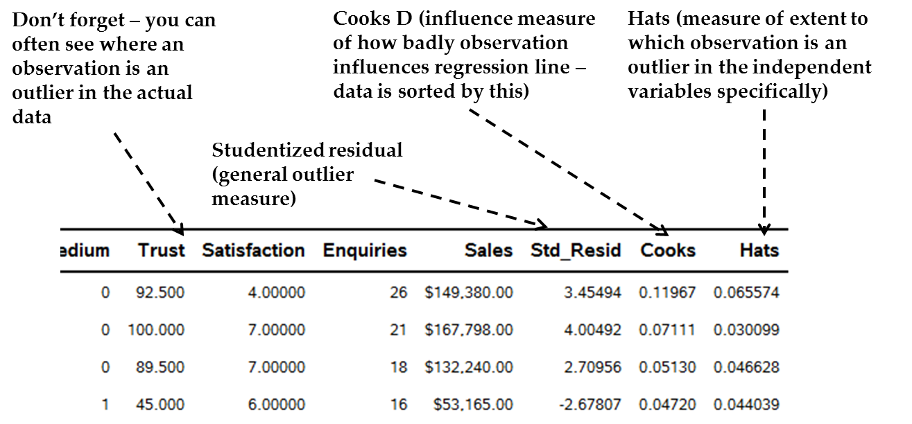
Figure 13.22 Example of outlier diagnostics in SAS datasheet
These diagnostics are
specific numerical assessments of the extent to which each observation
is an outlier or an influential point. An outlier is
where a statistic is generally unusual in relation to the data of
other outliers. However, this is not always a problem. Influence,
on the other hand, is where the outlier is altering the regression
equation, and is therefore a “problem.” This is really
the focus. There are four diagnostics for this, given in the special
printout:
-
The Cook’s D (“Cooks”) is a measure of influence. Cook’s D scores much larger than those below may suggest a large impact of an outlier on regression slopes, therefore that the observation may be influential. The diagnostic data set is automatically sorted by Cooks D values; therefore, look at those in the first few rows. A “spike” in the Cooks D value, compared to those a bit below it, possibly indicates that the observation is an influential point and may need to be dealt with (see below). For example, in Figure 13.22 Example of outlier diagnostics in SAS datasheet we see the Cooks D for the top observation has a quite substantially larger value than the one below. This might be an influential point.
-
The Studentized Residual (“Std_Resid”) is the standardized residual (extent to which the regression line misses the data). On this standardized scale, a studentized residuals score > +-2 possibly means that this observation is an influential point. In Figure 13.22 Example of outlier diagnostics in SAS datasheet we see the top two Cooks D values also have high studentized residuals of more than 3 in absolute value.
-
Leverage scores (also sometimes called “Hats”) give an overall idea of the extent to which the observation is an outlier on the independent variables only (the Hats scores do not take into account the dependent variable). There is also a formal suggested cut-off for possibly big hat scores[4]. Therefore, a very high Hat score may indicate that the outlier effect is somewhere in the independent variables, not the dependent variable. However, you may not always see strange scores in the actual predictor columns just because there is a big Hat score. Instead, a big Hat score may occur because of an abnormal combination of independent variable scores, not necessarily that any one is abnormal. Again, in Figure 13.22 Example of outlier diagnostics in SAS datasheet we see the top observation having what may be a high Hat score compared to others below it, although we would need to see the whole range.
-
Actual variable scores of the high-influence observations: For those variables at the top of the sorted dataset with the highest influence, examine their actual variable scores. Do they have unusual scores on one or a few variables? Make sure there are no data capturing mistakes (like a “0” for age). Is there a natural but very high score on one variable in particular or throughout? In Figure 13.22 Example of outlier diagnostics in SAS datasheet we see the top observation by Cooks D not having impossible data, but perhaps having some unusual combinations (it is a small firm with very high sales and enquiries but low satisfaction).
It is important to remember
that just because an observation has large outlier diagnostics does
not necessarily mean that it is a problem. One way to see the actual
effect of a given influential observation is to run the original regression
and compare it with a regression where the influential observations
are “taken care of” in some way. The comparison between
the two regressions can show the relative effect of the outliers.
For instance, an extreme method for dealing with an outlier is to
delete it altogether. However, there are other methods. Comparing
the fit statistics and slope parameters of a regression with all observations
to those where one or more observations are deleted is one way to
diagnose the actual effect of those outliers. The next section discusses
methods for dealing with outliers in more detail.
Remedies
for Problematic Influential Outliers
If you find some seemingly
large influential outliers, various solutions are available. I note
in advance that if other diagnostics suggest transforming data or
fitting a non-linear regression, do not bother with outlier changes,
rather implement the transformed regression then check outliers from
scratch.
-
Robust regression: This is an adjustment protocol offered by some programs for outliers. Robust regression estimates which observations are outliers, and in some way down-weights influential outliers. Such down-weighting ranges from entirely deleting the observation to giving it a lesser influence on the final regression results. Luckily SAS has a great robust regression option (PROC ROBUSTREG), which can do further assessments of the influence of outliers and also give you new slopes that are adjusted for outliers, based on various approaches. Robust regression is popular and powerful, but like all regressions they have their own rules and diagnostics that help you decide whether to accept the final outcome. This book cannot cover all these considerations, but you should read the SAS helpfiles on ROBUSTREG if you want to use it in the future[5], and analyze the main robust regression output in the program.
-
Manual outlier weighting or deletion: You could just delete bad influential outliers (i.e. excluding the row of data that produces an outlier); however I would not do this normally unless you are forced to, and especially not if the observation is important (e.g. if you are studying IT companies you would NOT necessarily delete a huge player like Cisco just because it was an outlier!) Certain robust regression techniques actually delete certain observations anyway. If you delete observations yourself, compare the regression with and without deletions to see their effects. If interesting or important outliers need to be deleted to make the regression work, then analyze these critical data points separately as stand-alone case-studies.
-
Bootstrapping: The bootstrap procedure can also help ameliorate outliers to some extent, although only in their effect on accuracy estimations like confidence intervals. I still suggest a robust solution or judicious deletion.
Overall
Approach to Dealing with Influential Outliers
Practically, therefore,
I recommend the following diagnostic steps to see whether there really
is an outlier problem:
-
After you are settled on the current regression, assess (diagnose) whether outliers exist and whether they are influential points:
-
First, assess whether there are influential points and which they are:
-
Look for clear outliers in the residual plots.
-
Look at the Cook’s D scores for the first few rows of the outlier printout. If the top score or scores represent a rapid “spike” above those immediately below, these may be influential observations. Note that it is very useful to have a column of data that identifies the observation, such as a name, number, or some other such data.
-
The studentized residuals (“Std_Resid”) for those at the top of the printout can act as a second check of outlier status.
-
Comparing overall fit scores (especially R² values) of original regressions with all observations with adjusted regressions where outliers are “taken care of” helps to see the relative effect.
-
-
The second major diagnostic task is to locate the actual variable scores that make the specific observation influential:
-
Partial residual graphs can show for which independent variables there exist outlier points.
-
High Hat scores show that a variable has an unusual combination of independent variable scores.
-
Actual variable scores for those observations with high Cooks D values may show the problem. An unusual dependent variable score would immediately suggest a cause. Unusual independent variable scores may show immediate reasons, but not always, because the problem may be an unusual combination of scores that themselves are each normal. Fix any impossible points. However, do not imagine that a low or high actual score in a variable is “wrong”. Such scores may be genuine data findings and therefore interesting.
-
Changes in variable slopes between original regressions and adjusted regressions helps to see the relative effect. See the next section.
-
-
-
Apply remedies for outliers if necessary, such as:
-
Robust regression
-
Regression with outliers removed
-
Bootstrapped regression if outliers seem to be mild
-
Diagnostic Issue #5: Normality of Residuals
The residuals should
also preferably be normally distributed. This is not the most crucial
assumption – regression is fairly robust to violations of normality
(in other words, the regression results are not too badly altered
by non-normality). The reason why residuals should be normally distributed
is that normality is an indication that a) most of the residuals are
close to zero which is desirable, since the bigger the residuals the
fewer of them there are, and b) when residuals are large, they are
equally above and below the regression line so that there is not a
bias.
Diagnosing
Residual Normality
SAS generates two residual
normality plots seen in Figure 13.23 The two SAS residual normality plots. On the left,
see how closely the actual residual histograms follow the normal-shaped
black line (bell curve). In the “Normal Probability Plot of
Residuals” on the right, if the line in this plot is relatively
diagonally straight from the bottom left corner to the top right,
the residuals are probably normal. If the line deviates substantially
(e.g. has waves in it) then the residuals may not be normal.
Figure 13.23 The two SAS residual normality plots

If you examine Figure 13.23 The two SAS residual normality plots, I believe you will find no obvious residual normality
problems in the plots for the case example.
Remedies
for Non-Normal Residuals
Remedies for non-normal
residuals are the same as for heteroscedasticity (see the previous
section) in general; bootstrapping alone usually fixes the problem
well.
Diagnostic Issue #6: Autocorrelation
Mostly seen with data
measured at different points in time (like time series data where
we try to explain or predict a dependent variable using time as the
independent variable), autocorrelation leads to residuals that are
correlated. You most commonly test this by asking for the “Durbin
Watson” statistic (see Figure 13.24 The SAS Durbin-Watson section for autocorrelation below for the case study example). The following may indicate
you have problematic autocorrelation:
-
The raw Durbin-Watson statistic: A rudimentary indication is that this statistic should be in the range of 2 to 4. If the statistic tends toward zero, it might indicate that autocorrelation exists. In Figure 13.24 The SAS Durbin-Watson section for autocorrelation it is about 2; therefore, it is alright. However, this test is not necessarily definitive; the p-values are better.
-
Durbin-Watson p-values: SAS gives a formal p-value test of the Durbin-Watson, where significant values indicate a potential autocorrelation issue – in Figure 13.24 The SAS Durbin-Watson section for autocorrelation neither p-value is significant, suggesting no issue with autocorrelation.
-
Residual patterns: Waves in the residual plot can indicate autocorrelation.
Figure 13.24 The SAS Durbin-Watson section for autocorrelation

If you have autocorrelation
then slightly more complex regression adjustment protocols exist;
these are similar to the regression taught to you here.
Diagnostic Issue #7: Missing Data
As discussed in Chapter
4 and Chapter 9, missing data can be a substantial issue for regression
because for every row in which any variable is missing, data is deleted
by default. This can lead to substantial loss of data. The following
sections discuss diagnosis and remedies.
Diagnosis
of Missing Data in Regression
There are various diagnostic
options:
-
Basic dataset analysis: Chapter 4 and Chapter 9 have already discussed diagnosis of missing data in a dataset without any reference to multivariate analysis like regression. See the Textbook program “Code09a Gregs missing data analysis” designed especially for your use in this diagnosis.
-
Total loss of observations: The first table in the SAS PROC REG analysis also identifies the overall loss of observations, so this can act as an immediate diagnosis after you run an initial regression.
-
Comparison of original and remedial regressions: Identifying the extent of missing data does not actually help establish the extent to which it changes or affects the regression. This question can be a complex one, and there is much reading to be done for the interested practitioner. The next section discusses some remedial regression options, the results of which can be compared to an original ordinary least squares regression including the missing data. Major discrepancies between the findings may indicate that missing data is a big issue.
Remedies
for Missing Data
Aside from strategies
to mitigate the problem at the data gathering or interim cleaning
stage[6], there are various remedies
for missing data:
-
Missing data in observations (rows): As discussed in Chapter 9, you may consider getting rid of observations that are missing all data for the dependent variable and deleting observations that are missing lots of data overall, before you try other options.
-
Missing data in variables (columns): Once you are left with only the observations that have data on the dependent variable and most of the data for the rest of the variables, assess variables for missing data. Before implementing other options, consider excluding or substituting variables that have a significant amount of missing data, unless the variables are strictly required for the analysis.
-
Simple imputation: Some researchers replace missing data themselves. For instance, if the variable is continuous, the average might be substituted for the missing data. This approach is not very desirable, since it may amplify any bias in the missing data. (For instance, if many more men answer a certain question than women, replacing the female-dominant missing cells with the average will impute the qualities of men to the missing women – but what if the genders fundamentally differ in the population?)
-
More complex solutions: There are two more complex and effective solutions[7] that are leading solutions for missing data in regression:
-
Multiple imputation: Multiple imputation for missing data is a good solution which is easy to achieve for regression in SAS, through PROC MI and PROC MIANALYZE[8]. It uses a clever method to estimate the regression while taking rows with missing data into account. The interested reader can find out how it works in texts such as those in footnote 9.
-
Full information maximum likelihood: A second solution is called the full information maximum likelihood measure, which also uses all available data. It has certain advantages over multiple imputation (e.g. Allison, 2012). This technique is easily implemented in SAS PROC CALIS, which is the structural equation modeling PROC in SAS.
-
How Does the Case Study Example Do on Diagnostics?
We have now seen the
case study data being examined against each diagnostic. How does the
case data stand up for regression, and should we consider implementing
any remedial actions? The following has been discussed:
-
With regard to model structure, we discussed the possibility of some more complex structures, such as the hypothetical possibility that satisfaction causes trust. We may want to contrast the regression with a structural equation modeling analysis that takes the endogeneity into account.
-
We saw some diagnostics that did not seem to present problems. Checks for multicollinearity, non-linearity, residual normality, and autocorrelation seem acceptable. Looking at the first table in our chapter example, there are only 11 deleted rows due to missing data, which may not be much. But you may wish to check the outcome of this regression with one that that accounts for missing data.
-
However, it is possible that there were some issues:
-
The residual plots seem heteroscedastic, notably with fans or diamond-like shapes throughout. We may consider remedial actions such as transformations (something like the logging of variables applied in Code 13b) or bootstrapping.
-
There are some outliers in the current regression. We may wish to check the outcome of a robust regression. However, because transformations may be necessary, we defer this discussion.
-
For the purposes of
this book, we will continue under the assumption that no changes were
necessary, just for the sake of illustration.
Fit Part 2: The R2 Statistics
Introduction to R2 Statistics
R² statistics are
one of the most commonly used global statistics for measuring fit
of a regression line. There are two main versions of this statistic:
the R2 and the adjusted R2.
The R² statistics
as produced in our SAS example for this chapter can be seen in Figure 13.25 SAS sample R² table for case example below using “Code13a Multiple Regression.”
Figure 13.25 SAS sample R² table for case example

The R2 is
broadly interpreted as the percentage of the variance
in the dependent variable which is accounted for by the regression
line. The R² is therefore the opposite of
error: it is how much of the Y-variable we are able to explain using
the straight line. The closer the data lies to a straight line, the
higher is that line’s ability to explain the data, and therefore
the higher the R².
The R² typically
lies between 0 and 1 (for instance, in Figure 13.25 SAS sample R² table for case example the R² is 0.7924, rounded to .79). The closer to 1,
the more of the variance in the dependent variable that is accounted
for by the line. Some people like to interpret the R² roughly
as a percentage, that is, the R² of .79 would equate to 79% of
the variance of the dependent variable being explained by your line.
There is also an “adjusted
R²” (see “Adj R-Sq” in Figure 13.25 SAS sample R² table for case example). This alternate statistic is useful because the raw R²
is dependent somewhat on the number of predictor variables –
the more predictor variables, the higher the R². The adjusted
R² adds a penalty for having many poor predictor variables that
do not do a very good explanatory job, especially when sample size
is small. Therefore, a much lower adjusted R² than raw R²
often means you need to remove some weak predictor variables or increase
your sample. You can interpret the adjusted R² in the same way
as the raw one. The adjusted R² in Figure 13.25 SAS sample R² table for case example is .7876, so it is close to the raw R². This is not
always the case; occasionally the adjusted R² is substantially
lower.
As inferred by the above
definitions, because the R² statistics are essentially the opposite
of error, the higher the R², the lower the amount of error and
vice versa. We want high R2 values, as
this infers that our regression line seems to do a good job of explaining
the dependent variable. The remaining question is “how high
does the R2 need to be to be acceptable
or good?”
Interpreting the Size of the R2
How big is a “big
enough” R² to conclude that the line fits the data sufficiently
to take seriously? This is a crucial question and it involves the
following complexities.
First, it is important
for the researcher to realize that there is no
definite, single cut-off point for how big the R² has to be before
we consider it big enough . The
researcher has to decide based on various considerations whether the
R² is sufficiently large to suggest “fit.”
There are three considerations
for whether the R² is “big enough”:
-
The characteristics of the dependent variable. Is it a variable that has many causes and might therefore be harder to explain or predict, or is it a variable with few, defined causes? Is it a very subjective or perceptual variable that may be hard to measure and conceptualize and therefore harder to explain?
-
The broad area of study. Behavioral and more subjective areas of social science study often have lower R² than harder science areas because variables are complex and highly interrelated. Take employee turnover: a large number of factors ranging from the individual’s psychology, to job and organizational issues, to economic factors probably affect turnover. A single model is unlikely to pick up all this variance. In other studies R² can be expected to be much higher because few things predict the dependent variable: some economic variables are like this.
-
Prior R² sizes in similar studies. To get these you would have to research prior statistical studies on the same dependent construct (possibly measured in varying ways), and similar sets or types of independent variables. Meta analyses may help. Again, if you are studying employee turnover your researchers might be content merely to explain 15-20% of the variance (an R² of .15-.20, in fact this is what we often get in turnover studies).
Therefore, when assessing
fit, after dealing with the data assumptions we assess R² statistics
and ask whether they are “big enough” to take seriously.
What might we make of
the R2 for the single-variable model in Figure 13.25 SAS sample R² table for case example? I would probably think this to be high. To account for
54% of the variance in a complex variable like Sales seems very high.
In addition to the R2 statistic,
we often look at a second global measure of fit called the ANOVA F,
as discussed next.
Fit Part 3: The ANOVA F-Statistic
The ANOVA F-statistic
is a formal statistical significance test of fit. Figure 13.26 Sample SAS ANOVA F-Test for global fit below shows the ANOVA F table from the SAS output for the
case example.
Figure 13.26 Sample SAS ANOVA F-Test for global fit

The ANOVA F-statistic
is a formal test of fit, and gives you a statistical value (the “F”
statistic) as well as estimates of error (the Sum of Squares and Mean
Square; I will not explain these further) and the associated p-value
(which in Figure 13.26 Sample SAS ANOVA F-Test for global fit is designated
the “PR > F”). With our knowledge about significance
in mind from Chapter 12, we can note the following about the ANOVA
F-statistic test for the fit of a regression equation:
-
Usually we look to the ANOVA p-value, and if it is low enough (typically lower than .05 or .01) then we conclude that it gives one piece of evidence that the straight line fits the data sufficiently to continue. For example, in Figure 13.26 Sample SAS ANOVA F-Test for global fit the “Pr > F” for the ANOVA table is <.0001, which is lower than .05 or even .01. Therefore we would say that, based on the estimates of error, this F statistic is significant at a level of .01, giving us one extra basis for accepting that a straight line fits our data.
-
The ANOVA F-value is related to the size of the R² – in a way, the R² is the “size” measure of regression fit and the ANOVA is the “accuracy” part which tests whether the R² is at least not zero (R² = 0 means no fit to a straight line). The smaller the R², the higher and therefore worse the p-value of the ANOVA F.
-
Having said this, the ANOVA F suffers from the usual weakness of statistical significance testing (see Chapter 12), namely, that sample size alone can make it significant (p-value < .05 and is therefore a “good fit”), but with a very small R². This is undesirable, so your first judgment still revolves around the relative size of the R², not on the ANOVA F p-value.
Therefore, in addition
to dealing with the data assumptions, we assess fit through a sufficiently
high R² for the context as well as a statistically significant
ANOVA F (p-value < .05). But what if we find poor fit –
a low R² or a non-significant ANOVA F? I discuss this next.
What to Do If Global Fit is Poor
What if we conclude
that a straight line does not fit our data (which, in this case, we
would conclude if R² is “too” low or the ANOVA
F-statistic is not significant at a level less than 0.05 or so)? Do
not panic, you have the following options:
-
Another type of predictable model (other than a straight line) might fit the data, like the example in Figure 13.8 Example of a nonlinear regression line where, although a straight line would probably have had poor fit, another line (the curvilinear parabola) would have had good fit.
-
The poor fit could be because of issues with the data you are using, like usually large data points (outliers) that are throwing out the whole analysis. These are often things that can be fixed, after you have diagnosed them (as discussed in the next chapter).
-
You may need to add more explanatory predictors with better ability to explain the dependent variable.
-
The dependent variable may not be measured correctly or well, so you might want to re-think its measurement.
-
It may be that a small sample size is causing the ANOVA F to be non-significant, whereas the R² is reasonable. This is the low power problem discussed in Chapter 12. If overall power is low (say, less than 70-80%) we might conclude that the non-significance of the ANOVA F does not in fact indicate poor fit necessarily, but might just be due to a small sample. We might then conclude that statistical significance is not the right measure, and rely on the R² alone, bearing in mind however that with a poor sample comes the risk that we are not representing the population well.
This concludes the first
major section of regression assessment: deciding if a straight line
is the correct fit to the data. Now, remember that fit does not mean
that the independent variables actually have any real impact! Therefore
having assessed and confirmed fit, you need to assess the impact of
the independent variables. To do this, we need to interpret the regression
slopes as our final major step.
Last updated: April 18, 2017
..................Content has been hidden....................
You can't read the all page of ebook, please click here login for view all page.