
Assessing Shape of a Variable’s Distribution
Introduction to Shape
It’s not good enough to just look at summaries of the spread of data. You will often
be interested in the shape of the spread too, which we call the variable distribution.
Variable distributions are often important because some statistics are appropriate
for variables only of a certain distribution. In addition, the distributions have
their own practical interpretations, as in the case of business decisions.
What do I mean by the distribution of data? Here are some common distributions that
may help you to understand the concept of distributions:
The Normal Distribution
The normal distribution is by far the most common one that we look for or find in
data. Figure 7.6 The normal distribution graphs data that approximates a normal distribution – this graph shows the number
of expected data points for every value of the data. (For instance, if scores on the
horizontal axis are people’s ages, the graph plots how many people the distribution
would have at each age, or the proportion of people at each age.)
As seen in see Figure 7.6 The normal distribution, normally distributed data have various characteristics:
-
In the normal distribution, most data clusters around the middle (the average).
-
The data are spread equally on either side of middle.
-
There are progressively fewer observations as you move away from middle.
The normal distribution is important for several reasons. Certain statistics can be
calculated only if the data are normally distributed, although this limitation can
be overcome. The distribution can also inform you about other business-related issues
such as the extent to which you can trust the average as the middle score.
Figure 7.6 The normal distribution

Other Distributions
There are a great number of other distributions. This book teaches only a few. The
important thing for the starting learner is to understand the basic concept of distributions,
and to know that they affect the types of statistics that can be done. Some common
examples include:
-
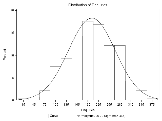
The lognormal distribution (see Figure 7.10 Histogram of enquiries from the univariate module) is similar to the normal distribution except that most of the data clusters around a relatively low median, and there are a few very large observations that make the right tail of the distribution stretch out. This is important in business because many finance and other business variables have this distribution. Examples of typically lognormal variables include firm sizes, employee tenure, many financial variables (e.g. stock returns), and countless more. If your data are lognormal in shape like that in Figure 7.10 Histogram of enquiries from the univariate module then you must take this into account in your approach to the statistics. Of course, this distribution also tells you that you have big outliers and cannot trust the average as the central measure necessarily.
Figure 7.7 A lognormal distribution

-
The uniform distribution as seen in Figure 7.8 A rough uniform distribution, almost any data point is equally common is one where any given data score has almost equal representation throughout the dataset. Imagine you have a workforce with three 20 year olds, three 21 year olds, three 22 year olds, and so on (three of every feasible age year). This would be a perfectly uniform distribution.
Figure 7.8 A rough uniform distribution, almost any data point is equally common

-
Bimodal distributions. Some distributions have two peaks of frequently found data. These are called bimodal distributions. Take the example of Figure 7.9 Bimodal data with peaks at low and high scores, where a 5-point Likert-type scale was asked. This only allows for 5 data points (corresponding to Strongly Agree, Agree, Neutral, Disagree, Strongly Disagree). If most people either strongly agree (a score of 1) or strongly disagree (a score of 5), and far fewer answer in the middle, then we get a bimodal distribution like that in Figure 7.9 Bimodal data with peaks at low and high scores.
Figure 7.9 Bimodal data with peaks at low and high scores

-
Many others. There are many other distributions with well-known properties that analysts look for and find in data.
For the non-statistician, knowing all the distributions that statisticians look for
and study is unnecessary. However, if you are commissioning statistics from a research
firm or statistician you may want to see the distributions of your key variables first.
Make sure that if your important variables are strangely shaped, you address this
with the analyst and find out whether he or she is aware of it and is prepared, if
necessary, to act on it. If you are reading statistical reports, you may also find
references to distributions.
Computer programs can typically generate graphs that help you examine the shape of
data. Histograms such as that of the variable enquiries in Figure 7.10 Histogram of enquiries from the univariate module below are good options. This gives the number of customers in various ”levels of
average enquiries” bands and, because you asked for it, a line showing the normal
distribution for comparison (it seems clear this variable is relatively normally distributed).
Assessing Distribution in SAS
Distributional Analysis Using SAS Histograms
As a start to assessing distributions in SAS, you can get a distributional histogram
of variables in the SAS UNIVARIATE module, along with a comparison to the normal distribution.
For instance, as before, open and run the file “Code07b Univariate Descriptives.”
If you scroll down you will get graphs, such as the histogram of enquiries seen in
Figure 7.10 Histogram of enquiries from the univariate module below. This gives the number of people in various age bands and, because you asked
for it, a line showing the normal distribution for comparison (it seems clear this
variable is very close to normally distributed.)
Figure 7.10 Histogram of enquiries from the univariate module
Dedicated SAS Chart Modules
SAS has many different graph-building modules, ranging from point-and-click options
to programming procedures. See Chapter 10 for more on some of these.
Formal Statistical Tests of Distribution
There are also more formal statistical tests of whether or not a variable is distributed
according to a given shape. Appendix A to this chapter gives more information on the
most basic of these.
Last updated: April 18, 2017
..................Content has been hidden....................
You can't read the all page of ebook, please click here login for view all page.