The PROC SGPLOT Routine in SAS
Introduction to PROC SGPLOT
PROC SGPLOT is
a powerful contemporary SAS routine. It allows you to make a great
number of basic graphs, including scatter, bar, line, box, histogram,
ellipsis, bubble, density, dot, block, dropline, high-low, needle,
spline, Loess, polygon, and waterfall charts among many others. (Perhaps
only a few of these mean anything to you at this stage. Do not worry:
examples of these appear below and in the SAS helpfiles and guides,
notably SAS 9.4 ODS Graphics: Procedures Guide, Third Edition).
There is a second, powerful
feature of PROC SGPLOT, namely, overlaying.
Here, you can create various related graphs, even using different
graph formats, and lay the graphs over each other in the same graph
area. For example, you can combine multiple scatter plots together
in the same view to show the difference in relationships of different
variables, or combine a bar chart with a line chart that shows something
specific about the data.
The following section
gives just a few examples of the many things one can achieve in PROC
SGPLOT.
Examples of PROC SGPLOT Graphs
Line Plots
Line plots are usually for
data that are measured over time or some other sequential basis.
Since we do not really
have such data in the main book example, we will use the “Electric”
dataset in the “sashelp” library that should have been
installed with the program. This dataset includes data on United States
power generation through various sources, such as coal or nuclear,
over a period of years.
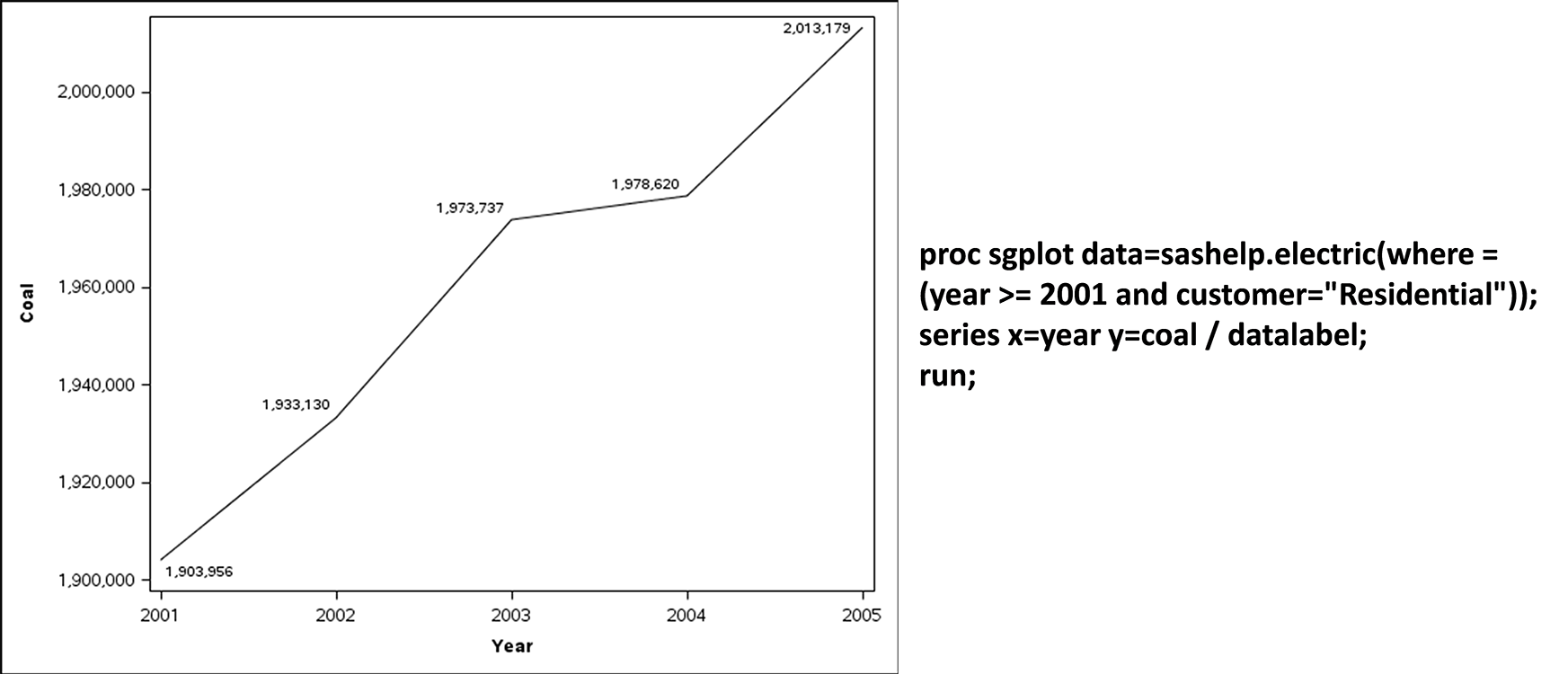
Say that you want to
track just the power generated from coal alone, specifically for residential
use, for the years after 2000. See this very simple example of PROC
SG PLOT in Figure 10.1 Example of a simple line plot (and code) below:
Figure 10.1 Example of a simple line plot (and code)
You can also overlay
and compare different line graphs. For example, to compare and contrast
the annual contribution of coal, gas and nuclear, we could run the
code seen in Figure 10.2 Overlay of multiple line graphs and
get the resulting graph:
Figure 10.2 Overlay of multiple line graphs

Scatter Graphs in PROC SGPLOT
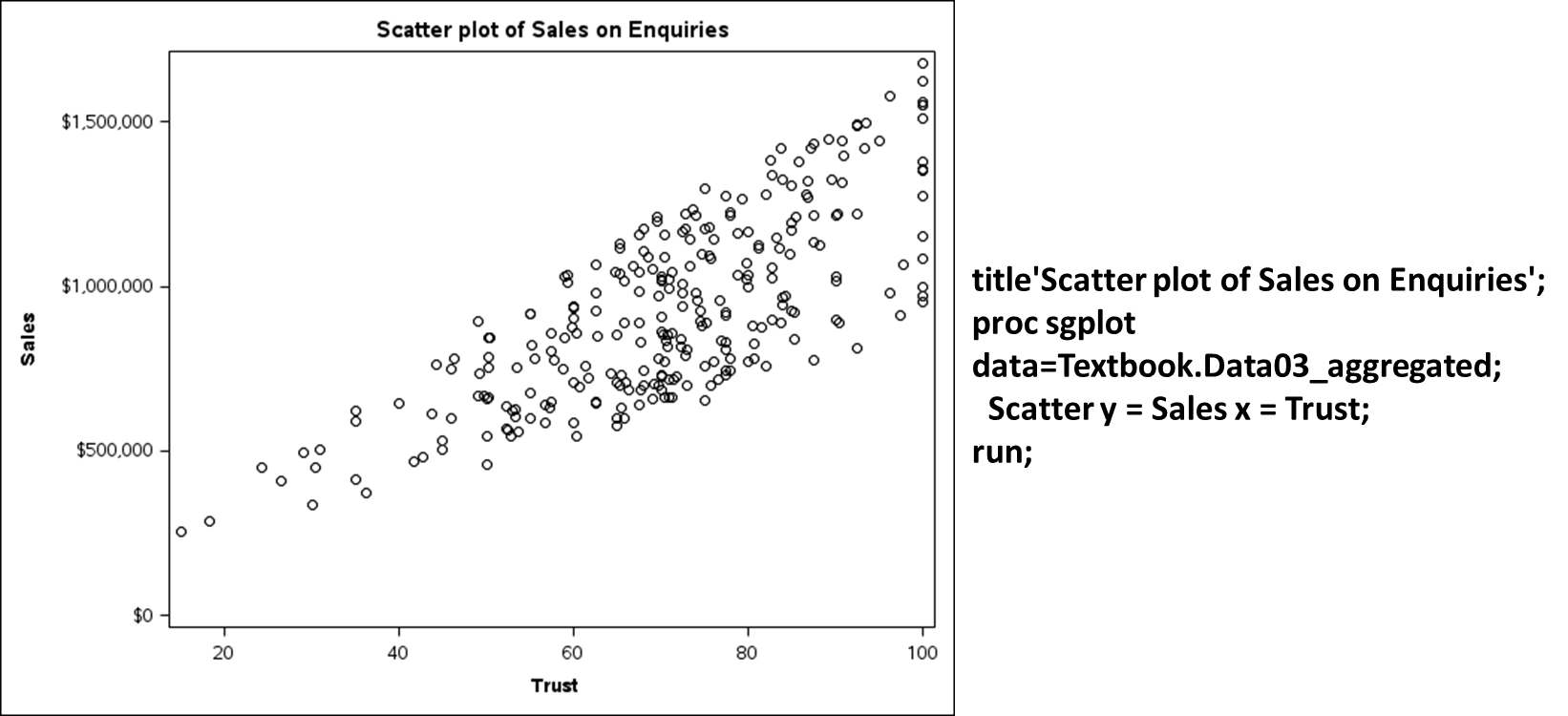
Similarly, one can use PROC
SGPLOT to generate scatter plots of data relationships. Figure 10.3 Example of a scatter plot in PROC SGPLOT below shows
a scatterplot from the main textbook example, where the two variables
in the scatter are Trust and Sales.
Figure 10.3 Example of a scatter plot in PROC SGPLOT
You can also create
scatter graphs grouped by some qualitative split in the data, for
example, in Figure 10.4 Grouped scatter plot in SGPLOT we
split the initial scatterplot by the two License types (Freeware and
Premium). Note that this is a black-and-white version; running the
same code using an ODS HTML Style = HTMLBLUE command or the like will
differentiate data points using different colors.
Figure 10.4 Grouped scatter plot in SGPLOT

Bar Graphs in PROC SGPLOT
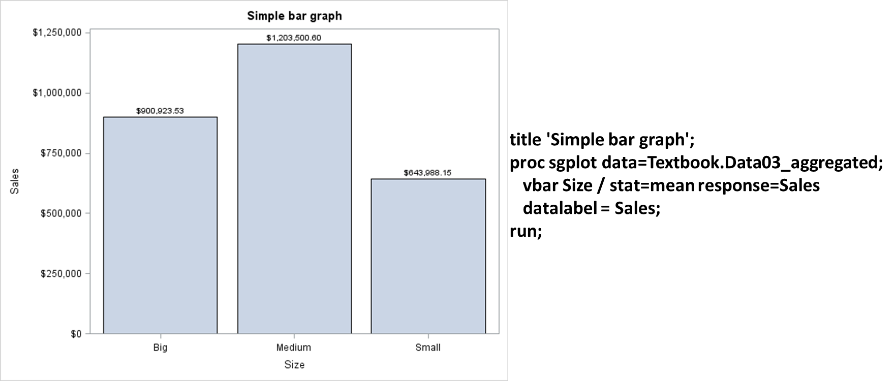
You can also create various
bar charts. Figure 10.5 Simple bar graph in SGPLOT below
shows a very simple bar chart of Sales averages for the main book
example.
Figure 10.5 Simple bar graph in SGPLOT
In SAS, bar charts can
be combined in multiple ways in the same graph, contrasted in the
same area with other graphs, and so on. See the SAS helpfiles for
more.
Box-and-Whisper Plots
Box-and-whisker plots
(”box plots”) are a particularly effective way of displaying
a lot of variable information in a simple way. Figure 10.6 Example and explanation of a box plot in PROC SGPLOT below shows
and explains the box-and-whisker plot derived by looking at sales
levels for different customer sizes in the book example (see the relevant
code in “Code10a SGPLOT Graphs”).
Figure 10.6 Example and explanation of a box plot in PROC SGPLOT
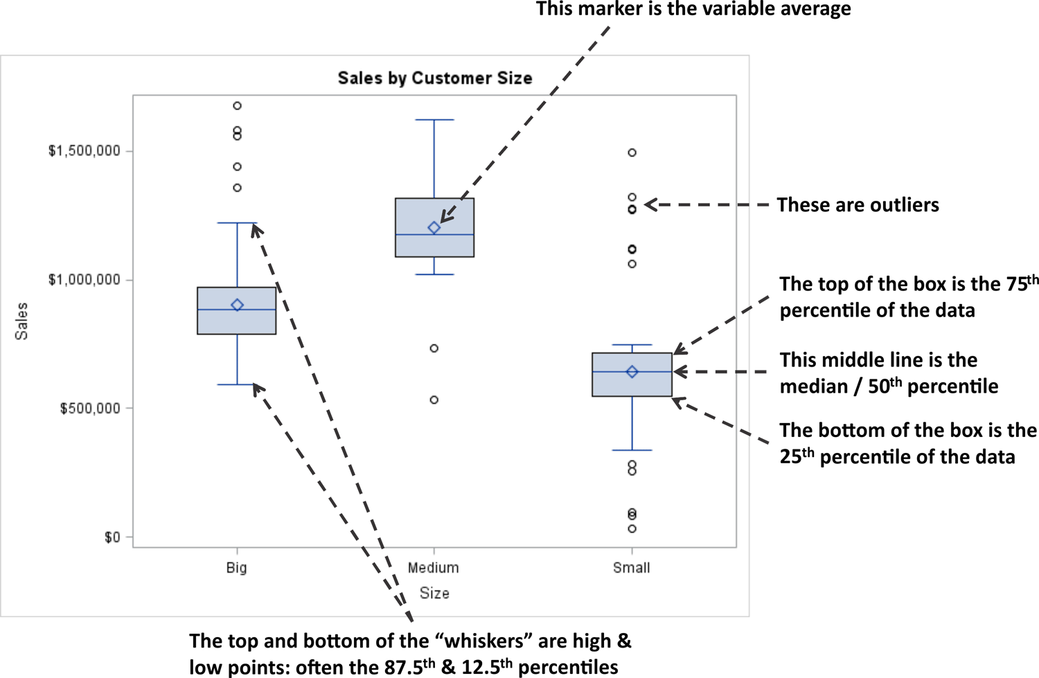
As can be seen in Figure 10.6 Example and explanation of a box plot in PROC SGPLOT above, box
plots give a remarkably complete picture of the distribution of data.
Other Graphing Options and Formatting in SGPLOT
There are a great number of graphing options in SGPLOT.
To become familiar with them all, it is probably necessary to experiment
and see what you can do. Companion texts that will help include Kuhfeld
(2010) and Matange & Heath (2011), but ultimately reading the
helpfiles and guides and experimenting with options is the best way
to learn.
Also, do not forget:
the default settings in SAS are only the beginning. There are hundreds
of commands that can make the graphs look exactly how you like, and
can create graphs that are far more attractive than the simple defaults.
For instance, open “Code10a
SGPLOT Graphs” and run the piece of code at the end entitled
/*A prettier example*/. You will see a simple bar graph that is enhanced
using a different color with an attractive sheen, bold labels, and
so on. (You need to have an ODS HMTL setting that will show this enhanced
graph; see above).
Last updated: April 18, 2017
..................Content has been hidden....................
You can't read the all page of ebook, please click here login for view all page.