A Pictorial Walk through Regression
The Simplest Case
Now that we have discussed
the broad aims behind linear regression, let us take a look at how
this is achieved through a pictorial explanation, using the following
simple linear example.
Let us begin with an
example. Say you are an HR researcher. Continuing with the sales example,
you might wish to investigate the predictors of sales
figures among a sales force. Therefore sales is
the dependent variable (DV), which you operationalize as average dollars
sold per annum. You choose a range of possible predictors or independent
variables (IVs), which could be anything relevant, such as salesperson
age, education, attitudes, behaviors, economic variables, and the
like. Let us just look at age of the salesperson as
the only independent variable with which to start.
If we start by simply
plotting values of sales and age for each salesperson, we get a graph
and data points like those seen in the incomplete top half and completed
bottom half side of Figure 13.2 Starting to plot data values in simple regression below.
As seen there, each
observation (in this case each salesperson) is represented by a dot,
which represents their actual recorded value for each of the values
which are represented on the axes (the dependent variable sales on
the vertical Y-axis, the independent (predictor) variable age on the
horizontal X-axis). In the top half of Figure 13.2 Starting to plot data values in simple regression I have simply picked out two salespeople whose data points
are indicated by position on the axes.
Figure 13.2 Starting to plot data values in simple regression

This is simple regression
– one predictor trying to explain a single dependent variable.
As discussed later, it does get slightly — although not a lot
— more complex when we add more predictor variables together.
Once we have a cloud
of data like that seen in the bottom half of Figure 13.2 Starting to plot data values in simple regression, regression will seek to see if a straight line that is
drawn through the middle of the cloud can adequately represent the
shape of the data. For this to be the case, the data itself needs
to be formed in the rough shape of a straight line – in other
words, the data needs to form something of a tube shape. If yes, then
we settle on the inference that a straight line adequately represents
our relationship, and we can proceed to have a look at what that line
tells us.
This is obviously a
specific version of Step 2 from Chapter 11 – looking for a
pattern in data by fitting an exact mathematical shape into the data
(in this case, a straight line) and seeing how well the data corresponds
to the line.
Figure 13.3 Fitting a straight regression line through the data shows this thinking for the salespeople age-sales simple
regression. As seen there:
-
The data do seem to have a linear trend, in that the data forms a tube shape.
-
In addition, when we examine the line that we have drawn through the data, we see that on average older salespeople seem to sell more and younger, less.
-
Fitting the best possible line through the data seems to give us an upward-sloping line. This would then possibly tell us something about a link between age and sales.
Figure 13.3 Fitting a straight regression line through the data

As mentioned previously,
it gets a bit more complex when there is more than one predictor. Figure 13.4 More than one predictor: Multiple regression with 2 predictors shows data with two predictors, which is as many as we
can easily make a plot for. In three dimensions it still looks like
the data probably forms a straight-line or tube shape.
Figure 13.4 More than one predictor: Multiple regression with 2 predictors

Once we get to three
or more predictors, plotting the complete data in graphs becomes all
but impossible. However, the sample principles apply.
Summarizing the above,
then, we look at the data relationships to see if they seem to form
a straight line. If the data does seem to form a straight line, we
proceed to decide exactly what that line tells us. Therefore, there
are two questions you need to answer in multiple regression:
-
Is my data a straight-line sort of shape? That is, does a straight line fit the data?
-
What does the line mean about the independent-dependent variable relationships? If the regression relationship is a straight line, is that line sloped sufficiently upwards (positive association) or downwards (negative) to mean anything substantial?
The distinction between
these two questions could hardly be more important, and it is an area
in which the inexperienced researcher often gets confused. Fit merely
means that you have arrived at the conclusion that your data is shaped
a certain, seemingly predictable way. Fit does not mean that there
are strong relationships in your data! In the case of regression,
just because your data is a straight line does not mean it is a strong
relationship. Let us take a look at some examples in Figure 13.5 Regression with good fit to a straight line & strong slope and Figure 13.6 Good fit to a straight line but no apparent age effect on sales. In Figure 13.5 Regression with good fit to a straight line & strong slope, the data has good fit to
a straight line (because the data is roughly tube-shaped) AND that
line is upward sloping, indicating a possibly strong relationship
– as age increases, sales generally do too.
Figure 13.5 Regression with good fit to a straight line & strong slope
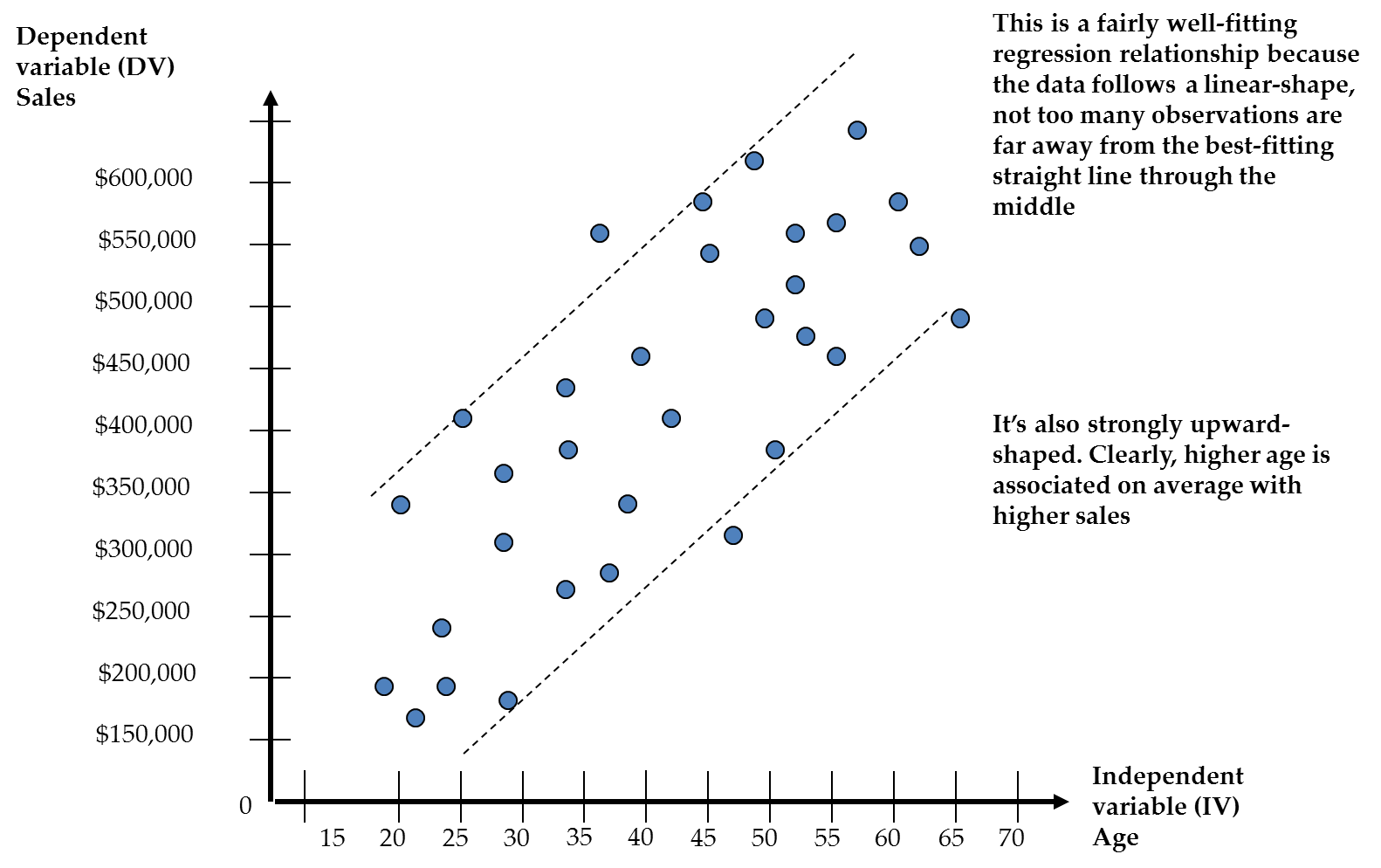
Figure 13.6 Good fit to a straight line but no apparent age effect on sales also has good fit to
a straight line (the data is roughly tube-shaped) BUT that line is
flat, indicating a weak or zero relationship
– differences in age do not lead to differences in sales. Or
put another way, no matter what age you are, your sales are roughly
the same on average.
Figure 13.6 Good fit to a straight line but no apparent age effect on sales

Inexperienced researchers
often make the mistake of assuming that because the data fits a straight
line well, a meaningful relationship exists. However, you
have a strong regression only if the line is sloped up or down for
an independent variable. In the case of a flat
line with almost no slope, as seen in Figure 13.6 Good fit to a straight line but no apparent age effect on sales, the best indicator of a given salesperson’s sales
is really only the average sales across all salespeople).
Therefore the slopes
of the imaginary straight line through the data are the key thing
in regression, specifically how steeply upwards or downwards the slope
lies. Fit is merely the confirmation that the slopes of the straight
line are in fact meaningful for the dataset, in other words that a
straight line is a good way to summarize the data. Having said this,
fit remains the crucial condition for using regression in the first
place, so we will explore it further in the following section.
Examining Fit in More Detail: Error & Residuals
As stated above, the
first aim in regression is to explain the variance of the dependent
variable. However, no exact model is ever likely to explain all the
variance in the dependent variable perfectly! This is simple logic.
There are just too many extra contextual complications, potentially
important predictor variables you did not measure, or mistakes in
measuring or capturing the data you did measure.
In the simple regression
example given earlier, in which the research seeks to explain sales
using salesperson age, we cannot expect all (or even much) of the
variance in sales to be explained. Some reasons include the following:
-
Specification error: Age cannot be the only predictor of sales! Surely there are many other factors, such as other aspects of the salespersons such as personality, aspects of the product such as price, economic conditions such as interest rates, organizational factors like advertising, etc. When we leave out predictors that might have been important, we have specification error, and this generally leads to less than all the dependent variable’s variance being explained.
-
Measurement error : Even with the variables we did include, we might not have measured them perfectly. Question and answer methods are often imperfect, like survey questions examining complex psychological issues. This would lead to imperfect relationships between the variables you did include, and probably a reduced ability to explain the DV perfectly. Even concrete constructs like age and sales can be imperfectly captured, as is the case when people lie about their age.
-
Context: Once again, even with the variables you did measure, the context in which the data was captured might have affected the measurements. For example, gathering data over differing economic conditions, without controlling for this, might lead to different answers by different people.
This leads to two important
and related concepts:
-
Fit: As discussed earlier, the extent that our line appears to explain most of the variance in the dependent variable is fit.
-
Error: The exact opposite of fit is error; that is the extent to which our model appears unable to explain variance in the dependent variable.
Practically, as discussed
earlier, fit is related to how closely a straight line lies to the
actual data. Thinking in 2- or 3-dimensions, does the data mimic a
tube shape? This is rather nonspecific though. How do we really examine
fit to a straight line (or any other line for that matter)?
The question in fit
and error is whether too many data points are far away from the best
possible straight line drawn through the data. If
too many data points are too far away from the best possible straight
line, then the data is not a good fit. Therefore,
after fitting the best possible straight line through the data, we
ask how far away the actual data point is from this best guess. Obviously,
this requires us to calculate a distance between the straight line
and each data point. This distance is known as a residual. Figure 13.7 The residual (distance between actual data and best straight line) shows the concept of the residual using the prior simple
regression example.
Figure 13.7 The residual (distance between actual data and best straight
line)

Figure 13.7 The residual (distance between actual data and best straight line) shows that the residual represents the extent to which
the best possible straight line misses the
actual data point. Residuals are one of most important concepts in
regression, as they are crucial in deciding whether the regression
has good fit.
Each residual is an
individual measure of error, the extent to which the line is wrong
about the true position of the data point. When we look at the total
dataset as a whole, some of the data points will be close to the line
and some far away. The more that are closer, and the closer they are,
the better a job we are doing of explaining the data.
The way we decide if
the regression line fits the data is to ask whether, in total, the
residuals are small enough to justify saying that the data clusters
around the regression line.
When later in the chapter
we examine how to assess fit, error and residuals practically, we
will find that there are several aspects to the issue and a variety
of measurements that assess fit, but the basic fit problem remains
the same: does a straight line lie close to most of the data points?
What Happens If Fit Cannot be Achieved?
What happens if the
data do not fit a straight line? In such a case, you cannot go on
to interpret the best possible straight line
because it will mean very little. However, as discussed in Chapter
11, inexperienced researchers or analysts often make a mistake, namely
to assume that there is no relationship. However, there could be a
very interesting relationship that is simply not linear!
Take a look at Figure 13.8 Example of a nonlinear regression line, in which the data is not really linear, so if we tried
to fit a straight line through it, we would not get very good fit.
However, if we were to draw a parabola through
the data, such a line would fit fairly well. Such a line is called
a quadratic or curvilinear line, and it indicates in this case that
sales are high for very young and older salespeople but low at middle
age. This is in fact more interesting than a straight line, but we
might have missed it had we tried to fit only a straight line! Now,
we will not learn how to fit this sort of line in this text, but later
I will discuss some nonlinear possibilities to keep in mind. Once
you have mastered linear regression, fitting such alternative curves
is actually quite easy, although it is outside the scope of this book.
Figure 13.8 Example of a nonlinear regression line

This concludes the general
orientation to regression. The following sections begin the reader’s
journey of implementing regression in SAS, and analyzing regression
results.
Last updated: April 18, 2017
..................Content has been hidden....................
You can't read the all page of ebook, please click here login for view all page.