
Appendix A to Chapter 7: Basic Normality Statistics
As discussed in Assessing Shape of a Variable’s Distribution, assessing the distribution of variables is often desirable. In that section, we
discussed the assessment of a histogram graph to decide whether a variable is normal
or not - in this case you can visually check the graph for differences between the
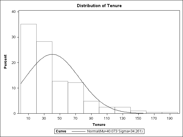
perfect mathematical model of the black normality line and the actual data. Figure 7.11 Example of tenure data histogram with comparison to normality is another example of comparing data to a perfect normal line in a histogram.
Figure 7.11 Example of tenure data histogram with comparison to normality
However, you would probably want more confirmation of the extent to which the variable
is or is not normally distributed, by using statistical measures. The shape of a normal
curve can be condensed into just two basic statistical measures (we often call statistical
measures parameters or coefficients as discussed in Chapter 2), namely ”skewness”
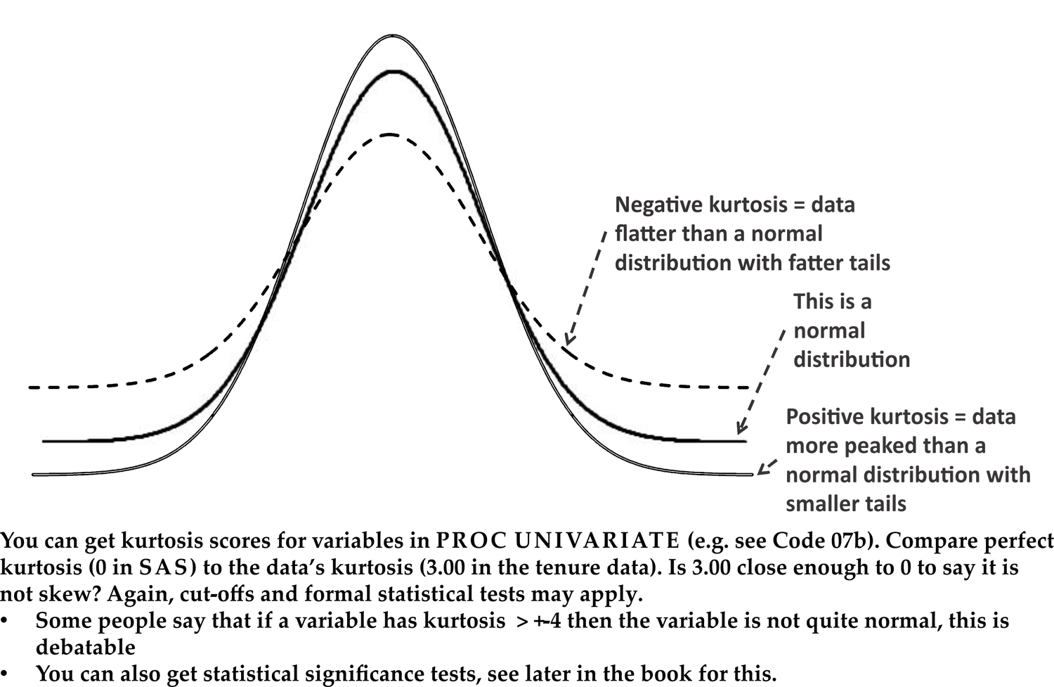
and “kurtosis.” These are summarized in Figure 7.12 Comparing data to normality - skewness and Figure 7.13 Comparing data to normality – kurtosis, and described below:
Figure 7.12 Comparing data to normality - skewness

Figure 7.13 Comparing data to normality – kurtosis
-
Skewness: A perfect normal distribution has equal distribution of data on either side of the middle, as in Figure 7.6 The normal distribution. As seen in the two panes in Figure 7.12 Comparing data to normality - skewness, skewed data has a longer tail either to the left or the right, indicating a few unusually small or big observations respectively. Visually, the tenure data in Figure 7.11 Example of tenure data histogram with comparison to normality is at least a bit skewed to the right, i.e. positive skew. To formally test this we can look at the data’s skewness score. Data with skewness = 0 is equally distributed around the middle (the benchmark) like a normal distribution. The tenure data has skewness = 1.16[2] . The question to be asked is whether 1.16 is sufficiently far away from the zero benchmark to suggest that the data does not fit a normal distribution. For this, sometimes you get debatable cut-offs (e.g. “skewness outside the range of +-1 may indicate significant non-normal shape”[3] ), and sometimes you get more sophisticated statistical significance tests which are introduced in Chapter 11. Ultimately all these tests help you answer the question ”does the data fit my pattern,” or in the example ”is this data normally distributed with close to zero skew, or skewed enough to reject normality?”
-
Kurtosis: A perfect normal distribution has a certain height and shape (in SAS the variable would have a kurtosis score of 0). As seen in Figure 7.13 Comparing data to normality – kurtosis, data with kurtosis significantly > 0 has a taller peak than normally distributed data. Data with kurtosis < 0 is flatter than a usual normal distribution. Again, you test the actual data’s kurtosis score against the benchmark of zero either by applying cut-offs (in this case many authors suggest a cut-off of +-2) or through more sophisticated tests[4] . The tenure data has a kurtosis score = 3, so we may conclude that there is a likely departure from a normal distribution shape.
Last updated: April 18, 2017
..................Content has been hidden....................
You can't read the all page of ebook, please click here login for view all page.