Relating Continuous or Ordinal Data: Correlation & Covariance
Introduction
In this book, when dealing with continuous or ordinal data we almost exclusively deal
with the simplest of all patterns of association, namely, linear association. The
speed versus errors example given above is an example of this. Linear association
happens in one of two ways:
-
Positive linearity implies that when one variable is high the other also tends to be high, and similarly when the first is medium or low so is the second.
-
Negative linearity implies that when the first variable is high, the second variable tends to be low and vice versa. A classic example of negative relationships is that between satisfaction and employee turnover: when employee satisfaction is higher we would expect there to be low turnover; when satisfaction is low we would expect turnover to be higher.
Graphically, Figure 8.2 Representation of positive and negative correlations shows the difference between positive and negative linear association, with data
from about 15 observations:
Figure 8.2 Representation of positive and negative correlations

Having looked at what association and linear association implies, how do we measure
it? We will look at three inter-related measures. The first classic measure of linear
association is the correlation coefficient.
Relational Statistic 1: Correlation Coefficients
Essential Idea behind Correlations
The correlation coefficient indicates the strength of a linear association. The following
sections explain the theory, types and SAS implementation of correlations.
A correlation is a statistic measured between -1 and +1, where:
-
A correlation of +1 indicates perfect positive linear association, and scores in between 0 and +1 indicate how close to positive linearity we are getting.
-
A correlation of -1 indicates perfect negative linear association, and again, the more negative, the closer the association.
-
A correlation close to zero indicates no linear association: when the one variable is high the other variable might be anywhere from low to high, and vice versa. They simply do not move together in that way. Note that they may be associated in some other more complex way.
Figure 8.2 Representation of positive and negative correlations shows a pictorial version of this explanation.
Figure 8.3 Scale of correlation coefficients

Figure 8.3 Scale of correlation coefficients shows a sample plot of some sales and enquiries data for customers (note this is
hypothetical and not related to the core case datasets).
Figure 8.4 Sample scatterplot of some sales and enquiries data

In this scatterplot each customer company is represented by a dot, and the coordinate
of the dot is determined by the customer’s enquiries score (the horizontal axis) and
sales score (the vertical axis).
The dotted arrow shows what the eye can easily see: the high enquiries scores tend
to also be high in sales, and the lows tend to continue to be low. There is a straight-line
relationship. This strength is initially measured by the correlation coefficient,
which we will learn to measure shortly.
Different Types of Correlations
There are different types of correlations. The most common are:
-
Pearson correlations for relationships between continuous variables. This is by far the most common, and is the default in programs like SAS.
-
Spearman correlations for relationships between ordinal variables.
-
Kendall’s Tau, which is used when you have paired data, e.g. the same variable measured in two different years.
-
Hoeffding Dependence Coefficient is based on ranks and can also be used for ordinal variables. Unlike the others, it can sometimes detect nonlinear relationships that are not straight lines. It runs from -0.5 to 1.
Calculating Correlations in SAS
You can generate correlations in SAS using the PROC CORR module. Say that you wish
to assess Pearson associations between trust, satisfaction, enquiries and sales. To
see this module running, open and run the file “Code08a Correlations”, which is based
on the dataset “Data03_Aggregated.” This gives a table like that seen in Figure 8.5 SAS correlation analysis main table.
Figure 8.5 SAS correlation analysis main table

In Figure 8.5 SAS correlation analysis main table the correlations are given on the top row for each variable. Chapter 12 explains
what is meant by the ”p-value” second rows in each line, the third row is the number
of observations used in each correlation. (This differs because missing data exists
more in some pairs of columns than others.) This table is not the usual way of presenting
correlations in a final report – see the next section on how to present correlations
properly.
Note that you can easily generate Spearman or other types of correlations too, simply
by adding the appropriate keyword (e.g. “SPEARMAN”) before the first semicolon.
Reporting and Interpreting a Correlation Table
As with all statistics, correlations should be arranged in a well-presented table.
Figure 8.6 Formatted presentation of a correlation table is an example for our final chapter data.
Figure 8.6 Formatted presentation of a correlation table

Notes on this table:
-
The correlation of a variable with itself is 1.00 (which is perfect linear relationship) because a variable is obviously perfectly associated with itself.
-
You need only one half of the table (in this case we use the bottom half), because the correlation of variable A with variable B is the same as the correlation of B with A (which would be in the mirror position at the other side of the table).
-
Some of the correlations are positive, and some are negative, indicating positive and negative linearity respectively.
I have written a program that will automatically generate this type of final report.
Open and run ”Code08b Gregs correlations.” You merely input your dataset, variables
and (optionally) type of correlation to get a formatted table like the above.
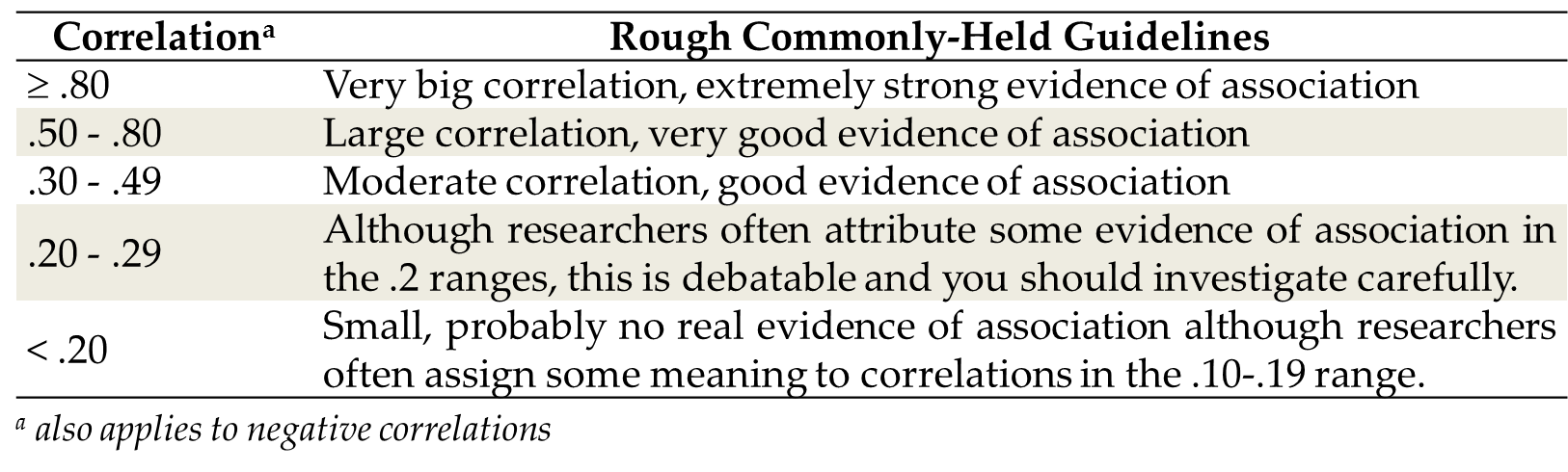
Understanding Sizes of Correlations
How do you know whether a correlation is big or not? In other words how do you know
whether or not it indicates a strong association between two variables? Various guidelines
for Pearson and Spearman correlations have been suggested, although as with all cut-offs
don’t use them too dogmatically. The version in Figure 8.7 Sizes of correlations and their commonly held interpretations is one version:
Figure 8.7 Sizes of correlations and their commonly held interpretations
Example of a Correlation Analysis
Look again at the correlations in Figure 8.6 Formatted presentation of a correlation table. Which variable has the strongest association? This would be the biggest correlation
(positive or negative), which is .76 between sales and trust. This would be a large
positive correlation suggesting strongly that when trust is high or low so are the
scores for sales. There are also negative correlations, such as -.59 between small
and sales, suggesting that smaller customers have lower sales.
Note also that the .25 correlation between satisfaction and sales is about a third
as strong as the .76 between trust and sales. Correlations can be compared as to relative
size, including one negative and one positive one.
One point: say you have a correlation that is r = -.11. Some people would say there is a negative relationship between these two
variables, just because there is a number and a minus sign. This may be faintly true,
but the correlation here is just too small to be sure, and you should not rely on
such a small correlation for evidence.
Finally, some readers read correlations as if they are percentages. They are not percentages.
The meanings are above and should be adhered to.
Relational Statistic 2: Covariance
Introduction to Covariance
The correlation coefficient is not the only assessment of linear association: in fact,
it is the simplest but is only the barebones of association. It assesses whether one
variable tends to be high when the other is, but it doesn’t really reveal much else.
It fails to assess scale (range) within the variables.
A Metaphor of the Difference between Correlation & Covariance
Have you ever heard of the ”butterfly effect”? It is a chaos theory picture in which
a butterfly flaps its wings in one part of the world, causing a cascade of events
that leads to a tidal wave elsewhere in the world.
It is just a metaphor, but consider the following. Say that I tell you that a butterfly
flaps its wings. Imagine this as a metaphor for movement in one variable. Now I tell
you that every time the butterfly flaps its wings, a body of water moves elsewhere. This is a metaphor for movement in a second variable.
Is there correlation? Yes – if the one variable (the water) tends to change when the other one changes
(the butterfly) then you have association between the two and you have correlation.
However, surely you should have further questions? Most importantly, I have told you
that when the butterfly flaps its wings the water moves, but I have not told you by how much the water moves. Surely this is the important thing. If the butterfly causes a small ripple in the
water every time it flaps, this is very different to whether the change in the water
is a tidal wave that kills thousands.
So, correlations deal with associations, but they do not really deal with how big
the associations are in the context of the variables.
Covariances are simply correlations that have been adjusted so that they include a
sense of the size of the relative association.
Let us use a business example too. Imagine if I told you that I have a variable measured
in US dollars, and I tell you that this variable changes by $1 when something else
happens, (e.g. when the oil price drops by 10%). What does this mean to you? Surely
you would tell me that it depends what a $1 change means in the overall context of my variable. Specifically, it would depend on the spread/range of my variable (i.e. standard
deviation). For example the following are two dollar-based variables:
-
The USD/EUR exchange rate. At the time of writing this book this exchange rate was around $0.8 to the euro, and doesn’t change by more than about $0.25. In this context, a change of $1.00 to the USD/EUR exchange rate is massive!
-
The gold price . Over the past few years the gold price has varied from about $400 to $1,500 per ounce, so a $1,000 range or more. In this context, a $1 change is not very big at all!
Do you see that a change of $1 means a very different thing depending on what the
spread/range of the variable is? In the USD/EUR exchange rate, a change of $1 is huge,
whereas in the gold price such a change is small. A correlation coefficient that predicts
a linear relationship where $1 is the scale of change is therefore an incomplete statistic
until we know more about the standard deviations of the variables.
To adjust for this we sometimes use a measure of association called the “covariance.”
The (true) covariance between two variables is a correlation scaled for the standard
deviations of the variables. You don’t need to know exactly how this looks, but just remember the basic lesson
that covariances reflect how much the one variable moves (varies) given a certain
variance in the other variable.
Covariances are better than correlations – they give more information, and pay attention
to the relative scales of the variables.
However, unlike the correlation, it is not really possible to look at a set of covariances
and see immediately what they mean about the association. Therefore, we use covariances
as the real raw material for more complex statistics (like regression as discussed
later in the book), but we typically do not analyze them directly.
It’s more important to understand the notion of covariances than to actually calculate
them – the essential thing is to know that they underlie many critical statistical
procedures. If you do want to generate them, add to keyword COV in the SAS correlation
module.
Relational Statistic 3: Regression and the Regression Slope
I cover regression in far more detail later in the book. Having explained what I mean
by correlation, I will just mention briefly the absolute basics of regression.
Essentially, regression is taking the correlation/covariance and formalizing it into
a linear relationship where one of the variables is assumed to be dependent on the other. For example, we may look at the relationship between scores on a satisfaction
survey and the propensity of employees to leave a company (turnover). We would generally
assume that turnover of staff is partially dependent on satisfaction.
The important thing in regression in our case is the regression slope. Once you have figured out via the correlation coefficient if there is a straight
line relationship between two sets of data, you can draw a line through the data (e.g.
the dotted line in Figure 8.4 Sample scatterplot of some sales and enquiries data) which is the line best describing that relationship. The slope indicates how steep that line is, and it is another measure of how strongly the two sets of variables are related (for example, how strongly satisfaction affects
employee turnover).
Not to confuse the issue, but placing regression in this section is a little incorrect
because you can relate categorical, ordinal and continuous variables all together
in various types of regressions. Before we get ahead of ourselves, however, at this
stage I will leave this discussion here. We examine regression further in Chapter
13.
Last updated: April 18, 2017
..................Content has been hidden....................
You can't read the all page of ebook, please click here login for view all page.