
If we look at the first Watson Analytics visualization that was based upon our original question, we see the following:
This visualization, although perhaps prettier, is not much more helpful than the Microsoft Excel result we looked at earlier, but we can see quite easily that there is a somewhat larger variance in the canceled amounts for each check.
This observation wasn't as obvious when we were using Microsoft Excel, looking at rows and columns of our data. Now, if we add a filter on the bank ID to our Watson visualization, we can really see something that may be considered somewhat suspicious, as shown in the following screenshot:

In this visualization that is automatically generated for us by Watson Analytics, it is easy to see that there are three canceled amounts that are found during this period that are much larger than what we can see is the normal amount for this particular bank ID. Hovering over those checks shows us the check number and amount, showing that all three amounts are the same $9,999.
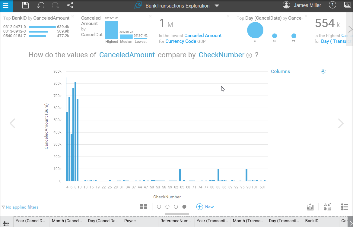
From here, we can continue the analysis of our data by asking some additional questions, such as how do the values of CanceledAmount compare by bank ID?
The resulting visualization, shown in the following screenshot, proves to us that the previous visualization has highlighted several transactions involving amounts that are out of what is considered normal for this bank ID, in that it shows the average canceled amounts by bank ID, and our highlighted bank ID (0312-0471-0) has an average of only $6,000:
